IS428 2017-18 T1 Assign Dinh Viet Nguyen
Links
Hourly sensor readings
Average daily sensor readings
Geographical distribution of chemical levels
Day-to-day levels of different chemicals
Hour-to-hour levels of different chemicals
Hourly sensor readings (more filters)
Wind Direction
Overview
Mistford is a mid-size city is located to the southwest of a large nature preserve. The city has a small industrial area with four light-manufacturing endeavors. Mitch Vogel is a post-doc student studying ornithology at Mistford College and has been discovering signs that the number of nesting pairs of the Rose-Crested Blue Pipit, a popular local bird due to its attractive plumage and pleasant songs, is decreasing! The decrease is sufficiently significant that the Pangera Ornithology Conservation Society is sponsoring Mitch to undertake additional studies to identify the possible reasons. Mitch is gaining access to several datasets that may help him in his work, and he has asked you (and your colleagues) as experts in visual analytics to help him analyze these datasets.
Mitch Vogel was immediately suspicious of the noxious gases just pouring out of the smokestacks from the four manufacturing factories south of the nature preserve. He was almost certain that all of these companies are contributing to the downfall of the poor Rose-crested Blue Pipit bird. But when he talked to company representatives and workers, they all seem to be nice people and actually pretty respectful of the environment.
In fact, Mitch was surprised to learn that the factories had recently taken steps to make their processes more environmentally friendly, even though it raised their cost of production. Mitch discovered that the state government has been monitoring the gaseous effluents from the factories through a set of sensors, distributed around the factories, and set between the smokestacks, the city of Mistford and the nature preserve. The state has given Mitch access to their air sampler data, meteorological data, and locations map. Mitch is very good in Excel, but he knows that there are better tools for data discovery, and he knows that you are very clever at visual analytics and would be able to help perform an analysis.
Companies
Roadrunner Fitness Electronics: produces personal fitness trackers, heart rate monitors, headlamps, GPS watches, and other sport-related consumer electronics.
Kasios Office Furniture :manufactures metal and composite-wood office furniture including desks, tables, and chairs.
Radiance ColourTek: produces solvent based optically variable metallic flake paints.
Indigo Sol Boards: produces skateboards and snowboards.
Chemicals
Appluimonia: An airborne odor is caused by a substance in the air that you can smell.
Chlorodinine : Corrosives are materials that can attack and chemically destroy exposed body tissues.
Methylosmolene : This is a trade name for a family of volatile organic solvents.
AGOC-3A: New environmental regulations, and consumer demand, have led to the development of low-VOC and zero-VOC solvents.
Data
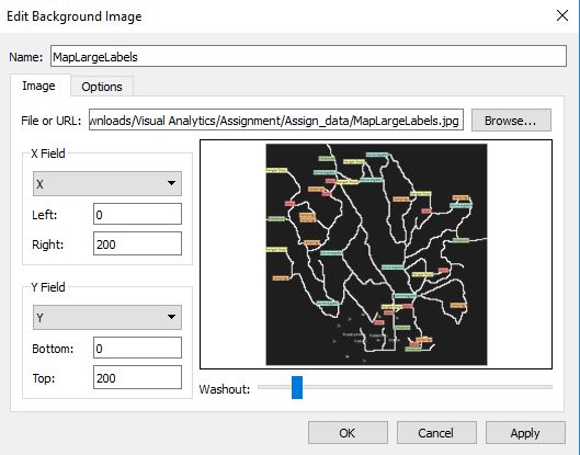
Map of Lekagul Wildlife Preserve Area
The factories and sensors locations are provided in terms of x,y coordinates on a 200x200 grid, representing a 12x12miles area, with (0,0) at the lower left hand corner (southwest). The sensors map shows the locations of the sensors and factories by number for the sensors and by name for the factories.
Factory Locations
The following are the factory locations:
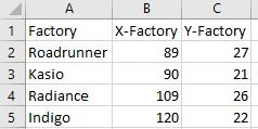
Roadrunner Fitness Electronics: 89,27
Kasios Office Furniture: 90,21
Radiance ColourTek: 109,26
Indigo Sol Boards: 120,22
Sensor Locations
Sensor locations are provided in an excel workbook with these information:
Sensor 1: 62,21
Sensor 2: 66,35
Sensor 3: 76,41
Sensor 4: 88,45
Sensor 5: 103,43
Sensor 6: 102,22
Sensor 7: 89,3
Sensor 8: 74,7
Sensor 9: 119,42
Problem 1
Characterize the sensors’ performance and operation. Are they all working properly at all times? Can you detect any unexpected behaviors of the sensors through analyzing the readings they capture?
As stated by the problem statement, the sensor data contains 3 months’ worth of readings by nine sensors, each monitoring four substances. Upon a cursory inspection of the data using Excel, I have found out that readings at the sensors are measured 1 hour apart. Measurements are taken in April, August and December, on every single day of the month. As a result, there are two possible criteria with which the performance and operation of the sensors can be assessed.
Missing Reading Assessment
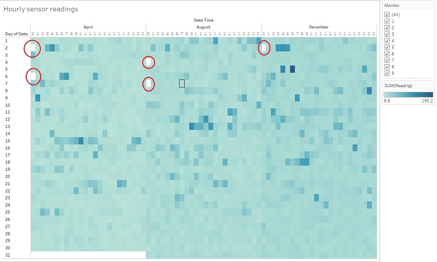
Each sensor had to record a reading every hour for all the days on which the measurements were supposed to be taken, to ensure that they are operating properly. In order to see at a quick glance whether the sensors have all readings they are supposed to have, a calendar heatmap can be an effective tool.
In Tableau, the setup for this map is as follows:
- Columns: MONTH (Date Time), HOUR (Date Time)
- Rows: DAY (Date Time)
- Filters: Monitor
- Color: SUM(Reading)
 |
|
Figure 1: Heatmap view in which white cell represents missing readings
Once the setup is done, I can use the ‘Monitor’ filter to obtain a heatmap view of the reading of each individual sensor. It is revealed from this heatmap that there are several empty slots with no data i.e. no pop-up to show the data when the cursor is placed on those slots. This is an indication that the sensors were not functioning properly, if at all, at the time represented by those slots, hence no readings available. By looking at each heatmap, I have found out an intriguing observation that the missing readings all happen at 00:00am. The following table summarises the dates with missing reading.

Figure 2: Summary table of dates with missing readings
As can be seen from the table, there are dates where all 9 sensors did not record any reading at 00.00am. These dates are: 2nd April, 6th April, 4th August, 7th August, 2nd December. There are also dates when only 1 or a few sensors did not record a reading. In particular, only sensor 3 missed a reading on 2nd August. Meanwhile, on 7th December, sensors 6, 7 and 8 did not record a reading.
Systematic Error Assessment
Throughout the 3 months of measurements, all sensors should have readings that fall in line with the expectation of a constant or declining trending.
As mentioned in the problem statement, all 4 factories have been taking very strict measures in their operations in order to protect the environment. With that in mind, I would expect every sensor to have day-to-day readings to stay relative constant, across 4 substances. In the case that the measures taken to protect the environment are effective, I would expect the day-to-day readings to be declining. While the decline from one day to the next may be masked by the fluctuating nature of these readings, the difference should be apparent after a period of 3~4 months. This means that for a sensor, August readings should generally be lower than April readings. Likewise, December readings should be generally lower than August readings.
To test this expectation, I use a cyclic plot with the following setup:
- Columns: MONTH(Date Time), DAY(Date Time)
- Rows: AVG(Reading)
- Filter: Monitor
- Color: Chemical
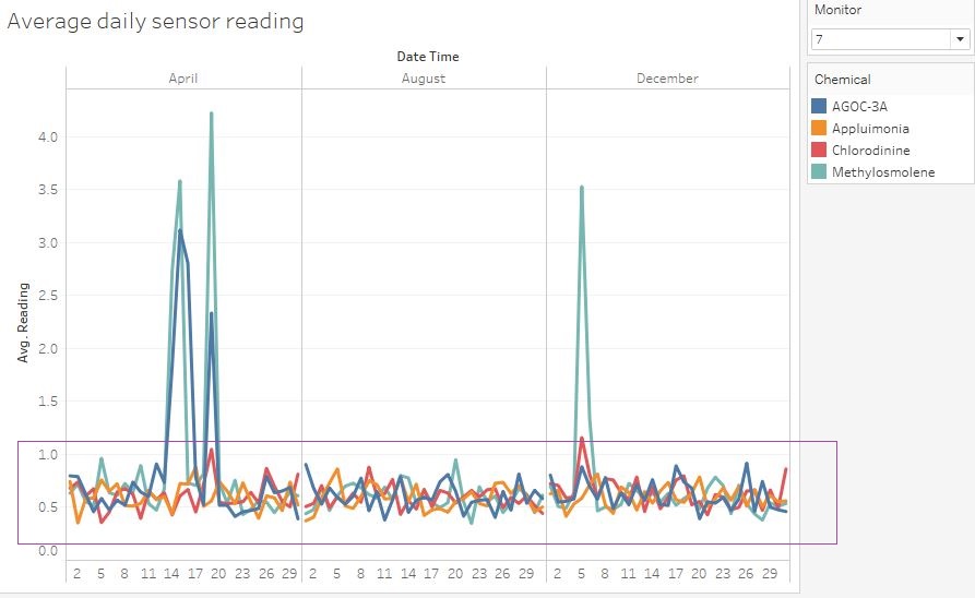
Figure 3: Averate daily sensor reading by sensor 7
From this chart, I have observed that sensors 1, 2, 3, 6, 7 and 8 display relatively constant day-to-day readings throughout 3 months. The chart of sensor 7 above is an example of relatively constant readings, where the 'bases' (in the purple box) are at around the same level.
Meanwhile, readings from sensors 4, 5 and 9 fall out of expectation:
- For sensor 4, the ‘base’ readings (in the red box), has shown a stark increase from April to August to December.
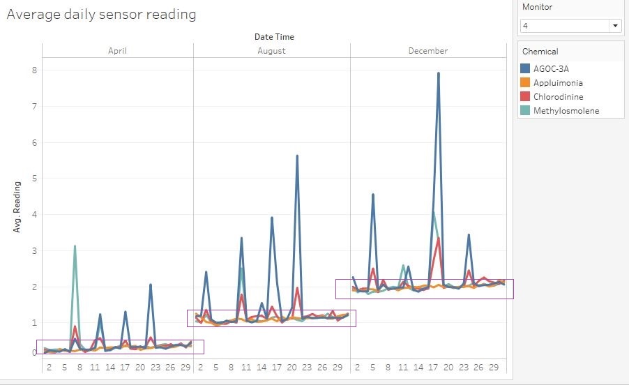
Figure 4: Averate daily sensor reading by sensor 4
- For sensor 5, the base readings have also increased throughout, although the difference between the 3 base levels is less apparent.
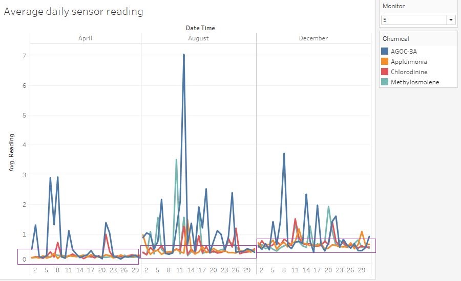
Figure 5: Averate daily sensor reading by sensor 5
- For sensor 9, readings generally increased from around 24th August, and the readings remain at this elevated level in December.
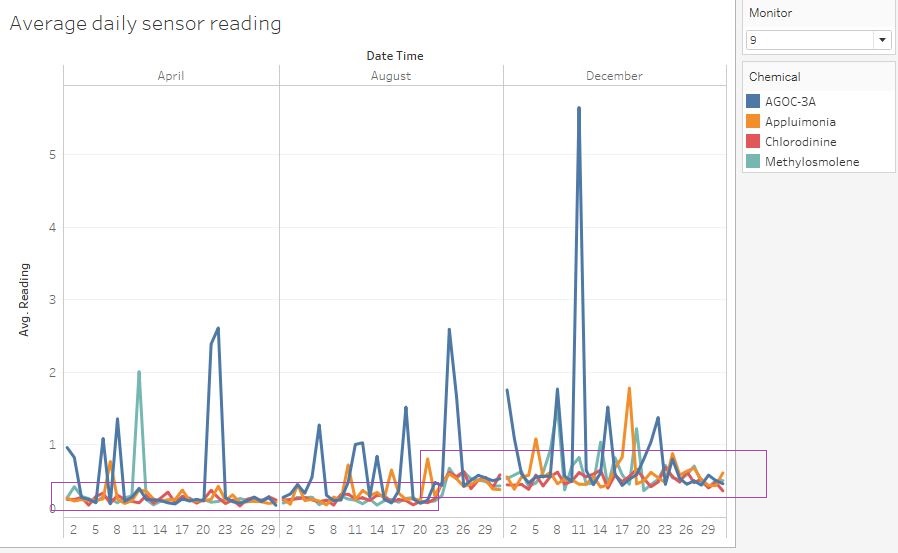
Figure 6: Averate daily sensor reading by sensor 9
There are two possible explanations for these unexpected behaviors:
- Explanation 1: Sensor 4, 5 and 9 were having a worsening systematic error. This caused the measurement unit in the sensor to register a substance level that was higher than the actual level, and the difference became larger as the sensor aged. To test this hypothesis, it will be useful to perform A/B testing between these sensors and a standard one. When subjected to the same manipulated level of airborne substance, if the readings from these 3 sensors are different from a standard one, it would mean that they do have systematic errors. Promptly, sensors 4, 5 and 9 need to be reset or replaced.
- Explanation 2: Sensor 4, 5 and 9 are functioning properly (after confirmation through A/B testing), which means that this gradual increase in day-to-day readings was caused by an increase in the actual substance levels. In this case, this observation will help solve the later parts of this case.
Problem 2
Now turn your attention to the chemicals themselves. Which chemicals are being detected by the sensor group? What patterns of chemical releases do you see, as being reported in the data?
Geographical Distribution
To tackle this problem, firstly, I am interested to find out the different chemical that have picked by different sensors, as well as a relative comparison of the chemical concentration between different sensors. For this, a geographical map of pie chart will be most useful. The geographical pie chart will be set up as follows:
- Columns: X (as dimension)
- Rows: Y (as dimension)
- Filters: MONTH (Date Time)
- Color: Chemical
- Size: SUM(Reading)
- Label: Monitor
- Background Maps: None
- Background Images:
The resultant geographical chart will be Figure 7 below, in which sensor 3 and 4 are shown to have picked up the highest readings while sensor 1 and 2 the lowest readings in April, August and December combined.
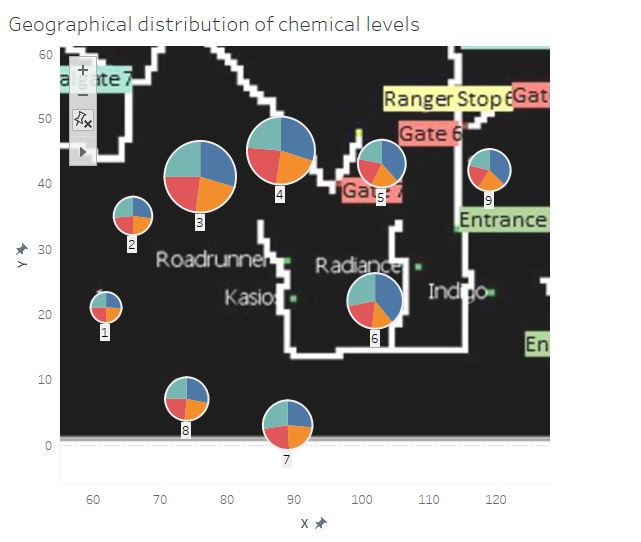
Figure 7: Geographical distribution of chemical levels across 3 months.
Day-to-day Chemical Level
Next, I am interested in the general level of each chemical in the entire area. For this, the cyclic setup in question 1 can be reused. Reading from all sensors will be averaged (i.e. all the sensors in the filters are ticked), but each substance is viewed separately by clicking on its legend one at a time. Using this method, I am essentially having an area-wide overview of the level of each chemical, for every day in April, August and December.
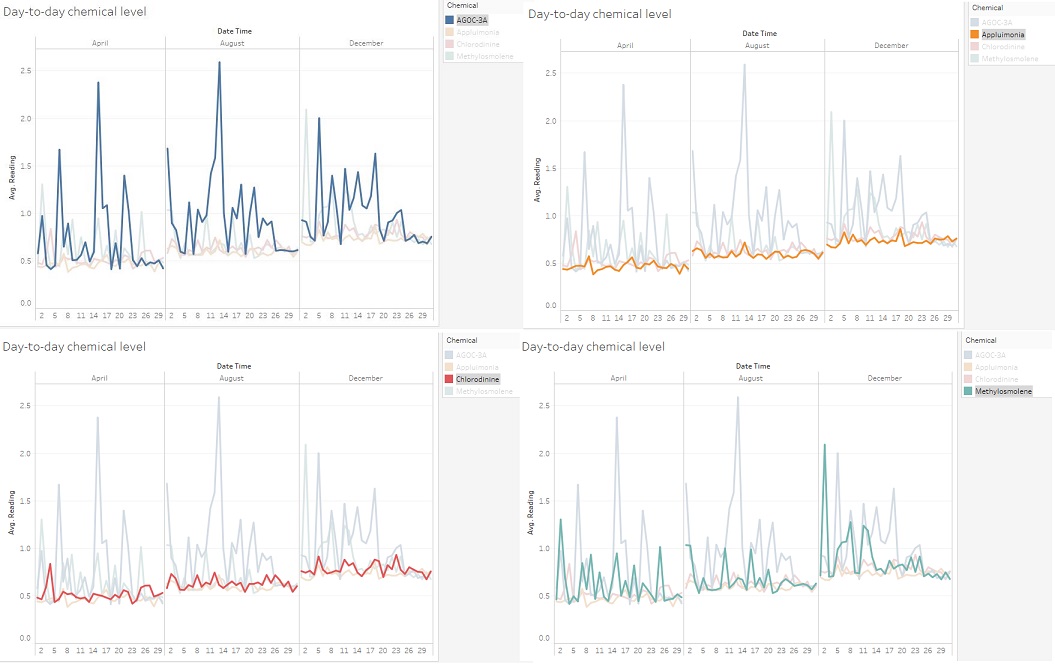
Figure 8: Day-to-day chemical levels, in order of left to right, top to bottom: AGOC-3A, Appluimonia, Cholorodinine, Methylosmolene
From Figure 8, I can see that Appluimonia and Chlorodinine level had generally increased from April to December. However, there are relatively less day-to-day fluctuation in the levels of these chemicals throughout the entire area. AGOC-3A and Methylosmolene levels had also increased area-wide but in contrast, the day-to-day fluctuations are much wider. Their line charts show more frequent and higher peaks. There are also recurring spikes worth noticing for these 2 chemicals:
- For AGOC-3A, spikes have recurred at the start of the month (6th April, 1st August and 5th December) as well as in the middle of the months (15th April, 13th August and 18th December). The rest of the spikes happened frequently and were spread out.
- For Methylosmolene, spikes recurred at the start of the month (2nd April, 1st August and 2nd December)
Hour-to-hour Chemical Level
Finally, I want to assess the level of chemical within a typical day. The cyclic plot to represent this is set up as follows:
- Columns: MONTH(Date Time), HOUR(Date Time)
- Rows: AVG(Reading)
- Color: Chemical
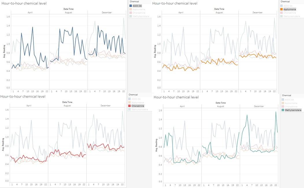
Figure 9: Hour-to-hour chemical levels, in order of left to right, top to bottom: AGOC-3A, Appluimonia, Cholorodinine, Methylosmolene
With this setup, I am able to view the levels of chemical in a typical day in these 3 months. From Figure X, I can see that Appluimonia and Chlorodinine have relative lower hour-to-hour fluctuations. AGOC-3A has wider and more frequent fluctuations. Methylosmolene gives the most interesting observations. In the charts of all 3 months, from 06:00am to 09:00pm, Methylosmolent level is in the same region as Appluimonia and Chlorodinine. However, outside of this window, there were suspicious peak levels of Methylosmolene in both early morning hours and late-night hours. Furthermore, the average values of these peaks have gone up between April and December. This means that during these hours, the area was flooded with an extremely high level of Methylosmolene coming from one or multiple sources.
Problem 3
Which factories are responsible for which chemical releases? Carefully describe how you determined this using all the data you have available. For the factories you identified, describe any observed patterns of operation revealed in the data.
Wind Direction Determination
In order to determine which factories are responsible for which chemical release, it is useful first to be able to have a visual representation of the wind speed and direction passing through each factory, at any recorded time. In this case, I will use a simple stick chart to determine wind direction passing through the factories.
Data preparation is needed to draw this chart.
Firstly, an excel file containing the locations of the factories are design as follows:
Then, we need to expand the meteorological data with 2 new columns: Factory and Path.
For each row entry of the original data, we will replicate once. The value of Path for the original rows will be “Start”, while the value of Path for the duplicated rows will be “End”. Then, use one of the 4 factories’ name for the Factory column.
The entire data set is the replicated three time for three other factories.
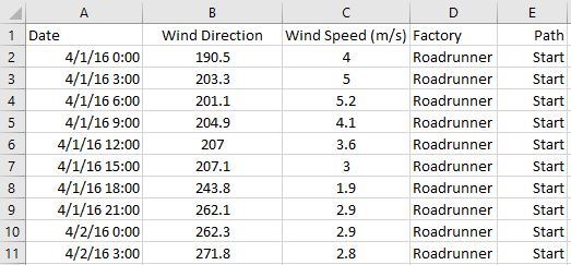
Use another Tableau workbook to load both the factory’s location data and the new wind data sheets, linking the using Factory as a joint.
We will create 2 calculated fields: X and Y with the following formulae:
- X: IIF([Path]="Start",[X-Factory],SIN(RADIANS( [Wind Direction]) )*[Wind Speed (m/s)]*10+[X-Factory])
- Y: IIF([Path]="Start",[Y-Factory],COS(RADIANS( [Wind Direction]) )*[Wind Speed (m/s)]*10+[Y-Factory])
The stick chart is built with the following setup:
- Columns: X (as dimension)
- Rows: Y (as dimension)
- Filters: MONTH(Date), DAY(Date), HOUR(Date)
- Marks: Line
- Colors: Factory
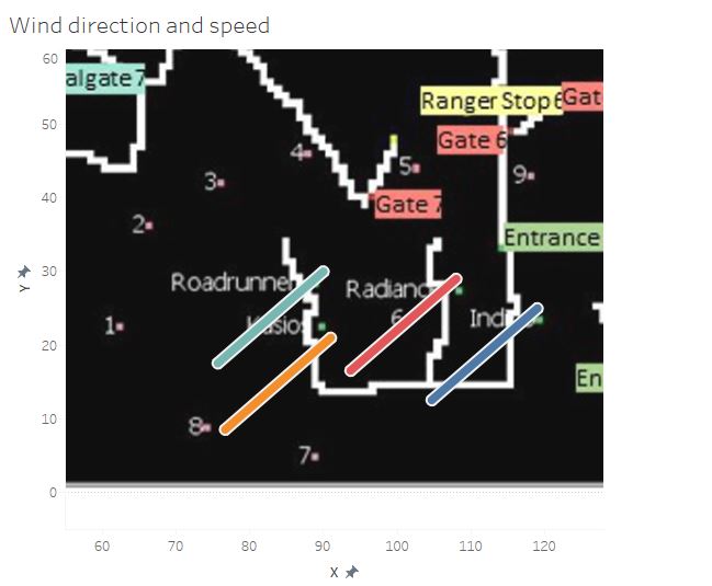
Figure 10: Sample wind chart display
As seen above, this chart wind direction and (arbitrary) speed. The direction of the wind is represented by the direction of the sticks, from the factories outward. Meanwhile, the length of the stick represents the speed of the wind.
High Chemical Level Event
In the next step, we will try to recognize incidents where a very high level of a particular chemical is detected, following which we will use the wind chart to determine where the chemical comes from.
The heatmap chart for this will be set up as follows:
- Columns: MONTH(Date Time), HOUR (Date Time)
- Row: DAY (Date Time)
- Filters: Monitor, Chemical
- Color; SUM(Reading)
By going through different combinations of the filter, we will be able to spot high chemical level event expressed as a very dark color on the heatmap. The following is an example:
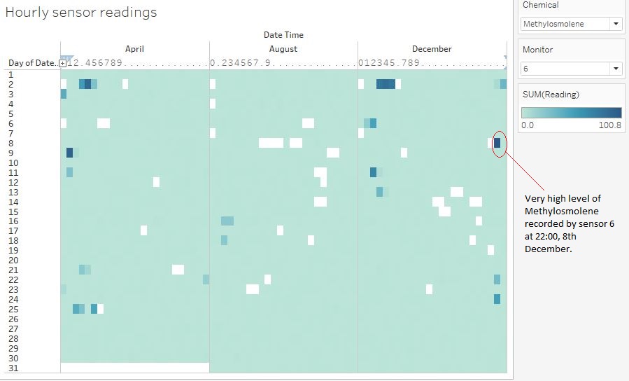
Figure 11: Hourly Methylosmolene reading for sensor 6
As observed from Figure 11, at 22:00, on 8th December, sensor 6 recorded an extremely high level of methylosmolene. Compare it to the wind direction obtained at 21:00, 8th December (the closest data point), it it highly likely that this amount of methlosmolene was carried from Indigo.
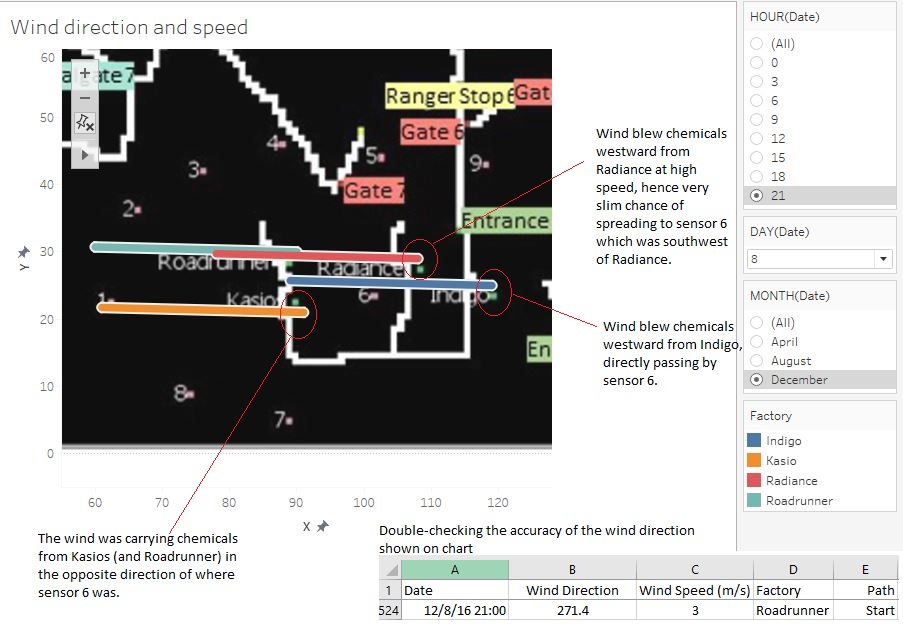
Figure 12: Wind direction at 21:00, 8th December/
Summarized Results
Following this method, I have arrived at the following summary of the number of times each factory was the suspect of a high chemical level events:

Figure 13: Summary of high chemical level events and the suspected companies
Conclusion
In order to determine which company is the culprit behind environmental degradation in the area, which led to the dwindling in number Rose-crested Blue Pipit, we can make use of the following insight:
- From problem 1: There were sensors going offline in certain nights and thus unable to record a reading.
- From problem 2: Sporadic dumping of Methylosmelene were revealed to be happening at either early morning or late-night hours.
- From problem 3: Wind data indicated that in the event of high levels of Chlorodinine and Methylosmolene, the 2 more harmful among the 4 chemicals, Indigo was mostly likely the source where the chemical releases came from.
It stands to reason to conclude that there was a very high chance Indigo were discreetly releasing 2 harmful chemicals, Chlorodinine and Methylosmolene. To further shed light on the issue, careful inspection should be conducted on the company's premise, or discreet intelligence processes should be carried out to gain more evidences.
