IS428 2017-18 T1 Assign Chew Jonathan Yee Long
Contents
- 1 Assignment Details
- 2 Overview
- 3 The Task
- 4 Data Preparation
- 5 Visualization
- 5.1 Tableau Visualization
- 5.2 Dashboard 1&2: Introduction & Context
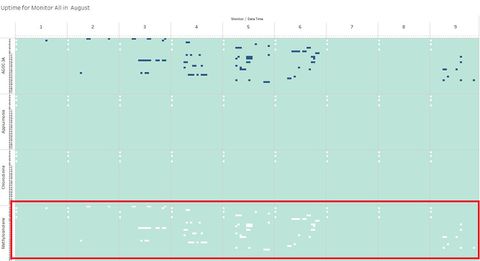
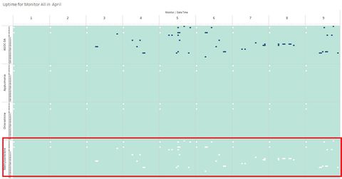
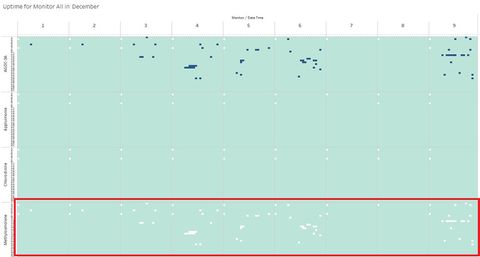
- 5.3 Dashboard 3:Monitor Operation Uptime
- 5.4 Dashboard 4: Overall Monitor Results
- 5.5 Dashboard 5: Specific Monitor Results
- 5.6 Dashboard 6: Chemical Readings
- 5.7 Dashboard 7: Chemical Concentration
- 5.8 Dashboard 8: Wind & Pollution Model
- 6 Investigation Tasks
- 7 Credits
- 8 Comments
Assignment Details
IS428 Main Page: (https://wiki.smu.edu.sg/1718t1is428g1/Main_Page)
Assignment Overview: (https://wiki.smu.edu.sg/1718t1is428g1/Assignments)
Assignment Dropbox: (https://wiki.smu.edu.sg/1718t1is428g1/Assignment_Dropbox)
Overview
Mistford is a mid-size city is located to the southwest of a large nature preserve. The city has a small industrial area with four light-manufacturing endeavors. Mitch Vogel is a post-doc student studying ornithology at Mistford College and has been discovering signs that the number of nesting pairs of the Rose-Crested Blue Pipit, a popular local bird due to its attractive plumage and pleasant songs, is decreasing! The decrease is sufficiently significant that the Pangera Ornithology Conservation Society is sponsoring Mitch to undertake additional studies to identify the possible reasons. Mitch is gaining access to several datasets that may help him in his work, and he has asked you (and your colleagues) as experts in visual analytics to help him analyze these datasets.
Mitch Vogel was immediately suspicious of the noxious gases just pouring out of the smokestacks from the four manufacturing factories south of the nature preserve. He was almost certain that all of these companies are contributing to the downfall of the poor Rose-crested Blue Pipit bird. But when he talked to company representatives and workers, they all seem to be nice people and actually pretty respectful of the environment.
In fact, Mitch was surprised to learn that the factories had recently taken steps to make their processes more environmentally friendly, even though it raised their cost of production. Mitch discovered that the state government has been monitoring the gaseous effluents from the factories through a set of sensors, distributed around the factories, and set between the smokestacks, the city of Mistford and the nature preserve. The state has given Mitch access to their air sampler data, meteorological data, and locations map. Mitch is very good in Excel, but he knows that there are better tools for data discovery, and he knows that you are very clever at visual analytics and would be able to help perform an analysis.
The Task
The four factories in the industrial area are subjected to higher-than-usual environmental assessment, due to their proximity to both the city and the preserve. Gaseous effluent data from several sampling stations has been collected over several months, along with meteorological data (wind speed and direction), that could help Mitch understand what impact these factories may be having on the Rose-Crested Blue Pipit. These factories are supposed to be quite compliant with recent years’ environmental regulations, but Mitch has his doubts that the actual data has been closely reviewed. Could visual analytics help him understand the real situation?
The primary job for Mitch is to determine which (if any) of the factories may be contributing to the problems of the Rose-crested Blue Pipit. Often, air sampling analysis deals with a single chemical being emitted by a single factory. In this case, though, there are four factories, potentially each emitting four chemicals, being monitored by nine different sensors. Further, some chemicals being emitted are more hazardous than others. Your task, as supported by visual analytics that you apply, is to detangle the data to help Mitch determine where problems may be. Use visual analytics to analyze the available data and develop responses to the questions below.
- Characterize the sensors’ performance and operation. Are they all working properly at all times? Can you detect any unexpected behaviors of the sensors through analyzing the readings they capture?Limit your response to no more than 9 images and 1000 words.
- Now turn your attention to the chemicals themselves. Which chemicals are being detected by the sensor group? What patterns of chemical releases do you see, as being reported in the data? Limit your response to no more than 6 images and 500 words.
- Which factories are responsible for which chemical releases? Carefully describe how you determined this using all the data you have available. For the factories you identified, describe any observed patterns of operation revealed in the data. Limit your response to no more than 8 images and 1000 words.
Data Preparation
The Data
For this investigation, we were given 3 sets of excel sheets to work with:
- Meteorological Data.xlsx
- Sensor Data.xlsx
- Sensor Location.xlsx
Sensor Data Combined with Wind Data
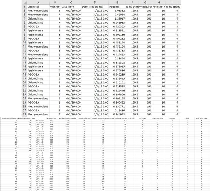
Issue: There was a lack of wind direction for each chemical reading, therefore lack of understanding where the possible source of pollution is coming from. Also in further visualization, in order to tag each reading and their direction, each reading should have time stamp tagged to it.
Solution: To resolve this issue, I combined the wind data based on the time stamp via vlookup function in excel. Here I am assuming that each sensor reading data is tagged on a 3-hourly basis. For example, readings from 0000 hrs to 0200 hrs are tied to wind direction reading of 0000hrs, and readings from 0300 hrs to 0500 hrs are tied to wind direction reading of 0300hrs.
- I began resolving this by copying the either data set from Meteorological Data.xlsx to another separate sheet in Sensor Data.xlsx.
- I created 4 new columns of in the first sheet:
- Date Time (Wind)– allows for each reading to be tagged to a wind direction timestamp for further visualization
- Wind direction – Absolute value of each wind direction
- Pollution Concentration Direction – This is the direction in which the sensor is reading the chemicals from.
- Wind Direction (Rounded) – a rounded figure of wind direction to the nearest tenth for easier processing for visualization later.
- Wind Speed – Absolute Wind Speed of each reading.
- Columns of Wind Direction, Data Time (Wind), Wind Speed, reads data from the next sheet via a VLOOKUP function
- Columns of Pollution Concentration and Wind Direction (Rounded) will read the data from the columns above and be processed as below.
Wind Direction Model Concept
Issue: It is difficult to visualize the wind and monitor reading direction because of the restrictions that Tableau have with the scatter plot data. Even if we were to plot the location data on Tableau, it is difficult to show the wind direction since each point is not dynamic.
Solution: Based on this visualization example, https://community.tableau.com/message/196527#196527 , I discovered that to make such a visualization happen, I would need to create a large spreadsheet of wind direction data that enables to creation of polygons for each monitor.
After extracting the data on this visualization, there is a noticeable pattern in the data.
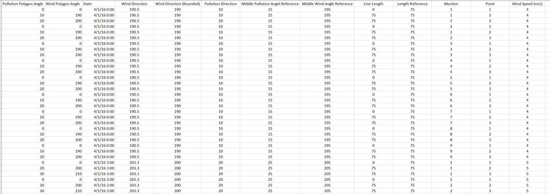
Based on this visualization, it can be understood that based on the angels each polygon was created with these following sets of data, where there are 3 specific points and angles tagged to each point. This would mean that each meteorological reading will be duplicated into a total of 27 times, since each monitor would need a total 3 angles.
To do so, I would first have to duplicate the data by 26 times. I managed to find a VBA code that allows for such function via this link https://www.extendoffice.com/documents/excel/3682-excel-copy-and-insert-row-multiple-times.html.
I copied the vba code and ran is as required. The following is the VBA code used for this duplication process.
   Sub insertrows()
       Dim I As Long
       Dim xCount As Integer
       xCount = Application.InputBox("Number of Rows", "Kutools for Excel", , , , , , 1)
       If xCount < 1 Then
           MsgBox "the entered number of rows is error ,please enter again", vbInformation, "Kutools for Excel"
           GoTo LableNumber
       End If
       For I = Range("A" & Rows.CountLarge).End(xlUp).Row To 1 Step -1
           Rows(I).Copy
           Rows(I).Resize(xCount).Insert
       Next
       Application.CutCopyMode = False
   End Sub
The following is the result as follows:
After running the code, I manged to duplicate 27 sets of meteorological data. Next I created the following columns as shown.
- Pollution Polygon Angle – the pollution angle for the polygon to pivot at
- Wind Polygon Angle – the wind angle for the polygon to pivot at
- Wind Direction (Rounded) – a rounded figure of wind direction to the nearest tenth for easier processing for visualization later
- Pollution Direction – a modulus of the wind direction
- Middle Pollution Angle Reference – this is a middle angle reference between the shorted end of the polygon.
- Line Length – an input figure for the length of the line for
- Length Reference – an input figure for the length of the line for
- Monitor – a monitor reference to be tagged to the wind direction data
- Point – the points for the polygon to be referenced to
Each meteorological reading and monitor polygon will look to have the following set of data:
Data Configuration
In the end, the following datasets will be imported into Tableau for analysis:
Each meteorological reading and monitor polygon will look to have the following set of data:
Each of the files are added as a data source in tableau. Part of the planned visualization will include having monitor reading direction, given that it was calculated in the excel above. However, it was tested that due to scale of the new meteorological data set, it is difficult for Tableau to call both the pollution polygons and wind direction polygons at the same time. Therefore, a duplicated data source is created for the meteorological data.
Visualization
Tableau Visualization
The following is the link to the Tableau Visualization: https://public.tableau.com/profile/jonathan482#!/vizhome/IS428_Visual_Analytics_Assignment/MistfordPollutionInvestigation?publish=yes
The visualization is told in Tableau story mode, browsed left to right.
Dashboard 1&2: Introduction & Context
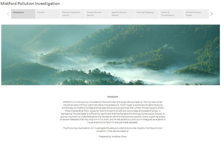
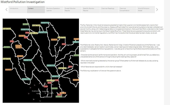
The following is the dashboard for the introduction of the story and the context.
The purpose of these 2 dashboard is due to the nature of the Tableau Visualization. Since it is a story mode, the introduction and context dashboards allow for a sequential flow of the story.
Dashboard 3:Monitor Operation Uptime
The following interactive techniques have been employed in this dashboard:
| Interactive Technique | Rationale | Brief Implementation Steps |
|---|---|---|
| Filter data by month and monitor | To show the differences in months | 1. Add the month and monitor filters of the sheet into the dashboard |
Dashboard 4: Overall Monitor Results
The following interactive techniques have been employed in this dashboard:
| Interactive Technique | Rationale | Brief Implementation Steps |
|---|---|---|
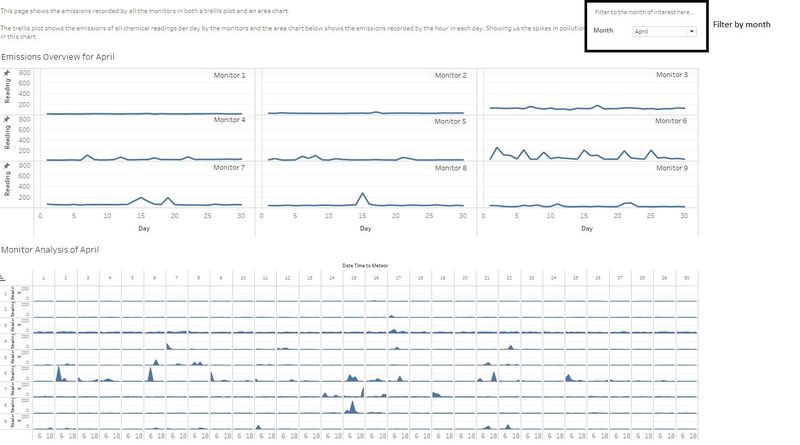
| Filter data by month and monitor | To show the differences in months | 1. Add the month and monitor filters of the sheet into the dashboard |
Dashboard 5: Specific Monitor Results
The following interactive techniques have been employed in this dashboard:
| Interactive Technique | Rationale | Brief Implementation Steps |
|---|---|---|
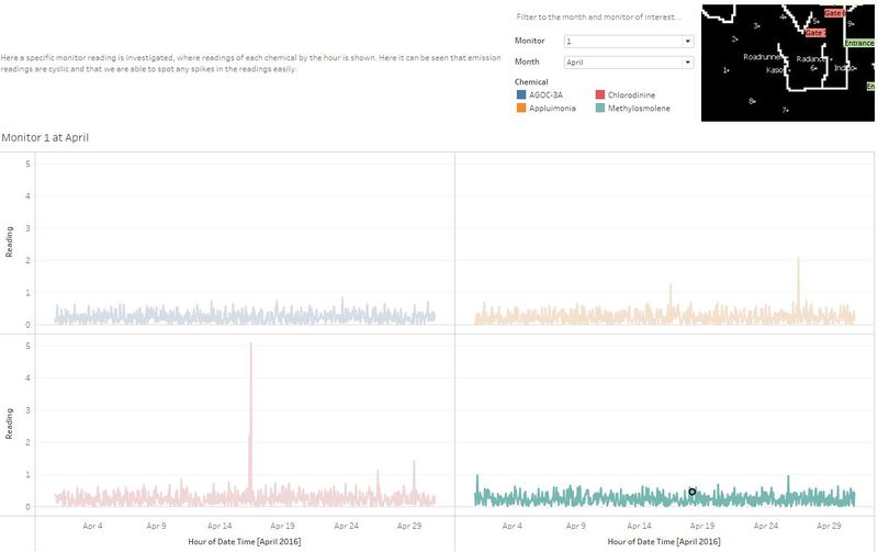
| Filter data by month and monitor | To show the differences in months | 1. Add the month and monitor filters of the sheet into the dashboard |
Dashboard 6: Chemical Readings
Dashboard 7: Chemical Concentration
Dashboard 8: Wind & Pollution Model
Investigation Tasks
Task 1: Sensor Performance and Operation
| S/N | Findings | Significance |
|---|---|---|
| 1 | There are common down times between most of the sensors at a specific day of each month |
During these down times, it is observed that during the night, chemical readings output increased. These down times could have provided important missing information that wasn’t recorded. |
| 2 | Some sensors are unable to detect Methylosmolene. | These sensors could have captured important information regard the emission of Methylosmolene. Its surprising to notice that only Methylosmolene is undetected, whereas the remaining chemicals are detected. |
Task 2: Chemicals
| S/N | Findings | Significance |
|---|---|---|
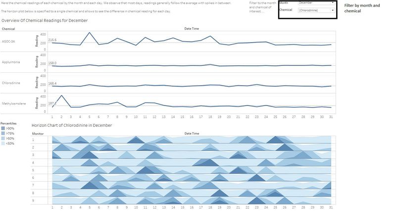
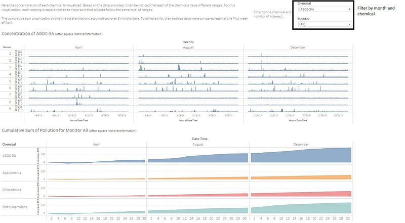
| 1 | There has been an overall gradual increase of chemical release, especially in AGOC-3A and Methylosmolene. |
The increase in Methylosmolene is a troubling sign as it is most likely the cause of the Rose-Crested Blue Pipit given its toxic nature. |
| 2 | AGOC-3A has the spikiest of the data, followed by Methylosmolene, suggesting illicit aggressive emission of chemicals during these times. |
There could be factories who are manufacturing at times, especially at night thinking that they wouldn’t be noticed. |
| 3 | Appluimonia and Chlorodine has had a stable levels of emissions, even though they may seem spiky at first. |
This suggests that factories are not trying to over pollute given that the emissions seems cyclic and has a regular pattern. |
Task 3: Possible Source
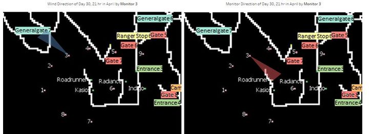
Given the nature of the Tableau Visualization for this task, there would be too many images required, as such it is recommended to interact with the visualization and see the results for oneself. The images below take notes of the peak in emissions and showing the directions where emissions occur.
| S/N | Findings | Significance |
|---|---|---|
| 1 | Roadrunner usually emits Cholordine but at low levels. | We can infer that, while emissions of Chlordine is overall not the highest, it could have been part of the reason that drove the Rose-Crested Blue Pipit away given its corrosive nature. |
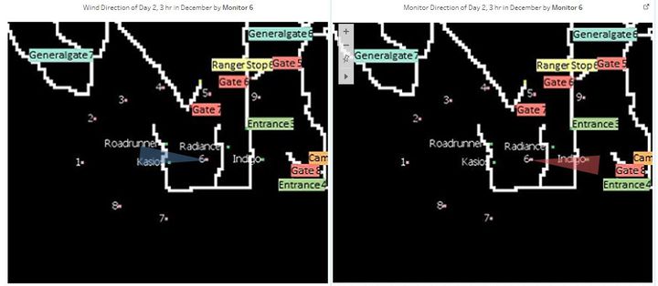
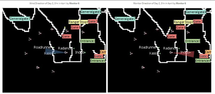
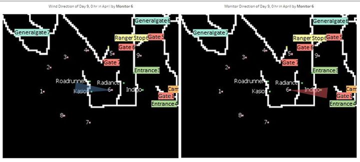
| 2 | Kasios emits mostly Methylosmolene and AGOC-3A, as seen on the wind direction model. Readings direction point mostly towards these 2 factories even if emissions are always peaking. The image below is taken of a peak of the Methylosmolene emission |
We can infer that the high emissions of Methylosmolene is most likely to have drove the Rose-Crested Blue Pipit away given the toxicity effects on vertebrates.
Kasios is most likely the culprit manufacturing factory. |
| 3 | Radiance emits AGOC-3A mostly. | Since AGOC-3A is known to be less harmful to human and environmental health. We can conclude that Radiance is not a likely suspect factory in this case. |
| 4 | Indigo is the primary source for Appluimonia but at lower levels. It also emits quite high amount of Methylosmolene as shown below. The frequencies of these peaks make Indigo highly suspicious. |
Since Appluminoia is known to be less harmful to human and environmental health. However, given the high concentration of Methylosmolene recorded from the direction of Indigno, it is also possible that Indigno could also be a suspect. |
Credits
How to insert multiple rows of data - https://www.extendoffice.com/documents/excel/3682-excel-copy-and-insert-row-multiple-times.html
Rose wind polygon reference - https://community.tableau.com/message/196527#196527
Creating horizon chart - https://www.tableau.com/about/blog/2016/4/visualizing-dense-data-how-cut-and-superpose-areas-52839?height=931&width=1004&inline=true#flight
Also, active discussion with Jazreel Siew and Victoria Koh made these all possible.

