ISSS608 2016-17 T3 Group5 Immigration Application
|
|
|
|
|
|
|
Dashboard
To ensure better interactivity and efficiency in coding, we chose flexdashboard over alternatives like the basic shiny package and the shiny dashboard due to its effective way in organising code and its relatively simpler syntax in dealing with reactive functions, inputs and outputs. Above all, flexdashboard allows seamless integration with RMarkdown and provides a clean interface to work with, especially with a team of multiple coders.
In the extraction, cleaning and general manipulation of data we used tidyverse, tidygraph, readxl, igraph and WDI. This helped us tremendously in aggregating and joining data that came from different sources as well as changing the format of the data to the correct type so that they could be visualized by the respective plots.
Chord diagram
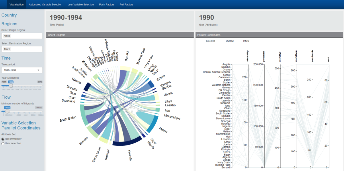
After exploring circlize and other visualisation packages, we settled on chorddiag due to its relative simplicity - as long as we fed it data in an adjacency matrix format it could display the chord diagram visualisations with ease. Given that it is an R wrapper on top of d3.js code, it provides beautiful and interactive graphics for e.g. the automatic adjustment and realignment of country names every time the data set is updated with a new set of countries, and when the country of interested is selected through hovering the cursor, the non-selected flows conveniently fade into the background allowing the user to explore the migrant flows interactively. It also allowed us to pass data through reactive functions to other parts of the app, so that we can connect say the clicking of a country of the chord diagram with the selection of country attributes in our parallel coordinates plot (described below). However, the chorddiag package has its downsides as well, as it is an experimental package still undergoing development. One functionality problem we discovered was that when we added more and more countries to plot, the names started to overlap and were difficult to differentiate, much less identify. We implemented a workaround where we calculated the number of countries being displayed, and change the font size of the chord diagram text accordingly so that the text is still legible even when many countries appear.
Parallel Coordinates Plot
We chose the parcoords package to represent Parallel coordinates with the same considerations in mind – that it is an R wrapper over d3.js code which allowed for powerful interactivity. Features we implemented include the following:
1) changing of colours of the lines of the parallel coordinate plot that correspond with the countries being selected – blue for selected country, red for source countries of the selected country, and green for destination countries of the selected country.
2) The selection and brushing of the y-axes of the parallel coordinate plot, which was extremely useful when too many countries were represented at the same time.
3) The shifting of the y-axes through clicking and dragging as it allows users to better position attributes that they are interested in comparing side by side when necessary.
4) The flipping of the axis when you double click on them allowing the exploration of data in cases where users might be more interested in comparing low scores rather than high scores for e.g. the Hofstede cultural dimensions data where low and high scores represent dichotomous polarities rather than a continuous measure such as GDP. We chose to limit the user to 9 variables due to space constraint issues. Moreover, this has implications further on when we performed the partial regression analysis, as too many variables in the multivariate linear regression will only add error and reduce the meaningfulness of the statistical model.

