ISSS608 2016-17 T3 Group5 Immigration Intro
 Group 5 - Why Did the Migrant Cross the Road?
|
|
|
|
|
|
|
Contents
Overview
Motivation of the Application
Migration is a big issue in the international relations and foreign policy. As a phenomenon, migration is not new, and people have been moving from place to place since the dawn of time.

Migration could be either permanent or temporal. At a more general level, the causes of migration are varied, ranging from social, political, to economic reasons. Theories of migration tend to focus on push-pull factors of source and destination countries. However, any migration flow is both a product of these factors as well as the relevant immigration policies of regulating cross border flows. Given all these factors, it is difficult to study the determinants of migration. Nevertheless, migration remains a very important topic of study today. In recent years, anti-immigrant sentiments has been growing particularly in the more developed West. Driven by fears of displacement, competition for jobs and dilution of national and/or ethnic identity amongst local populations, the issue of migration has been much politicised. The wave of popular dissatisfaction with migration-related issues have even resulted in Brexit and the Election of President Trump. Yet, migration is one of the building blocks of an international economy and having the ability to cross borders is a key factor in building up the economies of both sending and receiving countries. Understanding the factors that affect the causes and the flows of migration provide an important lens in interpreting the landscape of the international political economy.
Challenges of visualising migration - Past work reviews
Due to the complex nature of migration, any attempt to create a visualisation of migration data would encounter many difficulties and challenges. The following is a list of visualisation challenges we’ve encountered in our study of past attempts at visualising migration flows as well as our own attempts at designing a visualisation:
Multidimensionality of migration data
Migration data can be represented by stocks and flows.

The former refers to the stock of migrants in a country, and the latter refers to the flow from country to country. Other than being perceived as pair-wise flows between countries, migration flow data could also be represented by a net migration figure. All these have implications on how the data can be visualised. Social migrants migrate in search of a better quality of life, refugees and asylum seekers leave their home countries to escape political persecution or conflict, or to escape natural disasters, or even migrants trafficked for sex or labour exploitation. Many attempts at visualising these flows have used world maps and coloured lines between regions with vary thickness to represent migration flows from source to destination countries as well as the volume of the flow respectively.
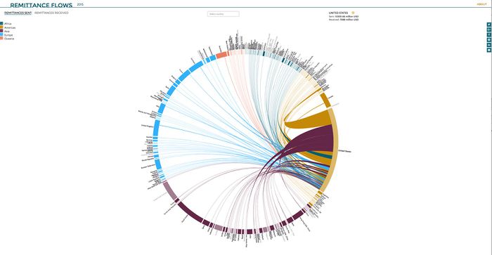
Economic migrants who migrate to destination countries work and stay on a temporary basis are considered as transnational migration flows. One way in which transnational migration flows have been represented is through the proxy indicators of remittance flows. This is premised on the assumption that transnational migrants would send money back to their hometowns and origin countries through remittance transfers. Attempts to visualise these flows (http://www.torre.nl/remittances/#?direction=sent) have also relied on Chord Diagrams, where countries are lined up in a circle and coloured by their regions; while remittance flows are represented by chords connecting these countries (see Figure below).

Of course, Chord Diagrams have also been used to visualise migrant flows (http://www.global-migration.info/). Another way in which flows has been represented is through the use of a scrolling slope graph, as can be seen in People Movin’(http://peoplemov.in/).
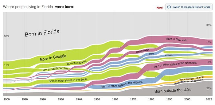
For stock data, the main question would be how a migrant is defined and how the data is collected. For example, would migrants who entered a country in 1980 still be considered a migrant in 1990s? What if the migrant had already attained citizenship or permanent resident status? How long would the label of a migrant be retained? Would they still be considered a migrant or would they be transferred from the stock migrants into the stock of citizens? One approach to addressing this issue was a visualisation by the New York Times (https://www.nytimes.com/interactive/2014/08/13/upshot/where-people-in-each-state-were-born.html#Utah). It used a Sankey diagram to visualise both inter- and intra-national migrant population of people living in various states in the USA and how they changed over time a la a stacked graph based on place of birth. The aesthetic choice to use different colours to represent different sources of migrants as well as the ordering of the stacks by population size and state of origin provided many layers of information that was neatly contained within the visualisation (see Figure below).

However, this approach skirts around the question of what a migrant actually is by representing them by country of birth, and whether a migrant is still a migrant after they have transitioned into naturalised citizens of their host country. More importantly, is the data for even these transitions collected? Even if they are, such data may not be available for all countries. This leads us to the next problem of data collection and availability .
Data quality, quantity, and availability
Given that the usefulness of any data visualisation depends on the quality of the data, one needs to be very wary of data sources. In particular, one needs to be careful in how the data is collected, and also whether the method in which the migration data is collected for one country is consistent with other countries. Thus, the quality and availability of the data collected highly depends on the administrative capacity of the government agencies of the country doing the collection. Some attempts at visualisation such as (http://www.global-migration.info/) have used flow estimates instead of actual data.
One of the most prominent challenges in the visualisation of global migration data is the sheer amount of data flows there are.

As of today, there are a total of 195 countries (http://www.worldometers.info/geography/how-many-countries-are-there-in-the-world/) in the world. Migration data however, is not restricted to countries, as World Bank bilateral migration data includes economies and special administrative regions such as Hong Kong, Macau and Taiwan as migration origins and destinations as well. Even if we count only migration data from countries, there are a total of 38,025 unique data points at least. As such, most attempts at visualising migration data have resorted to using interactive instead of static visualisations.
For example, the Human Trafficking Flow Map (http://dataviz.du.edu/projects/htc/flow/#SGP/in/sex) uses a drop down selection to allow users to choose between origin and destination countries in order to let them better manage the visualisation of flows. People Movin’(http://peoplemov.in/) deals with this problem by allowing users to vertically scroll through their entire dataset, and clicking on the name of the origin and destination countries will dynamically cause the migration flows to appear from or to the country depending on which side of the slope graph is clicked. Chord diagrams from Remittance Flows 2015 (http://www.torre.nl/remittances/#?direction=sent&country=PF) and the The Global Flow of People (http://www.global-migration.info/) filter the data so that only flows for the countries selected are displayed. Floating tooltips with migration data has also been used in many of these visualisations to provide the actual migration numbers when the cursor is hovered over it.
Last but not least, there is also the problem of limited data available for bilateral migration flows. The World Bank Bilateral Migration data that is used by the The Global Flow of People (http://www.global-migration.info/) is only available for 4 years - 1990, 1995, 2000, and 2005. The presentation of the data was done by allowing the user to toggle between different year periods. Visualisations such as People Movin’(http://peoplemov.in/) and Remittance Flows 2015 (http://www.torre.nl/remittances/#?direction=sent&country=PF) have chosen instead to depict one year’s data only, and the Human Trafficking Flow Map (http://dataviz.du.edu/projects/htc/flow/#SGP/in/sex) takes the anachronistic approach of only using the latest updates on the countries’ tier status.
Objective - Addressing the analytic gap
Currently, we observe that attempts at visualising migration flows tend to be more descriptive than analytic, choosing to focus on the presentation of the directions and the volumes of the migration flows rather than providing any analytical link explaining the flows. This tendency seems to partially stem from the complexity of the phenomenon of migration, which makes explaining its flows from a general level difficult. Ernest Ravenstein - the grandfather of migration theory - theorised migration as being caused by push-pull factors; where “push” factors in the origin country propel people to emigrate and “pull” factors attract people to immigrate. Most contemporary approaches to migration – be it neoclassical economics, segmented labour market theory, or the world systems approach – have fundamentally not departed from Ravenstein’s thesis. However, as the reasons that people migrate become more varied, a more comprehensive theory of migration becomes difficult to formulate. Hence, most studies of migration that move beyond a descriptive level tend to address the effects and implications of migration rather than the causes of migration itself. However, as scholars and policy makers focused on more context-focused approaches and “middle-level” theoretical explanations to the study of migration, they tend to lose sight of how variables at the more structural level - such as macro-economic indicators, political regime, sociocultural factors and other country level attributes - could actually play a part in influencing migration patterns.
Our ISSS608 project would like to address this gap, moving beyond the current visualisations and attempt to create a dashboard application that could provide an additional analytic lens. We fall back to Ravenstein’s theory of migration, by looking at how country attributes influence migration flows. In order to provide a more holistic overview, we decide to combine economic data from the World Bank, data on political regime characteristics from the Polity IV database, and sociocultural measures from Geert Hofstede’s 6 Cultural Dimensions to provide create a general profile for countries. This dashboard application focuses on allowing the user to explore not only the migration flows, but the push and pull factors behind these flows as well by visualizing the various country attributes as differential levels that may correlate with the magnitude and degree of migration.