ISSS608 2016-17 T3 Assign AKANGSHA BANDALKUL VisualisationPreparation
Akangsha Bandalkul VAST Challenge - MC2
|
|
|
|
|
|
|
|
Please note that there may be minor steps added/changed to the below when creating the visualisations as changes were made based on feedback received .
Question 1
Creating the Calendar Heat Map of Readings
The purpose of this calendar heat map is to show days where there are a higher/lower number of readings recorded by each of the sensors. To do this, a calendar heat map is used.
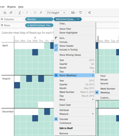
1. first, the Monitor and Date Time columns are dragged to the “Columns” shelf. The Date Time column’s arrow is selected in the shelf to change it to “Weekday”.
2. next, Date Time is dragged to the “Rows” shelf twice. The first is changed to “MONTH” and the second to “WEEK”.
This results in the calendar display of readings.
3. the Number of Records field is dragged to the “Colour” shelf so that each box of the calendar is coloured based on the number of readings recorded.
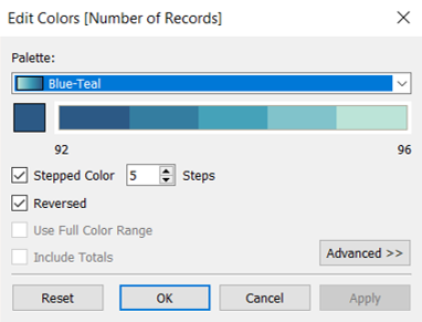
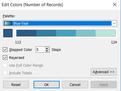
4. to highlight the days with lower readings, we want to make this colour darker and the days with the expected number of readings lighter. To do this, we click on the “Colour” box and select “Edit Colours”.
The following settings are applied:
5. the version prepared allows all months to be viewed at one go. However, for the dashboard, we want to allow users to change each of the visualisations based on the month selected. As such, we create a duplicate sheet (to be used for the dashboard) named “DASHBOARD Calendar Heat Map of Readings”.
6. in this sheet, we drag Date Time to the “Filters” shelf. The type is changed to “Month” and “April” is selected by default.
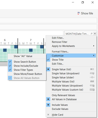
7. we right click on MONTH in the Filters shelf and select “Show Filter”.
8. in the new filter which appears to the right of the graph, we select the arrow down to change the display to “Single value (list)” and Customise > deselect “Show “All” Value”.
9. we rename the title to “Calendar Heat Map of Readings for each Sensor in <MONTH(Date Time)>” so that the title changes dynamically to reflect the month chosen by the user.
10. we select the down arrow next to “MONTH” in the “Rows” shelf and deselect “Show Header” so that this does not appear in the dashboard OR can remove the “MONTH” variable from the “Rows” shelf entirely.
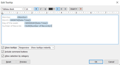
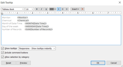
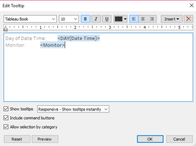
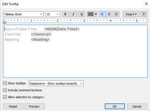
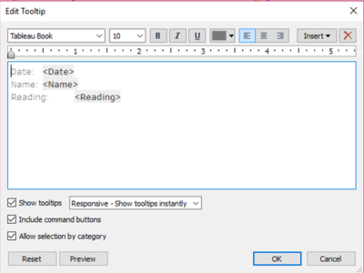
11. the “Tooltip” box is double clicked to change the text to ensure the following appears:
12. to ensure only the first letter for each day of the month is displayed, we right click on the days of the month, and click “Format”. In the Format pane on the right, under from the Dates dropdown, we select “First letter”.
This visualisation is now ready for the dashboard.
Creating the Calendar Heat Map of Readings for each Sensor Split by Chemical
The purpose of this calendar heat map is to allow users to compare the number of readings captured by each sensor across the chemicals. This is to determine whether there are any underlying patterns that are not seen when looking at an overall number of readings number at a high level.
1. first, the Monitor and Date Time columns are dragged to the “Columns” shelf. The Date Time column is changed to the “WEEKDAY” attribute.
2. next, the Date Time column is dragged to rows and changed to “MONTH”, the Chemical column is dragged to rows and the Date Time column is dragged again and changed to “WEEK”.
3. the Number of Records field is dragged to the “Colour” shelf so that each box of the calendar is coloured based on the number of readings recorded.
4. to highlight the days with lower readings, we again want to make this colour darker and the days with the expected number of readings lighter. To do this, we click on the “Colour” box and select “Edit Colours” and use the same settings as in the graph above.
5. the version prepared allows all months to be viewed at one go. However, for the dashboard, we want to allow users to change each of the visualisations based on the month selected. As such, we create a duplicate sheet (to be used for the dashboard) named “DASHBOARD Calendar Heat Map of Readings (Chemical)”.
6. in this sheet, we drag Date Time to the “Filters” shelf. The type is changed to “Month” and “April” is selected by default.
7. we right click on MONTH in the Filters shelf and select “Show Filter”.
8. in the new filter which appears to the right of the graph, we select the arrow down to change the display to “Single value (list)” and Customise > deselect “Show “All” Value”.
9. we rename the title to “Calendar Heat Map of Readings for each Sensor Split by Chemical in <MONTH(Date Time)>” so that the title changes dynamically to reflect the month chosen by the user.
10. we select the down arrow next to “MONTH” in the “Rows” shelf and deselect “Show Header” so that this does not appear in the dashboard OR can remove the “MONTH” variable from the “Rows” shelf entirely.
11. the “Tooltip” box is double clicked to change the text to ensure the following appears:
12. to ensure only the first letter for each day of the month is displayed, we right click on the days of the month, and click “Format”. In the Format pane on the right, under from the Dates dropdown, we select “First letter”.
This visualisation is now ready for the dashboard.
Creating the Monthly Hourly Readings Highlighted Table
The purpose of this visualisation is to see how the number of readings for each sensor differed over the hours of the day. The number of readings for each hour is summed across the days of the month for this visualisation.
1. the Date Time column is dragged to the “Columns” shelf and is changed to “HOUR”
2. the Date Time column is dragged to the “Rows” shelf and is changed to “MONTH”. The Monitor column is then dragged to the rows shelf.
3. the Number of Readings variable is dragged to the “Colour” box to colour each cell by the number of readings captured.
4. to highlight the hours with lower readings, we again want to make this colour darker and the hours with the expected number of readings lighter. To do this, we click on the “Colour” box and select “Edit Colours” and use the following settings:
5. the version prepared allows all months to be viewed at one go. However, for the dashboard, we want to allow users to change each of the visualisations based on the month selected. As such, we create a duplicate sheet (to be used for the dashboard) named “DASHBOARD Monthly-Hourly Readings”.
6. in this sheet, we drag Date Time to the “Filters” shelf. The type is changed to “Month” and “April” is selected by default.
7. we right click on MONTH in the Filters shelf and select “Show Filter”.
8. in the new filter which appears to the right of the graph, we select the arrow down to change the display to “Single value (list)” and Customise > deselect “Show “All” Value”.
9. we rename the title to “Sum of the Number of Readings for each Hour for each Monitor in <MONTH(Date Time)>” so that the title changes dynamically to reflect the month chosen by the user.
10. we select the down arrow next to “MONTH” in the “Rows” shelf and deselect “Show Header” so that this does not appear in the dashboard OR can remove the “MONTH” variable from the “Rows” shelf entirely.
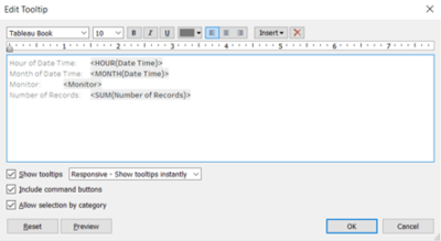
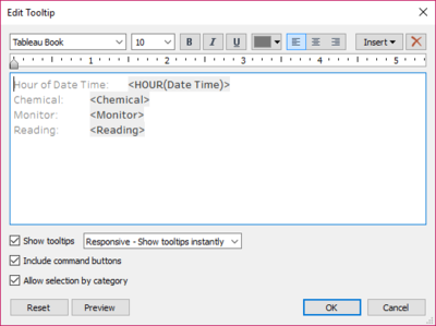
11. the “Tooltip” box is double clicked to change the text to ensure the following appears:
This visualisation is now ready for the dashboard.
Creating the Horizon Plot of Chemical Readings Captured by Sensors
The purpose of the visualisation is to identify which monitors capture higher readings over the days of the month.
1. the Date Time column is dragged to the “Columns” shelf and changed to “MONTH”.
2. the Date Time column is again dragged to the “Columns shelf and changed to “DAY”.
3. the Monitor column is dragged to the “Rows” shelf.
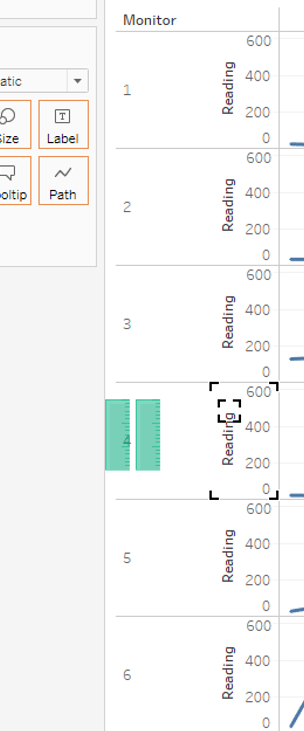
4. the Readings column is dragged to the “Rows” shelf. This will automatically change to “SUM(Reading)”. Leave this as is.
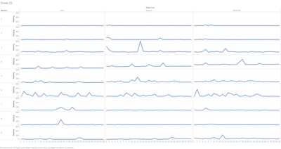
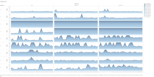
The result is a series of stacked line graphs for each monitor across the three months:
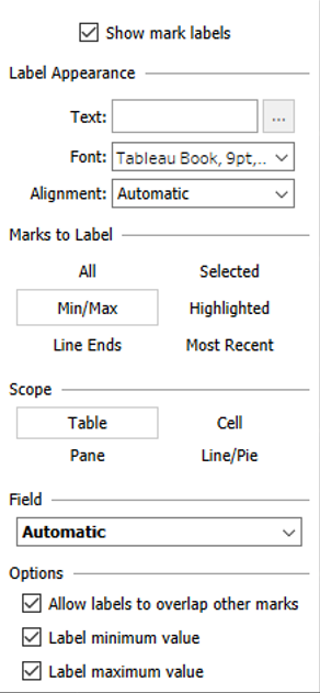
5. next, we need to create the bins for the sum of readings to create the different colours for the horizon plot. To do this, we can identify the maximum and minimum sum of readings by double clicking on “Labels” and applying the following settings:
6. now that we have identified the readings, we need to create bins for the readings. For the purpose of this visualisation, we group readings in the following bins since we know that overall the readings stay relatively low:
- 0 – 10 ppm
- 10 – 20 ppm
- 20 – 30 ppm
- 30 – 40 ppm
- 40 – 50 ppm
- 50 – 60 ppm
- 60 – 70 ppm
- 70 – 80 ppm
- Above 80 ppm
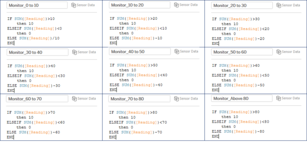
To create these bins, we create new calculated fields by clicking Analysis > Create Calculated Field
Then for each of the bins, the following statements are used:
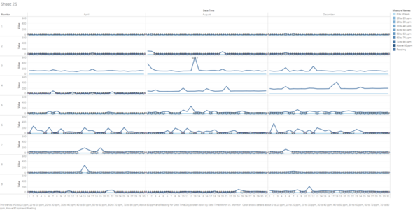
7. once the fields have been created, we need to add these as merged columns to the existing graph space. To do this, all of the columns are selected and dragged to the y axis of the work sheet till the merge icon appears:
The result is all the lines appearing in the same graphs:
8. next, we remove the labels by double clicking the “Label” icon and deselecting “Show Mark Labels”.
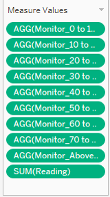
9. next, we drag “SUM(Reading)” out of the Measure Values shelf:
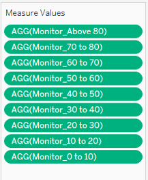
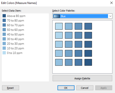
10. we now need to re-order the measure values in descending order. This is done by clicking on each of the AGG(Monitor_... buttons and dragging it to the desired location till the order is as follows:
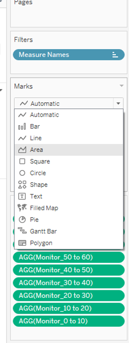
11. next, we change the mark type to “Area” by using the dropdown next to “Automatic”.
The result is stacked area charts:
12. we now want to disable stacking. To do this, we go to the top menu Analysis > Stack Marks > Off.
13. we then select the colour legend in the top left and edit the colours so that the colours range from light to dark of one colour and click “OK”.
14. the version prepared allows all months to be viewed at one go. However, for the dashboard, we want to allow users to change each of the visualisations based on the month selected. As such, we create a duplicate sheet (to be used for the dashboard) named “DASHBOARD Horizon Plot for Sensors”.
15. in this sheet, we drag Date Time to the “Filters” shelf. The type is changed to “Month” and “April” is selected by default.
16. we right click on MONTH in the Filters shelf and select “Show Filter”.
17. in the new filter which appears to the right of the graph, we select the arrow down to change the display to “Single value (list)” and Customise > deselect “Show “All” Value”.
18. we rename the title to “Horizon Plot of Sum of Readings for each Sensor in <MONTH(Date Time)>” so that the title changes dynamically to reflect the month chosen by the user.
19. we select the down arrow next to “MONTH” in the “Rows” shelf and deselect “Show Header” so that this does not appear in the dashboard OR can remove the “MONTH” variable from the “Rows” shelf entirely.
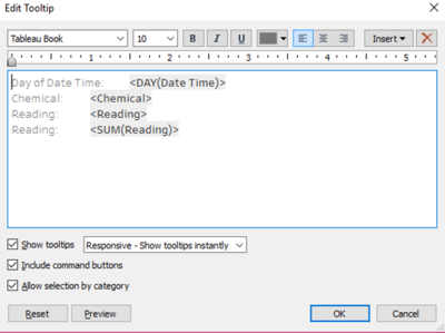
20. the “Tooltip” box is double clicked to change the text to ensure the following appears:
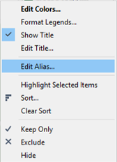
21. to change the name for each of the colour levels in the legend, we can create an Alias. This will allow the calculated variable names to remain the same nut more meaningful text to be presented in the visualisation. To do this, in “Measure Names” legend, right click on each name and select “Edit Alias…”:
This visualisation is now ready for the dashboard.
Question 2
Creating the Dot Plot of Hourly Chemical Emissions for each Chemical
The purpose of this visualisation is to allow users to see how the readings for each chemical changes during the hours of the day across all three months.
1. first, the Date Time column is dragged to the “Columns” shelf and changed to “HOUR”.
2. next, we drag the Chemical column to the “Rows” shelf.
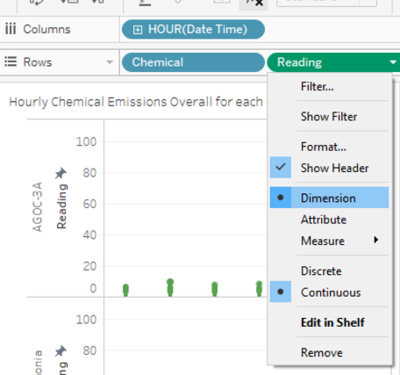
3. drag the Reading column to the “Rows” shelf. Click on the arrow next to Readings to change it to a dimension to ensure that the readings are not aggregated.
4. drag the Chemical column to the “Colour” box so that each of the readings is coloured by chemical
5. drag the Reading column to the “Size” box so that the size of each of the dots of the readings is relative to the reading amount.
6. next, we want to change the colours of the chemicals to represent the degree of “hazardousness”. To do this, we click on the “Colour” box and select “Edit Colours”. We then assign colours relevant to the degree of hazardousness. For my case I have assigned the following:
7. next, we change the title of the sheet to “Hourly Chemical Emissions Overall for each Chemical”.
8. the “Tooltip” box is double clicked to change the text to ensure the following appears:
This visualisation is now ready for the dashboard.
Creating the Dot Plot of Sum of Hourly Readings Captured by each Sensor for each Month
The purpose of the visualisation is to further drill down the previous dot plot to see if the same trends can be seen i) across sensors and ii) across the months.
1. the Date Time column is dragged to the “Columns” shelf and changed to “MONTH”.
2. the Date Time column is again dragged to the “Columns” shelf and changed to “HOUR”.
3. the Monitor column is dragged to the “Rows” shelf.
4. the Reading column is dragged to the “Rows” shelf. Click on the arrow next to Readings to change it to a dimension to ensure that the readings are not aggregated.
4. drag the Chemical column to the “Colour” box so that each of the readings is coloured by chemical. This should automatically be the same colours set in the previous graph.
5. drag the Reading column to the “Size” box so that the size of each of the dots of the readings is relative to the reading amount.
6. the version prepared allows all months to be viewed at one go. However, for the dashboard, we want to allow users to change each of the visualisations based on the month selected. As such, we create a duplicate sheet (to be used for the dashboard) named “DASHBOARD Dot Plot Hourly Readings”.
7. in this sheet, we drag Date Time to the “Filters” shelf. The type is changed to “Month” and “April” is selected by default.
8. we right click on MONTH in the Filters shelf and select “Show Filter”.
9. in the new filter which appears to the right of the graph, we select the arrow down to change the display to “Single value (list)” and Customise > deselect “Show “All” Value”.
10. we rename the title to “Dot Plot of Sum of Hourly Readings Captured by each Sensor for <MONTH(Date Time)>” so that the title changes dynamically to reflect the month chosen by the user.
11. we select the down arrow next to “MONTH” in the “Rows” shelf and deselect “Show Header” so that this does not appear in the dashboard OR can remove the “MONTH” variable from the “Rows” shelf entirely.
12. the “Tooltip” box is double clicked to change the text to ensure the following appears:
This visualisation is now ready for the dashboard.
Creating the Dot Plot of Chemical Emissions by Day
The purpose of this visualisation is to see how readings of each chemical change across the days of each month.
1. the Date Time column is dragged to the “Columns” shelf. This is changed to “MONTH”.
2. the Date Time column is again dragged to the “Columns” shelf. This is changed to “DAY”.
3. the Chemical column is dragged to the “Rows” shelf.
4. the Reading column is dragged to the “Rows” shelf. Click on the arrow next to Readings to change it to a dimension to ensure that the readings are not aggregated.
5. drag the Chemical column to the “Colour” box so that each of the readings is coloured by chemical. This should automatically be the same colours set in the previous graph.
6. drag the Reading column to the “Size” box so that the size of each of the dots of the readings is relative to the reading amount.
7. the version prepared allows all months to be viewed at one go. However, for the dashboard, we want to allow users to change each of the visualisations based on the month selected. As such, we create a duplicate sheet (to be used for the dashboard) named “DASHBOARD Chemical Emissions by Day”.
8. in this sheet, we drag Date Time to the “Filters” shelf. The type is changed to “Month” and “April” is selected by default.
8. we right click on MONTH in the Filters shelf and select “Show Filter”.
9. in the new filter which appears to the right of the graph, we select the arrow down to change the display to “Single value (list)” and Customise > deselect “Show “All” Value”.
10. we rename the title to “Chemical Emissions for each Day of <MONTH(Date Time)>” so that the title changes dynamically to reflect the month chosen by the user.
11. we select the down arrow next to “MONTH” in the “Rows” shelf and deselect “Show Header” so that this does not appear in the dashboard OR can remove the “MONTH” variable from the “Rows” shelf entirely.
12. the “Tooltip” box is double clicked to change the text to ensure the following appears:
This visualisation is now ready for the dashboard.
Creating the Horizon Plot of Sum of Readings for each Chemical across the Months
The purpose of the visualisation is to identify the values of the readings captured for each of the chemicals across the months.
1. the Date Time column is dragged to the “Columns” shelf and changed to “MONTH”.
2. the Date Time column is again dragged to the “Columns shelf and changed to “DAY”.
3. the Chemical column is dragged to the “Rows” shelf.
4. the Readings column is dragged to the “Rows” shelf. This will automatically change to “SUM(Reading)”. Leave this as is.
5. next, we need to create the bins for the sum of readings to create the different colours for the horizon plot. To do this, we can identify the maximum and minimum sum of readings by double clicking on “Labels” and applying the following settings:
6. now that we have identified the readings, we need to create bins for the readings. For the purpose of this visualisation, we group readings in the following bins since we know that overall the readings stay relatively high:
- 0 to 50 ppm
- 50 to 100 ppm
- 100 to 150 ppm
- 150 to 200 ppm
- Above 200 ppm
To create these bins, we create new calculated fields by clicking Analysis > Create Calculated Field
Then for each of the bins, the following statements are used:
7. once the fields have been created, we need to add these as merged columns to the existing graph space. To do this, all of the columns are selected and dragged to the y axis of the work sheet till the merge icon appears.
The result is all the lines appearing in the same graphs.
8. next, we remove the labels by double clicking the “Label” icon and deselecting “Show Mark Labels”.
9. next, we drag “SUM(Reading)” out of the Measure Values shelf:
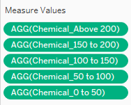
10. we now need to re-order the measure values in descending order. This is done by clicking on each of the AGG(Chemical_... buttons and dragging it to the desired location till the order is as follows:
11. next, we change the mark type to “Area” by using the dropdown next to “Automatic”
The result is stacked area charts.
12. we now want to disable stacking. To do this, we go to the top menu Analysis > Stack Marks > Off.
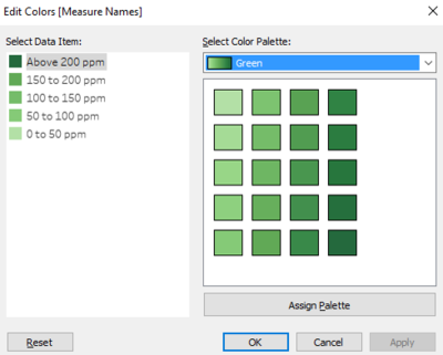
13. we then select the colour legend in the top left and edit the colours so that the colours range from light to dark of one colour and click “OK”.
14. the version prepared allows all months to be viewed at one go. However, for the dashboard, we want to allow users to change each of the visualisations based on the month selected. As such, we create a duplicate sheet (to be used for the dashboard) named “DASHBOARD Horizon Plot for Chemicals”.
15. in this sheet, we drag Date Time to the “Filters” shelf. The type is changed to “Month” and “April” is selected by default.
16. we right click on MONTH in the Filters shelf and select “Show Filter”.
17. in the new filter which appears to the right of the graph, we select the arrow down to change the display to “Single value (list)” and Customise > deselect “Show “All” Value”.
18. we rename the title to “Horizon Plot of Sum of R eadings for each Sensor in <MONTH(Date Time)>” so that the title changes dynamically to reflect the month chosen by the user.
19. we select the down arrow next to “MONTH” in the “Rows” shelf and deselect “Show Header” so that this does not appear in the dashboard OR can remove the “MONTH” variable from the “Rows” shelf entirely.
20. we also want to change the orientation of the graphs from vertically stacked to horizontally stacked for the purpose of easier comparison on the dashboard. To do this we shift the “Chemical” variable from the start of the “Rows” shelf to the start of the “Columns” shelf.
21. the “Tooltip” box is double clicked to change the text to ensure the following appears:
22. to change the name for each of the colour levels in the legend, we can create an Alias. This will allow the calculated variable names to remain the same nut more meaningful text to be presented in the visualisation. To do this, in “Measure Names” legend, right click on each name and select “Edit Alias…”:
This visualisation is now ready for the dashboard.
Question 3
Data Preparation for Question 3
Question 3 requires the wind data to be used to map the sensor chemical readings back to the factories where they likely originated from. This requires a lot of data preparation steps to be completed to i) map each of the sensor readings to relevant coordinates ii) prepare a table containing wind direction readings for each sensor for each of the 706 rows of wind data. This information will then be used to create separate plots representing the angle sectors of the wind over time.
Common methods of visualising wind direction and wind speed data would be a wind rose (coxcomb) plot. This plot bins the wind direction angles into bins which are then used as sectors of a “pie” that represents the angle of the wind direction. The radius of each section represents the wind speed. Here is a sample of a wind rose plot.
This same concept will be used to prepare the solution for question 3. The wind direction and speed readings will be converted into triangular shapes using trigonometry to calculate the coordinates for the points and using polygons to shade in the triangular shape. The result will be a wind rose plot pointing from each sensor in the direction of the origin of the wind with the triangle lengths calculated based on wind speed.
Creating the map
An image map is created that will be used as the image background of the plot with the different angle sectors for each sensor over time.
To do this, the self-made locations table is used to plot the X and Y coordinate and label them and colour them based on the type (factory/sensor).
Detailed steps
Note: because this sheet was used to create an image that was used as a background for the actual wind rose plot, this worksheet is not included in the live dashboard used for investigation.
1. the X coordinate column for the locations table is dragged to “Columns”, and the Y coordinate column is dragged to “Rows”
2. the Type column is dragged to the “Colour” box to colour each of the marks by the type, either Factory or Sensor
3. the Name column is dragged to the “Name” box to label each of the points
4. to ensure the best visibility of the data points, the maximum and minimum thresholds for the X and Y axes are set to 0 – 50 for X and 50 – 130 for Y
5. to remove the axes from the view, we right click on each axis and deselect “Show Header”
6. to save the image, we right click on the graph space and select “Copy” > “Image…” > ensure only “View” is selected > “Copy”
7. we then paste the image in PowerPoint and then right click and select “Save as Image” and name this “Locations map.png”
The image is now saved for future use.
Creating the wind data plot
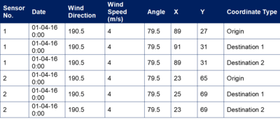
JMP was used to prepare the table for calculation. The following sample dataset represents the required end result that was to be prepared:
The first step is to prepare a table with meteorological data mapped to each of the sensors.
1. Load the Meteorological Data.xlsx file in JMP and first ensuring that the Date column data type is set to “Time” > “dd-mm-yy hh:mm”
2. add an empty column to the Meteorological data table and recode the missing values to “1”. This file is saved as “Sensor 1”. The same steps are repeated for each of the 9 sensors to generate one table for each sensor
3. all rows for each of the 9 sensor-specific tables are concatenated using JMP’s Table > Concatenate function. The sensor tables must be kept open for this to be used. A new table with all 6,313 rows is generated and saved as “MeteorologicalDataWithSensorCoordinates”
4. the “Locations Data” table is opened in JMP to join with the MeteorologicalDataWithSensorCoordinates table. This will allow each of the sensor’s X and Y coordinates to be loaded into the table. This is done via JMP’s Table > Join function. The match type is set to “Name” and the final columns are chosen: Date, Wind Direction, Wind Speed (m/s), Type, Name, x, y
5. two additional copies of the table from step 4 are created. For each of the three tables, we create a column named “Coordinate Type”, and for each table we recode the missing value to “Origin”, “Destination 1” or “Destination 2”
6. JMP’s concatenate function is used to concatenate the three tables into one. This table is then saved as a CSV file named “FinalMeteorologicalDataWithSensorCoordinates” to be used in Tableau
8. the new “FinalMeteorologicaldataWithSensorCoordinates” table is loaded to Tableau via the “Data Source” pane > “New Data Source”
7. a calculated field is added by opening a new worksheet and selecting Analysis > Create Calculated Field to convert the speed from metres per second to the grid distance per hour. The column is named “Wind Speed (Grid/Hour)” and the following formula is used:
8. we need to convert the wind speed from metres per second to the grid equivalent so that we can plot this information on the 200 x 200 grid space provided. An equation is created to convert the wind speed from metres per second to the grid distance per hour.
We are told that the 200 x 200 grid space represents an area of 12miles x 12miles.
First, we multiply the wind speed provided by 2.24 to convert from metres per second to miles per hour. Next, we multiply the result by (200/12) to take into account the conversion from miles to grids.
This is done using the following equation:
9. an equation is used to convert the wind direction to i) the math equivalent of direction where 0 degrees represents 90 degrees in wind direction and ii) to the opposite direction. This is to ensure that the sectors created point towards the location where the wind originated from, rather than pointing in the direction the wind is travelling to. The following equation is used:
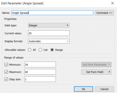
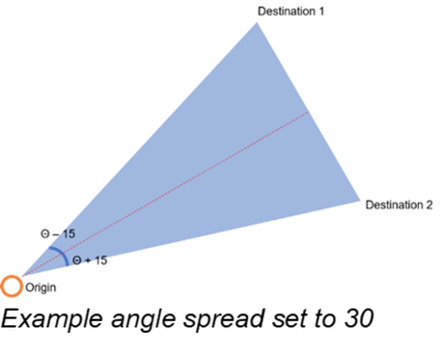
10. next, we want to create a way for users to submit their designed angle size (or bin size) for each wind rose plot. This is because the size of the radius of a factory’s plume may be very narrow or very large. To reflect this, we want to allow users to be able to change the radius from between 30 to 60 degrees.
To do this, in the new worksheet, a Parameter is created by right clicking in the right panel and selecting “Create Parameter”. We use the following settings:
10. the radius range is also used to calculate the (x,y) coordinate pairs for the wind rose:
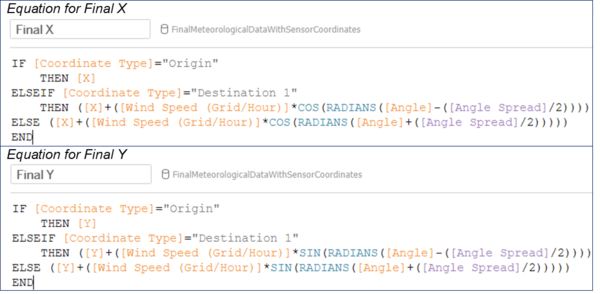
Using the angle (θ) of the wind direction, we want to calculate the destination 1 and 2 x and y coordinates an equal range away from the coordinate. This is to ensure that the leaf represents the total possible area that the factory’s emission plume may reach.
Since the stack (chimney) radius for each factory is not provided, allowing the radius size to be dynamic allows for multiple scenarios to considered.
To calculate the second and third points of the triangle, two calculated fields are created to calculate the final X and Y coordinates to for each of the points.
11. with the columns created, the next step is to these points are then plotted onto a graph space.
12. the Final X column is dragged to “Columns” and Final Y to “Rows”. The Name column is dragged to “Colour” to set a colour allowing each sensor’s wind rose to be differentiated.
13. the X axis is right clicked and the minimum and maximum values are set to 50 and 130, next “Show header” is switched off.
14. for the Y axis, the minimum and maximum values are set to 0 and 50 and the “Show header” option is also switched off.
15. the 9 nulls notification that appears at the bottom right of the graph is selected and this data is filtered.
16. the Date field is then dragged to the “Pages” shelf to create a slider to allow users to see how the wind rose for each sensor changes over time. The arrow next to Date is selected and “Exact Date” is selected so that users can see the sensor’s wind rose for each meteorological data recording.
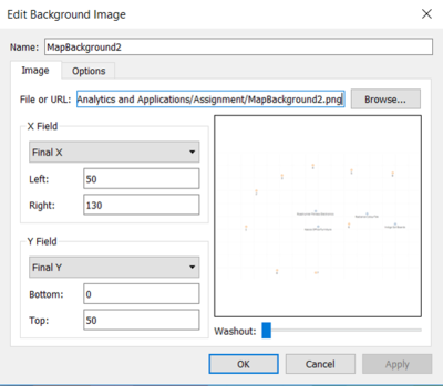
17. to add the plotted factories and sensors image, we select Map > Background Images > FinalMeteorologicalDataWithSensorCoordinates and apply the following settings after locating the saved image from the file directory:
18. the Date Time column is then dragged to the Pages shelf so that the plots can change over time. the “YEAR” is changed to “Exact Date”.
This visualisation is now ready for the dashboard.
Creating the chemical readings at each monitor table
Aside from seeing how the wind rose changes over time, we also want to allow users to see how the readings for each of the sensors at each point in time. To do this, we want to focus on readings for each of the sensors at timestamps where we have a corresponding meteorological reading.
1. to do this, we go to the “Data Source” tab in Tableau and change the data source through the dropdown to “Sensor Data”. We then select Data > Duplicate Data Source and rename this duplicate to “Sensor Data (Filtered)”
2. we then add a new Filter on the “Date time” column > Hours > and select only 0, 3, 6, 9, 12, 15, 18 and 21 (as we only have meteorological readings at 3 hour intervals starting from midnight).
We then select “Okay”.
3. we then select Ctrl + A to select all the data and then Ctrl + C to copy. We paste this data in an Excel sheet and save it as “Filtered Sensor Data”.
4. in Tableau, we use the Data Source dropdown to switch back to “FinalMeteorologicalDataWithSensorCoordinates”. In the “Connections” left panel, we select “Add” to add a new connection. The “Filtered Sensor Data.xlsx” file is selected.
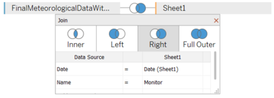
5. we create a join using the following settings:
6. with the dataset ready, we create a new worksheet named “Chemical Readings Table”. We plot Chemical as “Columns”, Name as “Rows”, and AVG(Reading) as the Label. We also set the colour to AVG(Reading). This creates a highlighted table that will show darker shades for higher chemical readings.
7. we drag Date to the “Pages” shelf and set to “Exact Date”.
Creating the Chemical Readings over Time Line chart
1. the Date column is dragged to the “Columns” shelf, the Reading column is dragged to “Rows”
2. the Name column is dragged to the “Colours” shelf. This creates multiple overlayed lines representing each of the monitors on the chart.
3. a filter is added to allow users to filter the chart by MONTH
4. a filter is added to allow users to filter the chart by Chemical
5. once “Show filter” is selected for each of the filters, we change the type to “Single value (list)” and Customise to remove the “Show “All” option” button.
6. we resize the graph space so that it is shorter and can be added to the top of the dashboard.
7. the title is changed to “Chemical Readings for <Chemical> in <MONTH(Date)>” so that the title changes dynamically to reflect the chemical and month chosen by the user.
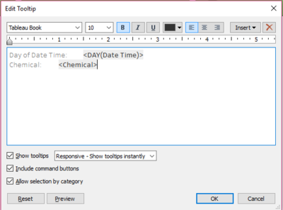
8. the “Tooltip” box is double clicked to change the text to ensure the following appears:
This visualisation is now ready for the dashboard.
Dashboard
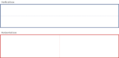
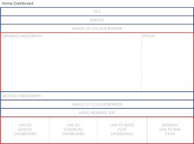
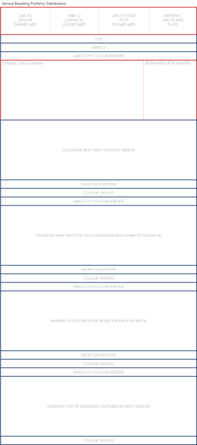
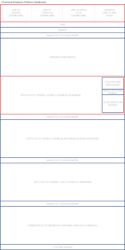
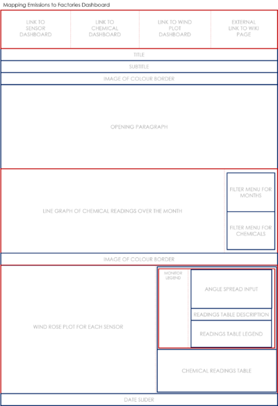
The steps below detail how the dashboard was prepared. For each of the dashboard screens, I have prepared a wireframe showing i) which container type was used for each area (vertical/horizontal) and ii) the content of the container.
Legend for the wireframes
The wireframes for each dashboard
Creating the buttons
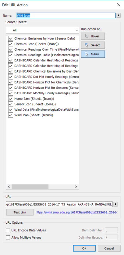
To improve the navigation around the different dashboards, I have made use of image buttons that can be clicked to change the dashboard being viewed.
1. to create these, I first prepared a table with each of the icon names and random x y values assigned (please note these x y columns are not necessary so this can be left out):
Icon.xlsx content
2. next I found icons to be used to represent each dashboard topic and one to represent the link to the project wiki. I resized these icons to the same height and width and saved them in My Tableau Repository\Shapes in a new folder I named “Images”.
3. in a new worksheet in Tableau, drag the Icon column to the “Rows” shelf.
4. add a filter to the worksheet on “Icon” and selected only “Home”.
5. change the Marks type to Shape in the dropdown list.
6. click on Shape once and select “More Shapes…”
7. from the “Select Shape Palette” dropdown, click the dropdown and select “Images”. Here you should see all the images created for the buttons.
8. select the icon for the home button and click “OK”.
9. right click on the “Home icon” text and deselect “Show Header”.
10. manually resize the shape of the area to a relatively square shape.
11. click on the Size box and resize the icon till it fills the desired space (without being cut off).
12. right click on the empty graph space around the icon and select “Format”.
13. ensure the “Row Divider” > “Pane” colour is set to null so that no lines appear around the icon.
14. rename the sheet to “Home Icon”.
15. repeat the steps 3 – 14 for each of the other icons required.
Creating the actions
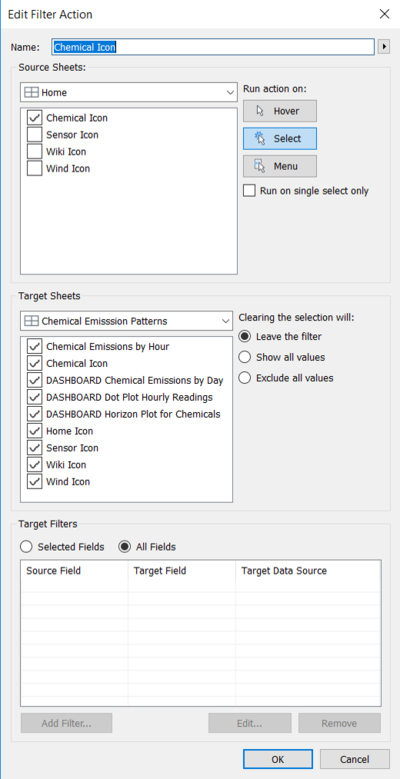
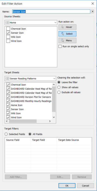
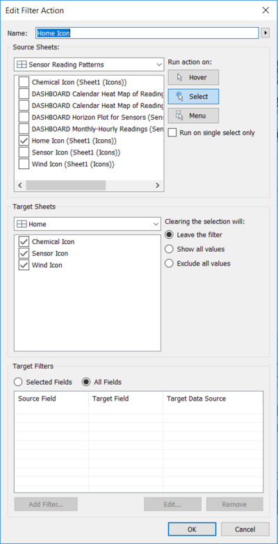
Button actions that are repeated across every dashboard
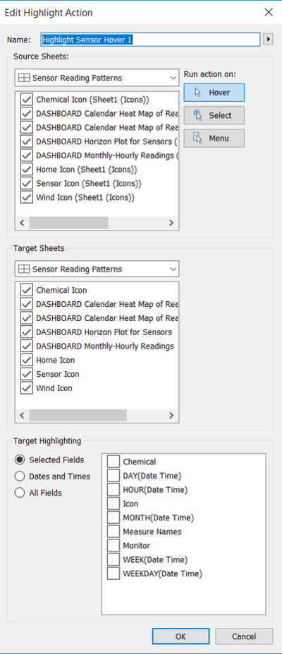
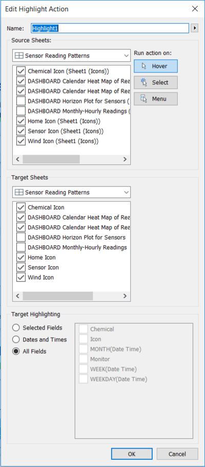
List of actions used on the Sensor Reading Patterns Dashboard
List of actions used on the Chemical Emission Patterns Dashboard
No actions were needed here as the MONTH filter was consistent across most of the worksheets. As such, when the worksheets were added in, these were automatically synchronised by Tableau.
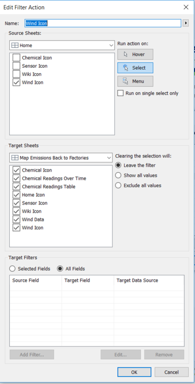
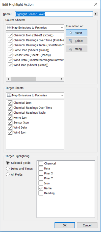
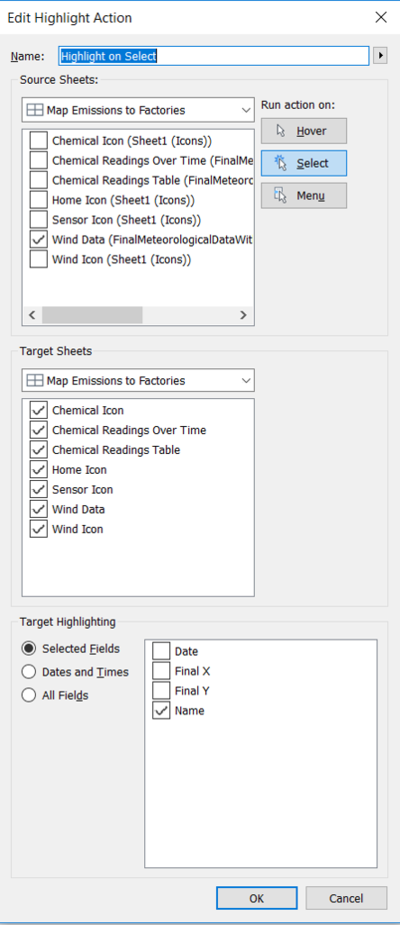
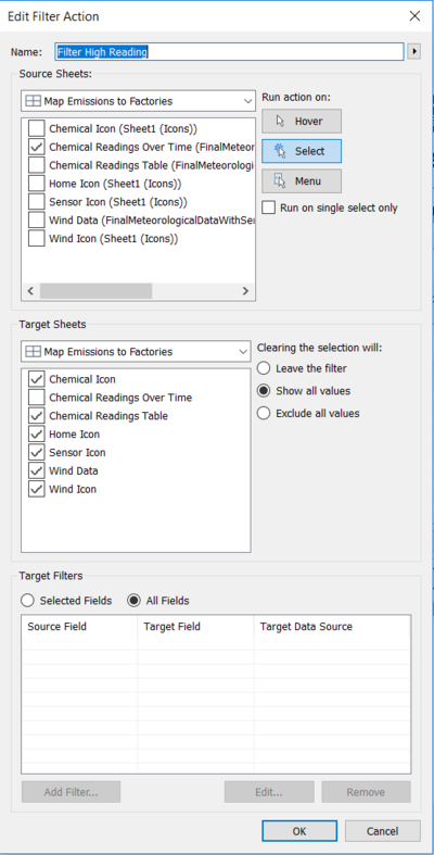
List of actions used on the Map Emissions to Factories Dashboard
