Mandi Assignment Final Answer
Contents
Questions & Answers
Q1. The scale and orientation of the supplied satellite images.
Identified the location and coordinates of the Boonsong Lake in the satellite image as below:
The orientation of the satellite image is the same with that of the Boonsong Lake.
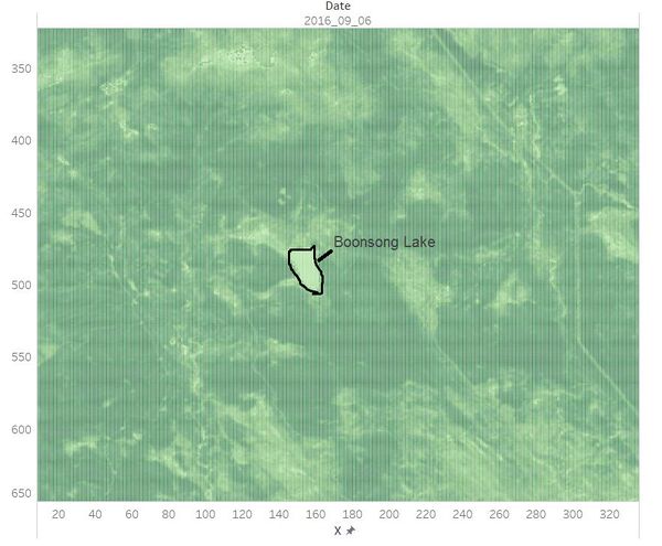
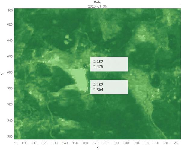
Hence, the length of a pixel is 3000/(504 - 475+1) ft, equals to 100 ft. Then the area of one pixel is 100 * 100 = 10000 square ft.
As the satellite image has 651*651 pixels, the actual scale of the region is 651*651*10000 square ft = 4,238,010,000 square ft.
The orientation of the satellite image is oriented north-south.
Q2. Features in the Preserve area as captured in the imagery.
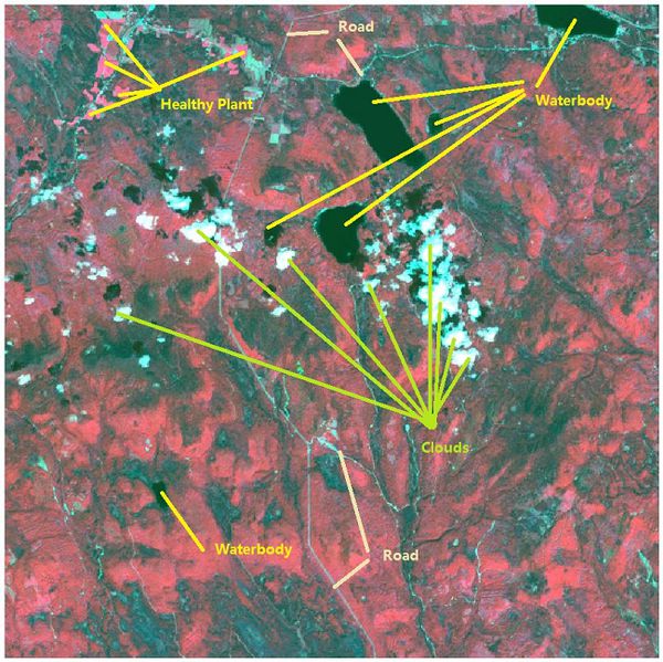
Most of the images have sensor artifacts at the bottom right corner. To identify the features in the Preserve Area, I picked the image which is generated from the data [image11_2016_09_06.csv]. It has no sensor artifacts at all.
Q3. Features that change over time in these images.
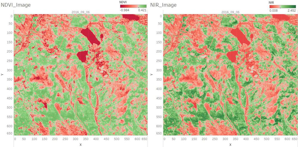
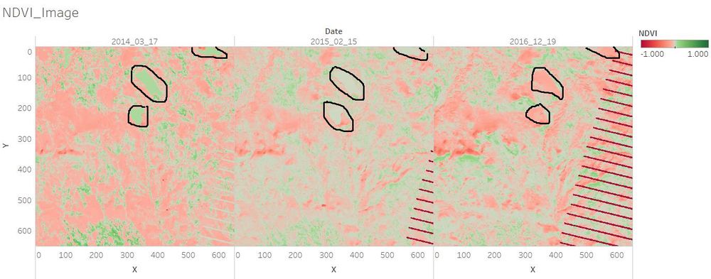
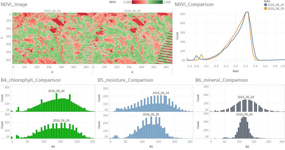
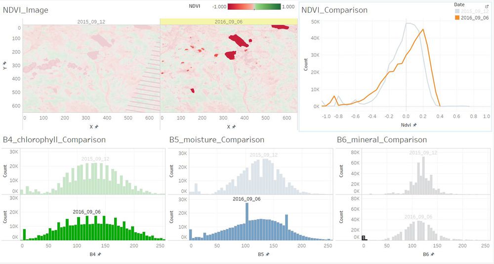
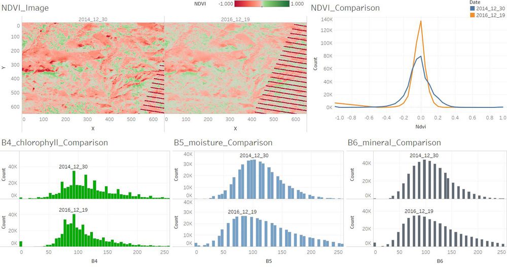
In general, the waterbody became more pure from 2014 to 2016. The plants which are with higher chlorophyll content became less from 2014 to 2016.
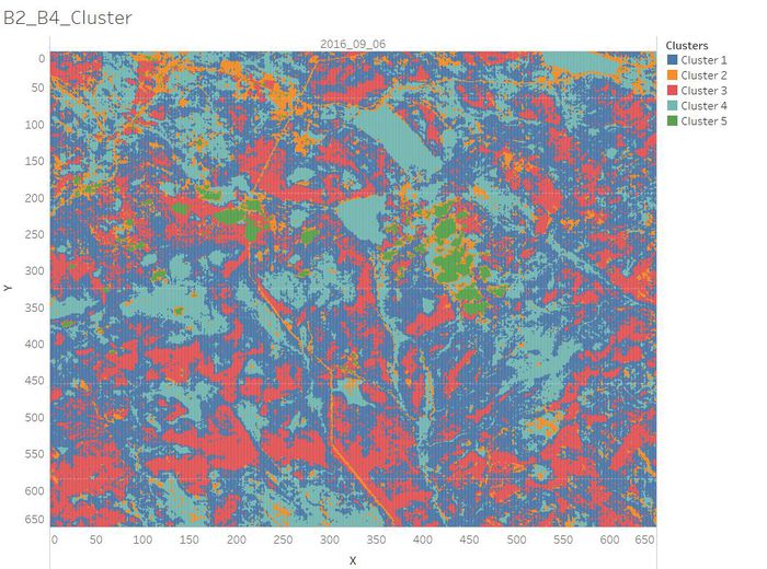
The visualization analysis results are as below.
Comments
Ghchua.2016 (talk) In your report:
"2. Features in the Preserve area as captured in the imagery."
"Band combinations(B4, B3, B2) are mapped to the RGB image channels to create the false-color image. The color of the waterbody is from dark blue to black. Red region stands for vegetation. Besides, we can recognize the clouds and roads by vision. " and
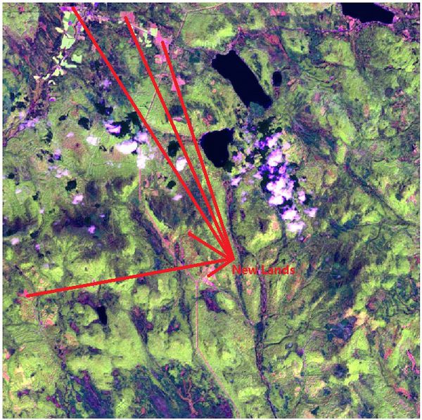
"Band combinations(B5, B4, B2) are mapped to the RGB image channels to create the false-color image. The red region represents new lands."
The two false colour satellite images you have chosen were useful to show the features. You can improve on the clarity if you include your True Colour image to help novice readers understand better why the False Colours represent what you have stated above.
Priyadarshi.2016 (talk) Holy Moly! was this done on tableau? the images look like something that you would get from satellites and process usin PCA or something to get this output. Amazing!
Priyadarshi.2016 (talk) All the graphs are very clear and easy to read and the comparisons make sense. Good job!
