ISSS608 2016-17 T3 Assign TEN KAO YUAN MC2
|
|
|
|
|
|
|
Contents
Mini-Challenge 2 : No Smoke Without Fire
Introduction
Ornithology student Mitch Vogel was immediately suspicious of the noxious gases just pouring out of the smokestacks from the four manufacturing factories south of the nature preserve. He was almost certain that all of these companies are contributing to the downfall of the poor Rose-crested Blue Pipit bird. But when he talked to company representatives and workers, they all seem to be nice people and actually pretty respectful of the environment.
In fact, Mitch was surprised to learn that the factories had recently taken steps to make their processes more environmentally friendly, even though it raised their cost of production. Mitch discovered that the state government has been monitoring the gaseous effluents from the factories through a set of sensors, distributed around the factories, and set between the smokestacks, the city of Mistford and the nature preserve. The state has given Mitch access to their air sampler data, meteorological data, and locations map. Mitch is very good in Excel, but he knows that there are better tools for data discovery, and he knows that you are very clever at visual analytics and would be able to help perform an analysis.
Mini-Challenge 2 provides a three month set of data for you to analyze, covering April, August, and December 2016.
The primary job for Mitch is to determine which (if any) of the factories may be contributing to the problems of the Rose-crested Blue Pipit. Often, air sampling analysis deals with a single chemical being emitted by a single factory. In this case, though, there are four factories, potentially each emitting four chemicals, being monitored by nine different sensors. Further, some chemicals being emitted are more hazardous than others. Your task, as supported by visual analytics that you apply, is to detangle the data to help Mitch determine where problems may be. Use visual analytics to analyze the available data and develop responses to the questions below. In addition, prepare a video that shows how you used visual analytics to solve this challenge. Novel visualizations and analysis approaches are especially interesting for this mini-challenge.
Sensors
Characterize the sensors’ performance and operation. Are they all working properly at all times? Can you detect any unexpected behaviors of the sensors through analyzing the readings they capture?
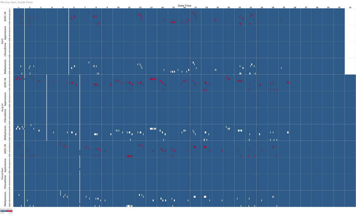
When plotting the number of readings by sensor, chemical, day of the month as well as month, a few clear patterns appear. If all the sensors were operating normally there would be one reading every hour. However this is not the case. Blue represents one reading, one represents no reading and red represents 2 readings.
There is a mass black out of monitors for all chemicals at midnight between 1st and 2nd day of every month (except monitor 3 in December). This is possibly due to a systemic issue or a scheduled event like a sensor reset, power blackout or data center reset causing all the sensors to go offline on the 2nd of each month at midnight Similar issue is seen for specific months at midnight as well:
- 5th to 6th April (all monitors)
- 3rd to 4th and 6th to 7th August (all monitors)
- 6th to 7th December except monitor 6,7,8 working for AGOC-3A; 7 working for Appluimonia, 8 working for Methylosmolene
There are missing values for Methylosmolene only. This could be a cause for concern it is toxic and is stringently regulated. There are double readings for AGOC-3A only. It is possible that it is due to the nature of the chemical itself and not the monitor. This is less of a concern as this chemical has a foul odour but is not harmful.
When put side by side, double readings for AGOC-3A occur at the same time when there are missing readings for Methylosmolene! This cannot be a coincidence. The chemicals might be affecting each other’s sensor readings; the levesl of methylosmolene might be so high that the sensor cannot give a reading and affect the channel that reads the AGOC-3A value. If true this is very dangerous as Methylosmolene is highly toxic.
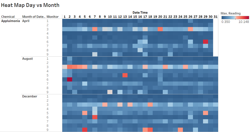
When plotting the different sensor values for Appluimonia it is clear that there are differences between the sensors. Sensors 3 and 7 are obviously giving higher readings than the other sensors. This could indicate that they are not calibrated properly and giving excessively high values. The fact that they are consistently high seems to rule out the influence of meteorological influence. A boxplot would be suitable to illustrate this. As such we should be cautious when relying on the readings of these sensors.
Chemicals
Now turn your attention to the chemicals themselves. Which chemicals are being detected by the sensor group? What patterns of chemical releases do you see, as being reported in the data?
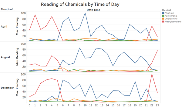
We only have reading and do not know the danger threshold. In general AGOC-3A readings and Methylosmolene ([0-100] range) are higher than Appluimonia and Cholorodinine values ([0-10]) range.
- AGOC-3A and Methylosmolene have lower values during the last week (or 2 weeks) of each month. This could be linked to Christmas holidays in December, summer holidays in August and spring break in April.
- AGOC-3A occurs more frequently on Fridays and during week 33
- Methylosmolene peaks on the 2nd of every month, followed by 7-8 days after that
- Appluimonia is high during 2-4 August
- When plotting the Month vs the Day of the Month it is even clearer that AGOC-3A and Methylosmolene are not emitted towards the end of the month.
- Methylosmolene peaks between 10pm-5am
- AGOC-3A peaks between 6am and 9 pm
- Applumonia and Chlorodinie are more stable during the day
There seems to be a link between the use of these 2 chemicals which are organic compounds and they complement each other. It is possible that one chemical is converting to the other or that one factory is swapping out a safe compound for a toxic compound at night to avoid detection. Given the link we saw earlier between Methylosmolene and Appluimonia values, this does not seem to be a coincidence.
Factories
Which factories are responsible for which chemical releases? Carefully describe how you determined this using all the data you have available. For the factories you identified, describe any observed patterns of operation revealed in the data.
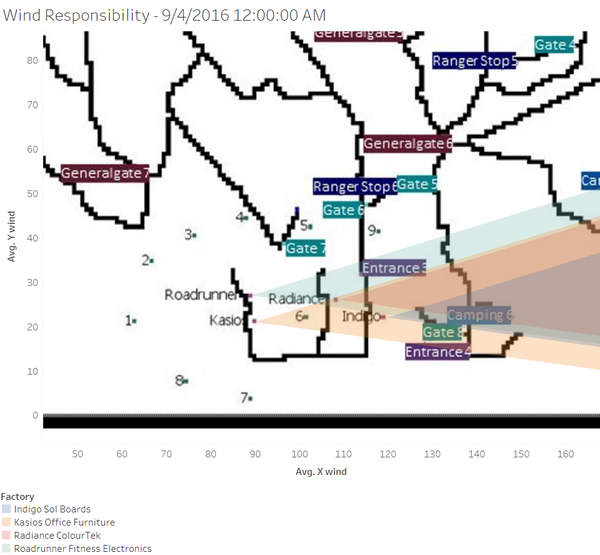
The chosen method is to focus on when the there is a peak in the detection levels and then use the wind direction to determine which factory could have emitted the chemicals. We need to take into account the fact that the wind data is only available every 3 hours and that what was detected would need to take time to travel to the sensor. We have to be careful about the wind direction given as it is the orientation where the wind comes from. Since we are studying which sensor is downwind, we need to inverse the wind direction.
Methylosmolene
We focus on this one which very toxic. Kasios is likely to be responsible. There a lower probability that it is Road Runner.
Relying on Peak Readings
We observe a peak for Methylosmolene on sensor 6 at 1AM 4th April. During this time of day the wind is blowing from Kasios.
Relying on Missing Values
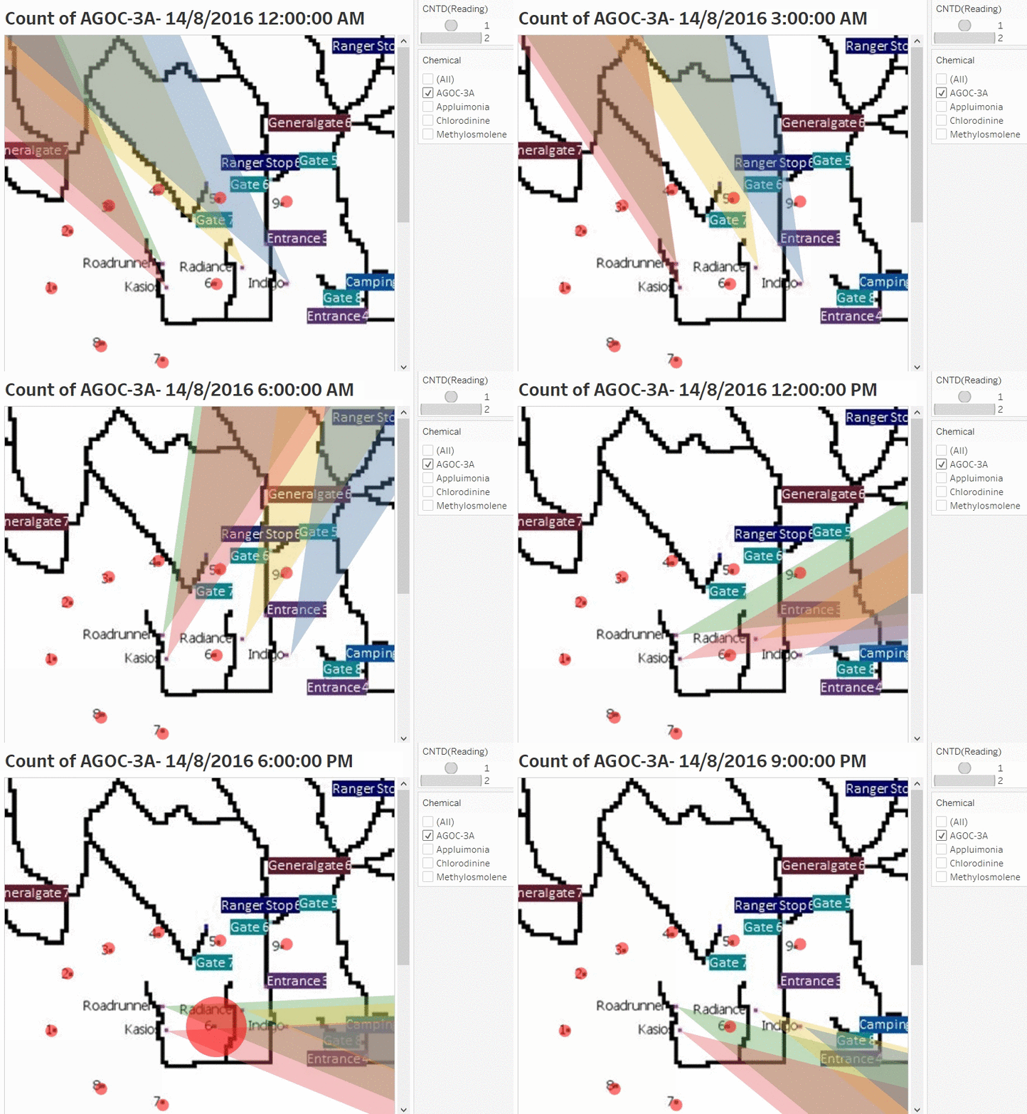
If assume that the missing values indicates that there is an anomaly with the Methylosmolene emissions (either a massive amount of Methyosmolene outside the range of the sensors or an incomplete conversion of Methylosmolene into AGOC-3A), then we should also study incidents like this closely. As seen in question 1, missing values of Methylosmolene coincide with a double value of AGOC-3A. As such, we can rely on the count of AGOC-3A readings instead. Our visualization shows the direction the wind is blowing to and also the count of of the AGOC-3A readings at each station. In this animation, we see that the emissions could have come from either Kasios or Road Runner. This investigation is carried for the different days where there are double AGOC-3A readings and missing Methylosmolene values.
Chlorodinine
Road Runner is likely to be responsible. There a lower probability that it is Kasios.
Appluimonia
It is likely to be Indigo or Radiance. This is just a smelly chemical and probably not regulated.
AGOC-3A
We have to be cautious with AGOC-3A as in our working hypothesis, it is affected by Methylosmolene. In this case we need to do studies, the first taking into account the peaks due to interference from Methylosmolene and secondly excluding peaks from Methylosmolene.
References and Feedback
References
Feedback Please leave your feedback here
Hi David,
Nice work! It's pretty cool that you have done all three MC cases! Great efforts!
Here are some of my concerns:
- For Q2 to see the pattern of chemical release: you look at it by day in all three months, it may be more rational to compare the release pattern in three separate month instead of aggregate all three months together.
- For Q3 wind plot: Would it be more reasonable to plot the wind area start point at each sensor? Since the wind direction and speed data are detected by the sensor, then we can inverse the wind detected area to see if which factory is under this area.
Best regards,
Xiaoqing
Hi David,
I’m very impressed with your work! Clarity wise there is no issue. I’m particularly impressed at how you managed to squeeze the hours into the y axis. The only (minor) comment I have is on the aesthetics. I find the dark blue and the maroon colours a little hard on the eyes, particularly as they appear to be of the same value despite being of different hues. Maybe if you change the maroon to a brighter shade of red it might be better? The one that I’m most impressed is how you managed to flip the colours of the map around. The use of the overlapping wind plots is also very clear, although aesthetics wise, choosing 4 distinct colours - rather that 2 blue and 2 yellow/orange - may make the distinction between the sources clearer.
Thanks,
Vincent Mack

