Difference between revisions of "Mandi Assignment Analysis Procedure"
| Line 29: | Line 29: | ||
<br/> | <br/> | ||
Then we zoom the image in QGIS and compare the shape of these water area with the image of Boonsong Lake. The water area appears in the left bottom corner should be the Boonsong Lake as their shape are the same. The orientation of the supplied satellite image is also the same with the image of Boonsong Lake, which is oriented north-south.<br/> <br/> | Then we zoom the image in QGIS and compare the shape of these water area with the image of Boonsong Lake. The water area appears in the left bottom corner should be the Boonsong Lake as their shape are the same. The orientation of the supplied satellite image is also the same with the image of Boonsong Lake, which is oriented north-south.<br/> <br/> | ||
| − | Next, let's calculate the scale of the supplied satellite image. | + | Next, let's calculate the scale of the supplied satellite image. <br/> |
| + | I load the "image09_2016_03_06.csv" into Tableau, drag X from the Measure Pane into Columns, Y from Measure Pane into Rows. | ||
| + | As there are 651 rows and columns, I fix the range of x axis and y axis from 0 to 650. | ||
| + | X=0, Y=0 refers to the pixel in the upper left corner of the image. Similarly, the bottom right pixel of the image is X=650, Y=650. | ||
| + | To map the pixel in the dashboard with the real image, I reversed the scale of Y axis. | ||
| + | |||
==Question 2: Features in the images== | ==Question 2: Features in the images== | ||
Revision as of 22:09, 14 July 2017
Contents
Question 1: Lake Location
As there is no sensor artifacts in the image which is taken on 2016-09-06, I take this image to locate the position of Boonsong Lake.
First, let's find out where are the waterbody in the image then we can narrow the search area.
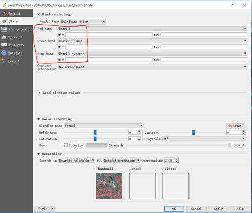
Map B4, B3, B2 to RGB in QGIS to generate the "false-color" image.

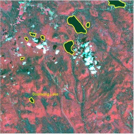
In this band combination, water is black. Hence, we can identify the main waterbody which have been highlighted with the yellow line in the preserve area as below.


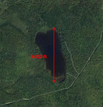
Then we zoom the image in QGIS and compare the shape of these water area with the image of Boonsong Lake. The water area appears in the left bottom corner should be the Boonsong Lake as their shape are the same. The orientation of the supplied satellite image is also the same with the image of Boonsong Lake, which is oriented north-south.
Next, let's calculate the scale of the supplied satellite image.
I load the "image09_2016_03_06.csv" into Tableau, drag X from the Measure Pane into Columns, Y from Measure Pane into Rows.
As there are 651 rows and columns, I fix the range of x axis and y axis from 0 to 650.
X=0, Y=0 refers to the pixel in the upper left corner of the image. Similarly, the bottom right pixel of the image is X=650, Y=650.
To map the pixel in the dashboard with the real image, I reversed the scale of Y axis.