Difference between revisions of "Data Preparations"
Xqchen.2016 (talk | contribs) |
Xqchen.2016 (talk | contribs) |
||
| Line 25: | Line 25: | ||
<br/> | <br/> | ||
=Join Sensor Reading and Meteorological Data= | =Join Sensor Reading and Meteorological Data= | ||
| + | |||
| + | We have two datasets, one is the sensor reading and another one is meteorological data. | ||
| + | |||
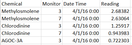
| + | The Sensor data (provided in an Excel spreadsheet) contains 3 months of readings in the following format: | ||
| + | |||
| + | [[file:4-1.png]] | ||
| + | |||
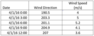
| + | The Meteorological data represents 3 months of readings in the following format: | ||
| + | |||
| + | [[file:4-2.png|400px]] | ||
| + | |||
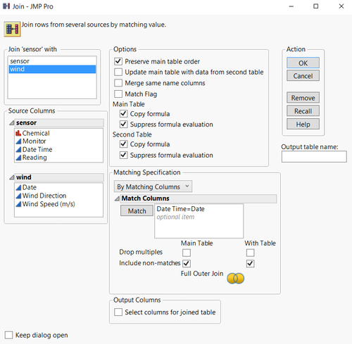
| + | First these two data sets need to be joined into one table by “Data Time” = “Date”. (Tool: JMP_PRO, note that it is full join) | ||
| + | |||
| + | [[file:4-3.png|500px]] | ||
| + | |||
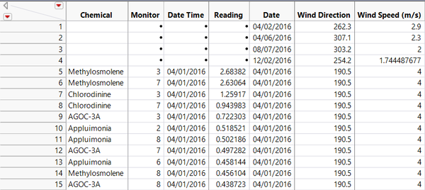
| + | After joining two table together, the table looks like: | ||
| + | |||
| + | [[file:4-4.png|600px]] | ||
| + | |||
| + | =Wind Detected Area= | ||
| + | |||
| + | *In order to plot the wind detected area, a triangle, which needs three points in one sensor, here create three same datasets. | ||
| + | Create a new column named “Path” in each dataset. Assign 1, 2 and 3 to them for differentiation. | ||
| + | |||
| + | [[file:4-5.png|400px]][[file:4-6.png|400px]][[file:4-7.png|400px]] | ||
| + | |||
| + | *Concatenate all three tables | ||
| + | |||
| + | [[file:4-8.png]] | ||
| + | |||
| + | Then the rows in whole dataset increase as three times from 79247 to 237741. | ||
| + | |||
| + | [[file:4-9.png]]------------------------->[[file:4-10.png]] | ||
| + | |||
| + | *Import this dataset into Tableau. The data frame looks like: | ||
| + | |||
| + | [[file:4-11.png|600px]] | ||
| + | |||
| + | *Build pre-coordinates using the location of each monitor | ||
| + | |||
| + | [[file:4-12.png|500px]][[file:4-13.png|500px]] | ||
| + | |||
| + | The monitor location is showing left below then add the park map as the background as right show: | ||
| + | |||
| + | [[file:4-14.png|500px|border]] [file:4-15.png|500px|border]] | ||
| + | |||
| + | *Building the coordinate for plotting wind | ||
| + | |||
| + | Wind detected area is a triangle, consisting of three points. The original point is from each sensor, two equal sides are the distance decided by wind speed, the middle angle is self-defined due to the unavailability of this data. The angle here is created as a control parameter, which can be changed manually. | ||
| + | |||
| + | [[file:4-16.png|500px]] | ||
| + | |||
| + | The angle’s range is from 0 to 90. The angle is related to the height of chimney in each factory, which is not available in this dataset, so here I assume it is 30。. | ||
| + | |||
| + | The wind triangle’s three points positions are related to the wind direction and wind speed. The principle is showing below: | ||
| + | |||
| + | [[file:4-17.png|500px]] | ||
| + | |||
| + | So the X and Y are defined as below: | ||
| + | |||
| + | [[file:4-18.png|500px]][[file:4-19.png|500px]] | ||
| + | |||
| + | *Put X and Y into column and row | ||
| + | *uncheck the aggregation measure | ||
| + | *filter by hour of the date | ||
| + | *put monitor in the detail | ||
| + | *select the polygon | ||
| + | |||
| + | The wind detected area is like: | ||
| + | |||
| + | [[file:4-20.png|600px]] | ||
| + | |||
| + | =Horizon Graph= | ||
Revision as of 21:26, 13 July 2017
|
|
|
|
|
Join Sensor Reading and Meteorological Data
We have two datasets, one is the sensor reading and another one is meteorological data.
The Sensor data (provided in an Excel spreadsheet) contains 3 months of readings in the following format:
The Meteorological data represents 3 months of readings in the following format:
First these two data sets need to be joined into one table by “Data Time” = “Date”. (Tool: JMP_PRO, note that it is full join)
After joining two table together, the table looks like:
Wind Detected Area
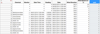
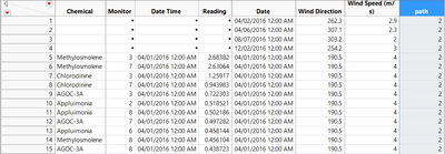
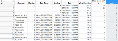
- In order to plot the wind detected area, a triangle, which needs three points in one sensor, here create three same datasets.
Create a new column named “Path” in each dataset. Assign 1, 2 and 3 to them for differentiation.
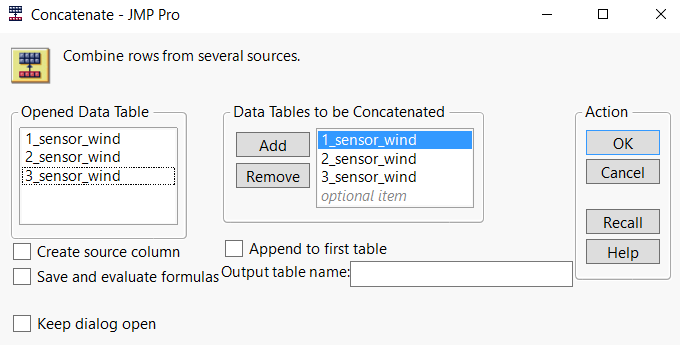
- Concatenate all three tables
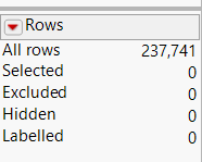
Then the rows in whole dataset increase as three times from 79247 to 237741.
------------------------->
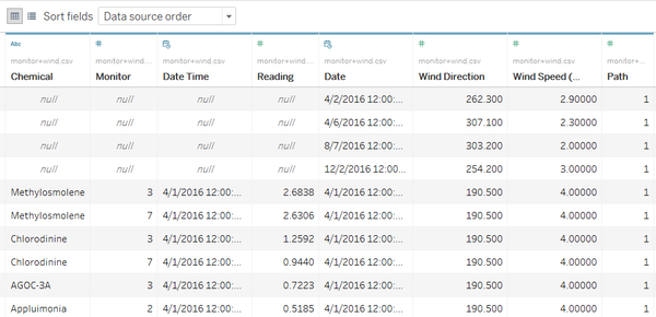
- Import this dataset into Tableau. The data frame looks like:
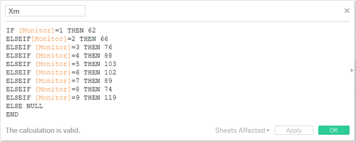
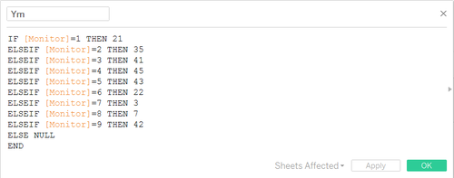
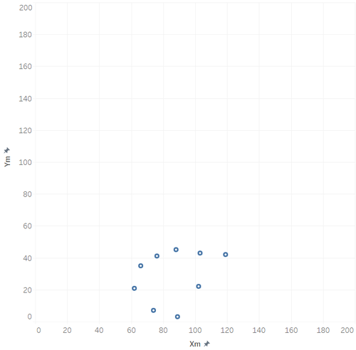
- Build pre-coordinates using the location of each monitor
The monitor location is showing left below then add the park map as the background as right show:
- Building the coordinate for plotting wind
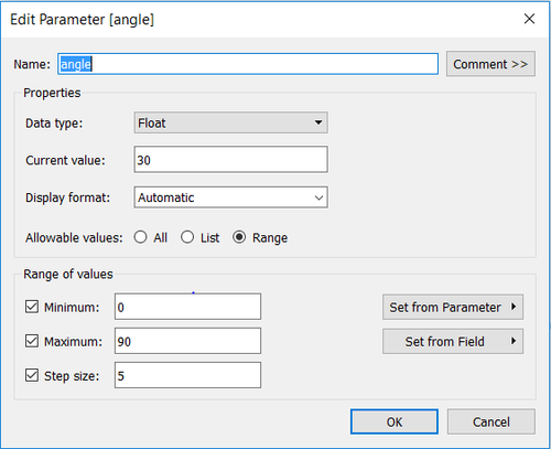
Wind detected area is a triangle, consisting of three points. The original point is from each sensor, two equal sides are the distance decided by wind speed, the middle angle is self-defined due to the unavailability of this data. The angle here is created as a control parameter, which can be changed manually.
The angle’s range is from 0 to 90. The angle is related to the height of chimney in each factory, which is not available in this dataset, so here I assume it is 30。.
The wind triangle’s three points positions are related to the wind direction and wind speed. The principle is showing below:
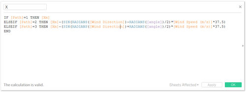
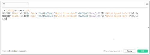
So the X and Y are defined as below:
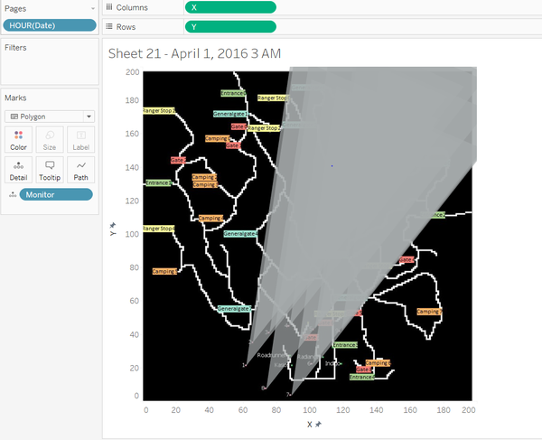
- Put X and Y into column and row
- uncheck the aggregation measure
- filter by hour of the date
- put monitor in the detail
- select the polygon
The wind detected area is like:

