Data Preparations
 ISSS608 Assign Chen Xiaoqing - MC2
|
|
|
|
|
Contents
Join Sensor Reading and Meteorological Data
We have two datasets, one is the sensor reading and another one is meteorological data.
The Sensor data (provided in an Excel spreadsheet) contains 3 months of readings in the following format:

The Meteorological data represents 3 months of readings in the following format:

First these two data sets need to be joined into one table by “Data Time” = “Date”. (Tool: JMP_PRO, note that it is full join)

After joining two table together, the table looks like:

Wind Detected Area
- In order to plot the wind detected area, a triangle, which needs three points in one sensor, here create three same datasets.
Create a new column named “Path” in each dataset. Assign 1, 2 and 3 to them for differentiation.


- Concatenate all three tables

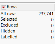
Then the rows in whole dataset increase as three times from 79247 to 237741.
------------------------->


- Import this dataset into Tableau. The data frame looks like:

- Build pre-coordinates using the location of each monitor


The monitor location is showing left below then add the park map as the background as right show:


- Building the coordinate for plotting wind
Wind detected area is a triangle, consisting of three points. The original point is from each sensor, two equal sides are the distance decided by wind speed, the middle angle is self-defined due to the unavailability of this data. The angle here is created as a control parameter, which can be changed manually.

The angle’s range is from 0 to 90. The angle is related to the height of chimney in each factory, which is not available in this dataset, so here I assume it is 30。.
The wind triangle’s three points positions are related to the wind direction and wind speed. The principle is showing below:

So the X and Y are defined as below:


- Put X and Y into column and row
- uncheck the aggregation measure
- filter by hour of the date
- put monitor in the detail
- select the polygon
The wind detected area is like:

Horizon Graph
Use horizon graph to show the individual reading more clearly. X-axis is the date time while y-axis is the difference between the reading and median along the whole. The density of color coding represents the level of difference. Orange means higher than median while green means lower than median. Then wrap the lower one up to the same horizon of higher one. Here need to create 5 bands represent different level of difference.

The graph is band positive 1, means the reading is higher than median one band size. So on so forth.
The whole design is like:

Other Graphs
Other graphs are all quite straightforward, just click the following link to see the sheets and dashboards.