Difference between revisions of "Assign NGO SIEW HUI Q2"
| Line 36: | Line 36: | ||
==Response== | ==Response== | ||
| − | To view the chemicals being detected by the sensors, a dashboard was developed with interactive filters (i.e. select month and chemical) to enable the viewing of daily average readings of the specified chemical. A reference line had been added to compare the daily average readings against the monthly average readings, facilitating the analysis of trends observed in the chart. | + | To view the chemicals being detected by the sensors, a dashboard with trellis chart was developed with interactive filters (i.e. select month and chemical) to enable the viewing of daily average readings of the specified chemical. A reference line had been added to compare the daily average readings against the monthly average readings, facilitating the analysis of trends observed in the chart. |
<br/> <br/> | <br/> <br/> | ||
[[Image:ngo_fig4.png|800px|center]] | [[Image:ngo_fig4.png|800px|center]] | ||
| Line 43: | Line 43: | ||
<br/> <br/> | <br/> <br/> | ||
| − | Next, we used <u> | + | Next, we used <u>calendar chart</u> to show similar analysis as the trellis chart above. Interactive filters had been added too (i.e. select month, sensor and chemical). |
<br/> <br/> | <br/> <br/> | ||
[[Image:ngo_fig5.png|800px|center]] | [[Image:ngo_fig5.png|800px|center]] | ||
Revision as of 03:01, 8 July 2017
|
|
|
|
|
|
|
Question 2
Now turn your attention to the chemicals themselves. Which chemicals are being detected by the sensor group? What patterns of chemical releases do you see, as being reported in the data? Limit your response to no more than 6 images and 500 words.
Response
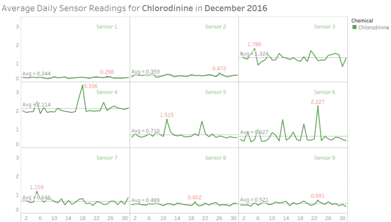
To view the chemicals being detected by the sensors, a dashboard with trellis chart was developed with interactive filters (i.e. select month and chemical) to enable the viewing of daily average readings of the specified chemical. A reference line had been added to compare the daily average readings against the monthly average readings, facilitating the analysis of trends observed in the chart.
Observation 1: There were some days where the average daily sensor readings had increased significantly when compared against the respective monthly average readings. For example, from the above view of the dashboard, it was observed that there were spikes in the readings for Chlorodinine on 18th December (for Sensor 4) and 23rd December (for Sensor 6). Further analysis should be carried out to validate those spikes in the data.
Next, we used calendar chart to show similar analysis as the trellis chart above. Interactive filters had been added too (i.e. select month, sensor and chemical).
Observation 2: Same as above, it was noted that there were unusually high readings of Chlorodinine on 18th December for Sensor 4.
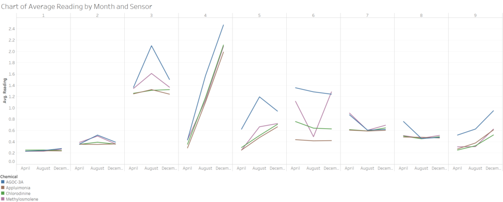
For a quick view of the trend of average readings for each sensor and chemical, the dashboard below was developed to enable a high-level view prior to data drill-down.
Observation 3: For all 4 chemicals, it was noted that Sensors 4 and 9 had shown increasing trend in readings from April to December (across 3 average data points by month). On the other hand, Sensors 2, 3 and 5 had shown decreasing trend in readings for Methylosmolene and AGOC-3A. The decreasing trend in chemical readings might be due to the factories having recently taken steps to make their processes more environmentally friendly.


