Assign NGO SIEW HUI Q2
|
|
|
|
|
|
|
Question 2
Now turn your attention to the chemicals themselves. Which chemicals are being detected by the sensor group? What patterns of chemical releases do you see, as being reported in the data? Limit your response to no more than 6 images and 500 words.
Response
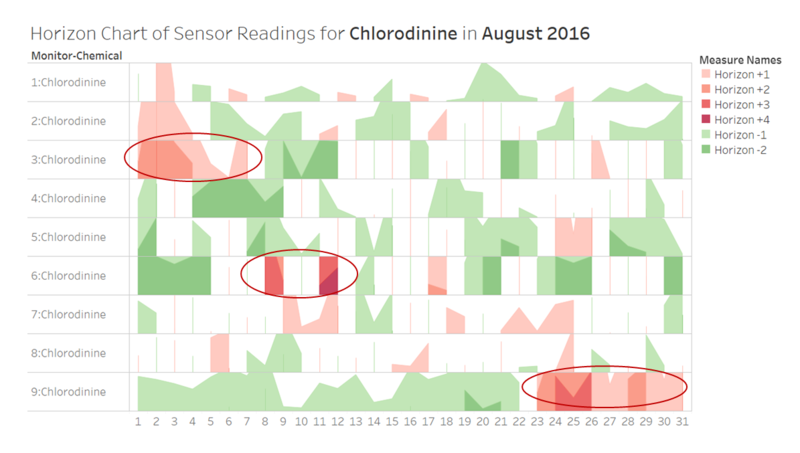
To begin the analysis on the chemicals, a dashboard in the form of a horizon chart is created to enable a quick overview of all 9 sensors at the same time. The dashboard has interactive filters to allow selection of 'month' and 'chemical'. The horizon chart shows the daily fluctuations of sensor readings for the selected chemical in comparison to the monthly average reading by sensor. It is colour-coded to represent the degree of deviation from the monthly average reading by multiple bands.
Note that having negative bands in shades of green would be the ideal scenario, while the positive bands in shades of red should be avoided. Areas of red would mean that the daily average readings have been consistently above the monthly average reading for more than one day in a row, while a single red vertical line represents a high daily average reading for a single day only. (Note: These spikes will be further analysed in the next dashboard below.)
Sample View of Dashboard: Horizon Chart of Sensor Readings
Observation 1: For all 4 chemicals, it is observed that the daily average readings are higher than the monthly average reading by sensor for many days across the month. Take Chlorodinine for example, which is a particular harmful chemical if inhaled or swallowed, high daily average readings have been recorded for several consecutive days in August for Sensors 3 and 9 in particular (as represented by the large areas of red shading). Hence, this is a valid cause for concern, and further analysis should be carried out to validate and investigate such spikes in the data.
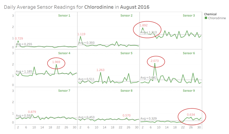
Next, a dashboard in the form of a trellis chart is created to further analyse the readings of the chemicals being detected by each sensor. The dashboard has interactive filters (i.e. select month and chemical) to enable the viewing of daily average readings for the selected chemical. A reference line representing the monthly average reading has been added to each panel so as to facilitate the comparison of daily average readings against the monthly average reading by sensor.
Sample View of Dashboard: Daily Average Chemical Readings by Sensor
Observation 2: Similar to the horizon chart, it is observed that there are some days where the daily average readings for the selected chemical have increased significantly above the respective monthly average readings by sensor. For example, there are spikes in the sensor readings for the chemical Chlorodinine on 21 August (for Sensor 4) and 08 August (for Sensor 6). Hence, further analysis should be carried out to investigate the spikes observed in the data.
From the trellis chart, it is also observed that there are consecutive days in August for Sensors 3 and 9 with consistently higher daily average readings as compared to the monthly average readings. Note that the dates with consecutive days of higher readings are in alignment with the horizon chart shown earlier, i.e. the early days of August for Sensor 3, and the last few days of August for Sensor 9.
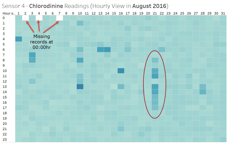
With the above observations from average readings, it is recommended to further analyse the chemical readings at the hourly basis. Hence, a dashboard showing the hourly readings of each chemical is created, with interactive filters added to allow user selection of the month, sensor and chemical. Note that each hour is represented by a small grid cell, and the intensity of the colour shading of each grid cell represents the level of chemical reading captured by the sensor for that hour.
Sample View of Dashboard: Hourly Chemical Readings by Sensor
Observation 3: With this dashboard, it is clear that higher readings of the chemicals have been detected by the sensors at specific hours. For example, it is observed that there are unusually high readings of Chlorodinine on 21 August for Sensor 4. This is aligned to the earlier observation from the trellis chart. Hence, more deep-dive analyses can be performed using this dashboard to see if there is any trend for the chemical readings at the daily and hourly basis.
From this dashboard, it is also observed that there are missing records during midnight (00:00hr) on 02, 04 and 07 August. Note that this is aligned to the earlier observation in Question 1, with regard to the performance and operations of the sensors.
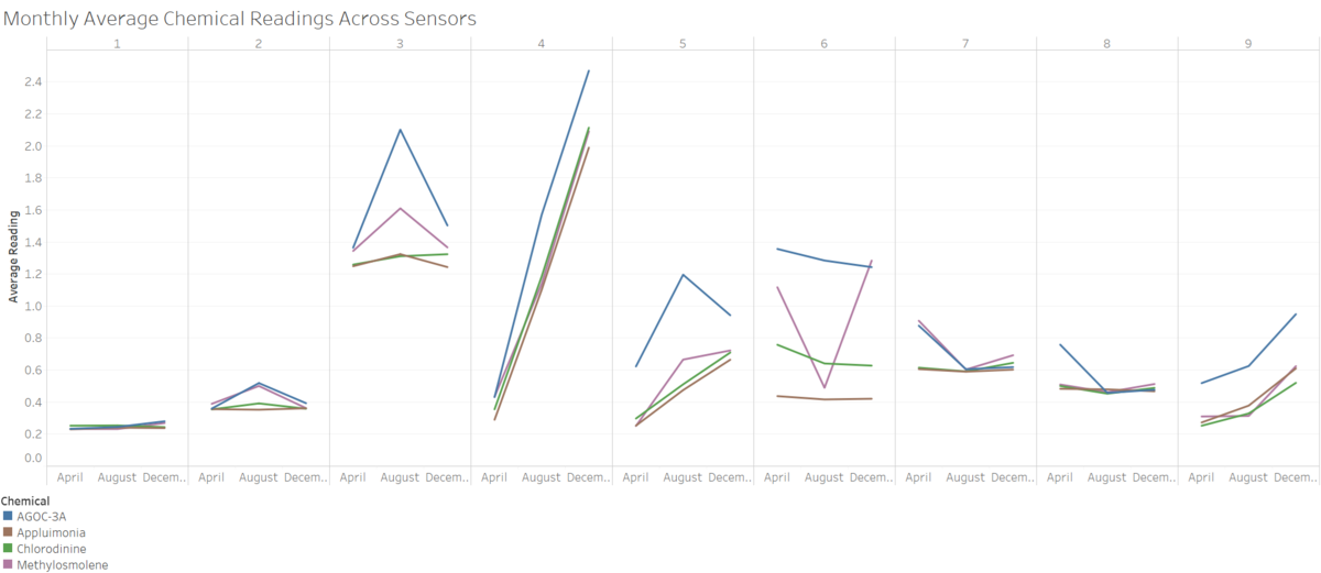
In contrast to the micro-view above, a dashboard showing macro-view of the trends in chemical readings by month and sensor has also been created to facilitate a quick overview of the landscape as captured by the Sensor Data. This dashboard shows the monthly average readings (for the 3 months of data provided, i.e. in April, August and December) for each chemical and sensor, and hence it can be used to obtain a high-level 'landscape' view to investigate if the factories have indeed taken steps to make their processes more environmentally friendly.
Sample View of Dashboard: Monthly Average Chemical Readings Across 9 Sensors
Observation 4: For all 4 chemicals, it is observed that Sensors 4 and 9 have shown increasing trend in the average readings from April to December in 2016 (across the 3 monthly average data points). This is a worrying trend given that it is expected that the readings of the harmful chemicals like Chlorodinine and Methylosmolene should decline in general (due to the factories making their processes more environmentally friendly).
From the dashboard, it is also observed that Sensors 2, 3 and 5 have shown decreasing trend in the average readings for chemical AGOC-3A across the 3 months. This should be further investigated because AGOC-3A actually belongs to the family of new solvents which are less harmful to human and environmental health (i.e. the readings are expected to go up due to the factories having signed on to use more of this solvent to be environmentally friendly). Since the data shows a different trend, it might be that the factories have not actively changed their processes to switch to the new solvent.
To access the interactive version of the above dashboards, please go to the following URL on Tableau Public:
https://public.tableau.com/profile/siew.hui.ngo#!/vizhome/VAST_MC2_Assignment_Report/VASTMC2


