Difference between revisions of "ISSS608 2016-17 T3 Assign TEN KAO YUAN MC2"
| (32 intermediate revisions by the same user not shown) | |||
| Line 44: | Line 44: | ||
The primary job for Mitch is to determine which (if any) of the factories may be contributing to the problems of the Rose-crested Blue Pipit. Often, air sampling analysis deals with a single chemical being emitted by a single factory. In this case, though, there are four factories, potentially each emitting four chemicals, being monitored by nine different sensors. Further, some chemicals being emitted are more hazardous than others. Your task, as supported by visual analytics that you apply, is to detangle the data to help Mitch determine where problems may be. Use visual analytics to analyze the available data and develop responses to the questions below. In addition, prepare a video that shows how you used visual analytics to solve this challenge. Novel visualizations and analysis approaches are especially interesting for this mini-challenge. | The primary job for Mitch is to determine which (if any) of the factories may be contributing to the problems of the Rose-crested Blue Pipit. Often, air sampling analysis deals with a single chemical being emitted by a single factory. In this case, though, there are four factories, potentially each emitting four chemicals, being monitored by nine different sensors. Further, some chemicals being emitted are more hazardous than others. Your task, as supported by visual analytics that you apply, is to detangle the data to help Mitch determine where problems may be. Use visual analytics to analyze the available data and develop responses to the questions below. In addition, prepare a video that shows how you used visual analytics to solve this challenge. Novel visualizations and analysis approaches are especially interesting for this mini-challenge. | ||
| − | ==Sensors== | + | |
| + | ==Data Preparation== | ||
| + | This data consists of sensor readings from a set of air-sampling sensors and meteorological data from a weather station in proximity to the factories and sensors. | ||
| + | The factories and sensors locations are provided in terms of x,y coordinates on a 200x200 grid, with (0,0) at the lower left hand corner (southwest). The sensors map shows the locations of the sensors and factories by number for the sensors and by name for the factories. Some of the other features of the map (such as entrances and gates in that area) have been removed for readability. (Please note that the terms “sensor” and “monitor” are used interchangeably.) | ||
| + | |||
| + | |||
| + | |||
| + | |||
| + | ----- | ||
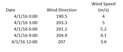
| + | The Meteorological data represents 3 months of readings in the following format: | ||
| + | |||
| + | [[File:TKY Meteorological.JPG|400px|left|float|border]] | ||
| + | <br> | ||
| + | '''Date''': The date and time of the readings, local time with no change for Daylight Savings.<br> | ||
| + | '''Wind Direction''': The compass directions '''where the wind is originating from''', using a north-referenced azimuth bearing where 360/000 is true north. <br> | ||
| + | '''Wind Speed''': The speed of the wind in meters per second. <br> | ||
| + | |||
| + | Each of these reading is taken at the date and time provided. <br> <br> <br> <br> | ||
| + | ----- | ||
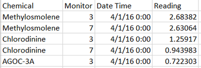
| + | The Sensor data (provided in an Excel spreadsheet) contains 3 months of readings in the following format: | ||
| + | [[File:TKY Chem Data.JPG|400px|left|float|border]] | ||
| + | <br> | ||
| + | '''Chemical''': Which one of the four chemicals detected by the sensors <br> | ||
| + | '''Monitor''': Which one of the nine sensors picking up the reading <br> | ||
| + | '''Reading''': The air sensor detected amount in parts per million <br> | ||
| + | '''Date Time''': The date and time of day of the reading, local time with no change for Daylight Savings. br> <br> <br> <br> | ||
| + | |||
| + | ----- | ||
| + | |||
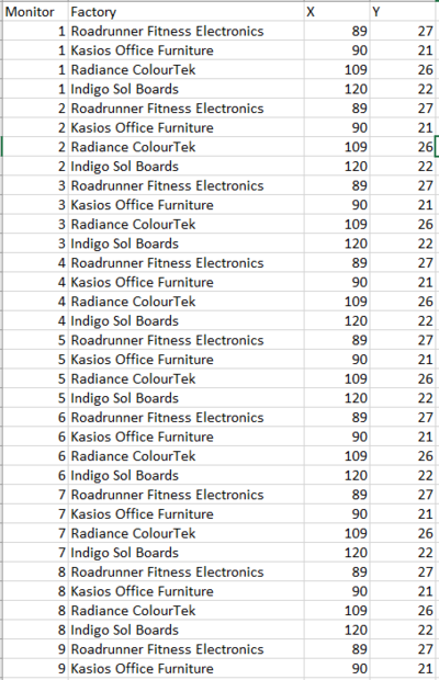
| + | We create a simple excel file '''Sensor Coordinates''' with the monitor number and sensor coordinates to integrate into Tableau | ||
| + | |||
| + | <br> | ||
| + | |||
| + | [[File:TKY Sensor Coordinates.JPG|300px|border]] | ||
| + | |||
| + | |||
| + | |||
| + | |||
| + | ----- | ||
| + | |||
| + | The following are the factory locations: | ||
| + | |||
| + | '''Roadrunner Fitness Electronics''': 89,27 <br> | ||
| + | '''Kasios Office Furniture''': 90,21 <br> | ||
| + | '''Radiance ColourTek''': 109,26 <br> | ||
| + | '''Indigo Sol Boards''': 120,22 <br> | ||
| + | |||
| + | As such we create an excel file '''Factory''' with the Factory Coordinates as well as the Factory name. In order to pad the data in tableau, we repeat the data for each monitor number : <br> | ||
| + | |||
| + | [[File:TKY Factory ID.JPG|400px|border]] | ||
| + | ----- | ||
| + | |||
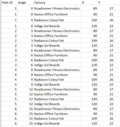
| + | Likewise we create an excel file called '''Path ID''' with Path ID (from 1 to 12 ) and angles (from 0 to 30 with increments of 3 degrees). When the Path ID reaches 12, the angle reverts to 0. This is to enable us to trace the wind direction as polygons in Tableau. | ||
| + | |||
| + | [[File:TKY Path ID.JPG|400px|border]] | ||
| + | |||
| + | ----- | ||
| + | |||
| + | Finally the data is joined in Tableau as follows : | ||
| + | |||
| + | [[File:TKY Join.JPG|800px|center|border]] | ||
| + | |||
| + | |||
| + | |||
| + | |||
| + | ----- | ||
| + | For our analysis we will rely on 2 main tools : heatmaps and the wind direction chart. <br> | ||
| + | '''Heat Maps''' | ||
| + | <br> | ||
| + | Heat maps are a useful tool allowing us to visualize values (in this case sensor readings) over a period of time. | ||
| + | |||
| + | |||
| + | |||
| + | For our analysis we have found it useful to compare the sensor readings by chemical and monitor. Time-wise, we group it according to Month, Day of Month and Hour. The max values, min values as well as the count of readings can be compared to deliver useful insights. Creating a calendar like heat map with the day of the week and month can also be done if we wish to look for recurring patterns over the days of the week; however in our analysis we find that it can make comparison difficult as we want to drill down from daily readings to hourly readings. The sensor readings can be represented by color. Although the readings are all positive values, we have found it useful to use a diverging color scale as it quickly draws attention to the high readings in red compared to the lower readings in blue. A possible improvement is to know the regulatory threshold of the chemical readings, allowing us to immediately flag high readings with the others in blue. | ||
| + | <center> | ||
| + | {| | ||
| + | |- | ||
| + | |[[File:TKY Pile.JPG|700px|center|border]] | ||
| + | || [[File:TKY Details.JPG|400px|center|border]] | ||
| + | |} | ||
| + | </center> | ||
| + | |||
| + | <br> | ||
| + | '''Wind Direction Chart'''<br> | ||
| + | The wind sensor readings are created using Tableau's polygon display. We combine this with a scatter plot of the monitor readings placed at the various monitor positions; the scatter plot mark size will be proportional to the sensor readings. This will allow us to quickly spot which factory is causing the sensor readings to increase. We create a time based animation by placing the Date Time variable into the Pages section of the plot. To cap it off we place the map of the area as the background. | ||
| + | |||
| + | {| class="wikitable" | ||
| + | ! scope="col" style="width: 50px;" |Number | ||
| + | ! scope="col" style="width: 500px;" | Description | ||
| + | ! scope="col" style="width: 750px;" | Illustration | ||
| + | |- | ||
| + | |1 | ||
| + | || To create a polygon according to the wind path these calculations are required : | ||
| + | * The wind direction has to be adjusted to convert from the azimuth into a X-Y Cartesian coordinate plot | ||
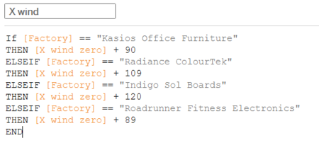
| + | * The X wind zero values and Y wind zero values are calculated from the wind direction. Using Path ID we are able to plot a polygon instead of a straight line . The angle parameter allows us to widen or narrow the wind direction polygon for our analysis. | ||
| + | * The value 111.84678 is used to convert from meter/second to miles travelled in 3 hours as the wind speed is given every 3 hours. We know that the area in the map is 12 miles x 12 miles and that there are 200 pixels. As such, one pixel would represent 0.06 miles. Using a conversion factor of 1 meter : 0.000621371 miles, we need to multiple the wind speed by 0.000621371*3*60*60/0.06, or 111.84678 to correctly represent the wind plume | ||
| + | |||
| + | || [[File:TKY Wind X Zero.png|center|650px]] [[File:TKY Wind Y Zero.png|center|650px]] | ||
| + | |- | ||
| + | |2 | ||
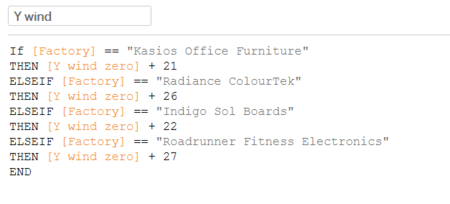
| + | ||The polygon obtained in the above step will be centered at zero. As such we need to create additional X and Y parameters to be able to offset the polygons into the right position on the cartesian X-Y plot. | ||
| + | || [[File:TKY Wind X.png|center|450px]] [[File:TKY Wind Y.png|center|450px]] | ||
| + | |- | ||
| + | |3 | ||
| + | || | ||
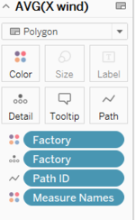
| + | *Now we can place the X wind and Y wind into the Column and Row readings respectively. The Measure is set to Average. <br> | ||
| + | *The other measures are also set up as follows to produce a polygon | ||
| + | **Factory as Detail and Color | ||
| + | **Path ID as Path | ||
| + | **Set to Polygon | ||
| + | || [[File:TKY Pile 2.PNG|center|450px]] [[File:TKY Windplot.PNG|center|150px]] | ||
| + | |- | ||
| + | |4 | ||
| + | || | ||
| + | * Next we add the X sensor and Y sensor coordinates to the columns and rows attributes respectively. | ||
| + | * Dual axis and synchronize axis are selected for both. The Measure is set to Average. | ||
| + | * The other measures are also set up as follows to produce a polygon | ||
| + | **Monitor as Detail | ||
| + | **Chemical as Color | ||
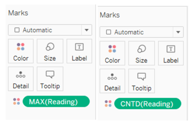
| + | **Max(Reading) as Size | ||
| + | || [[File:TKY Windplot 2.PNG|center|150px]] | ||
| + | |- | ||
| + | |5 | ||
| + | || Finally we set the map as background with the following coordinates as shown on the right. A washout value has to be selected in order to avoid obstructing the view of the plot. The image is swapped to the negative intensity by using Microsoft Paint as the black background in the original image is too dark and prevents us from seeing the colors properly. A slight offset is required in order to match the background image to the coordinates supplied to us. | ||
| + | || [[File:TKY Windplot 3.PNG|center|650px]] | ||
| + | |||
| + | |} | ||
| + | |||
| + | |||
| + | Tableau Visualization available here '''https://public.tableau.com/profile/david.ten.kao.yuan#!/vizhome/MC2_3/MC2''' | ||
| + | |||
| + | ==Q1 - Sensors== | ||
'''Characterize the sensors’ performance and operation. Are they all working properly at all times? Can you detect any unexpected behaviors of the sensors through analyzing the readings they capture?''' | '''Characterize the sensors’ performance and operation. Are they all working properly at all times? Can you detect any unexpected behaviors of the sensors through analyzing the readings they capture?''' | ||
| Line 66: | Line 197: | ||
When plotting the different sensor values for Appluimonia it is clear that there are differences between the sensors. Sensors 3 and 7 are obviously giving higher readings than the other sensors. This could indicate that they are not calibrated properly and giving excessively high values. The fact that they are consistently high seems to rule out the influence of meteorological influence. A boxplot would be suitable to illustrate this. As such we should be cautious when relying on the readings of these sensors. | When plotting the different sensor values for Appluimonia it is clear that there are differences between the sensors. Sensors 3 and 7 are obviously giving higher readings than the other sensors. This could indicate that they are not calibrated properly and giving excessively high values. The fact that they are consistently high seems to rule out the influence of meteorological influence. A boxplot would be suitable to illustrate this. As such we should be cautious when relying on the readings of these sensors. | ||
| − | ==Chemicals== | + | When examining the minimum reading for each of the sensors, we notice that sensor 4 is drifting upwards each month. This seems to indicate that sensor 4 has an offset issue which is getting worse and worse. We should not overly rely on sensor 4's reading in August and December. |
| + | |||
| + | [[File:TKY - Sensor 4 is broken.png|center|700px]] | ||
| + | |||
| + | ==Q2 - Chemicals== | ||
'''Now turn your attention to the chemicals themselves. Which chemicals are being detected by the sensor group? What patterns of chemical releases do you see, as being reported in the data?''' | '''Now turn your attention to the chemicals themselves. Which chemicals are being detected by the sensor group? What patterns of chemical releases do you see, as being reported in the data?''' | ||
| Line 96: | Line 231: | ||
There seems to be a link between the use of these 2 chemicals which are organic compounds and they complement each other. It is possible that one chemical is converting to the other or that one factory is swapping out a safe compound for a toxic compound at night to avoid detection. Given the link we saw earlier between Methylosmolene and Appluimonia values, this does not seem to be a coincidence. | There seems to be a link between the use of these 2 chemicals which are organic compounds and they complement each other. It is possible that one chemical is converting to the other or that one factory is swapping out a safe compound for a toxic compound at night to avoid detection. Given the link we saw earlier between Methylosmolene and Appluimonia values, this does not seem to be a coincidence. | ||
| − | ==Factories== | + | ==Q3 - Factories== |
'''Which factories are responsible for which chemical releases? Carefully describe how you determined this using all the data you have available. For the factories you identified, describe any observed patterns of operation revealed in the data.''' | '''Which factories are responsible for which chemical releases? Carefully describe how you determined this using all the data you have available. For the factories you identified, describe any observed patterns of operation revealed in the data.''' | ||
The chosen method is to focus on when the there is a peak in the detection levels and then use the wind direction to determine which factory could have emitted the chemicals. We need to take into account the fact that the wind data is only available every 3 hours and that what was detected would need to take time to travel to the sensor. We have to be careful about the wind direction given as it is '''the orientation where the wind comes from'''. Since we are studying which sensor is downwind, we need to inverse the wind direction. | The chosen method is to focus on when the there is a peak in the detection levels and then use the wind direction to determine which factory could have emitted the chemicals. We need to take into account the fact that the wind data is only available every 3 hours and that what was detected would need to take time to travel to the sensor. We have to be careful about the wind direction given as it is '''the orientation where the wind comes from'''. Since we are studying which sensor is downwind, we need to inverse the wind direction. | ||
| − | + | ----- | |
===Methylosmolene=== | ===Methylosmolene=== | ||
| Line 118: | Line 253: | ||
|} | |} | ||
</center> | </center> | ||
| − | If assume that the missing values indicates that there is an anomaly with the Methylosmolene emissions (either a massive amount of Methyosmolene outside the range of the sensors or an incomplete conversion of Methylosmolene into AGOC-3A), then we should also study incidents like this closely. As seen in question 1, missing values of Methylosmolene coincide with a double value of AGOC-3A. As such, we can rely on the count of AGOC-3A readings instead. Our visualization shows the direction the wind is blowing to and also the count of of the AGOC-3A readings at each station. In this animation, we see that the emissions could have come from either Kasios or Road Runner. This investigation is carried for the different days where there are double AGOC-3A readings and missing Methylosmolene values. | + | If we assume that the missing Methylosmolene values indicates that there is an anomaly with the Methylosmolene emissions (either a massive amount of Methyosmolene outside the range of the sensors or an incomplete conversion of Methylosmolene into AGOC-3A), then we should also study incidents like this closely. As seen in question 1, missing values of Methylosmolene coincide with a double value of AGOC-3A. As such, we can rely on the count of AGOC-3A readings instead. Our visualization shows the direction the wind is blowing to and also the count of of the AGOC-3A readings at each station. In this animation, we see that the emissions could have come from either Kasios or Road Runner. This investigation is carried for the different days where there are double AGOC-3A readings and missing Methylosmolene values. |
| − | + | ----- | |
| − | ==Chlorodinine== | + | ===Chlorodinine=== |
<center> | <center> | ||
| Line 129: | Line 264: | ||
</center> | </center> | ||
Road Runner is likely to be responsible. There a lower probability that it is Kasios. The animation shows the wind direction and chlorodinine levels for December 5, 18 and 23, days with the highest Chlorodinine levels in December. | Road Runner is likely to be responsible. There a lower probability that it is Kasios. The animation shows the wind direction and chlorodinine levels for December 5, 18 and 23, days with the highest Chlorodinine levels in December. | ||
| + | ----- | ||
| + | ===Appluimonia=== | ||
| + | |||
| + | <center> | ||
| + | {| | ||
| + | |- | ||
| + | |[[File:TKY - Animated Appluimonia.gif|center]] | ||
| + | |} | ||
| + | </center> | ||
| + | The culprit is likely to be Indigo, and a lower possibility of it being Radiance. This is just a smelly chemical and probably not regulated. The animation shows readings and wind directions for 7th and 20th April, 13th Aug as well as 5th, 7th and 18th Dec. We cannot trust the reading from sensor 4 in the months of August and December as the minimum offset is increasing. We can see this by plotting the minimum sensor reading for each day; the readings for sensor 4 are increasing each month. This indicates a problem with the sensor itself. We also observe that sensors 3, 7 and 8 give a high reading for Appluimonia when the wind is blowing in the opposite direction. Appluimonia might be coming from other areas, such as the pathways or the park itself as this could be emitted from rotting vegetation and organic matter. | ||
| + | |||
| + | [[File:TKY - Appluomonia minimum.png|700px|center]] | ||
| + | ----- | ||
| + | ===AGOC-3A=== | ||
| + | We have to be cautious with AGOC-3A as in our working hypothesis, it is affected by Methylosmolene. Without filtering for anomalous behavior of the sensors, we obtain the following animation, which seems to indicate that either Kasios or Road Runner is responsible for the emissions. | ||
| − | + | <center> | |
| − | + | {| | |
| + | |- | ||
| + | |[[File:TKY - Animated AGOC-3A.gif|center]] | ||
| + | |} | ||
| + | </center> | ||
| − | + | ----- | |
| − | |||
| + | We have to be cautious when concluding which factory is responsible for the pollutants as there is a lot of uncertainty with the wind measurements. The wind measurements are only given every 3 hours while the sensor readings are hourly. We are uncertain if the wind direction changed in between the readings, affecting our conclusions. The factories are also bunched into to groups close to each other; Kasios is close to Roadrunner while Indigo is close to Radiance. If we take a larger angle parameter, this could cause more uncertainty. Further information would be required: | ||
| + | * How fast the chemicals disperse over an area | ||
| + | * The height of the sensors | ||
| + | * The density of the chemicals relative to the air; i.e. if they continue ascending, descending or remain at the same height over time | ||
| + | |||
| + | ==Further Improvement== | ||
| + | |||
| + | Currently the wind plume analysis uses a basic triangle to determine the travel. It would be interesting to connect Tableau to R and then to use geospatial analysis such as Inverse Distance Weights or Kriging to see. The Plume analysis could also be made more realistic using Gaussian Plumes. Below are some images obtained with R directly for Methylosmolene over the whole area of the park. However further improvement is needed as the variogram has a poor fit. | ||
| + | |||
| + | <center> | ||
| + | {| | ||
| + | |- | ||
| + | |[[File:TKY - IDW.png|500px|center]] | ||
| + | ||[[File:TKY - Krig.png|500px|center]] | ||
| + | |||||[[File:TKY - Gauss.png|500px|center]] | ||
| + | |} | ||
| + | </center> | ||
==References and Feedback== | ==References and Feedback== | ||
'''References''' | '''References''' | ||
| − | + | <br> | |
| + | http://onlinehelp.tableau.com/current/pro/desktop/en-us/buildexamples_heatmap.html | ||
| + | <br> | ||
| + | '''Tableau Visualization available here :''' https://public.tableau.com/profile/david.ten.kao.yuan#!/vizhome/MC2_3/MC2 | ||
| + | <br> | ||
'''Feedback''' | '''Feedback''' | ||
| − | + | <br> | |
| − | + | ----- | |
Hi David, | Hi David, | ||
| Line 157: | Line 331: | ||
Xiaoqing | Xiaoqing | ||
| − | + | ----- | |
Hi David, | Hi David, | ||
Latest revision as of 23:44, 16 July 2017
|
|
|
|
|
|
|
Contents
Mini-Challenge 2 : No Smoke Without Fire
Introduction
Ornithology student Mitch Vogel was immediately suspicious of the noxious gases just pouring out of the smokestacks from the four manufacturing factories south of the nature preserve. He was almost certain that all of these companies are contributing to the downfall of the poor Rose-crested Blue Pipit bird. But when he talked to company representatives and workers, they all seem to be nice people and actually pretty respectful of the environment.
In fact, Mitch was surprised to learn that the factories had recently taken steps to make their processes more environmentally friendly, even though it raised their cost of production. Mitch discovered that the state government has been monitoring the gaseous effluents from the factories through a set of sensors, distributed around the factories, and set between the smokestacks, the city of Mistford and the nature preserve. The state has given Mitch access to their air sampler data, meteorological data, and locations map. Mitch is very good in Excel, but he knows that there are better tools for data discovery, and he knows that you are very clever at visual analytics and would be able to help perform an analysis.
Mini-Challenge 2 provides a three month set of data for you to analyze, covering April, August, and December 2016.
The primary job for Mitch is to determine which (if any) of the factories may be contributing to the problems of the Rose-crested Blue Pipit. Often, air sampling analysis deals with a single chemical being emitted by a single factory. In this case, though, there are four factories, potentially each emitting four chemicals, being monitored by nine different sensors. Further, some chemicals being emitted are more hazardous than others. Your task, as supported by visual analytics that you apply, is to detangle the data to help Mitch determine where problems may be. Use visual analytics to analyze the available data and develop responses to the questions below. In addition, prepare a video that shows how you used visual analytics to solve this challenge. Novel visualizations and analysis approaches are especially interesting for this mini-challenge.
Data Preparation
This data consists of sensor readings from a set of air-sampling sensors and meteorological data from a weather station in proximity to the factories and sensors. The factories and sensors locations are provided in terms of x,y coordinates on a 200x200 grid, with (0,0) at the lower left hand corner (southwest). The sensors map shows the locations of the sensors and factories by number for the sensors and by name for the factories. Some of the other features of the map (such as entrances and gates in that area) have been removed for readability. (Please note that the terms “sensor” and “monitor” are used interchangeably.)
The Meteorological data represents 3 months of readings in the following format:
Date: The date and time of the readings, local time with no change for Daylight Savings.
Wind Direction: The compass directions where the wind is originating from, using a north-referenced azimuth bearing where 360/000 is true north.
Wind Speed: The speed of the wind in meters per second.
Each of these reading is taken at the date and time provided.
The Sensor data (provided in an Excel spreadsheet) contains 3 months of readings in the following format:
Chemical: Which one of the four chemicals detected by the sensors
Monitor: Which one of the nine sensors picking up the reading
Reading: The air sensor detected amount in parts per million
Date Time: The date and time of day of the reading, local time with no change for Daylight Savings. br>
We create a simple excel file Sensor Coordinates with the monitor number and sensor coordinates to integrate into Tableau
The following are the factory locations:
Roadrunner Fitness Electronics: 89,27
Kasios Office Furniture: 90,21
Radiance ColourTek: 109,26
Indigo Sol Boards: 120,22
As such we create an excel file Factory with the Factory Coordinates as well as the Factory name. In order to pad the data in tableau, we repeat the data for each monitor number :
Likewise we create an excel file called Path ID with Path ID (from 1 to 12 ) and angles (from 0 to 30 with increments of 3 degrees). When the Path ID reaches 12, the angle reverts to 0. This is to enable us to trace the wind direction as polygons in Tableau.
Finally the data is joined in Tableau as follows :
For our analysis we will rely on 2 main tools : heatmaps and the wind direction chart.
Heat Maps
Heat maps are a useful tool allowing us to visualize values (in this case sensor readings) over a period of time.
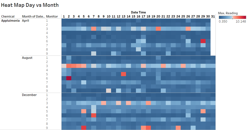
For our analysis we have found it useful to compare the sensor readings by chemical and monitor. Time-wise, we group it according to Month, Day of Month and Hour. The max values, min values as well as the count of readings can be compared to deliver useful insights. Creating a calendar like heat map with the day of the week and month can also be done if we wish to look for recurring patterns over the days of the week; however in our analysis we find that it can make comparison difficult as we want to drill down from daily readings to hourly readings. The sensor readings can be represented by color. Although the readings are all positive values, we have found it useful to use a diverging color scale as it quickly draws attention to the high readings in red compared to the lower readings in blue. A possible improvement is to know the regulatory threshold of the chemical readings, allowing us to immediately flag high readings with the others in blue.
Wind Direction Chart
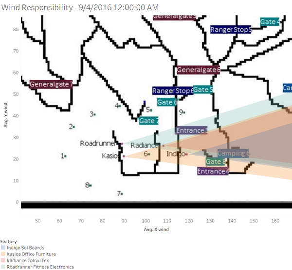
The wind sensor readings are created using Tableau's polygon display. We combine this with a scatter plot of the monitor readings placed at the various monitor positions; the scatter plot mark size will be proportional to the sensor readings. This will allow us to quickly spot which factory is causing the sensor readings to increase. We create a time based animation by placing the Date Time variable into the Pages section of the plot. To cap it off we place the map of the area as the background.
| Number | Description | Illustration |
|---|---|---|
| 1 | To create a polygon according to the wind path these calculations are required :
|
|
| 2 | The polygon obtained in the above step will be centered at zero. As such we need to create additional X and Y parameters to be able to offset the polygons into the right position on the cartesian X-Y plot. | |
| 3 |
*Now we can place the X wind and Y wind into the Column and Row readings respectively. The Measure is set to Average. |
|
| 4 |
  * Next we add the X sensor and Y sensor coordinates to the columns and rows attributes respectively.
  * Dual axis and synchronize axis are selected for both. The Measure is set to Average.
  * The other measures are also set up as follows to produce a polygon
      **Monitor as Detail
      **Chemical as Color
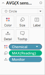
      **Max(Reading) as Size
|
|
| 5 | Finally we set the map as background with the following coordinates as shown on the right. A washout value has to be selected in order to avoid obstructing the view of the plot. The image is swapped to the negative intensity by using Microsoft Paint as the black background in the original image is too dark and prevents us from seeing the colors properly. A slight offset is required in order to match the background image to the coordinates supplied to us. |
Tableau Visualization available here https://public.tableau.com/profile/david.ten.kao.yuan#!/vizhome/MC2_3/MC2
Q1 - Sensors
Characterize the sensors’ performance and operation. Are they all working properly at all times? Can you detect any unexpected behaviors of the sensors through analyzing the readings they capture?
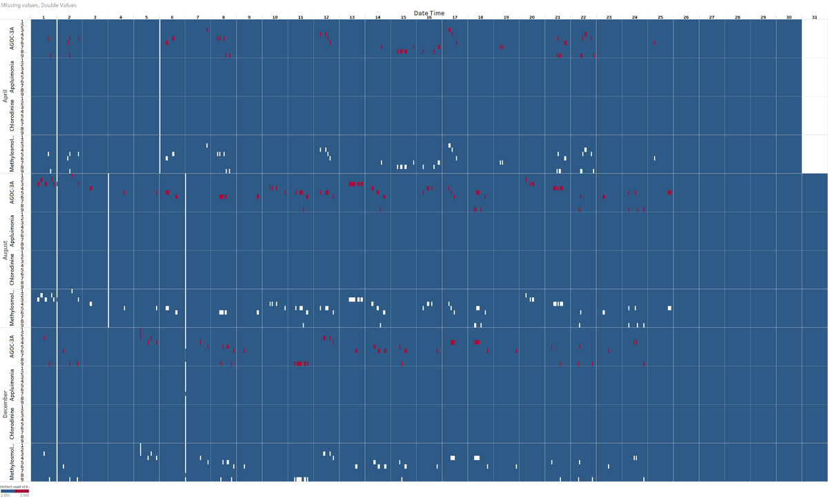
When plotting the number of readings by sensor, chemical, day of the month as well as month, a few clear patterns appear. If all the sensors were operating normally there would be one reading every hour. However this is not the case. Blue represents one reading, one represents no reading and red represents 2 readings.
There is a mass black out of monitors for all chemicals at midnight between 1st and 2nd day of every month (except monitor 3 in December). This is possibly due to a systemic issue or a scheduled event like a sensor reset, power blackout or data center reset causing all the sensors to go offline on the 2nd of each month at midnight Similar issue is seen for specific months at midnight as well:
- 5th to 6th April (all monitors)
- 3rd to 4th and 6th to 7th August (all monitors)
- 6th to 7th December except monitor 6,7,8 working for AGOC-3A; 7 working for Appluimonia, 8 working for Methylosmolene
There are missing values for Methylosmolene only. This could be a cause for concern it is toxic and is stringently regulated. There are double readings for AGOC-3A only. It is possible that it is due to the nature of the chemical itself and not the monitor. This is less of a concern as this chemical has a foul odour but is not harmful.
When put side by side, double readings for AGOC-3A occur at the same time when there are missing readings for Methylosmolene! This cannot be a coincidence. The chemicals might be affecting each other’s sensor readings; the levesl of methylosmolene might be so high that the sensor cannot give a reading and affect the channel that reads the AGOC-3A value. If true this is very dangerous as Methylosmolene is highly toxic.
When plotting the different sensor values for Appluimonia it is clear that there are differences between the sensors. Sensors 3 and 7 are obviously giving higher readings than the other sensors. This could indicate that they are not calibrated properly and giving excessively high values. The fact that they are consistently high seems to rule out the influence of meteorological influence. A boxplot would be suitable to illustrate this. As such we should be cautious when relying on the readings of these sensors.
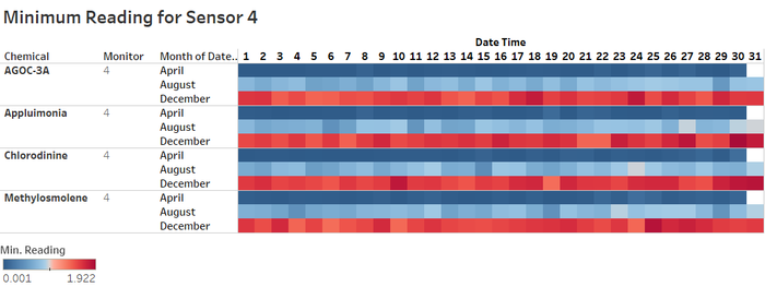
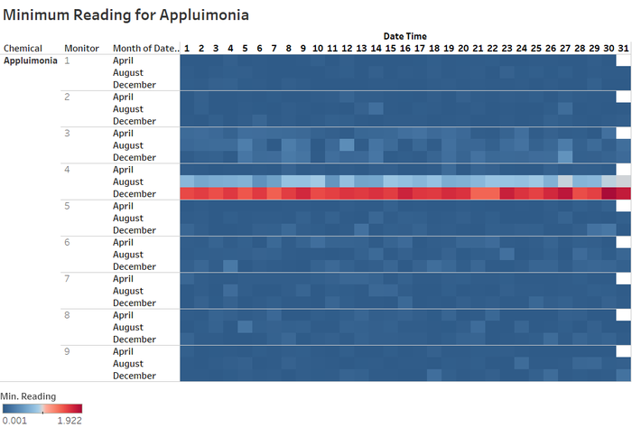
When examining the minimum reading for each of the sensors, we notice that sensor 4 is drifting upwards each month. This seems to indicate that sensor 4 has an offset issue which is getting worse and worse. We should not overly rely on sensor 4's reading in August and December.
Q2 - Chemicals
Now turn your attention to the chemicals themselves. Which chemicals are being detected by the sensor group? What patterns of chemical releases do you see, as being reported in the data?
We only have reading and do not know the danger threshold. In general AGOC-3A readings and Methylosmolene ([0-100] range) are higher than Appluimonia and Cholorodinine values ([0-10]) range.
- AGOC-3A and Methylosmolene have lower values during the last week (or 2 weeks) of each month. This could be linked to Christmas holidays in December, summer holidays in August and spring break in April.
- AGOC-3A occurs more frequently on Fridays and during week 33
- Methylosmolene peaks on the 2nd of every month, followed by 7-8 days after that
- Appluimonia is high during 2-4 August
- When plotting the Month vs the Day of the Month it is even clearer that AGOC-3A and Methylosmolene are not emitted towards the end of the month.
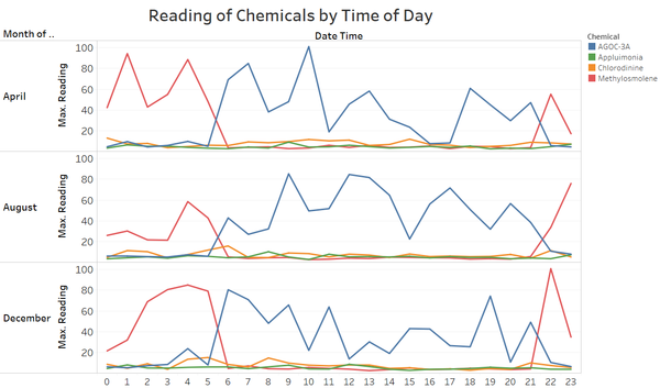
- Methylosmolene peaks between 10pm-5am
- AGOC-3A peaks between 6am and 9 pm
- Applumonia and Chlorodinie are more stable during the day
There seems to be a link between the use of these 2 chemicals which are organic compounds and they complement each other. It is possible that one chemical is converting to the other or that one factory is swapping out a safe compound for a toxic compound at night to avoid detection. Given the link we saw earlier between Methylosmolene and Appluimonia values, this does not seem to be a coincidence.
Q3 - Factories
Which factories are responsible for which chemical releases? Carefully describe how you determined this using all the data you have available. For the factories you identified, describe any observed patterns of operation revealed in the data.
The chosen method is to focus on when the there is a peak in the detection levels and then use the wind direction to determine which factory could have emitted the chemicals. We need to take into account the fact that the wind data is only available every 3 hours and that what was detected would need to take time to travel to the sensor. We have to be careful about the wind direction given as it is the orientation where the wind comes from. Since we are studying which sensor is downwind, we need to inverse the wind direction.
Methylosmolene
We focus on this one which very toxic. Kasios is likely to be responsible. There a lower probability that it is Road Runner.
Relying on Peak Readings
We observe a peak for Methylosmolene on sensor 6 at 1AM 4th April. During this time of day the wind is blowing from Kasios.
Relying on Missing Values
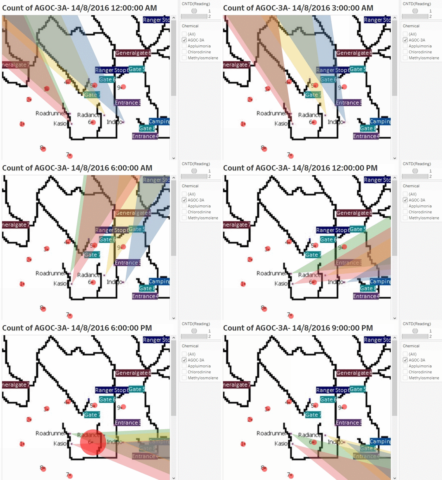
If we assume that the missing Methylosmolene values indicates that there is an anomaly with the Methylosmolene emissions (either a massive amount of Methyosmolene outside the range of the sensors or an incomplete conversion of Methylosmolene into AGOC-3A), then we should also study incidents like this closely. As seen in question 1, missing values of Methylosmolene coincide with a double value of AGOC-3A. As such, we can rely on the count of AGOC-3A readings instead. Our visualization shows the direction the wind is blowing to and also the count of of the AGOC-3A readings at each station. In this animation, we see that the emissions could have come from either Kasios or Road Runner. This investigation is carried for the different days where there are double AGOC-3A readings and missing Methylosmolene values.
Chlorodinine
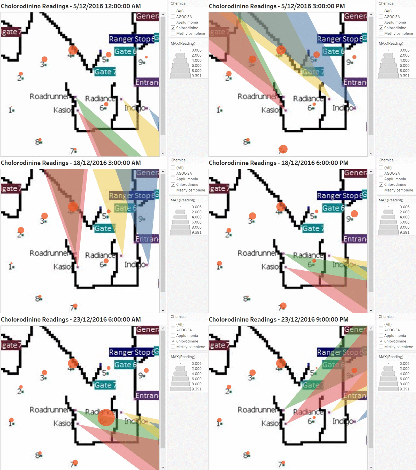
Road Runner is likely to be responsible. There a lower probability that it is Kasios. The animation shows the wind direction and chlorodinine levels for December 5, 18 and 23, days with the highest Chlorodinine levels in December.
Appluimonia
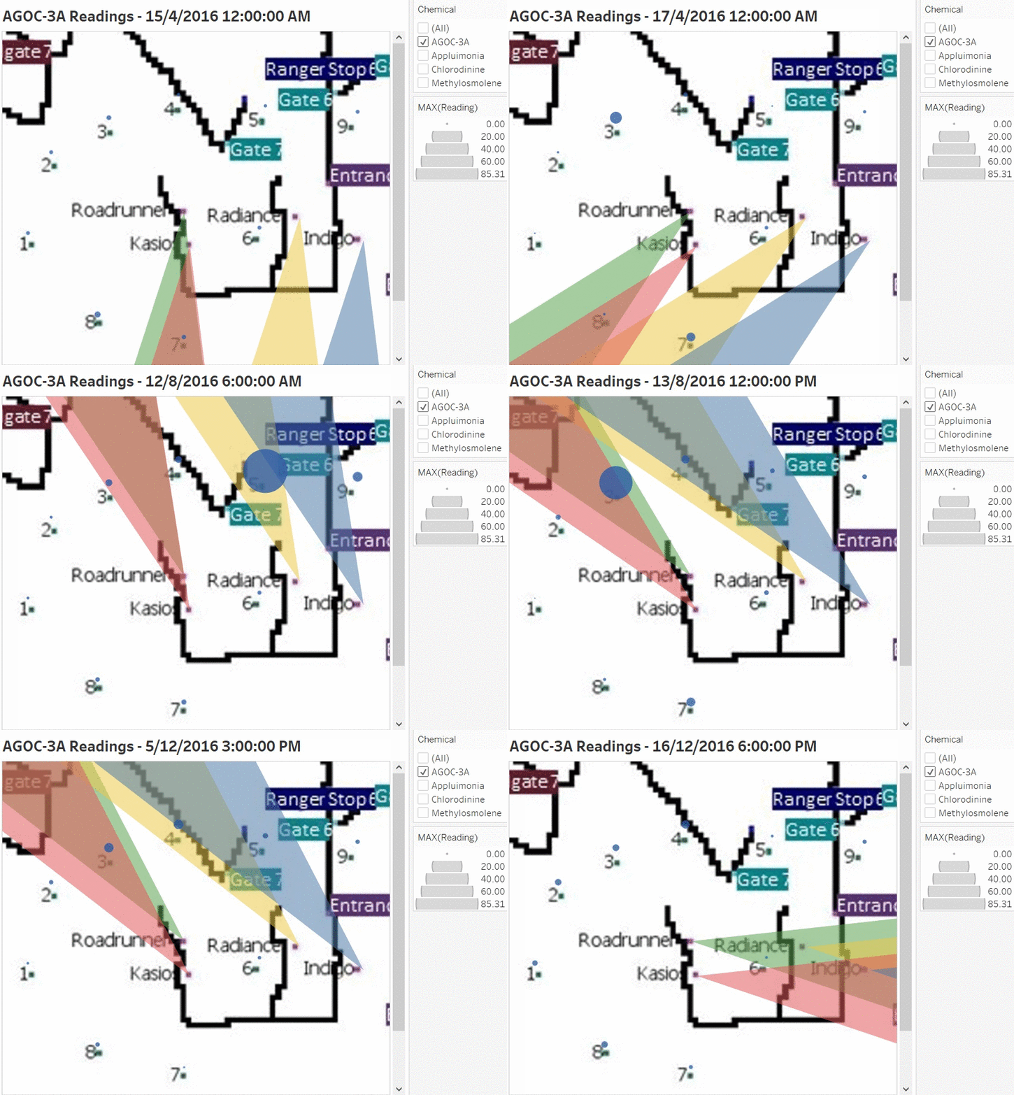
The culprit is likely to be Indigo, and a lower possibility of it being Radiance. This is just a smelly chemical and probably not regulated. The animation shows readings and wind directions for 7th and 20th April, 13th Aug as well as 5th, 7th and 18th Dec. We cannot trust the reading from sensor 4 in the months of August and December as the minimum offset is increasing. We can see this by plotting the minimum sensor reading for each day; the readings for sensor 4 are increasing each month. This indicates a problem with the sensor itself. We also observe that sensors 3, 7 and 8 give a high reading for Appluimonia when the wind is blowing in the opposite direction. Appluimonia might be coming from other areas, such as the pathways or the park itself as this could be emitted from rotting vegetation and organic matter.
AGOC-3A
We have to be cautious with AGOC-3A as in our working hypothesis, it is affected by Methylosmolene. Without filtering for anomalous behavior of the sensors, we obtain the following animation, which seems to indicate that either Kasios or Road Runner is responsible for the emissions.
We have to be cautious when concluding which factory is responsible for the pollutants as there is a lot of uncertainty with the wind measurements. The wind measurements are only given every 3 hours while the sensor readings are hourly. We are uncertain if the wind direction changed in between the readings, affecting our conclusions. The factories are also bunched into to groups close to each other; Kasios is close to Roadrunner while Indigo is close to Radiance. If we take a larger angle parameter, this could cause more uncertainty. Further information would be required:
- How fast the chemicals disperse over an area
- The height of the sensors
- The density of the chemicals relative to the air; i.e. if they continue ascending, descending or remain at the same height over time
Further Improvement
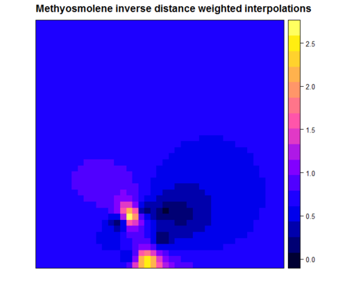
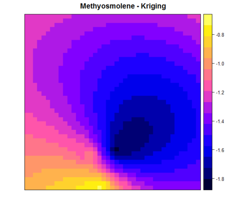
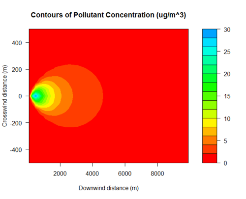
Currently the wind plume analysis uses a basic triangle to determine the travel. It would be interesting to connect Tableau to R and then to use geospatial analysis such as Inverse Distance Weights or Kriging to see. The Plume analysis could also be made more realistic using Gaussian Plumes. Below are some images obtained with R directly for Methylosmolene over the whole area of the park. However further improvement is needed as the variogram has a poor fit.
References and Feedback
References
http://onlinehelp.tableau.com/current/pro/desktop/en-us/buildexamples_heatmap.html
Tableau Visualization available here : https://public.tableau.com/profile/david.ten.kao.yuan#!/vizhome/MC2_3/MC2
Feedback
Hi David,
Nice work! It's pretty cool that you have done all three MC cases! Great efforts!
Here are some of my concerns:
- For Q2 to see the pattern of chemical release: you look at it by day in all three months, it may be more rational to compare the release pattern in three separate month instead of aggregate all three months together.
- For Q3 wind plot: Would it be more reasonable to plot the wind area start point at each sensor? Since the wind direction and speed data are detected by the sensor, then we can inverse the wind detected area to see if which factory is under this area.
Best regards,
Xiaoqing
Hi David,
I’m very impressed with your work! Clarity wise there is no issue. I’m particularly impressed at how you managed to squeeze the hours into the y axis. The only (minor) comment I have is on the aesthetics. I find the dark blue and the maroon colours a little hard on the eyes, particularly as they appear to be of the same value despite being of different hues. Maybe if you change the maroon to a brighter shade of red it might be better? The one that I’m most impressed is how you managed to flip the colours of the map around. The use of the overlapping wind plots is also very clear, although aesthetics wise, choosing 4 distinct colours - rather that 2 blue and 2 yellow/orange - may make the distinction between the sources clearer.
Thanks,
Vincent Mack

