Difference between revisions of "Analytical Results"
Xqchen.2016 (talk | contribs) |
Xqchen.2016 (talk | contribs) |
||
| (2 intermediate revisions by the same user not shown) | |||
| Line 26: | Line 26: | ||
=Question 1= | =Question 1= | ||
| + | |||
| + | '''Are all the sensors working properly all the time?''' | ||
| + | |||
| + | To see if the sensor is working properly all the time, we can visualize the number of record of each monitor at specific chemical and same timestamp. | ||
| + | |||
| + | Interestingly, we can find there are some duplicate records in the same occasion and also some missing records. | ||
| + | |||
| + | [[file:5-1.png|border|800px]][[file:5-2.png|border|800px]][[file:5-3.png|border|800px]] | ||
| + | |||
| + | The dark blue indicates there are two records in this timestamp and green color is only 1 record. While the white color represents there is no record. | ||
| + | |||
| + | Conclusion: | ||
| + | |||
| + | 1. April | ||
| + | |||
| + | Monitor 3,4,5,6,7,8 and 9 have some duplicate records when detecting chemical AGOC-3A while also have some no records when read the chemical Methylosmolene. These monitors except 1 and 2, are not working well all the time in April. | ||
| + | |||
| + | 2. August | ||
| + | |||
| + | Monitor 1,2,3,4,5,6 and 9 have some duplicate records when detecting chemical AGOC-3A while also have some no records when read the chemical Methylosmolene. These monitors except 7 and 8, are not working properly all the time in April. | ||
| + | |||
| + | 3. December | ||
| + | |||
| + | The monitor working condition is the same as it in August. Monitors except monitor 7 and 8, are not working properly all the time. | ||
| + | |||
[[file:1-1.png|500px|border|thumb|1-1]] To characterize the performance of each monitor, first use the line chart to compare the reading in every time stamp with the overall median reading value, whether the reading in this time stamp is higher or lower than the median value. Then characterize how the monitor performs and operates through the whole period. | [[file:1-1.png|500px|border|thumb|1-1]] To characterize the performance of each monitor, first use the line chart to compare the reading in every time stamp with the overall median reading value, whether the reading in this time stamp is higher or lower than the median value. Then characterize how the monitor performs and operates through the whole period. | ||
Latest revision as of 22:48, 13 July 2017
 ISSS608 Assign Chen Xiaoqing - MC2
|
|
|
|
|
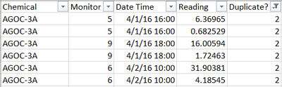
Question 1
Are all the sensors working properly all the time?
To see if the sensor is working properly all the time, we can visualize the number of record of each monitor at specific chemical and same timestamp.
Interestingly, we can find there are some duplicate records in the same occasion and also some missing records.


The dark blue indicates there are two records in this timestamp and green color is only 1 record. While the white color represents there is no record.
Conclusion:
1. April
Monitor 3,4,5,6,7,8 and 9 have some duplicate records when detecting chemical AGOC-3A while also have some no records when read the chemical Methylosmolene. These monitors except 1 and 2, are not working well all the time in April.
2. August
Monitor 1,2,3,4,5,6 and 9 have some duplicate records when detecting chemical AGOC-3A while also have some no records when read the chemical Methylosmolene. These monitors except 7 and 8, are not working properly all the time in April.
3. December
The monitor working condition is the same as it in August. Monitors except monitor 7 and 8, are not working properly all the time.

To characterize the performance of each monitor, first use the line chart to compare the reading in every time stamp with the overall median reading value, whether the reading in this time stamp is higher or lower than the median value. Then characterize how the monitor performs and operates through the whole period.
The line chart consists of two lines in each monitor panel. One line is the reading of this monitor, another one is the overall median value. It has four chemicals and each chemical detected characteristics is not the same, so it’s not reasonable to sum them up. It does more sense to see the monitors operates with each chemical. The same reason for looking at individual month. So here placed two filters, by month and by chemical. The whole dashboard is like right graph 1-1:
Findings:
Finding 1:

Above graph indicates the reading of four chemicals of each monitor in April. The X-axis is the hour of each day in April, while the Y-axis represents the monitors. Compare the reading of these four pollutions through whole period, the characteristics are shown below:
- Monitor 3, 7 and 8 are consistently detecting the relative higher reading value compare to the median reading of four chemicals.
- The reading detected by rest monitors (1, 2, 4, 5, 6 and 9) along this month is consistently fluctuated around the median reading value with some cases that detect relative higher value above the median value in all chemicals. (monitor 1 and 2 have very few cases that detect relative higher values.)
- Note that the number of cases of detecting relative higher value is much higher in detecting AGOC-3A than detecting others. The reason probably is the duplicated records of reading this chemical. (there are 168 records with same time stamp, same monitor but two different reading records) Another reason may be this kind of chemical is more actively released around this park.

Finding 2:

The characteristics of monitors in August are slightly different with those in April.
- Not only monitor 3 and 7 but also monitor 4 are consistently detect values higher than median.
- Monitor 1, 2, 8 and 9 detect the values just around the median with very few cases that will much higher than the median. While the rest monitors have read more cases with higher value.
Finding 3:

- Monitor 3, 4, 5, 7 and 9 always have read the relative higher value than median during this month. The reading of 9 is just slightly higher than the median.
- Monitor 1, 2, 6 and 8’s readings fluctuated around the median value. Only the monitor 6 in detecting AGOC-3A has higher variance.
Conclusion:
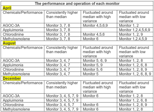

From the conclusion table we can see the monitors have three main performances in reading the chemicals. There are two main finding in the performance of all the monitors:
- The monitor 3 has always read the consistent higher value in all moths and all chemicals.
- Monitor 1 and 2 have caught the fluctuated reading around median all the time no matter what the chemicals and whenever the months.
These two behaviors may be considered as unexpected performances due to consistent the same behavior. We have higher possibility to suspect that they may not be working properly all the time because the performance of both monitor 3 and 1&2 has remained the same all the time no matter what the chemical is and which moth it is in. What’s more, the reading detected by sensor 3 is much higher than the median at all situations.
Take a closer look at the unexcepted behaviors using the horizon graph. The horizon graph of all the reading through three months shows the difference between individual reading and median value in a same horizon, using orange-green diverging color to represent the positive and negative value. The density of color represents the level of difference from median. The darker the color is, the higher it differs from median.
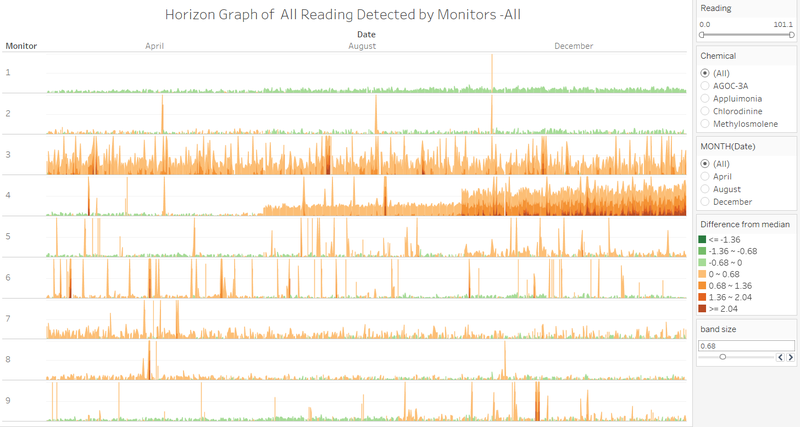

First take a look at the monitor 1, which represents as consistently slight lower than the median through this whole period. As previous analysis showed, the reading of monitor 1 fluctuated around median, which here obviously is wrong. The reason probably is the reading of monitor 1 is very slightly lower than the median and we cannot see it clearly at first look. Although it’s different from previous result, the monitor 1 still may be not working properly all the time. The performance always tends to read lower value consistently.
Then is the monitor 2, both the green and orange have taken up almost half percentage with relative low variance. This is identical to previous analysis. The level of difference between reading of monitor 3 and median is very high during all the time. Many time stamps have reached the highest level.
Interestingly, monitor 4 also seems not to be working properly all the time. It performs differently during all three months, which represents around median, relative higher than median and much higher than median in April, August and December respectively.
Question 2
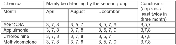
1) To determine which chemicals are mainly be detecting by sensor group, we’d better use the boxplot to see the reading distribution of each chemical in each monitor. Define the top-3 covered quartile size into the main sensor group.


Below table shows the conclusion of grouping sensors for detecting each chemical through the distribution of reading in three months.

2) Chemical Release Pattern:
- Looking the reading month by month, it shows the total release of each chemical has an upward trend from April to December. Then looking it day by day in each month, the release of Appluimonia and Chlorodinie remains almost the same in the whole month (not changing too much), which the AGOC-3A and Methylosmolene have their specific pattern. The release patterns of AGOC-3A in three months are quite similar, which has been fluctuating during around 5-25 days. The release pattern of Methylosmolene remained consistent during the most days in whole month but there are some irrgular days fluctuated a lot.
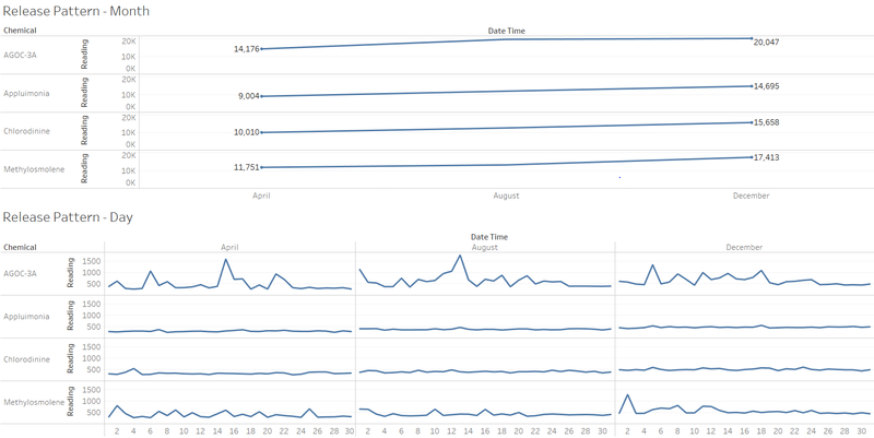

- Below gragh is to see the release pattern in persepctive of hour in a day. It’s obivious that the release pattern of Appluimonia and Chlorodinie remains constant through whole day. But the AGOC-3A release is mainly gathered from 5:00 – 0:00, while Methylosmolene is mainly collected from 21:00 to 6:00 in the next day.
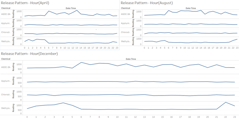

Conclusion:

Question 3
1) Defined Rules:
plot the wind covered area using the wind direction and wind speed detected by each monitor. Because the wind data is detected by each sensor, so here I reverse the wind coverage area to see if which factory is the source to release chemicals. If it is under the area, it means the chemical is released by this factory.
The wind triangle starts from each sensor, reverse the wind direction. Two sides are the distance calculated by speed, the angle is self-defined. Technically, the angle is related to the height of chimney, which is not available in this data set. So here just assume it is 30。.
Then combine the wind plot and horizon graph to check those time stamps with high reading of chemicals belongs to which factory. The high reading value here is determined as the value higher than median+2.04, which is the 5th band in the horizon graph.
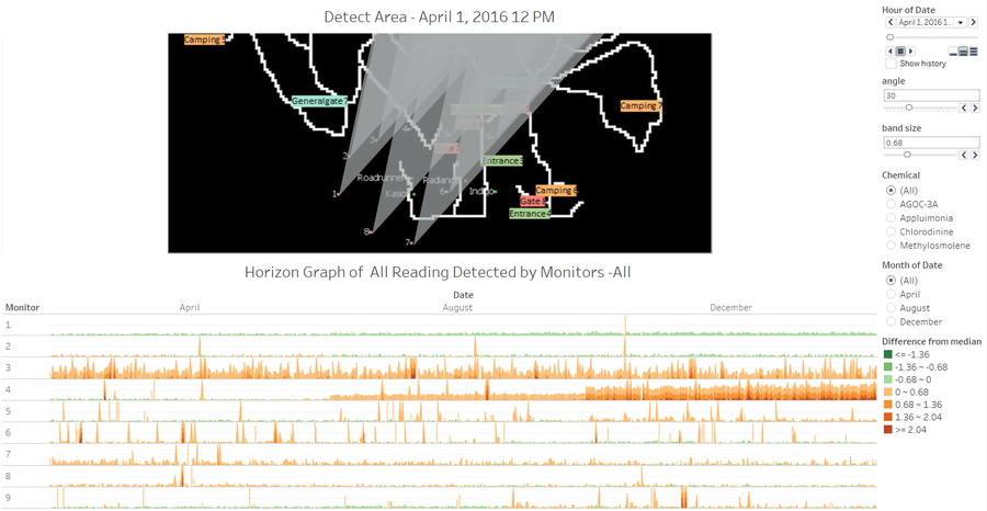

Steps:
- Highlight the value in 5th band first to find those corresponding time stamps.
- See which factory is covered under the corresponding wind detected area.
- Manually check one by one, record which factory is covered and its frequency.
- Summarize the frequency of each factory related to release of each chemical.
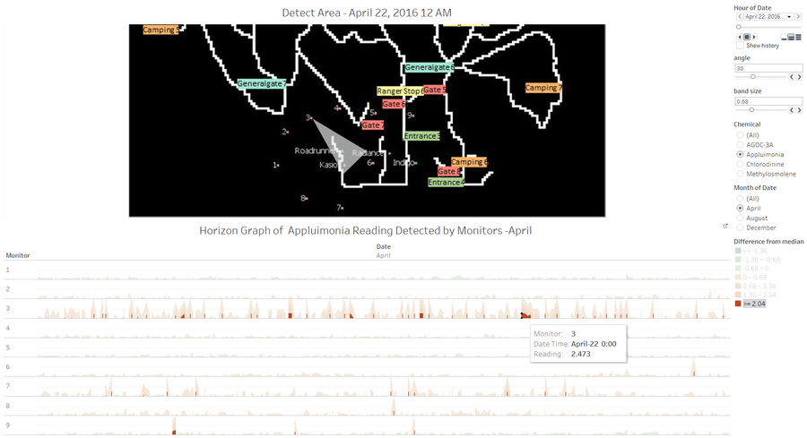

For example, highlight the value in 5th band, then use the dashboard action to filter the wind detected area in the above map at this specific time stamp. This graph shows the reading of monitor 3 in April-22 0:00 is 2,473 and the wind detected area cover factory Roadruuner and Kasio, which means these two factories probably are responsible for the release of chemical Appluimonia.
Result:
After repeating several times, will get the frequency of each factory being exposed in the wind coverage area under the high reading value of chemicals.
Recording: the Chinese character “正” stands for frequency 5.
 =============>>>
The table indicates the frequency of each factory showed up at the area of the wind under each chemical’s release. Yellow color highlights the highest frequency of being exposed in the wind area. Indigo has the highest frequency 74 times of the high release value both in AGOC-3A and Methylosmolene. Factory Radiance has the frequency 59 and 68 times releasing high amount of Applumonia and Chlorodinie respectively.
Conclusion:
- Factory Indigo are mainly responsible for AGOC-3A and Methylosmolene release.
- Factory Radiance are mainly responsible for Applumonia and Chlorodinie release.
2) The pattern of operation of Indigo and Radiance
Pattern-1
It has been identified factories Indigo and Radiance are mainly responsible for release the chemicals AGOC-3A & Methylosmolene and Applumonia & Chlorodinie. So we can identify the pattern of two factories’ operation through the release pattern of their representative chemicals. The aggregation reading of AGOC-3A & Methylosmolene can represent the operation of Indigo while aggregation reading of Applumonia & Chlorodinie can reflect the operation pattern of Radiance.
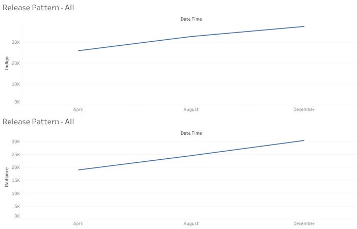

See the operation month by month, both Indigo and Radiance has an increasing trend of the release amount of chemicals from April to December. It means both factories have an increasing pattern of operation.
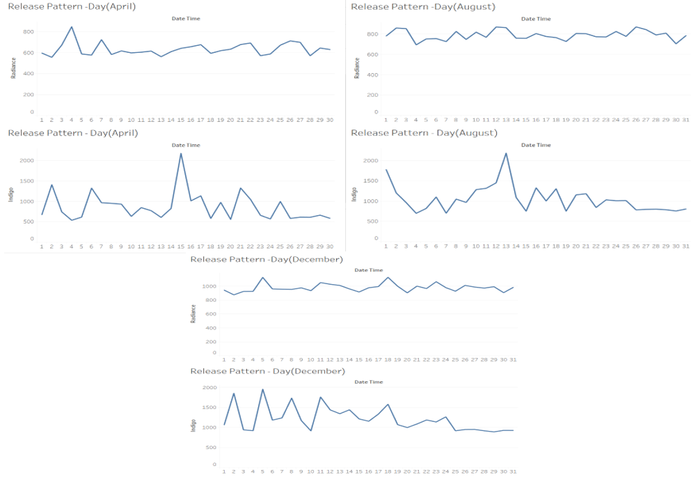
Pattern-2
Take a closer look at the pattern day by day, Indigo is more fluctuated in 30 days of all three months compared to those patterns of Radiance with relative constant pace (with lower variance).

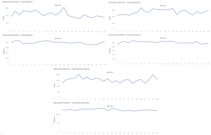
Pattern-3
Lastly look at it hour by hour in a whole day. Radiance still has a very constant and consistent pattern in whole day of all three months. While the relative busy working hour in a day of three month varies. Indigo is operating more often at 0:00-14:00, 5:00-23:00 and 22:00-7:00(+1) in April, August and December respectively.

Assignment Tableau Workbook Link
Tableau work sheets and dashboards: