Difference between revisions of "ISSS608 2016-17 T3 Assign AKANGSHA BANDALKUL Dashboard"
Jump to navigation
Jump to search
(ak db) |
|||
| (4 intermediate revisions by the same user not shown) | |||
| Line 37: | Line 37: | ||
<div style="padding-left:15px; text-align:left"> | <div style="padding-left:15px; text-align:left"> | ||
<font size = 4; color="#002060"><span style="font-family:Century Gothic; font-weight:bold">The Dashboard</span></font> | <font size = 4; color="#002060"><span style="font-family:Century Gothic; font-weight:bold">The Dashboard</span></font> | ||
| + | </div> | ||
| + | |||
| + | <div style="padding-left:15px; text-align:left; background:#f3f3f3"> | ||
| + | '''''The dashboard used in the visualisations above have been uploaded to Tableau Public accessible via [https://public.tableau.com/profile/akangsha.bandalkul#!/vizhome/Dashboard_700/Home this link].''''' | ||
| + | |||
| + | Please note that you can see full details on the dashboard preparation steps steps on [[ISSS608_2016-17_T3_Assign_AKANGSHA_BANDALKUL_VisualisationPreparation#Dashboard|this page]]. | ||
</div> | </div> | ||
<div style="padding-left:15px; text-align:left"> | <div style="padding-left:15px; text-align:left"> | ||
| − | |||
| − | |||
Below is a list of features available on each of the dashboards that users can use to filter the dashboards: | Below is a list of features available on each of the dashboards that users can use to filter the dashboards: | ||
</div> | </div> | ||
| − | |||
<br/> | <br/> | ||
<div style="padding-left:15px; text-align:left"> | <div style="padding-left:15px; text-align:left"> | ||
Latest revision as of 15:54, 16 July 2017
Akangsha Bandalkul VAST Challenge - MC2
|
|
|
|
|
|
|
|
The Dashboard
The dashboard used in the visualisations above have been uploaded to Tableau Public accessible via this link.
Please note that you can see full details on the dashboard preparation steps steps on this page.
Below is a list of features available on each of the dashboards that users can use to filter the dashboards:
Home
- This screen provides an overview of the investigation;
- There are links pointing to each sheet of the dashboard;
- There is also an additional link pointing back to this wiki for ease of access.
Sensor Reading Patterns
- This dashboard provides an overview of sensor reading patterns;
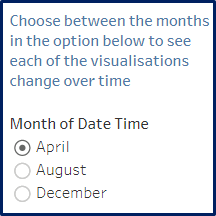
- Each of the visualisations can be filtered by Month using the single selection list on the top right of the dashboard.
Chemical Emissions Patterns
- This dashboard provides an overview of chemical release patterns;
- Each of the visualisations can be filtered by Month using the single selection list on the top right of the dashboard.
Map Emissions to Factories
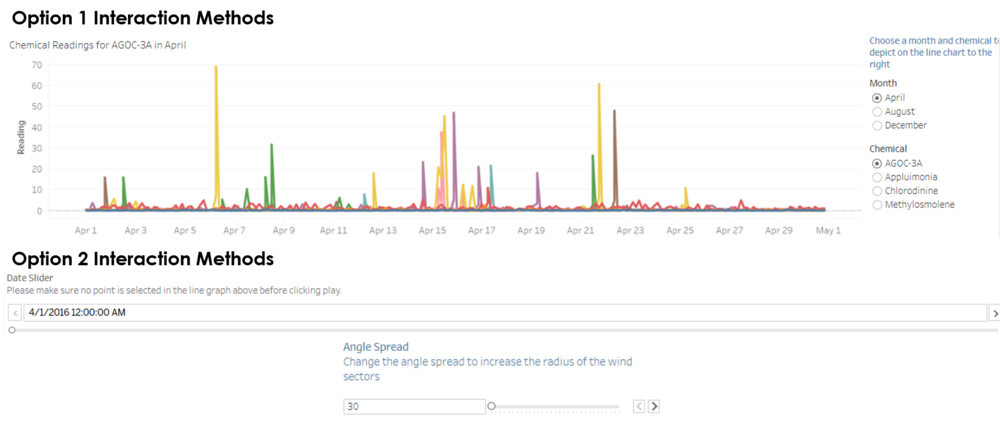
Through this dashboard users can link chemical readings back to the likely source factory. This can be done through one of two ways:
Option 1: Using the line graph at the top of the dashboard
- The line graph at the top of the dashboard displays readings for each chemical over the days of the months selected for each of the 9 monitors;
- By selecting any point on the lines, the wind plot and chemical reading table under the line graph will be filtered to reflect the reading time.
Option 2: Using the date time slider at the bottom of the dashboard
- The slider at the bottom of the dashboard can be used to see how the wind direction and chemical readings change over time for all monitors and readings;
- By hovering on either a chemical reading or a sensor's wind plot, users can highlight relevant readings;
- Users can also change the spread of the wind plots to reflect different smoke stack radii that may exist for the factories. This slider can be moved between 30 to 60 degrees.

