Difference between revisions of "Mandi Assignment Analysis Procedure"
| Line 72: | Line 72: | ||
[[File:FC3.jpg|1500px]] | [[File:FC3.jpg|1500px]] | ||
<br/> | <br/> | ||
| + | ==== False-color Image (B4, B3, B2 --> RGB) ==== | ||
In the left band combinations case (B4, B3, B2 --> RGB), plants reflect near infrared and green light, while absorbing red light. <br/> | In the left band combinations case (B4, B3, B2 --> RGB), plants reflect near infrared and green light, while absorbing red light. <br/> | ||
This combination normally makes urban areas appear blue, vegetation land appears red, water bodies appears from dark blue to black, soils with no vegetation from white to brown. And denser plant growth is darker red. | This combination normally makes urban areas appear blue, vegetation land appears red, water bodies appears from dark blue to black, soils with no vegetation from white to brown. And denser plant growth is darker red. | ||
This combination illustrates that most of the regions are plant covered on 2016-09-06 as most areas are red. But it is difficult to identify the dense plant area. <br/> | This combination illustrates that most of the regions are plant covered on 2016-09-06 as most areas are red. But it is difficult to identify the dense plant area. <br/> | ||
| − | + | ==== False-color Image (B5, B4, B2 --> RGB) ==== | |
In the middle band combinations case (B5, B4, B2 --> RGB), | In the middle band combinations case (B5, B4, B2 --> RGB), | ||
| − | + | ==== False-color Image (B1, B5, B6 --> RGB) ==== | |
| − | |||
In the right band combinations case (B1, B5, B6 --> RGB), | In the right band combinations case (B1, B5, B6 --> RGB), | ||
| − | |||
===Band Clustering in Tableau=== | ===Band Clustering in Tableau=== | ||
Revision as of 11:23, 15 July 2017
Contents
Question 1: Lake Location
As there is no sensor artifacts in the image which is taken on 2016-09-06, I take this image to locate the position of Boonsong Lake.
First, let's find out where are the waterbody in the image then we can narrow the search area.
Map B4, B3, B2 to RGB in QGIS to generate the "false-color" image.
In this band combination, water is black. Hence, we can identify the main waterbody which have been highlighted with the yellow line in the preserve area as below.
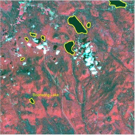
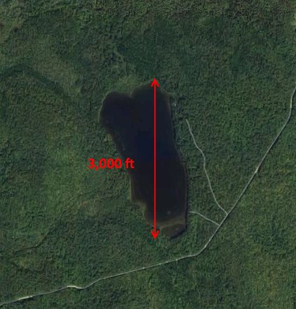
Then we zoom in the image in QGIS and compare the shape of these water area with the image of Boonsong Lake. The water area appears in the left bottom corner should be the Boonsong Lake as their shape are the same. The orientation of the supplied satellite image is also the same with the image of Boonsong Lake, which is oriented north-south.
Next, let's calculate the scale of the supplied satellite image.
I load the reedited "image09_2016_03_06.csv" into Tableau, drag X from the Measure Pane into Columns, Y from Measure Pane into Rows. Choose the Measure method as "Dimension".
As there are 651 rows and columns, I fix the range of x axis and y axis from 0 to 650.
X=0, Y=0 refers to the pixel in the upper left corner of the image. Similarly, the bottom right pixel of the image is X=650, Y=650.
To map the pixel in the dashboard with the real image, I reversed the scale of Y axis.
Drag the NDVI from the Measure Pane to dashboard area and set the measure method of NDVI as "Dimension" in the Marks Card.
Choose "Square" from the drop-down list and set the size as the smallest. Then it will be easier to locate the Boonsong Lake as each square will represent one pixel.
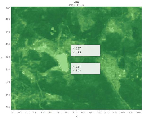
Now we still cannot recognize the preserve area in the map. Drag NDVI to the Color card then different regions in the area will be shown in different colors.
We can see that the Boonsong Lake is at the left bottom corner of the dashboard.
Use the view toolbar to zoom in the dashboard and add annotation to show the X, Y coordinates at the top pixel and bottom pixel of the Boonsong Lake respectively.
Hence, the length of a pixel is 3000/(504 - 475+1) ft, equals to 100 ft. Then the area of one pixel is 100 * 100 = 10000 square ft.
As the satellite image has 651*651 pixels, the actual scale of the region is 651*651*10000 square ft = 4,238,010,000 square ft.
Question 2: Features in the images
When looking at the multi-spectral images, it is very helpful to map different bands to RGB image channels.
Different bands represent different wavelength of the spectrum. Their utility are as below.
| Band | Color | Wavelength (nm) | Useful for Mapping |
|---|---|---|---|
| B1 | Blue | 450-520 | Penetrates water, shows thin clouds and general visible brightness |
| B2 | Green | 520-600 | Shows different types of plants and general visible brightness |
| B3 | Red | 630-690 | Vegetation color and certain mineral deposits. |
| B4 | Near Infrared (NIR) | 770-900 | Partially absorbed by water, sensitive to vegetation structure and chlorophyll |
| B5 | Short-wave Infrared (SWIR) 1 | 1550-1750 | Completely absorbed by liquid water. Sensitive to moisture content of soil and vegetation; penetrates thin clouds |
| B6 | Short-wave Infrared (SWIR) 2 | 2090-2350 | Insensitive to vegetation color or vigor, shows differences in soil mineral content |
B1, B2 and B3 represent the visible spectrum while B4, B5 and B6 represent the invisible spectrum which are beyond human preception.
B3, B2 and B1 are always used to map RGB image channel to generate the "true-color" image. And some band combinations of these six bands are also useful to be used to create the "false-color" images.
For instance, if we map B4, B3 and B2 to RGB, we can see the changes in plant health. If we map B4, B4 and B2 to RGB, the floods or newly burnt land can be shown. And we can differentiate between snow, ice and clouds if we map B1, B5 and B6 to RGB.
Band Combinations Analysis
To identify the features we can discern in the Preserve area, I still choose the image which was taken on 2016-09-06.
In the data prepation process, I have mapped B3, B2 and B1 to RGB in QGIS to create the "true-color" image as below.
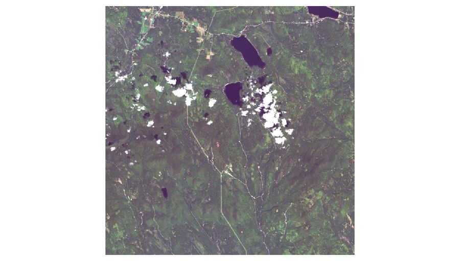
It can be seen from the image that there are different regions which are in different colors (light green, dark green, etc) in the Preserve area. From question 1, we have known the locations of the main waterbody in the area. But there appears some white regions in the center which look quite consipucuous. Compared to other "true-color" images which have been created, these white regions have also appeared in different locations of several images. Based on our common sense, these irregular shaped white regions may be clouds, snow or ice.
To figure out more features from the satellite image, I created three "false-color" images as below.
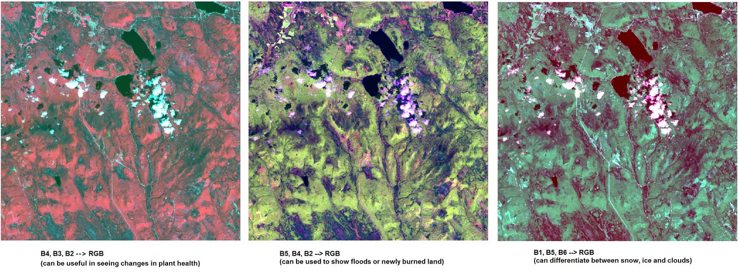
False-color Image (B4, B3, B2 --> RGB)
In the left band combinations case (B4, B3, B2 --> RGB), plants reflect near infrared and green light, while absorbing red light.
This combination normally makes urban areas appear blue, vegetation land appears red, water bodies appears from dark blue to black, soils with no vegetation from white to brown. And denser plant growth is darker red.
This combination illustrates that most of the regions are plant covered on 2016-09-06 as most areas are red. But it is difficult to identify the dense plant area.
False-color Image (B5, B4, B2 --> RGB)
In the middle band combinations case (B5, B4, B2 --> RGB),
False-color Image (B1, B5, B6 --> RGB)
In the right band combinations case (B1, B5, B6 --> RGB),
