Visual findings
Visual Analytics Science & Technology Challenge 2017 MC2
|
|
|
|
|
|
Visualization Journey through the nature reserve
Sensors operations and performance
Calendar Heat map
This calendar map helps visualize the sensor data across the days of April, August and December. The sum of recordings per day has been used to plot this map. As can be seen clearly, the days in color grey represent low or no(zero) readings. These days are :
1. April: 2nd and 6th
2. August: 2nd, 4th and 7th
3. December: 2nd and 7th
Sensor Analysis
It can be seen from the graph above that on 2nd and 6th April at 12:00 am no sensors recorded any readings. Similarly, on 4th and 7th August and 2nd December, no sensor recorded readings.
There are a lot of instances of multiple recordings of the same chemical at the same time on the same day. For example on April 2, AGOC was recorded more than average no of recordings.
In addition, there are high readings for sensors 3, 4, 5, 6 and 7
Analysis of Chemical readings
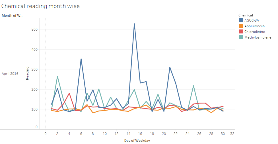
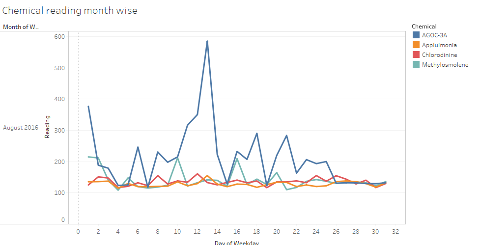
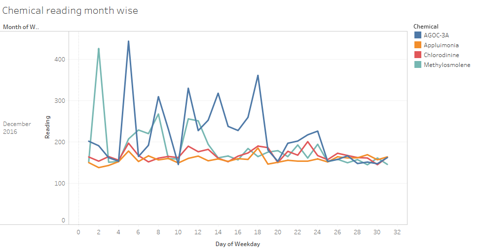
The following graphs reveal that the chemical AGOC-3A (followed by Methylosmolene) has been emitted the most across all three months. These are low-VOC and zero-VOC solvents. These solvents are less harmful to humans and environmental health.
December readings show a unsual hike in the emission of Methylosmolene. This chemical has toxic side effects in vertebrates and hence harmful.
Chemical readings calendar heat map
As depicted in the calendar heat map for chemical readings, days of maximum chemical readings are as follows:
1. April 15
2. August 1,12 and 13
3. December 2,5,8,11-14,17,18, 23 and 24
Month wise hourly analysis of each chemical
AGOC-3A
This graph helps understand that the chemical AGOC-3A is released above average between the hours of 6:00 am to 6:00 pm.
"New environmental regulations, and consumer demand, have led to the development of low-VOC and zero-VOC solvents. Most manufacturers now use one or more low-VOC substances and Mistford’s plants have wholeheartedly signed on. These new solvents, including AGOC-3A, are less harmful to human and environmental health."
Increase in average levels of AGOC-3A (196.9 in April , 271.3 in August and 278.4 in December) support the fact that Mistford's plants are making an increased effort to release these less harmful chemicals as their by-product.
Appluimonia
The average levels of release of Appluimonia has increased from April to December.The release of this chemical is consistent throughout the day which means continuous odor for the residents.
Chlorodinine
The average levels of release of Chlorodinine has increased from April to December.The release of this chemical is consistent throughout the day.
Increase in average levels is a cause of concern and must be regulated. Inhaling or swallowing Chlorodinine may cause damage to the skin, eyes, respiratory tract and digestive tract.
Methylosmolene
This chemical is released distinctly more during the hours of 10:00 pm to 5:00 am each night. This pattern is clearly visible in the graph above.
The highest reading for Methylosmolene was recorded at 437.9 in December at 10:00 pm.
I shall further analyse which factory and chemicals contribute to the same below.
Analysis of Factory Emissions
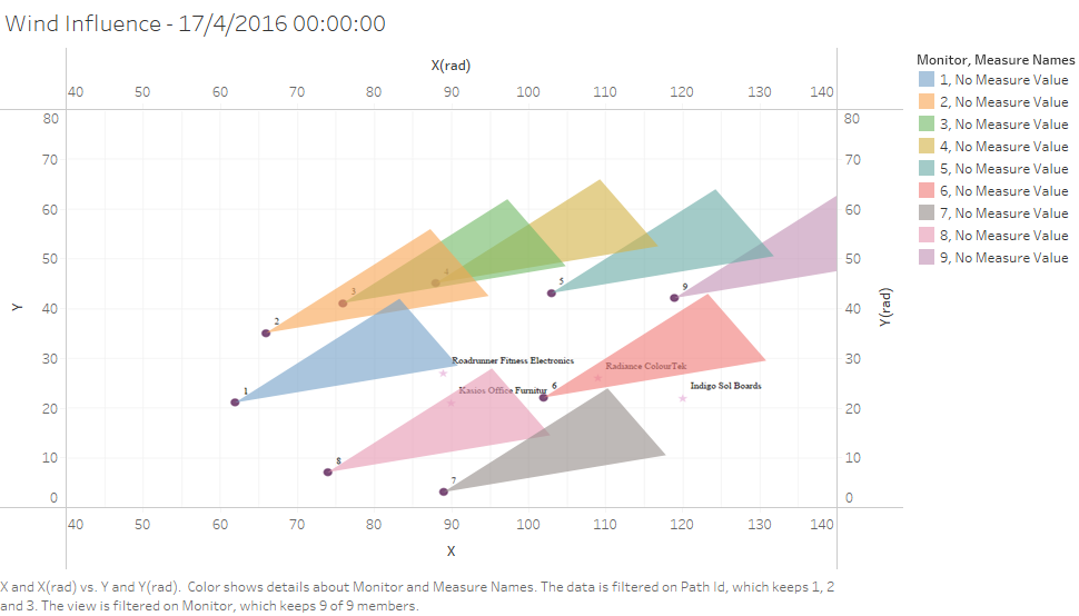
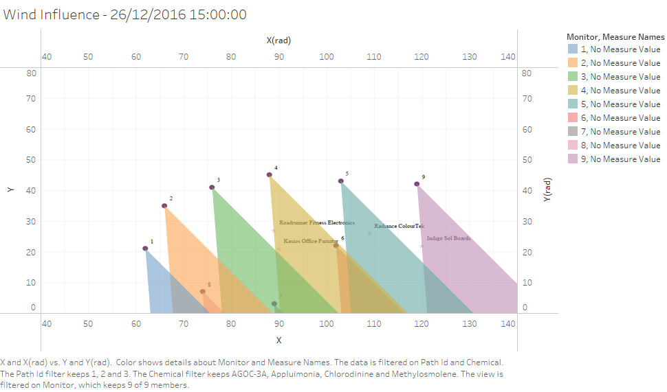
Wind Influence on Sensors has been studied to get a better understanding.
As promised in the above section, a deeper analysis of the dates with high chemical readings has been done. The findings have been as follows:
For illustration purposes,I have chosen to depict wind influence on the exact moment of 17th April 12 am. Graph as shown below.
It can be seen that Raidance ColourTek plant is contributing to the readings recorded by sensor 6.
Plume model
In this visualization, I have chosen to depict wind influence on the exact moment of 26th December 3 pm. It can be seen that Indigo Sol Boards plant is contributing to the readings recorded by sensor 9.


