ISSS608 2016 17T3 Group11 Report
Performance Decomposition of China Listed Firms
|
|
|
|
|
Contents
Motivation of Our Work
Since initiating market reforms in 1978, China has shifted from a centrally-planned to a market-based economy and has experienced rapid economic and social development. With a population of 1.3 billion, China is the second largest economy and is increasingly playing an important and influential role in development and in the global economy.
An increasing number of foreign investors are looking for opportunities to invest in China. Therefore, understanding the performance of China listed firms becomes very essential. This project identifies the need of developing an interactive dashboard to display the performance of China listed firms, which will be very helpful in understanding how these companies of different industries have developed over the past 12 years.
Data Preparation
The dataset the project built on is a combination of mutiple date sets and each item in the final dataset is cautiously selected to achieve our project goal.
One of the most important dataset used is China listed private enterprise research data, which offers data of companies whose nature of equity are listed non-state-owned enterprises at the end of the year, or later transferred into non-state-owned enterprises since 2003. The data of the database covers the complete information of the above companies every year since 2003, including Stock Code, Listing Exchange, Area, Province, Privatization Sign, Listing Date , Total Share Number, Number of Employees, Operating Revenue, Net Profit, etc.
Besides, data preparation process also involves the data collection of the geographic information including China map and the information on financial performance indicators across different industries and regions—with current dataset, explicitly as province and city.
- The data structure of the final dataset is as follow:
Dashboard Design framework
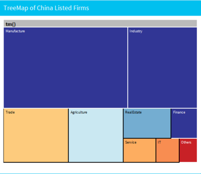
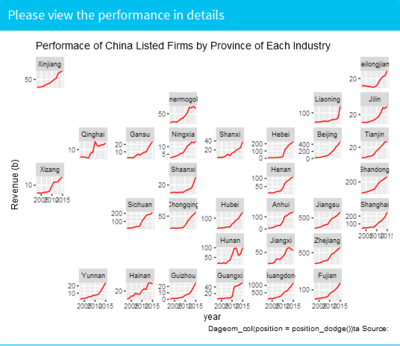
To develop a comprehensive display of the performance of China listed firms, four parts are covered in our application. The first part is an interactive tree map, which shows 4 layers from industry to province to city. The tree map provides an overview of listed firms’ distribution in terms of total assets and profits in a top-down method. The second part is a geo_facet line graph which is linked to the tree map by click action. The geo_facet map compares the yearly revenue performance from 2003-2015 of each province by industry. The third part is scatter plot, which is also linked to the tree map by click action. The scatter plot shows each stock performance in terms of earning and cash flow based on the selected province, which provides a more granular view of the stock’s performance. The forth part is a spark table, which is an information dashboard design. This spark table is a way that displays all the important indicators of each stock so that the investors have a pipeline to observe the data in a more detailed manner.
Graphic Visualization
Overview
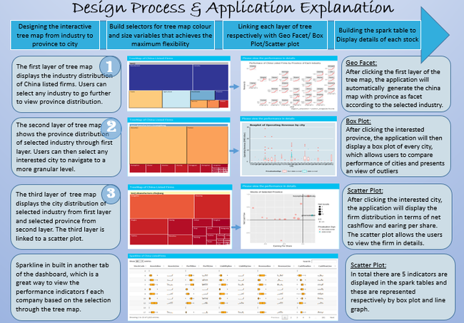
The first layer of tree map displays the industry distribution of China listed firms. Users can select any industry to go further to view province distribution.
After clicking the first layer of the tree map, the application will automatically generate the china map with province as facet according to the selected industry.
Detailed Info
Performance Breakdown by Industry & Province
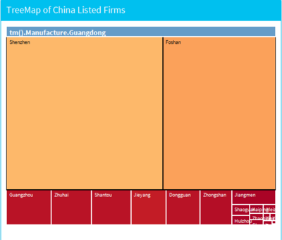
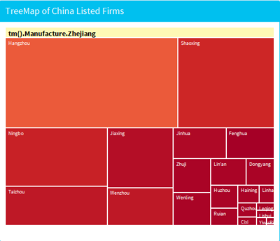
The second layer of tree map shows the province distribution of selected industry through first layer. Users can then select any interested city to navigate to a more granular level.
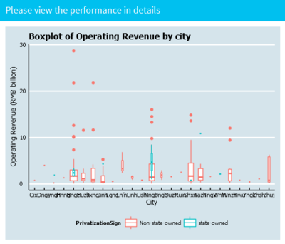
After clicking the interested province, the application will then display a box plot of every city, which allows users to compare performance of cities and presents an view of outliers.
Performance Breakdown by Industry & City
The third layer of tree map displays the city distribution of selected industry from first layer and selected province from second layer. The third layer is linked to a scatter plot.
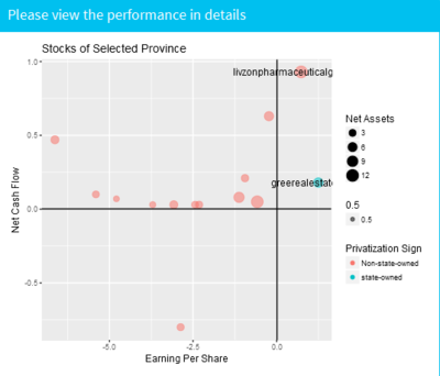
After clicking the interested city, the application will display the firm distribution in terms of net cashflow and earing per share. The scatter plot allows the users to view the firm in details.
Performance of Individual Stock
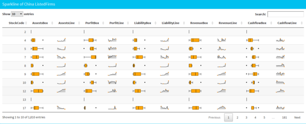
Sparkline is built in another tab of the dashboard, which is a great way to view the performance indicators for each company based on the selection through the tree map. In total there are 5 indicators that displayed in the spark tables and these are represented respectively by box plot and line graph.
Discussion
For Visual Analytics and Applications, Tableau and R are two main softwares we apply during the course. Generally, tableau is a fantastic tool for pattern discovery using data visualization. It is an ideal tool of choice when we want to throw some data and keep playing with the data to see whether any patterns emerge.
Whereas, R has a relatively steep learning curve. However, any investment we make in R, will be returned to us with significant rewards. In fact, R is easily more than a programming language; it is almost a whole framework. There are countless libraries ready to give us a helping hand. For instance, quite a few R packages were used to build our project application. In a word, there are two important reasons why we use R for the project: reproducibility and repeatability. Provided with the application code, you can easily reproduce the whole application to play with it and explore the data!
Future Work
1 Data Capture
The data is downloaded manually. We can build a pipeline to read the data from API directly in the future, which will automate the whole visualization process
2 More interactive
Some of the graphs can be developed from static to interactive so that the whole application is more user friendly
3 Faster
The interaction part of the visualization is a bit slow. In the future, the whole application can be deployed on Cloud, instead of local server to make it much faster to play with
4 More detailed
The micro parts of the graph can be further tuned
User Guide
The explanation of function is shown in the picture below. Actually the application is quite user-friendly. You just need to click wherever you are interested in and view it!
Reference
[1] shiny
[2] DT
[3] geofacet
[4] tibble
[5] d3Tree
[6] d3treeR
[7] tidyverse
[8] sparkline
[9] dplyr
[10] reshape2
[11] shinydashboard
[12] ggthemes
[13] ggplot2
[14] Combining data tables and sparklines
[15] https://wiki.smu.edu.sg/1617t1ISSS608g1/ISSS608_2016_17T1_Group6_Poster
[16] https://wiki.smu.edu.sg/1617t1ISSS608g1/ISSS608_2016_17T1_Group5_Proposal
Special Thanks
We would like to give a special thanks to Prof. Kam for his dedicated support and guidance! Moreover, thanks whoever spend your time on the fruits of our labor. We sincerely hope you enjoy it! Your suggestions & feedbacks are most appreciated and welcome!


