ISSS608 2016-17 T3 Anuthama Data Prep
|
|
|
|
|
|
|
|
Tools And Techniques Used
1. JMP
2. Tableau
3. Power BI
4. Microsoft Excel
Data Cleaning
Check for Missing Values:
I did a missing Value check using JMP and found that there were no missing values
Check for Duplicates:
1) Sort the data according to the car ID. Now all the car IDs will be sorted in ascending.
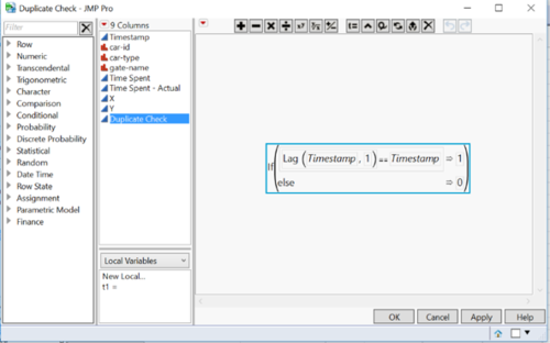
2) Use the formula below to check for duplicates
If you see 1 there are duplicates if u see 0 there are no duplicates.
Data Transformation
Annotating Points X and Y:
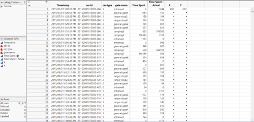
1)In Jmp create 2 new columns X and Y with values only in the first row. Since the map is 200*200 in dimension we need to use 200 as the X and Y coordinate values.
2)Load the Map as background image in Tableau. Click on Map --> Background Images.
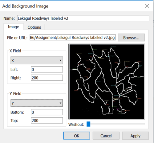
3)Browse for the map and set the parameters as above.
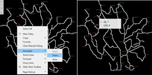
4)Next Annotate the points for each gate and fill the coordinates for the gate in JMP.
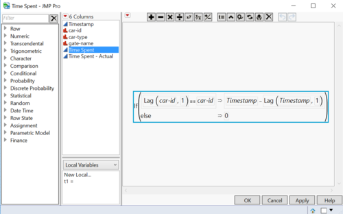
Calculating Time Spent:
Create an new column and enter the following formula:
Calculating Sequence:
The following formula is used for calculating the sequence that a car ID has made. Each time the car exits the preserve it starts its sequence from 0 again. This will help us to track car IDs who have made multiple visits.
Visualizations
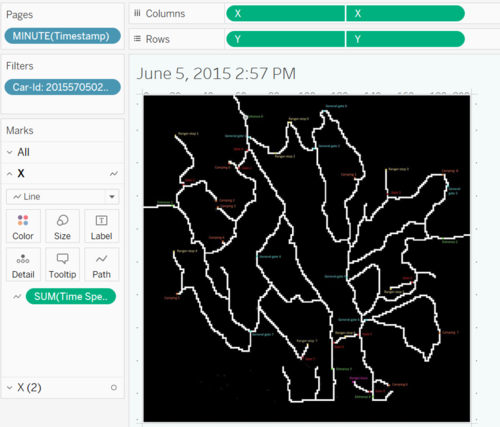
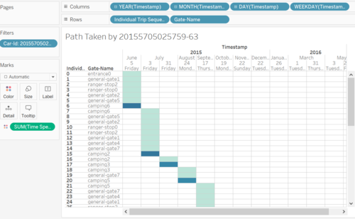
In this section I have explained a few of the Plots I have done. I have used an interactive map that shows the path taken by an ID and the time spent at Gates. Steps to recreate the graph.
1.Drag and drop the measure 'X' in rows and measure 'Y' in column.
2.Drag and drop the Sum of 'Time Spent in path'
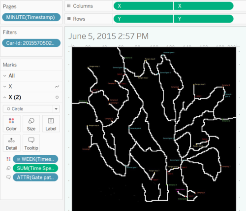
1.Drag and drop the measure 'X' in rows and measure 'Y' in column. Click on Dual Axis.
2. Drag and drop the Sum of 'Time Spent in path' on size.
3. Drag and drop weeks in colors
4. Drag and drop Minutes in pages. This will let you play the path with trace.
The next plot which is interesting is the calendar plot. I have used it in many of the analysis to understand the the hour-wise patterns for cars.
1.Drag and drop the 'Year', 'Month', 'Day','Weekday' in row
2.Drag and drop the 'Individual Trip Sequence' and 'Gate-Nate' in columns.
3.Drag and drop the Sum of 'Time Spent in path' on colours.


