ISSS608 2016 17 T1 Project Team 7 Report
|
|
|
|
|
Contents
Motivation
TalkingData, China’s largest third-party mobile data platform, understands that everyday choices and behaviors paint a picture of who we are and what we value. Currently, TalkingData is seeking to leverage behavioral data from more than 70% of the 500 million mobile devices active daily in China to help its clients better understand and interact with their audiences. In this project, we are challenged to visualize users’ demographic characteristics based on their app usage, geolocation, and mobile device properties. Doing so will help millions of developers and brand advertisers around the world pursue data-driven marketing efforts which are relevant to their users and catered to their preferences.
Review and critic on past works
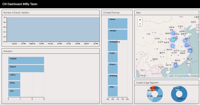
The graph shown above is a very early version of our dashboard. In this dashboard, we use a bar chart to represent the brands and there's no chart to visualize user's using behaviour in different time periods. Actually, this early version just gave the basic ideas of what are in the datasets. To get a deeper understanding of users' behaviour, we've tried to build a behaviour matrix for each person later. And we'll use a tree map to both show people's behaviour in different time period and different brands status.
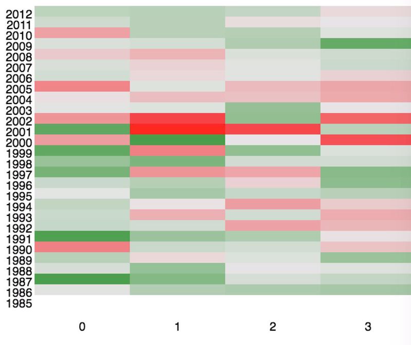
As shown above, in the very beginning, we were trying to use a heat map to represent the volume of events of different brands and time periods. But the truth is that such a heat map is quite massive and confused for people to read. Then we tried to use a tree map to do so. A tree map would be better to represent this kind of visualization since it's more capable to handle the relation ship between multiple variables and the comparison is more clear and significant.
Design framework
Age Segment
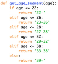
In the first step, we will first transform the age of users into nominal attribute. This would be helpful when we want to get better understanding of our users by age groups.
The graph shown below is a basic
Get Location
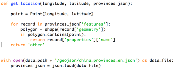
In the second step, we would like to get the geographical information of all events. To achieve this, we’ll try to use a python library named Shapely. Below is a screenshot of how we do this in the source code.
Time Flag
In the third step, we ‘ll try to transform out time attribute into numeric attribute and put them in bags. This would helpful for us to make matrix for each user. Below is a screenshot of the key function of how we made it.
Ratio Matrix
After giving time flag to every event record, we can build user’s behavioral matrix based on this. To do so, for each user, we first count the number of events happened in each different time period. Then we build it as a matrix and normalize it to make the sum of each matrix as one.
Finally, we can get a matrix like this:
In the matrix shown above, the last row is users’ device id and others are the ratio of events happened in different time period.
With such a matrix, we can know our users are mainly using their mobile phone in which time period.
User Clustering
After build the ratio matrix, we can do a clustering for our users to put them into different groups. In this case, we use the K-means function of scikit-learn which is a Python library to achieve this. Basically, we’ve finally get three meaningful clusters, each cluster has different behaviour pattern compare with others. The details of this will be discussed in the insights part.
Demonstration
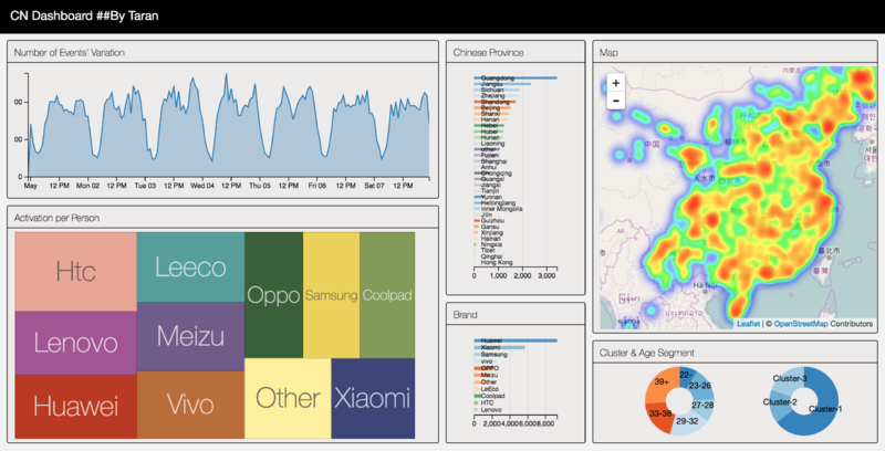
To visualize our data and get better understand of user’s behavior, we’ve built a dashboard to visualize the volume of events with certain conditions. The graph shown below is a screenshot of it.
There are six modules in this dashboard, people can interact with the dashboard to see the volume of events based on customize conditions. In following chapters, we’ll try to explain each part of this dashboard.
Number of Events’ Variation
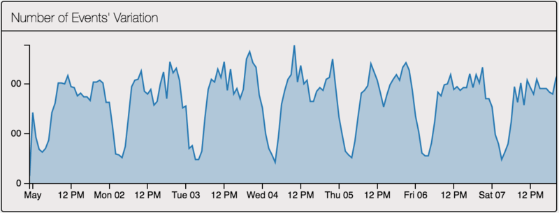
The graph shown below is a screenshot of “Number of Events’ Variation”. This is a line chart based on time and the volume of events.
In this chart, we can see the variation of the volume of events along with time. It’s significantly that there’s a cycle along with time. In generally, people are mainly using their cell phones during 9:00 am to 0:00 am. There some peaks in this time duration. In the time between 0:00 am to 9:00 am, there’re low peaks.
Activation per Person
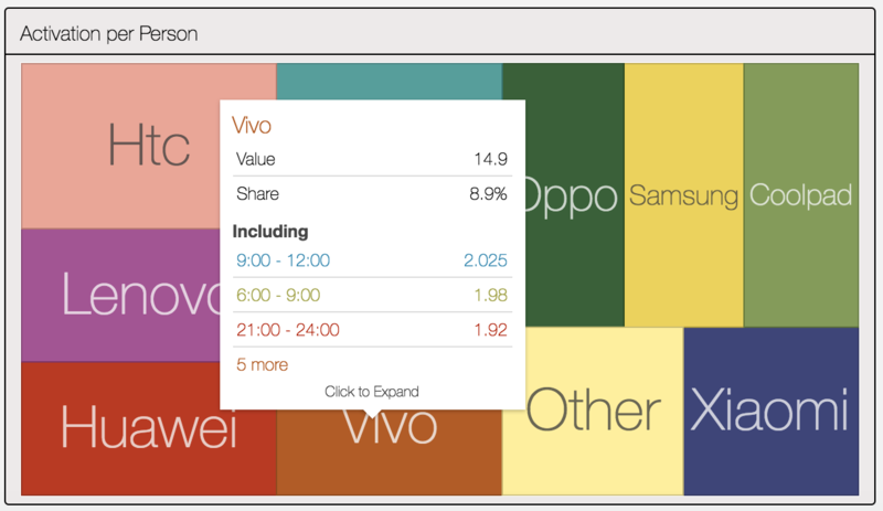
Then we have a tree map for average activation per person. As shown below, it’s a screenshot of the tree map.
This tree map is a zoomable tree map. The first level is brand and the second level is time flag. The size of each square is depended on the number of activation per person. In generally, HTC has the largest value here which is about 20 while others only have around 15. It’s quite a meaningful find since HTC actually is a very unpopular brand in China now. But for other unpopular brands, they don’t have such a value like HTC.
It can infer that HTC’s users more heavily rely on their cell phones although it’s becoming a minority choice.
Chinese Province
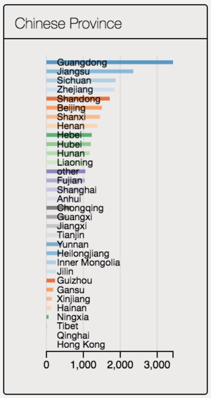
Below is the screenshot of the bar chart of the volume for different provinces.
As a developing country, China’s economy is not balance of different provinces. From the chart we can also find this. The volume of events of Beijing and Shanghai are even higher than some provinces although they are just cities.
In generally, the value of this chart is basically related with the economy status and population of each province / city.
(P.S.: Since the data is collected from a mainland telecom operator, HK’s value is quite low here)
Brand
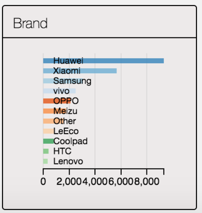
Below is a bar chart for the volume of events of each brand.
In this bar chart, we can see the top 3 brand are: HUAWEI, XIAOMI and SAMSUNG. There’s no iPhone since the data only contains android users (for security consideration, Apple won’t allow companies collect users’ data easily).
Compare with other countries, it’s quite different. In many countries, the most popular android cell phone is Samsung while in China is HUAWEI and SAMSUNG only takes one-fourth of HUAWEI.As we’ve discussed in the tree map, HTC here is actually a quite unpopular brand but with much higher average events on each user.
XIAOMI takes the second place in generally. But in some certain age groups, it’s more popular than HUAWEI.
Map
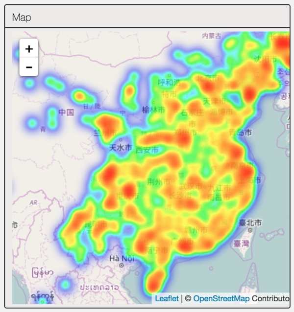
And we’ve built a heat map shown as below:
In this heat map, we can see that most of the events are happened in the south east part of China which has better economy status than other part.
As we’ve discussed before, a province/city with higher population or better economy will have higher volume of events here. If we combine this map with the bar chart of brand, we can find that different part of China has different preference on brands. For example, HUAWEI is the most popular one in Guangdong while XIAOMI is the best in Sichuan. Both provinces have a high volume of events.
Actually, it’s quite valuable for those vendors to choose which brand of cell phone should be sold in which part of China.
Cluster & Age Segment
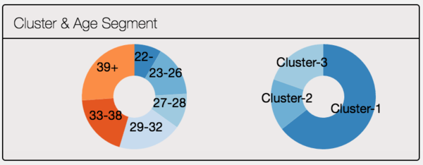
Finally, we’ve two pie charts for different clusters and age groups shown below:
For age segment, the number people who are more than 39 years old have taken the first place while the number of who are less than 23 years old is the lowest one. It seems that, in China, young people especially middle school students are less likely to have or use their own cell phones.
For clusters, we’ve have three clusters here. The sizes of cluster-2 and cluster-3 are almost the same while the rest one cluster takes about 60% of the total. Cluster-2 and cluster-3 mainly contain people who are using cell phones centralized in certain time periods. People in cluster-1 are much more smooth than compare with previous two clusters. More details of these clusters will be introduced in the insights part.
Discussion
- After clustering users by their previous behavior, we can actually get three major clusters. The first one contains people who mainly have events between 9:00 am and 12:00 am and the second one contains people who prefer to use cell phone after 9:00 pm while this cluster have more young people who are less than 29 years old than the rest two clusters. The last cluster contains people who do not have significant peak time among their previous behavior. Basically, they’ll use cell phones among the day between 9:00 am and 12:00 pm
- For different phone brands, more than half of Huawei and Samsung’s users are more than 32 years old, while for Xiaomi, the situation is totally opposite. Xiaomi’s most popular for people who are less than 23 years old. In this group, Xiaomi has an almost same market share compare with Huawei. In other groups, Xiaomi just takes about half number of users of Huawei.
- For a quite unpopular brands such as HTC, its users average using frequency is significantly higher than other brands. An HTC’s user may have about 20 events a day while for other brands this number is commonly around 15. And HTC is usually preferred by young people although the absolute value is not as high as popular brands. We can HTC is now a quite minority choice but its users are usually more active than other brands.
Installation guide
- Download the source code
Download our source code in:
https://www.dropbox.com/s/t75h1ix096ydyl9/VA%20Dashboard.zip?dl=0
After unzip the source code folder, please unzip the “input.zip” file and put it in the root folder (just keep it in the place you unzip it).
- Dependencies
You need Python 2.7.x and 3 Python and libraries: Pandas, Flask and Shapely. You can install Flask and Shapely using pip. In Linux system, you can type in such command to install them:
pip install flask shapely
If you cannot import these libraries after installation, please check about your import library path
User Guide
- How to run the code
- Install all Python dependencies
- Unzip ```input.zip``` and put it in the root folder
- From the root folder, run ```python app.py```
- You can stop the app by “ctrl + C” or “command + C” (Mac OS)
- Customize
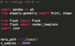
If you want to customize the sample size, please open app.py in the root folder.
As shown above, change the number given to “n_samples” (here, it’s 30000).
Also, you can change the port address used to run the dashboard in the part shown below:
In the last line of “app.py”, you can change the port address by changing the value pass to “port”.
- Interactive with the Dash board
- After installation and running the app.py code, you can get in “localhost:$YOUR PORT ADRESS$” with your browser and play with the dashboard. (You may need to wait for a moment since the data will process for some time)
- After you can see the dashboard, you can have interactive operations with it. Basically, all charts are bonded together by crossfilter.js except the heat map and tree map but we’ve developed some functions to make them change when people click other charts.
- For “Number of Events’ Variation”, “Chines Provinces”, “Brand” and “Cluster & Age Segment”, you can click on them to give certain conditions. When conditions are given, all charts will change due to these conditions.
- For “Activation per Person”, it’s a zoomable tree map which means that click on this chart will not effect on others. In this chart, the first level is brands while you can click on them to see the second level values within each brand.

