ISSS608 2016 17T1 Group5 Report
|
|
|
|
|
Contents
Motivation of the application
For an ecommerce website, tremendous of data from sales log, source traffic, etc. was generated daily. It’s a challenging task for digital marketer to make decision quickly based on the information in hand. The data was stored in various storage such as Google Analytics and SQL databases. Currently, combining and visualizing is a manual work that requires lot of time and efforts. Creating this visualization dashboard would help a digital marketer to be able to see and explore marketing campaign effectively.
Review and critic on past works
Currently the digital marketers in most organizations load and view these data in a consolidated master Microsoft Excel worksheet. Marketing analysts, managers, and executives in organizations use this Excel spreadsheet in which they table up the data separately and in their periodic reports which must be done manually. Building dashboard is also possible in Excel but tools like Tableau, R have proved superior for visualizing data, creating interactive dashboards, managing larger data, and supporting real-time data discovery.
Data
The dataset used in this project is real sales dataset from e-commerce website SQL databases. However, due to confidentiality, we blinded the data and use the exported csv file instead of the original connection. The dataset consists of information about the source, medium, campaign, orders, revenue, and status.
Source, medium, campaign is the UTM parameters which is collected by the databases on how the traffic source is from[1] . Utilizing UTM parameters, channel of traffic could be obtained such as Facebook Ads, Google Ads, etc. Moreover, medium or campaign parameters often reflect which brand the product belongs to. Using this information, channel of traffic, product brand and product category could be obtained.
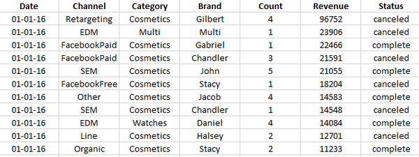
In order to better visualize the data, similar data was created for the missing months and data to be used is from April to December 2016 and did not take the status into consideration. This is only part of the data available to e-commerce marketers but this project is conducted as ‘proof-of-concept’ that R and Tableau could also be used to create dashboards effectively. Both platforms also allow SQL databases connection.
Design framework
Dashboard Design Framework
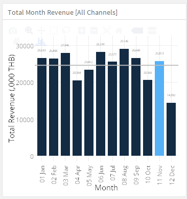
The principle of visual analytics - “Overview first, Zoom and Filter; then details-on-demand”[2] was used in the dashboard design. The overview graph comparing the month’s performance with other months in the year were given in the upper left corner. Zoom and tooltips are also introduced by using ‘ggplotly’ interface. Users can zoom and select the data using the interactive tools.
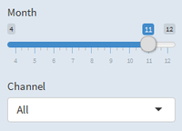
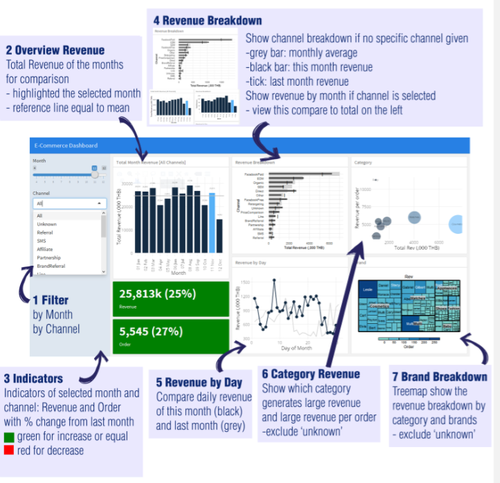
Filtering was also introduced in the dashboard by filtering by month (the current month) or the month we would like investigate. Also, there is the option to filter the performance by channel such as SEM or FacebookPaid.
Color
From the color design principle, using common hues could help signify the sequence of data[3] as well as being not too make unnecessary use of different colors. The sequential hues in blue was chosen as blue is soft for the eyes and has clear distinction with grey background as well as matched with the default Shiny / flexdashboard theme.
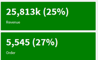
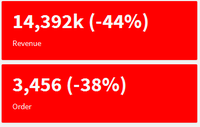
However, for the indicator boxes – showing this month revenue and orders as well as % change from last month, red and green colors were used. Green color typically signifies increase which we would use green color for increase or equal performance. On the other hand, if the performances worsen, red color was used here to get more attention and signify warnings.
Graphic Visualization
Overview
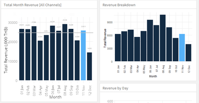
The overview chart of monthly revenue was drawn using bar charts with dark blue color. The selected month will be highlighted in light blue. Moreover, the reference line of monthly average in grey was added. The data was shown as ‘thousands’ instead of 1 baht unit to avoid unnecessary zeroes.
Although line graph is also suitable for this data, as we only view the limited timeline of 12 months, bar chart could show the data clearer and the categories (months) are not too much for bar charts.
Since the graph is overview chart, it would not be effected by ‘channel’ filter since we would like to fix this as reference when investigating other sources.
Revenue and Order
The revenue and order were shown for selected month and channel in the box with large font size to emphasize the numbers. Also, % change from previous month is shown in the bracket and reflected in box colors.
Revenue Breakdown by Channel / Revenue Breakdown by Day
With ‘All’ channel selected, a bullet chart of overall revenue breakdown is shown. The grey area shown average revenue for that channel in each month. The black dash show the performance of specific channel in previous month as a KPI to hit for current month. Lastly, the dark grey bar chart show the revenue of selected channel. For example, in the sample below, FacebookPaid performance was lower than the average but higher than previous month.
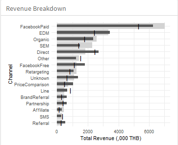
The bullet chart format was chosen for the graph as it could help measure the month performance with last month and average performance.
After viewing the overview, the drill down of channel is given by selecting specific channels. Viewing this bar chart in comparison with the overview on the left, the performance can be easily compared.
Revenue Breakdown by Day
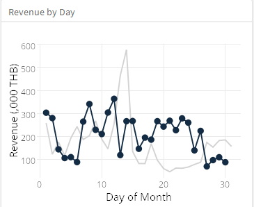
The revenue breakdown by day is also shown in line graph. With last month’s performance as light grey for reference, comparison could be easier seen and dark blue highlight of this month’s revenue. Line graph was chosen as it could show movement during the month.
Category and Brand
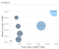
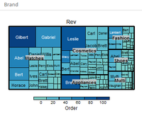
Sales by category is shown in bubble chart where the size of bubble is total number of orders, x-axis is total revenue, and y-axis is how large average order is. For example, watches category has high revenue and large order as well as higher average order revenue. On the treemap, the brand breakdown by categories is shown.
Investigating both charts, best-seller category brand and products could be seen. This is useful in planning the strategy and product mix whether the sales is dominated by one category or not as well as which category could generate high revenue.
Demonstration
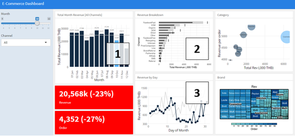
For example, the team would like to investigate the sales report in October. First, the month filter is selected to ‘10’ for October.
Firstly, looking at the overview (1), lower revenue for the month could be observed. The month revenue was lower than the previous month and monthly averages. Moreover, the boxes were red showing the decrease in revenue and orders which were more than 20% dropped. Then, checking at the revenue breakdown (2), most channels faced performance drop except ‘Direct’ and ‘Line’. This might due to lower spending – more investigation is needed here. Moreover, from the daily revenue (3), the revenue from 15th to 26th was significantly lower than the same period in previous month. This raised the question whether there was something wrong with the website or lower ads spending during the period.
Discussion
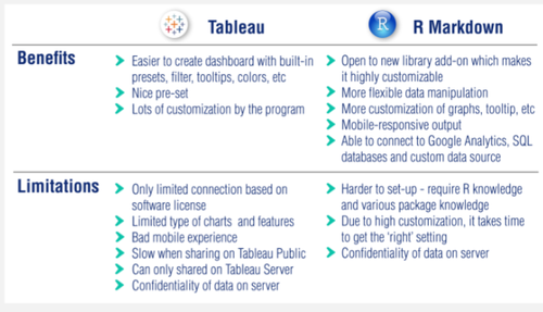
Using visualization software such as Tableau will help us interactively analyze the data with the visualization. Moreover, Tableau also have the data connection where it could connect to various data sources such as SQL databases. With Tableau user-friendly interface, a dashboard could be created effortlessly.
Seeking more customization than what Tableau can provide from data import, data manipulation, or data visualization, enthusiasts could also use R Markdown to create the interactive dashboard with the help of the following packages: rmarkdown, shiny, flexdashboard, ggplot2, plotly, treemap. There are several packages in R to choose from when creating this dashboard which allows high customization level. Although the platform itself requires coding, it is a good start for those who want to try out data visualization programming. The interactive part of graph which is done by ‘plotly’ transformed simple R codes into JavaScript which learning curve is much steeper.
When choosing between both platforms, users should look at their requirements of their dashboard and use the one that is most suitable for the project. Both approaches have its advantages and disadvantages which are summarized below:
Future Work
1 Data integration with various sources
With various libraries available in R, using API to integrate with current platforms such as Google Analytics, Google AdWords, Facebook Ads Management, Sales SQL Databases, etc. is possible. This means that marketers no longer have to fetch the data one by one but can fetch it and combined it within R using the libraries.
2 Real-time Data
Also, with the integration of above APIs, this dashboard could be utilized to fetch the latest data when going live.
3 Dashboard Function
In terms of functions, possible improvements include adding more type of graph to reflect more metrics with different data sources and more flexible filtering such as customizable date ranges, brand filtering which can be done through R.
4 Report Generation
With the needs of reporting, the application would be more useful if the graphs and dataset are downloadable for management report. Moreover, with the ability to download filtered data, in-depth analysis which might not be present in the dashboard design could be discovered.
Installation guide
Both Tableau and R Markdown application could be accessed online via the link or QR codes below.
R Markdown
R Application: https://goo.gl/b42hOS The application could be accessed online via mobile or laptops from the link above. The recommended browser is Google Chrome for both desktop and mobile version. Despite the convenience of viewing the data on mobile, its performances might be slower than desktop.
Tableau
Tableau Application: https://goo.gl/fH4qiz
As mentioned earlier, Tableau is not mobile responsive if the design was created using desktop size. Therefore, the recommended device is laptop computer. Google Chrome is the recommended browser.
User Guide
The explanation of function is shown in the picture below:
Reference
[1] https://ga-dev-tools.appspot.com/campaign-url-builder/
[2] Visual Information-Seeking Mantra [Shneiderman,1996]
[3] http://www.perceptualedge.com/articles/b-eye/choosing_colors.pdf

