ISSS608 2016 17T1 Group10 Report
Where there is life, there is hope. Grover 1969
|
|
|
|
|
REPORT
Please find attached our research report
File:Report-Kronos (Group SENSEXimi).pdf
USER GUIDE
This user guide serves to demonstrate the different functionalities of the SenseXimi application, using the data from the VAST Challenge 2016 Mini Challenge 2 (http://vacommunity.org/2016+VAST+Challenge%3A+MC2).
- Setting the scene
The challenge involves an analysis of two-week static data of GAStech operations from two groups of sensor data - building sensor readings and prox-card movement readings throughout the building. The deliverables include identifying routine and/or anomalous behaviour, event or pattern from the data.
- Interface
SenseXimi follows the general guidelines given by Shneiderman’s mantra: overview first, zoom and filter, then details-on-demand.
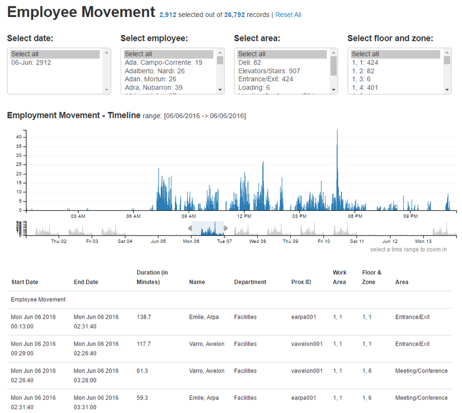
The Employee Movement home screen provides a coordinated view of employee movements throughout the Building and across time as captured from the 'prox card' sensors. The dataset is 3.5MB, so it might take a few seconds to download.
The Employee Movement home screen has 3 main sections:
1. Employee movement timeline
The Employee movement timeline which takes majority of the screen space, is a time-series bar chart showing the employee movement across the whole range of dates and times in the data. The height of the bars represent the number of individual movement picked up by the fixed sensor network as an individual move from one sensor zone to another. The purpose of this chart is to allow users to have an overview of the employee movement for a particular day and/or time and identify routine and/or anomalous movements, before seeking to find a reason for such phenomenon.
The “range chart” - the smaller window below the main chart, allows users to specify a range of date/time to zoom in and view the number of movements spread over a specific time interval. Users would then be able to visualise a zoomed / more granular version of the employee movement at the hour and minute interval in the main chart. Once a rectangular time period is defined, the built-in brush functionality allows users to move that time period across the range chart and thus dynamically change the selected subset. Selecting a specific time period in the "range chart" panel highlights corresponding data points in the bar chart as well as the filter bar (more on the filter bar in the next section) and vice versa. Furthermore, users have the capability to zoom out at any time and select a different temporal category to focus on.
2. Filter bar
Filter bar - at the top of the time-series bar chart, provides users with a rich set of filters to narrow down the dataset. Users can filter the data to focus on a reduced set of movements by selecting one or more filters to filter by the associated dimension. For instance, users can filter a specific or multiple date(s), employee name(s), area(s) and/or floor and zone(s).
The number next to the respective filters represents the total number of individual movement picked up by the fixed sensor network on a specific date, for a specified employee, at a specified area (note: zones were classified by their dominant function e.g. office space, meeting/conference, server room, Deli etc.) and/or a specific floor and zone (the lowest spatial resolution for analysis since the sensor network itself is largely at fixed spatial locations). As users eliminate data, our SenseXimi application keeps all visualizations synchronized.
3. Dynamic data table
Dynamic data table - the detailed panel at the bottom of the screen, shows the top 20 movement data in the dataset that match the current filters; these are the details-on-demand, anecdotal evidence you can use to weigh different hypotheses. The data table provides users the ability to contextualise the data points and allow users to view the detailed movement pattern to identify routine and/or anomalous behaviour, event or pattern from the data.
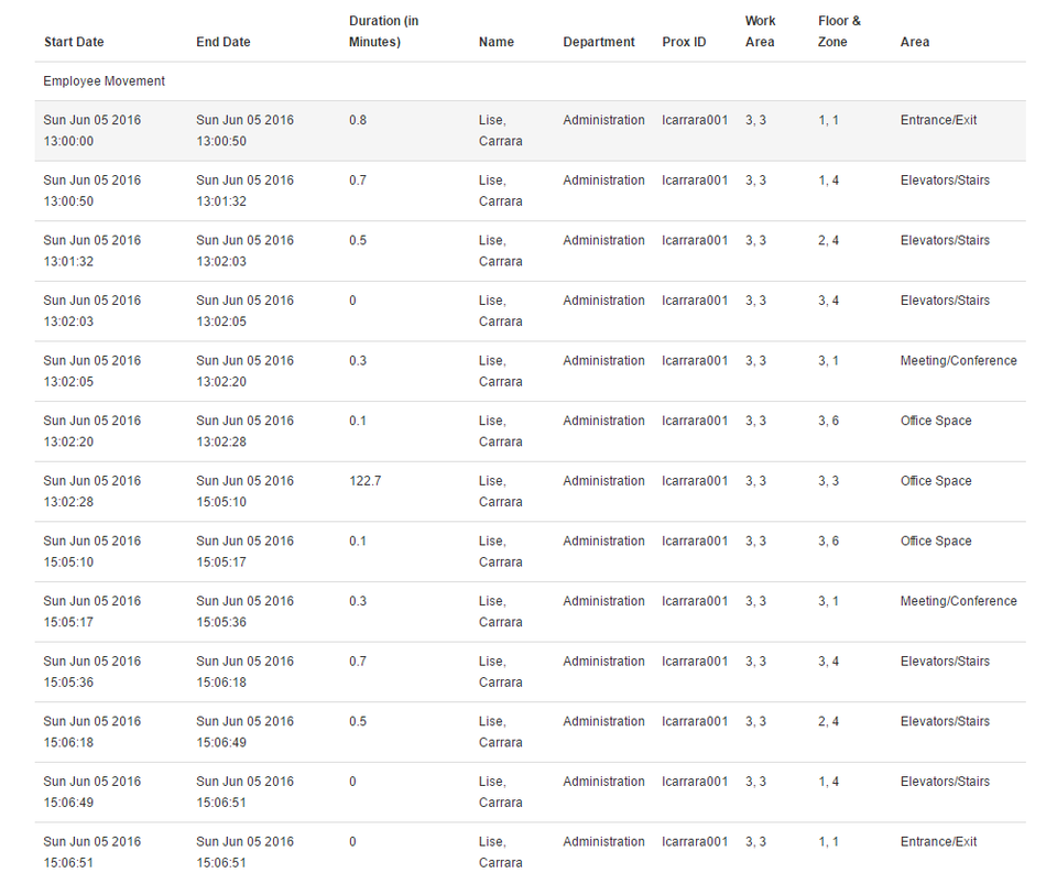
Consider the example below, where users were able to view the detailed movement of Lise, Carrara (with Prox ID “Icarrara001”) from the Administration department on Sunday, 05 June 2016. In this example, Lise came in to office on a weekend – an “unusual” pattern. Lise came in through the Entrance/Exit (located at Floor 1, Zone 1) at 13:00:00, walked and took the elevator at Floor 1, Zone 4 to go to her office / work area located in Zone 3 on the 3rd Floor and worked at her cubicle (note that the sensor network itself is largely at fixed spatial locations and so movement can only be inferred as sensor readings are combined to identify transitions from one sensor zone to another. This not only requires an additional data processing stage but also introduces a degree of spatial and temporal uncertainty in inferred patterns as potentially important behaviour within zones or for short periods of time may remain undetected) for about 2 hours before heading out of the office using the same route at 14:06:51.
There is a "Reset All" button at the top of the screen to allow users to reset the filters. Clicking on "Reset All" will revert the visualisation back to its original state, with all the records selected.
Some of the questions we aimed to solve through the data visualization are:
- What is the typical pattern for employees going to the Deli area? When is the peak hour for the Deli?
- How do movement patterns differ between weekends and weekdays, or mornings and nights?
- Who entered the Server Room? How many times did the employee visit the Server Room over the two-week period? When and for how long / duration was the person there?
- How does the daily pattern for an employee e.g. Patrick Young look like?
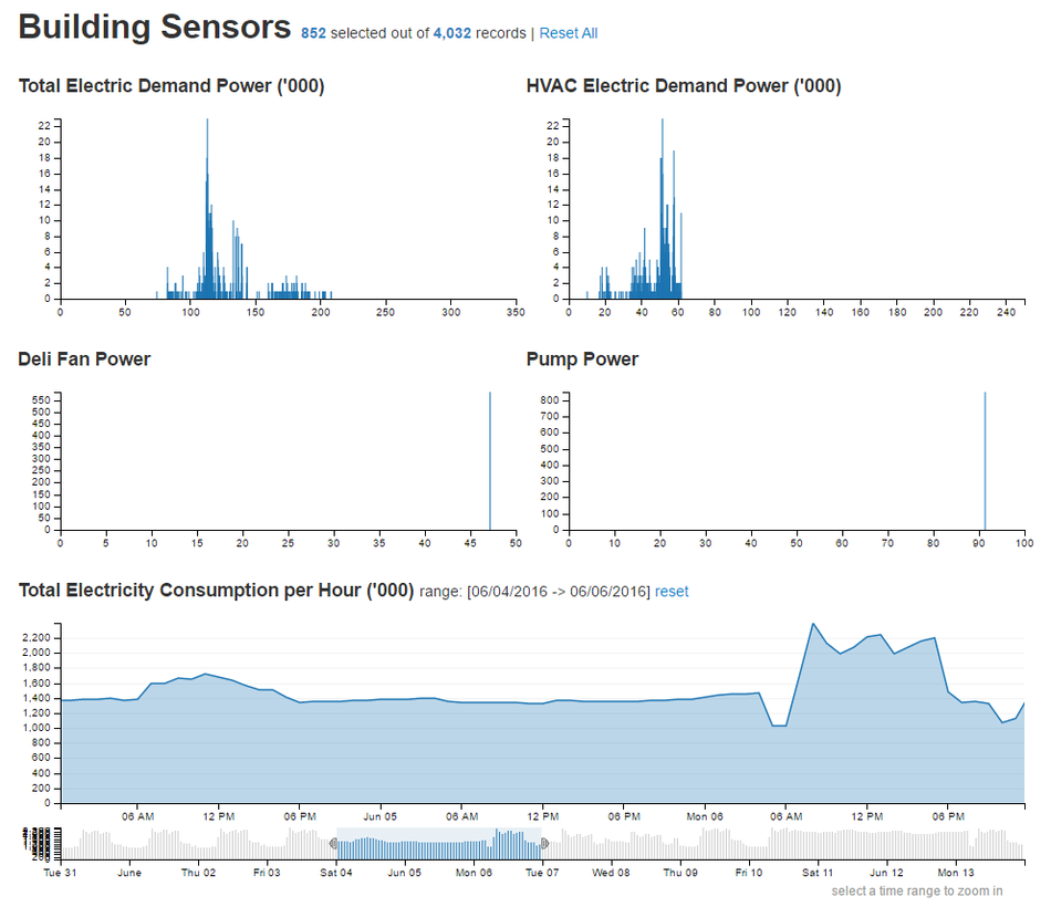
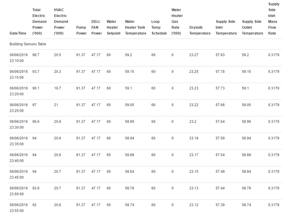
The same design framework and interface layout supports the display of HVAC sensor readings.


