ISSS608 2016 17T1 Group10 Application
Jump to navigation
Jump to search
Where there is life, there is hope. Grover 1969
|
|
|
|
|
Type of applications
We have used the following to design different applications:
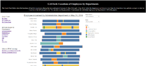
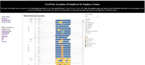
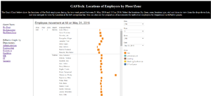
- Tableau - being our first-love and the application which we are most comfortable with. Furthermore, with Tableau, we are able to plot the layout of GasTech locations to visualise the changes in readings and movements over time. We are also able to create sparklines in Tableau, using online guide at http://www.vizwiz.com/2015/09/kpisandsparklines.html. However Tableau has its limitations in web publishing. The published version lacks certain features like Pages Playback, and is extremely slow in refreshing of pages during filtering. We had also tried inserting the Tableau embed code into a html page, but there were no significant improvements in performance. Nevertheless, the worksheets and dashboards which we had created in Tableau were still useful in analysing the data to address the questions posed in this challenge.
- Excel - we have explored creating dashboards using Excel for publishing onto the web. However the page faced the same problem as Tableau - not smooth in refreshing.
- R Studio - there are many tutorials on how to build a dashboard using R Studio, with R package Shiny, and apparently it is quite straight-forward. This would have been our preferred method, however due to time constraints, we were not able to pick up the skills in time for Poster Day.
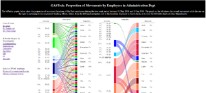
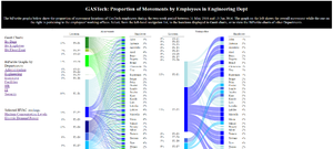
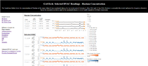
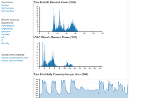
- D3.JS - Using online reusable scripts, we experimented with various visualisations to test if they work, and how to transform our data to fit into them. The following visualisations were created using D3.JS:
- BiPartite Graph
- Gantt Charts
- Zoomable Area Charts

