ISSS608 2016-17 T1 Assign3 Lim Hui Ting Jaclyn - Data Organisation
| Main Page |
Data Organisation
Choice of Layout
After creating the various nodes and edges CSV files, I had to load them into Gephi for network data visualisation. In this segment, I will describe the procedures I took to select the type of network visualisation that I eventually conducted the rest of my analysis with. In gephi, there are many layouts available for one to organise the network data.
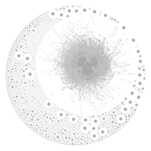
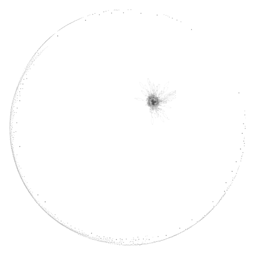
As I wanted to focus on highlighting complementary nodes, layouts like Force Atlas 2, Fruchterman Reingold and Yifan Hu were advisable. Hence, I tried out the three different layouts.
After plotting these graphs, I decided to compare the three different network layouts. This can be seen in the table below.
|
Force Atlas 2 |
Fruchterman Reingold |
Yifan Hu |
|
|
|
After comparing the three options, I decided to use Force Atlas 2 for the rest of my analysis. This was because the results were achieved quickly and accurately with the large communication dataset.
Visualising Dynamic Timeline
In order to visualise network data changes over time, I decided to use the dynamic timeline function on Gephi.
The steps taken in order to create a dynamic timeline were as follows:
- Load the node and edges csv files into Gephi
- Toggle the option "Merge Column" and select "Timestamp" and the option "Create Time Interval"
- For the options start time and end time, select "Timestamp". This was because the communication data varied in seconds.
- Select Parse Date. Under the option, select the format similar to the Timestamp column, in this case, it was dd/mm/yyyy hh:mm. In the following 2 columns, select the day 2014-06-08.
- After the previous step, the "Interval" column of the edges file would be filled with interval data.
- Create Timeline
- Edit the bounds of the timeline, to ensure that it captures the start and the end time of the interval data correctly.
After the following steps were taken, a dynamic timeline would have been created. As such, I used the dynamic timeline function to observe the changes in communication data before and after the crime occurred on Sunday. This allows me to understand the changes in patterns of communication data better.


