ISSS608 2016-17 T1 Assign2 Parikshit Ravindra MAYEE
Contents
Abstract
Surveys are generally conducted to understand and uncover answers to questions which can help improve services. Survey results, with proper analysis, can help in decision making. In this assignment, I analysed the survey results of faculty members from two Spanish universities on teaching uses of Wikipedia. My visual analysis of for this survey has been posted to Tableau public.
Theme
My theme for this assignment is to visualize the sentiments about Wikipedia as a teaching resource.
Questions
With this assignment I have tries to analysis and answer following questions about the survey results.
1. Who are my survey respondents?
1.1. Which universities did the respondents belong to?
1.2. What’s the demographic profile of my respondents?
1.3. Have the participants used Wikipedia or are they new to the concept?
2. What is the overall sentiment of my respondents for each question?
3. Does the sentiment change with change in demographics and other factors?
3.1. How does the sentiment vary with the change in participant’s age, experience, education, position, gender, etc.
3.2. Is there any difference in the sentiment for universities? Does it change if the participants have PhD?
The Visual analysis posted in Tableau public is interactive and helps to answer more questions than listed below.
Dataset
Following Dataset was used from for analysis : wiki4HE Data Set
Data Preparation & Analysis
SAS JMP pro was used for initial data analysis and cleaning. Listed below are some of the important observations and corresponding actions taken for cleaning data.
Domain: Recoded data points with values “1” to “5” as per the Attribute Information. Data points with value “6” were recoded to “Others”. Missing values(?) were recoded to “No Response”.
Gender, PhD, University: Response recoded to words as per attribute Information. No missing values.
UOC_Position: Response recoded to position title as per attribute Information. For all records of Respondents from UPF, corresponding UOC position missing values changed to “N/A”. After this change, no missing values.
USERWIKI: Response recoded to Yes/No as per attribute information. Missing values were recoded to “No Response”.
OTHER & OTHER_POSITION: Details of the column names "OTHER" and "OTHER_POSITION” in the dataset doesn't match with the attribute details provided in attribute Information. It is possible that the description has been interchanged. Also, the name of column doesn’t match with attribute details for: ‘OTHERSTATUS’.
To avoid confusion and ease of further analysis I decided to update & redefine column names as follows in dataset:
OTHERSTATUS column name in dataset renamed to OTHER_POSITION_Title. This will represent the attribute ‘OTHER_POSITION’ (work as part-time in another university and UPF members): 1=Professor; 2=Associate; 3=Assistant; 4=Lecturer; 5=Instructor; 6=Adjunct (main job in another university for part-time members): 1=Yes; 2=No
OTHER_POSITION column name in dataset was left unchanged. This will represent the attribute ‘OTHER’ (main job in another university for part-time members): 1=Yes; 2=No
Rationale to handle and recode data points for OTHER_POSITION & OTHER_POSITION_Title :
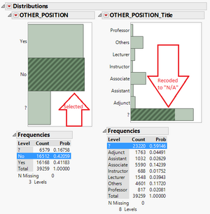
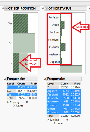
OTHER_POSITION_Title will be applicable only when the survey respondent has a job in other university. So, if the respondent has provided an answer for OTHER_POSITION_Title and if the corresponding OTHER_POSITION value is missing then the missing value for OTHER_POSITION is marked as “Yes”.
Now, If the OTHER_POSITION is marked as “No” then the corresponding missing value for OTHER_POSITION_Title was recoded to “N/A”.
Now, for columns OTHER_POSITION & OTHER_POSITION_Title, all remaining missing values were recoded to “No Response”.
Missing Values (?) for 5-Point Likert scale Questions: I checked for records with no response (?) for questions. No record was found where all questions were left unanswered. So all respondents has answered at least some part of survey and hence the records cannot be excluded from analysis.
I decided to replace all missing values (?) for questions with score of “3” which represents neutral sentiment on the 5-point Likert scale for a given question.
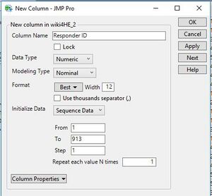
Responder ID: I added a new column in dataset to represent unique responded, since there was no unique identified for the same.
Stacking:
Using the stack function in SAS JMP pro I stacked the Columns with Survey questions and corresponding answers. With this transformation, I was able to consolidate all Questions in one column and corresponding response in another column.
Master Table for questions:
For ease of analysis I created a separate table with list of unique questions & corresponding question category. I also added the full description of the questions in one column and a short description of the corresponding question in another column. I plan to use the short description to display on Screen and will use the full description as Label.
Join: Using Table Join function in SAS JMP Pro, I joined the original datase (stacked) with the master tables for question. With this I was able to extract all required Question descriptions ( Short & Long) and Question categories into my main dataset.
Visual Analysis in Tableau: After completing the basic analysis and data cleaning I exported the final data set from SAS JMP pro as a .CSV file. This .csv file was used an input to Tableau.
Sentiment : Sentiment of the respondents can be analysed by the direct number of responses received for any given Likert scale value.
5-point Likert scale considered in this analysis is described below:
1 : Strongly Disagree >> Shows high Negative sentiment
2 : Disagree >> Shows Negative sentiment
3 : Neutral >> Shows Neutral sentiment
4 : Strongly Agree >> Shows Positive sentiment
5 : Strongly Agree >> Shows high Positive sentiment
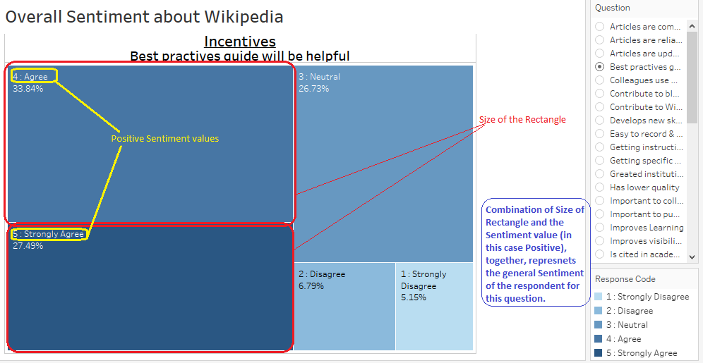
I used TreeMaps to visualize the sentiment for each of the question. In this case the size of the rectangle sections in Treemap represents the sentiment of the respondents for the specific question. However, using this It is difficult to quantify the general sentiment using this visualization. The combination of the size of the rectangle representing a Likert value ( Agree/Disagree/Neutral, etc) and the values themselves ( Positives, Negatives), together, will give the general sentiment for the specific question.
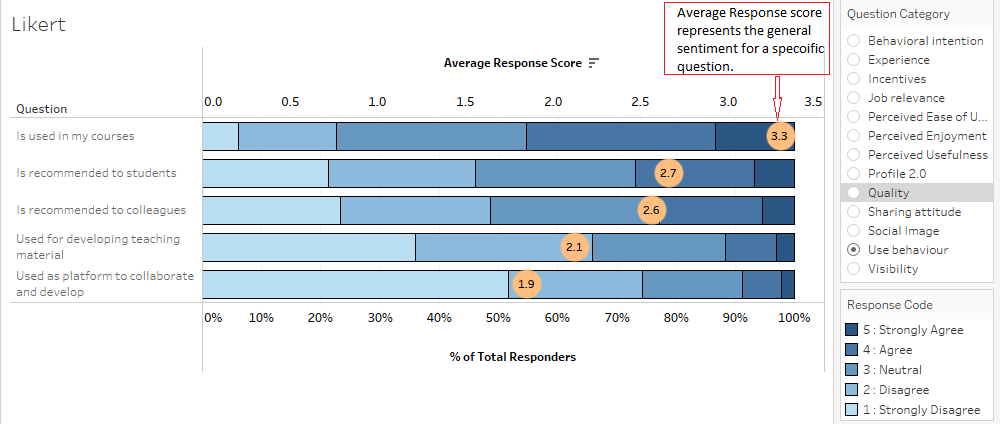
In addition to the total number for responses for a Likert scale value, I also considered the average response score for any given question. This is incorporated in the stacked bar chart plotted in the Broken Down Sentiment tab of my dashboard published in Tableau public.
The Likert scale response of 1 to 5 is used as the corresponding weightage of sentiment. So the average score of the response represents the general sentiment of the respondents for that specific question.
Iteration 2:
As part of improvement to original analysis, I have included following new changes:
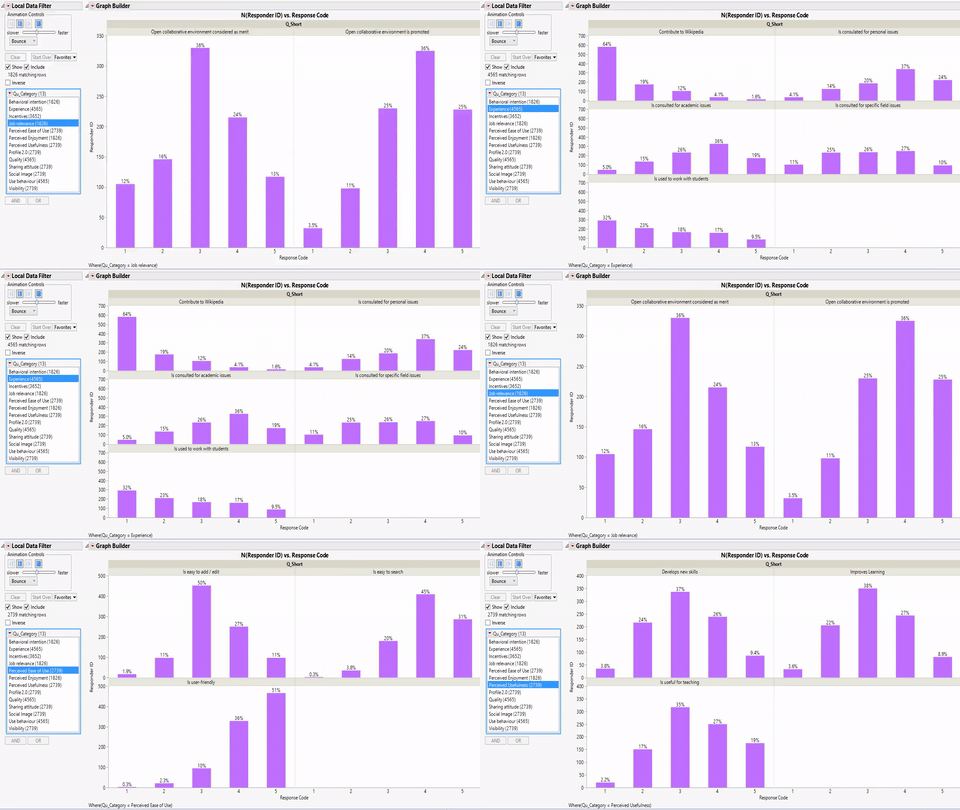
1) Included Trellis Plot visualization generated through SAS JMP Pro. One of the important reasons of using SAS JMP pro for this visualization was the 'wrap' feature available in JMP graph builder. This 'wrap' feature helps to customize the view such that multiple sub plots are displayed in multiple rows & columns. This is one advantage that SAS JMP has over Tableau Trellis visualization.
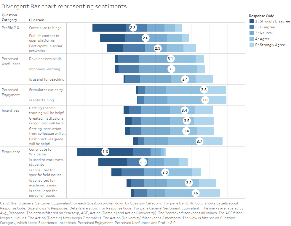
2) I improved the stacked bar chart visualization by converting it to divergent bar chart. (Reference section updated with the details of material used to create this visualization)
3) Added 'Navigation Help' in the Tableau Public dashboard to help users understand how to navigate & use the interactive dashboard.
Tools Utilized
1. SAS JMP Pro : Used for initial data analysis and data cleaning. Also used for creating Trellis plot visualization in Iteration 2.
2. Tableau : Used for exploratory data analysis and to generate visual representations.
3. Tableau Public : Visual dashboard was published to Tableau Public and the web url is shared above.
Results
Results for my visual analysis are available on Tableau Public: Sentiment analysis about Wikipedia as teaching resource (Updated)
The dashboard published above is interactive and can be used to explore the sentiments expressed through survey about Wikipedia as teaching resource. 1. Respondents tab from the published dashboard helps to answer my first question Who are my survey respondents? 2. Broken Down Sentiments tab helps to answer question about the changes in Sentiments with respect to varying factors. 3. Overall Sentiment tab helps to answer about the overall sentiments expressed through the survey for each of the question.
Citation & References
1. Meseguer, A., Aibar, E., Lladós, J., Minguillón, J., Lerga, M. (2015). “Factors that influence the teaching use of Wikipedia in Higher Educationâ€. JASIST, Journal of the Association for Information Science and Technology. ISSN: 2330-1635. doi: 10.1002/asi.23488.
2. http://www.datarevelations.com/visualizing-survey-data
3. https://community.jmp.com/community/academic
4. https://community.tableau.com/
5. http://www.datarevelations.com/likert-scales-the-final-word.html
6. https://wiki.smu.edu.sg/1617t1ISSS608g1/ISSS608_2016-17_T1_Assign2_PRASONGTHANAKIT_Kanokkorn
