ISSS608 2016-17 T1 Assign2 PRASONGTHANAKIT Kanokkorn
WIKI4HE DATA VISUALIZATION
Contents
Abstract
In this study, we would like to explore the use of Wikipedia in teaching and learning activities from professors in 2 Spanish universities. Tableau Public was used to create the visualization which could be accessed at Tableau Public Workbook. The following conclusions could be made using the visualization:
- It's uncommon among professors in these two universities to use Wikipedia to develop teaching materials or educational activities
- While UPF professors tend to use more Wikipedia to develop teaching materials, UOC professors were slightly more likely to develop educational activities with Wikipedia.
- Wikipedia registered users tend to use Wikipedia more in educational activities and has more intention to use Wikipedia in teaching activities in the future.
- Engineering & Architecture as well as Sciences were more open towards Wikipedia, unlike Law and Politics
- The intention to use Wikipedia for teaching activities is higher than current usage. This might result from indicating ‘intention’ or actual higher trend of using.
- To promote Wikipedia among professors as teaching platform, the first priority for Wikipedia is a best practice guide followed by getting greater institutional recognition (by promoting its up-to-date information and reliability).
Data Source
Wiki4HE Data Set was selected for the assignment. The data set was retrieved from UCI Machine Learning Repository at https://archive.ics.uci.edu/ml/datasets/wiki4HE.
Research Objectives
Theme of Interest
We would like to understand the use of Wikipedia in teaching and learning activities. The theme of interest would focus on the current usage and future intention of Wikipedia usage.
Questions for Investigation
In the beginning, we’d start with investigating these three main questions: 1. What’s the current usage of Wikipedia in teaching activities? 2. What’s the future intention towards using Wikipedia in teaching activities in the future? 3. What would be helpful to encourage Wikipedia usage in educational activities?
Tool & Techniques used
Tool:
- Tableau Public
Techniques
- Divergent Bar Chart
Rationale
To visualize the data, we’ve compared several options and feasibility to visualize so-called ‘Likert Scale’ or ‘5-point-scale’.
- Firstly, we’ve to identify the data type. ‘Likert Scale’ is Ordinal data – not interval since we could not tell the differences (distance) between ‘5’ and ‘4’ at it is quite subjective to the respondents.
- Secondly, we’ll eliminate those not suitable for high dimension categorical data especially in this case where we’ve more than 20 dimensions. Those eliminated are per below:
- Tree map – Not much use if we’ve more than 5 categorical data. More suitable for hierarchical data where importance of variables could be ranked.
- Ternary Diagram – Only suitable for 3 numerical variables
- Parallel Set – Would be hard to explore after 5 or 6 variables
- Now with the choices left, we’ll evaluate and choose the best fit with the dataset
- Parallel Coordinates – Although it’s perfect for high dimensional data. It’s not much useful for categorical data and could not show proportion
- Mosaic Plot – Could perfectly display the relationship between 2 categorical variables but the limitation of only 2 dimensions, it’s not suitable for this task.
- Trellis Chart – It’s a very good choice but harder for comparison between group such as Gender
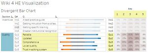
- Divergent Bar Chart – It could illustrate the proportion of the answers in each scale and show the positive / negative opinion clearly. Also, comparting between sub-group could be illustrated by putting two divergent bar chart together.
Data Preparation
Before proceeding to our analysis or creating visualization, we should check our data. After investigating data in excel, the following was edited in the data:
- Mismatch column name
- OTHER_POSITION (was explained in the UCI repository as OTHER) = Main job in another university for part-time members (Yes / No)
- OTHERSTATUS (was explained in the UCI repository as OTHER_POSITION = Work as part-time in another university and UPF members (Position)
The header mismatch was noted in explanation but not changed in the dataset
- Create new ‘Position’ Field
- University position currently comes from UOC Position and Other Status.
- In order to better analyze data, the fields combined and will only show the higher position by using ‘max(UOC Position, Other Status)’ to obtained the highest position the professor achieved (either in UOC or UPF)
- Add ID field
- Create explanation sheet for question and answer code definition
- ‘qexp’ sheet is for question meaning
- section of question and short label were added
- meaning sheet is for answer meaning
- Add coded meaning for profile section
- The value codes were replaced with actual value in the profile section. For example, code 0 in gender were replaced by ‘Male’.
- Recode for Qu4
- Since all questions except Qu4 has positive answers coded as ‘5’/’4’ and negative answers coded as ‘1’/’2’. We would like to inverse the scale for Qu4 for better interpretation
- Missing values
- There were some missing values in many columns.
- For the survey questions, these missing value were recoded from ‘?’ to blank.
- For respondents’ profile section, we’ve replaced the missing value per below:
- Domain: missing values were coded as ‘Unknown’
- Yearexp: missing values were coded as ‘0’
- UOC_Position: missing values are from those not in UOC. Therefore, coded as ‘N/A’
- Other: only UOC professors are asked whether they’re working in other university. If the missing value is from UOC, it’ll be coded as ‘Unknown’. If the missing value is from UPF, it’ll be coded as ‘N/A’
- Other_Position: This question either applicable to UPF professors or UOC professors which has other position. These group will have ‘Unknown’ for missing values. However, for UOC professors who did not have other position, the missing values were coded as ‘N/A’
- Userwiki: missing values were coded as ‘Unknown’
Creating Divergent Bar Chart in Tableau
The trick to create divergent bar chart in Tableau is to create a Gantt Chart by calculating the location. 1. Import the data and Pivot to have the data format as ID / Profile (Gender, Age, etc.) / Question / Answer and change the Answer column to “String”. Also, joining question to be the question label and section as well as answer meaning for each coded were done. 2. Create some calculated fields for location and start of Gantt Chart
Percentage will be used as the width of Gantt Bar
- Total Count = Total(Sum([Number of Records])) *Calculated on Answers
- Percentage = Sum([Number of Records])/[Total Count]
Gantt Percent will be used as location of the Gantt Bar
- Count Gantt
= IF [Ans] = '1' THEN 1
ELSEIF [Ans] = '2' THEN 1
ELSEIF [Ans] = '3' THEN 0.5
ELSEIF [Ans] = '4' THEN 0
ELSEIF [Ans] = '5' THEN 0
END
- Total Count Gantt = Total(Sum([Count Gantt]) [Calculated on Ans]
- Gantt Start = -[Total Count Gantt]/[Total Count]
- Gantt Percent = Previous_Value([Gantt Start])+ZN(Lookup([Percentage],-1)) [Calculated on Ans]
Then, Grantt Percent were added as column and questions as row with answers as color to Gantt Bar. Also, to show the percent positive, we’ve to calculate using similar fomula
- Count Positive
= IF [Ans] = '1' THEN 0
ELSEIF [Ans] = '2' THEN 0
ELSEIF [Ans] = '3' THEN 0
ELSEIF [Ans] = '4' THEN 1
ELSEIF [Ans] = '5' THEN 1
END
- Total Count Positive = Total(Sum([Count Positive]) [Calculated on Ans]
- Percent Positive = -[Total Count Positive]/[Total Count]
The Interactive Result
- The color used was limited to only ‘Color Blind’ theme in order to maximize compatibility with uses as well as not to ‘fancy’
- The respondent’s profile was included since it’s crucial to investigate respondent’s profile to evaluate the credibility of survey and decide which subgroup analysis is suitable
- Gender: Included in the respondents’ profile section but not in the filters or detailed section since it’s not meaningful for the use behavior
- University: Included both in respondents’ profile and filter. The user should be aware than the portion of UOC professors are significantly higher than UPF professors
- PhD : Included both in respondent’s profile and filter as this factor might be meaningful when analyzing the result
- Userwiki: Included both in respondent’s profile and filter as this factor might be meaningful when analyzing the result
- Domain: Included both in respondent’s profile and filter as this factor might be meaningful when analyzing the result
- Position: The higher position from UOC or UPF were shown. Since majority of professors surveyed are Adjunct, it is included only in respondents’ profile.
- For divergent bar chart, the following elements were included
- Color: Red-orange to convey negative meaning and Blue-light blue to convey positive meaning
- Percentage of Positive: for user to get the overview of the answer with one single glance – the blue color were used for the percentage to be in-line with the overall color
- Full question and meaning when mouse over: for user to get ‘detail on demand’
.
Results
Respondent’s Profile
Majority of respondents were from UOC with only small portion comes from UPF. Also, most of the professors surveyed at UOC are adjunct professors.
1. What’s the current usage of Wikipedia in teaching activities?
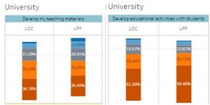
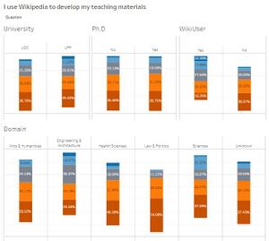
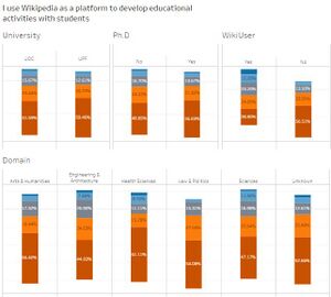
The data for this question could be found in usage behavior section in USE1 and USE2. The questions for these columns are: USE1: I use Wikipedia to develop my teaching materials USE2: I use Wikipedia as a platform to develop educational activities with students The scale for all survey questions are Likert scale from 1-5 where 5 means always and 1 means never. Looking at top 2 boxes (those who rated 4 and 5 for the usage), it’s quite uncommon for the professor in these two Spain university to use Wikipedia to develop teaching materials or develop educational activities with students.
However, there is one interesting finding that although the usage is not significantly different among universities, the trend is different. We can see than more portion of professors in UPF used more Wiki to develop teaching materials than UOC. However, when it comes to using Wiki as a platform for educational activities, professors at UPF utilize Wiki more than UOC
WikiUser tends to use Wikipedia more to develop teaching materials in their teaching activities. When it comes to domains, Engineering & Architecture and Sciences seems to be more open to Wikipedia while Law and Politics seemed to be least favorable towards Wikipedia.
2. What’s the future intention towards using Wikipedia in teaching activities in the future?
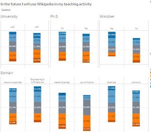
The future intention towards using Wikipedia in teaching activities in the future was reflected in BI2 question: “In the future I will use Wikipedia in my teaching activity”. The distribution of BI2 showed higher portion of people who intend to use in the future compared to current usage. This might be interpreted as more users will use Wikipedia in the future. However, since it’s only intention, the answer might be higher than actual intention.
Looking at the subgroups, it’s still a problem for Wikipedia to introduce Wikipedia among non-users. Also, it’d be more likely for Engineering, Architecture, Science, Art and Humanities domain professors to use Wikipedia in teaching than in Health sciences or Law and politics domain.
3. What would be helpful to encourage Wikipedia usage in educational activities?
The answer to the question could be derived from these questions in incentive section. Incentives INC1: To design educational activities using Wikipedia, it would be helpful: a best practices guide INC2: To design educational activities using Wikipedia, it would be helpful: getting instruction from a colleague INC3: To design educational activities using Wikipedia, it would be helpful: getting specific training INC4: To design educational activities using Wikipedia, it would be helpful: greater institutional recognition All of the proposed campaigns would be helpful to encourage the use of Wikipedia in educational activities. When comparing, the most important would be providing a best practice guide followed by greater institutional recognition.
To investigate the institutional recognition, we’d look at the ‘Quality section’ of the questionnaire. The quality of wiki was considered lower compared to other academic sources with 14% strongly agreed and 25% agreed. However, its up-to-date contents and reliable contents could be the strength of Wikipedia. Therefore, to promote Wikipedia among professors as teaching platform, the first priority for Wikipedia is a best practice guide followed by getting greater institutional recognition (by promoting its up-to-date information and reliability). Note: Most of the questions in the questionnaire is positive at ‘5’ and negative at ‘1’ except Qu4 ‘Low quality’. As we do not want to modify the data, it was leave as-is but must be used with caution.
Citations
Data Set
Data Set Retrieved from: https://archive.ics.uci.edu/ml/datasets/wiki4HE Lichman, M. (2013). UCI Machine Learning Repository [1]. Irvine, CA: University of California, School of Information and Computer Science./
Meseguer, A., Aibar, E., Lladós, J., Minguillón, J., Lerga, M. (2015). “Factors that influence the teaching use of Wikipedia in Higher Educationâ€. JASIST, Journal of the Association for Information Science and Technology. ISSN: 2330-1635. doi: 10.1002/asi.23488.
Creating Divergent Bar Chart
Likert Scales — The Final Word? Retrieved September 24, 2016, from http://www.datarevelations.com/likert-scales-the-final-word.html

