ISSS608 2016-17 T1 Assign2 Lim Hui Ting Jaclyn Visualisations
Contents
- 1 Visualisation 1: What are the main reasons for faculty members to use Wikipedia?
- 2 Visualisation 2: What is the profile of faculty members who are users of Wikipedia?
- 3 Visualisation 3: Are there differences between faculty members solely in UOC, and in UPF, with regards to their usage of Wikipedia?
- 4 Links to Visualisations
Visualisation 1: What are the main reasons for faculty members to use Wikipedia?
Methodology
To answer the question, I have decided to display a visualisation related to the two categories of the two main reasons why faculty members would use Wikipedia.
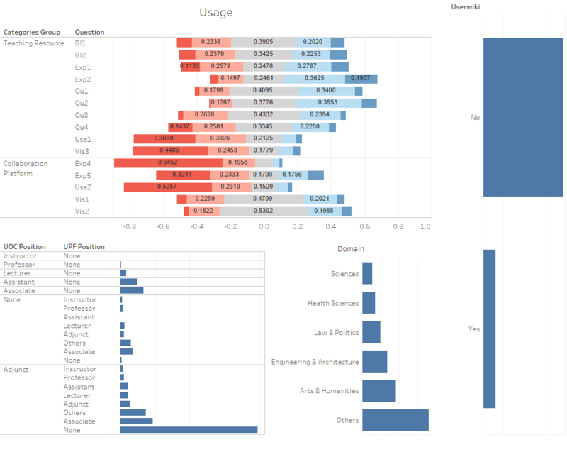
First, Divergent Bar Charts were used to display the questions related to using Wikipedia as a Teaching Resource or a Collaboration Platform. This is because divergent bar charts help to display the percentages of likert scale values of 1-5 on the same bar, and users will be able to see the distribution of scores for each question. The average score was also included, in the bar charts. Although the average score cannot be relied on, by its own, it can come handy when paired with a divergent bar chart.
The divergent bar charts were coloured on a spectrum of two colours, red to blue. This allows us to see the values of 5, that represent "Strongly Agree" can be identified with the portions of the bars that are in dark blue. The values of 1, that represent "Strongly Disagree" can be identified with the portion of the bars that are in dark red.
Other variables were added to the dashboard as well, such as Domain, Position, and UserWiki. These variables were represented in bar charts. The area of the bar represents the distinct count of IDs within each attribute of the variable. A filter function was added to each of these bar charts as well. As such, in the dashboard, the user will be able see which category of each variable uses Wikipedia more as a teaching resource and/ or a collaborative platform, as the divergent bar charts will change according to the filtered variables.
A screenshot of the dashboard can be seen below. It was done using Tableau.
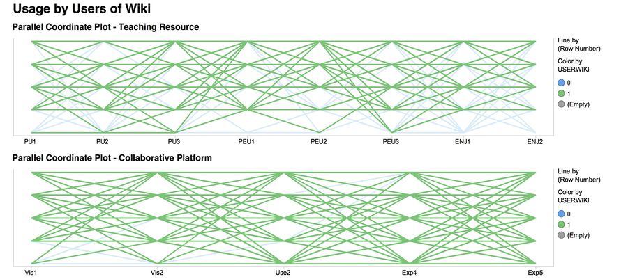
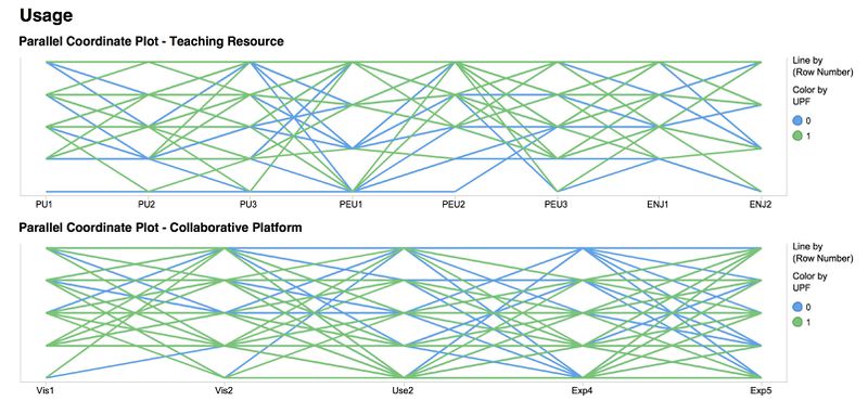
Second, Parallel Coordinates were also used to allow for better comparison. In the following visualisation that was done using Tibco Spotfire, I plotted the parallel coordinates plot of both categories against each other. In this visualisation, as seen in the screenshot, I highlighted the values that corresponded with faculty members who were registered users of Wikipedia.
A screenshot of the parallel coordinate plot can be seen below.
Questions
|
Qn Code |
Question - Teaching Resource |
| BI1 | In the future I will recommend the use of Wikipedia to my colleagues and students |
| BI2 | In the future I will use Wikipedia in my teaching activity |
| EXP1 | I consult Wikipedia for issues related to my field of expertise |
| EXP2 | I consult Wikipedia for other academic related issues |
| QU1 | Articles in Wikipedia are reliable |
| QU2 | Articles in Wikipedia are updated |
| QU3 | Articles in Wikipedia are comprehensive |
| Qu4 | In my area of expertise, Wikipedia has a lower quality than other educational resources |
| USE1 | I use Wikipedia to develop my teaching materials |
| VIS3 | I cite Wikipedia in my academic papers |
|
Qn Code |
Question - Collaborative Platform |
| EXP4 | I contribute to Wikipedia (editions, revisions, articles improvement...) |
| EXP5 | I use wikis to work with my students |
| USE2 | I use Wikipedia as a platform to develop educational activities with students |
| VIS1 | Wikipedia improves visibility of students' work |
| VIS2 | It is easy to have a record of the contributions made in Wikipedia |
Visualisation
Parallel Coordinates by Tibco Spotfire:
Divergent Bar Charts by Tableau:
The actual Dashboard can be found here.
Observation & Insights
- Faculty members are more likely to use Wikipedia as a Teaching Resource than a Collaborative Platform.
- Faculty members tend to consult Wikipedia for other academic related issues, as this has a the highest number of responses of "Agree" (5) and "Strongly Agree" (5)
- The main reason why they use Wikipedia as a Teaching Resource is because the articles in Wikipedia are updated
- Most of these faculty members who are users, come from UOC, and they're Adjunct Professors. The domain that they are from differs, and most of them come from the others category
- On the other hand, these users do not tend to use Wikipedia as a Collaborative Platform, as it can be seen that they do not contribute to Wikipedia, and use it as a platform to develop educational activities with their students
Visualisation 2: What is the profile of faculty members who are users of Wikipedia?
Methodology
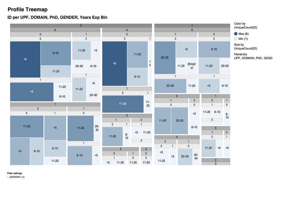
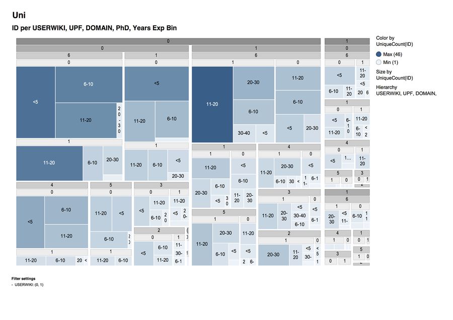
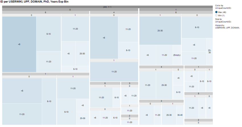
For this visualisation, I decided to use a Treemap Representation to display the findings. Treemaps allow us to visualise and analyse hierarchical data. In this case, as I wanted to find out the profile of faculty members who will be more likely to be users of Wikipedia, I could achieve an organised multivariate hierarchical visualisation, by using a pivot-by-size layout. I have made 2 different Treemaps, one using Tibco Spotfire, and the other using Tableau. Both treemaps differ due to the visualisation options provided by both softwares.
The hierarchy that I've set for the visualisation (in Tibco Spotfire) is as follows:
- Domain: values of 1-6 refers differing categories of domains (refer to attribute table above)
- Phd: 0 represents no Phd, 1 represents Phd
- Gender: 0 represents Male, 1 represents Female
- Years of Experience in bins
I also added a filter to ensure that only the registered users of Wikipedia were captured in the treemap visualisation. The size and the colour of the treemap representation is based on the count of distinct ID values. I used a range of blues, from the lightest shade that represents the smallest area, to the darkest shade of blue that represents the largest area.
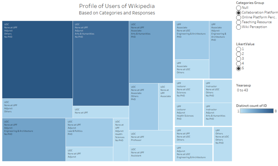
The hierarchy that I've set for the visualisation (in Tableau) is as follows:
- University
- Position in UPF
- Position in UOC
- Domain
- PHD
I added 3 different filters to this representation. The first one being Categories, to allow users to see the typical profile of users based on each categorical grouping. The second one being Likert Value, to capture the respondents' response. The last one being a filter with regards to the years of experience that each faculty member had, so that users view the difference between members who have had a lot of experience, and those with the least expereince.
The size and the colour of the treemap representation is based on the count of distinct ID values. I used a range of blues, from the lightest shade that represents the smallest area, to the darkest shade of blue that represents the largest area.
Visualisation
Tibco Spotfire Treemap:
A video of the visualisation can be found here: Treemap Profile
Tableau Treemap:
The Dashboard for the visualisation above can be found here: User Profile Dashboard
Observation & Insights
- The highest number of Wikipedia users are Adjunct or Lecturer Faculty members who are from UOC only. They do not have a PHD, are males and tend to have less than 5 years of experience in their field
- In general, most users of Wikipedia are those who only teach in UOC, and are adjunct faculty members. From the Treemap in Tableau, we can also see that the group of users of Wikipedia with the largest group of "Strongly Agree" (5) for all 4 categories (CP, OPP, TR, WP) belong to this profile.
- As for the faculty members in UPF, it can be noted that the profile with the most number of users of Wikipedia belong to adjunct faculty members who are males, with PHDs, and have 20-30 years of experience.
Visualisation 3: Are there differences between faculty members solely in UOC, and in UPF, with regards to their usage of Wikipedia?
Methodology
I decided to find out the differences between faculty members who solely teach in UOC, as compared to UPF professors (of which some may be teaching in UOC) and their usage of Wikipedia because of the differences in school environments. UOC is an internet- centered open university, whereas UPF is a public university. Both of them are based in Spain. As such, by finding out the differences, I would be able to see if the environment that these faculty members were from will impact the survey results.
To compare the differences, I used three different visualisation methods to be able to understand the survey results better.
First, using Tibco Spotfire, I created another Treemap Representation. In this case, as I wanted to find out the profile of faculty members of differing universities and their likelihood of using Wikipedia, I could achieve an organised multivariate hierarchical visualisation, by using a pivot-by-size layout
The hierarchy that I've set for the visualisation (in Tibco Spotfire) is as follows:
- Userwiki: 0 represents not a registered Wikipedia user, 1 represents a registered Wikipedia user
- UPF: 0 represents faculty members solely based in UOC, 1 represents faculty members in UPF
- Domain: values of 1-6 refers differing categories of domains (refer to attribute table above)
- Phd: 0 represents no Phd, 1 represents Phd
- Years of Experience in bins
I also added a filter to ensure that only the registered users of Wikipedia were captured in the treemap visualisation. The size and the colour of the treemap representation is based on the count of distinct ID values. I used a range of blues, from the lightest shade that represents the smallest area, to the darkest shade of blue that represents the largest area.
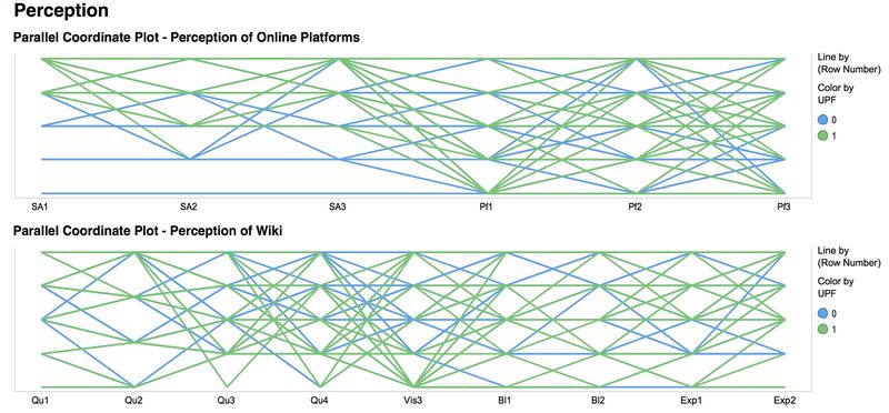
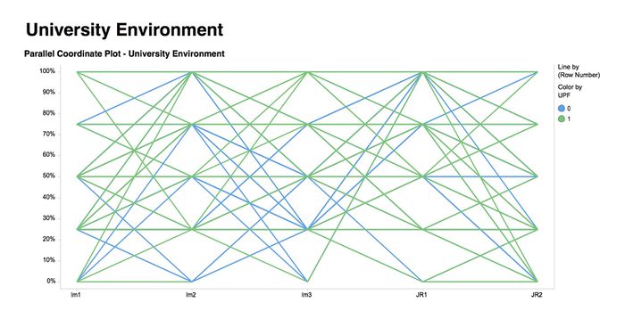
The next visualisation representation I used was Parallel Coordinates using Tibco Spotfire. This visual representation was done for three categories: Perception and Usage. I used parallel coordinates as it would allow the user to look at the variation of answers per question, and to spot trends. In this case, the charts are coloured as well. Blue represents responses of faculty members who were only from UOC. Green represents responses of faculty members who are from UPF. From the visualisation charts below, we will be able to see the differences in responses between the two universities. I also filtered out responses of users who were not registered users of Wikipedia, as the key question relates to registered users of Wikipedia.
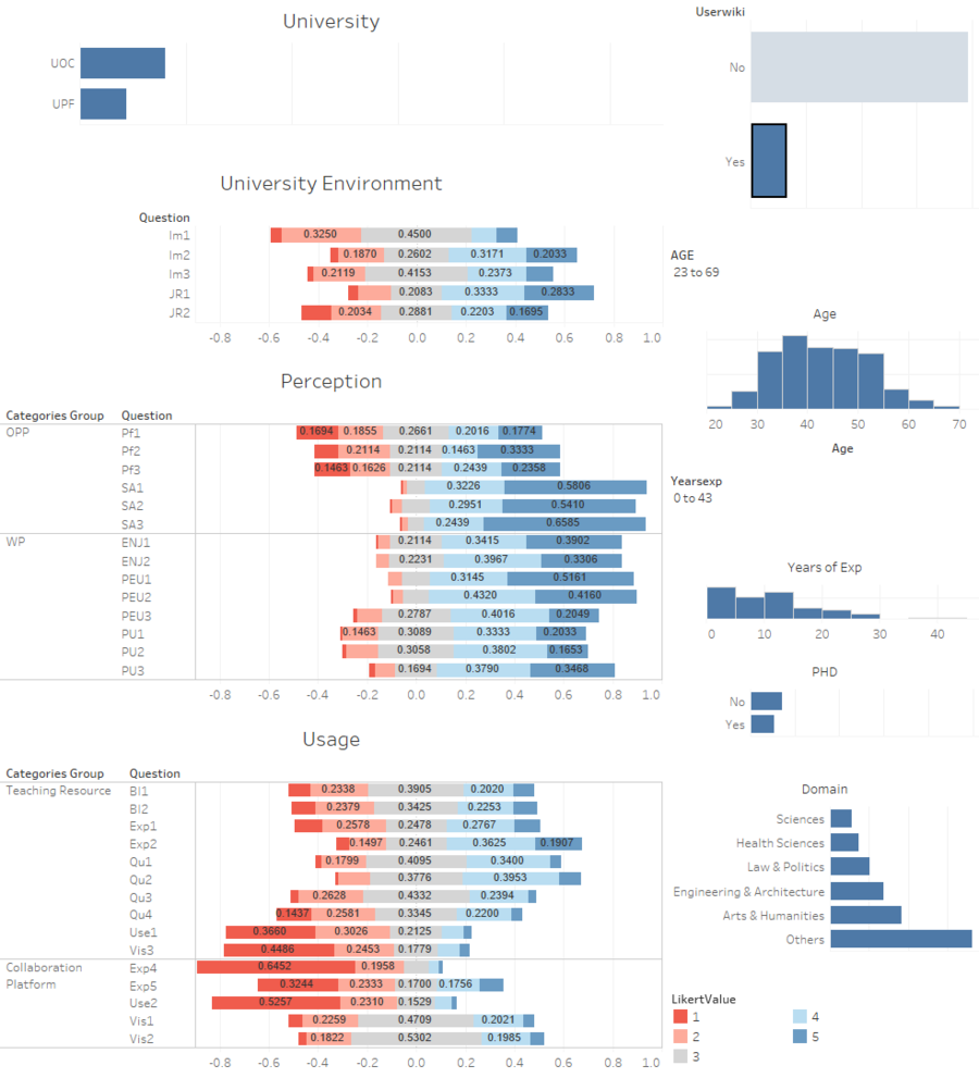
The last visualisation method I used was Divergent Bar Charts. There are 3 categories of Divergent Bar Charts that were introduced in the dashboard, University Environment, Perception, and Usage. These divergent bar charts allow us to see the variation of responses of individuals.
The divergent bar charts were coloured on a spectrum of two colours, red to blue. This allows us to see the values of 5, that represent "Strongly Agree" can be identified with the portions of the bars that are in dark blue. The values of 1, that represent "Strongly Disagree" can be identified with the portion of the bars that are in dark red. Additional filters, such as "YearsExp" and "Age" were added to allow the user to filter the data to see the changes in responses (in the divergent bar charts).
Questions
|
Qn Code |
Question - Perception of Online Platforms |
| PF1 | I contribute to blogs |
| PF2 | I actively participate in social networks |
| PF3 | I publish academic content in open platforms |
| SA1 | It is important to share academic content in open platforms |
| SA2 | It is important to publish research results in other media than academic journals or books |
| SA3 | It is important that students become familiar with online collaborative environments |
|
Qn Code |
Question - Perception of Wikipedia |
| ENJ1 | The use of Wikipedia stimulates curiosity |
| ENJ2 | The use of Wikipedia is entertaining |
| PEU1 | Wikipedia is user-friendly |
| PEU2 | It is easy to find in Wikipedia the information you seek |
| PEU3 | It is easy to add or edit information in Wikipedia |
| PU1 | The use of Wikipedia makes it easier for students to develop new skills |
| PU2 | The use of Wikipedia improves students' learning |
| PU3 | Wikipedia is useful for teaching |
|
Qn Code |
Question - University Environment |
| IM1 | The use of Wikipedia is well considered among colleagues |
| IM2 | In academia, sharing open educational resources is appreciated |
| IM3 | My colleagues use Wikipedia |
| JR1 | My university promotes the use of open collaborative environments in the Internet |
| JR2 | My university considers the use of open collaborative environments in the Internet as a teaching merit |
Visualisation
Tibco Spotfire Treemap:
Tibco Spotfire Parallel Coordinates:
Tableau Dashboard:
The Dashboard for the visualisation above can be found here: Dashboard
Observation & Insights
| Faculty Members from UOC Only | Faculty Members from UPF | |
|---|---|---|
| Perception |
|
|
| Usage |
|
|
| University Environment |
|
|
| Profile |
|
|
| Responses |
|
|
Links to Visualisations
Visualisation 1: Tableau Dashboard
Visualisation 2: Tibco Spotfire Dashboard Tableau Dashboard
Visualisation 3: Tableau Dashboard
