ISSS608 2016-17 T1 Assign2 Lim Hui Ting Jaclyn Approach
Data Cleaning
The data was prepared in JMP itself.
- Recoding data There were columns with “?” cells. Although they meant that there was no response, the usage of “?” resulted in the data type of the column to be Character instead of Numeric. These cells were recoded from “?” to NULL. I also recoded data in OTHER_POSITION from “2” to “0” as they represented faculty members with no other positions.
- Inconsistent attributes with the given attributes information table There were only 5 variables in the “Domain” attribute table given. However, there are 6 different variables, and null values inside the column itself. I assumed that “6” belonged to the category of others. Also, in the column “OTHERSTATUS”, there were 7 variables instead of 6 listed. Hence, I assumed that the variables with value of “7” represented other faculty positions.
- Inconsistent data OTHER_POSITION only had values such as ?, 1, 2. Unlike stated in the attribute table. Also, there is an additional column named “OTHERSTATUS” which was not mentioned in the attribute table given. This column, “OTHERSTATUS”, has values ranging from ?, and 0 to 7. As such, a probable guess is that OTHER_POSITION contains variables of whether faculty members hold other positions, and OTHERSTATUS refers to the position taken in the other position that the faculty member holds.
- Inverse data values A majority of the questions were positively phrased except for QU4 that was negatively phrased. “QU4: In my area of expertise, Wikipedia has a lower quality than other educational resources “ Hence, the values had to be swapped inversely. For example, “5” would represent “Strongly Agree”, such that Wikipedia has a lower quality than other educational resources. By recoding it to “1”, it would mean that these are the people who agree that Wikipedia has a lower quality. The new value of “5” would represent people who agree that Wikipedia is not of a low quality than other educational resources.
- New columns As I found that the following columns, “University”, “Other Position”, “Other status” was quite confusing and also difficult to do analysis in, I decided to create additional columns on JMP. Hence, I created Columns such as “UOC” that contains 0 or 1, 1 if the faculty member is from UOC, and “UPF” that contains 0 or 1, 1 if the faculty member is from UPF. Also, “UOC_Position” contains a value of 1 to 6 if the faculty member is from UOC, and “UPF_Position” contains a value from 1 to 7 if the faculty member is from UPF.
- Grouping survey questions into different categories
- Question Categories
- Group Categories
- Transpose data on excel sheet In order to create a “response” column to find out the scores, and a “questions” column, I had to create a column listing arbitrary ID numbers, and to use a Tableau add-in function on Excel to create a pivot table.
I categorised the questions according to their codes.
Perceived Usefulness
PU1: The use of Wikipedia makes it easier for students to develop new skills
PU2: The use of Wikipedia improves students' learning
PU3: Wikipedia is useful for teaching
In this case, PU1, PU2 and PU3 will be placed in the group named “PU”. I categorised all of the other questions the same way.
|
Categories |
Questions |
Code |
| Teaching Resource | BI1, BI2, EXP1, EXP2, QU1, QU2, QU3, QU4, USE1, VIS3 | TR |
| Collaborative Platform | EXP4, EXP5, VIS1, VIS2, USE2 | CP |
| Perception of Online Platforms | PF1, PF2, PF3, SA1, SA2, SA3 | OPP |
| Perception of Wikipedia | ENJ1, ENJ2, PEU1, PEU2, PEU3, PU1, PU2, PU3 | WP |
Data Exploration
Iteration 1
In iteration 1, I initially found the mean and median values of each survey question and plotted them in order to compare them. However, I found out that the values were on a Likert Scale, and this meant that the mean and median values cannot be compared with each other as it is not meaningful. A question that has a mean score of 2.5, would not allow the user to understand the actual percentage of responses and the variation within a question.
Also, in iteration 1, I initially wanted to focus my analysis on the perception of Wikipedia amongst faculty members. However, I realised that the perception of Wikipedia is a small subset of a wider range of categories that can come from the survey questions. Hence, I decided to expand my analysis to look at more factors that can explain why faculty members will use Wikipedia.
Iteration 2
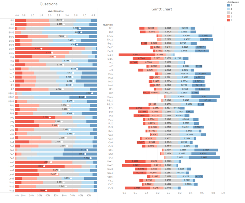
After iteration 1, I had to re-look at my data and find alternative ways to analyse them. In this case, I created divergent bar charts by referencing to Data Revelations. The step-by-step instructions can be found here and here. With the help of the online reference, I managed to create a basic Divergent Bar Chart for the survey questions. Below is a screenshot of these charts.
The actual dashboard can also be found: Here.
After coming out with the initial charts, I decided to create different divergent bar charts for the different question categories. By grouping them, I could analyse the categories more easily. They can be seen in the visualisations that can be found in the next tab.
