ISSS608 2016-17 T1 Assign1 Lim Hui Ting Jaclyn
Contents
Cooling Measures
In attempting to cool the property market in Singapore, the government has made changes to the national policy on housing. Since 2013, when the cooling measures have been put into place, the property market has eased. Specifically, for this assignment, with the use of visualisation tools such as Tableau and QGis, I have looked at the resale public housing market in Singapore. From my analysis, I found that the transaction prices have stopped dipping, and that the supply of houses have increased. Hence, the cooling measures that the government has put in place has not reached its intended effect in 2015 and 2016,
Problem and Motivation
The property market in Singapore used to experience huge fluctuations, with large and rapid price growth of about 20% each year. To curb these high prices, the government introduced major cooling measures in 2013. Since then, it has been reported that the prices of resale houses in the property market has gone down, with the supply increasing. As such, there has been debate about whether the cooling measures should be relaxed or not.
Hence, through this assignment, I hope to verify if the phenomenon reported is correct. The increase in supply and decrease in transaction prices can be attributed to many internal and external factors, such as economic downturn. However, I will retain the scope of this assignment to internal factors, such as the number of years of lease left, and the town the resale public houses are situated in.
The main variables I will look at are as follows:
- Resale Public Housing Supply
- Resale Public Housing Prices
- Flat Type
- Town/ Region
- Storey Range
- No. of Years of Lease Left
From my analysis, I will answer the question of whether the cooling measures have been working effectively in the public resale housing market.
Tools Utilised
- Tableau - for data visualisation purposes with charts (i.e. bar charts, box plots, scatter plots)
- QGis (Quantum Geographic Information System) - an open source application that allows for data visualisation on a geographic region
Approaches
Data Preparation
Data Set
The data set, Resale Flat Prices Based on Registration Date from March 2012 Onwards, has been retrieved from: http://data.gov.sg, as it is a publicly available dataset provided by the government. This set of data helps us to look at the shares of the resale public housing supply, as well as the distribution of the resale public housing prices.
In order to prepare the data for the analysis, I had to make modifications to the given dataset. This can be seen in the section below.
Another set of data that I used was Singapore's Planning Area SHPFile, and it was also retrieved from http://data.gov.sg. This was retrieved in order to create a visualisation on the map of Singapore.
Data Cleaning
The first thing I did was to split the the "Month" field, so as to retrieve the exact month and the year of each transaction. The new columns are seen in the screenshot below, and they are shaded in blue.
After which, I created a date column with the actual date, as the current data set only has Month and Year. I did this by creating a calculated field Month+”-01” and rename new column as “Date”
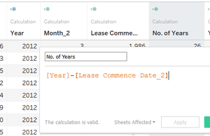
Another column called "No of Years" was created to represent the difference between the day of the transaction as well as the lease commencement date.
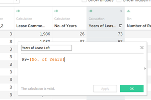
To find the number of years of lease left, a column named “Years of lease left” was created to represent the number of lease left on the property, before the property reaches 99 years of leasehold. The formula was “99-[No of Years]. This can be seen below.
Through the data exploratory process, I have also discovered that there had to be additional modifications made to the data set or the analysis process itself.
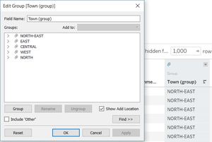
One of the issues that I found was that there were too many "Towns", and in fact, they could be separated into the Regions that they were situated in. Hence, I created a new group for the column "Towns" to group some of the variables together.
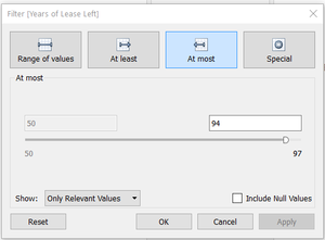
In my analysis, I also added a filter of “Year:2015, 2016” and another filter of “Years of Lease Left” of at most 94 years. This is because of the requirement by the government that resale flats can only be sold after the five-year minimum occupation period (MOP). Resale flats that have Years of Lease left of above 95 years will have been sold back to the government at cost price. Hence, they are removed from the distributions. The filter can be seen in the figure below.
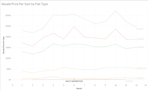
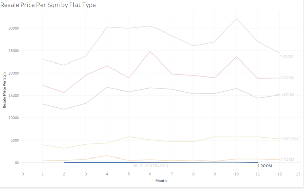
I added one more filter to my analysis, as I discovered that there was a lack of data of the multi-generational flats as well as the 1-room flats in 2015 and 2016. Hence, I also filtered "Flat Type" at some points in my analysis. Examples of the lack of data can be seen below.
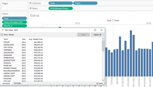
To prepare the data for the geospatial image, I created a distribution on Tableau, viewed the data and exported it into a csv format. As I was planning to create a visual distribution of the average transaction prices of each planning area (or Town) on the map of Singapore, the input in the "columns" and "rows" were as follows:
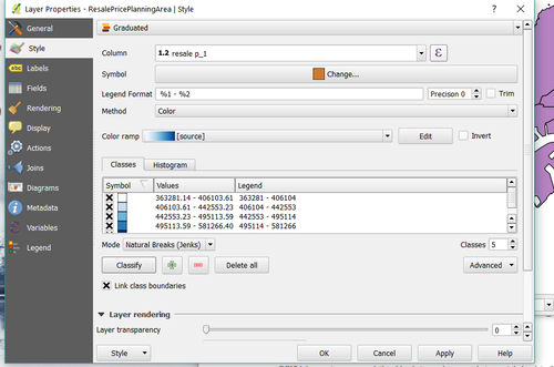
Last but not least, to create the distribution on QGis, I merged the csv file with the Planning Area SHPfile, and changed the layer properties of the SHPfile as follows:
Data Exploration
I have split the data exploration process into three sub-headers, mainly, the shares of resale public housing supply in 2015, the distribution of resale public housing prices in 2016, and the comparison between 2015 and 2016.
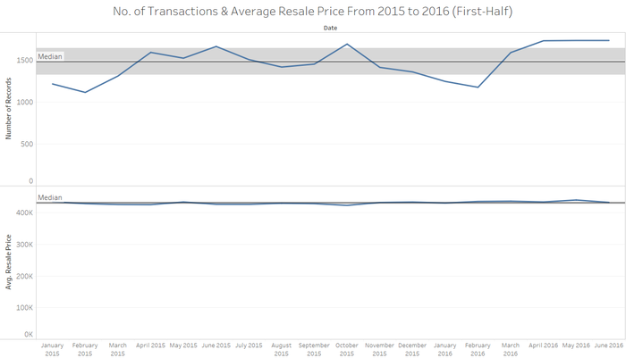
In general, just looking at the number of transactions (i.e. supply) and the average resale price on a time-series graph, from 2015 to 2016, we can see the following trend.
The pattern of the number of records varies each month. Generally, from March 2015 onwards, we can see that the number of transactions have increased. The resale price however, has not changed much. This is in line with the news article dated in November.
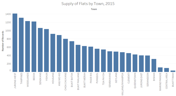
From this graph, we can see that the supply of flats are mostly in Jurong West, Tampines and Bedok. Also, the supply of flats that come from Marine Parade, Central Area and Bukit Timah are the least.
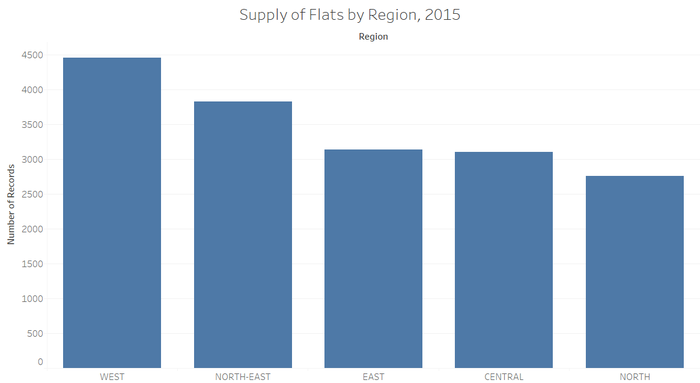
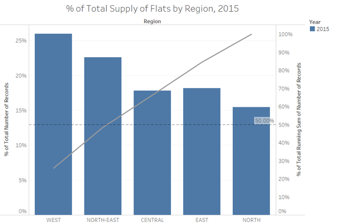
In general, the West has the most supply of resale flats, and the north has the least supply of resale flats. To understand further, I created a pareto chart, as seen below.
From this chart, we can see that about slightly less than 50% of the supply of flats come from the West and the North East.
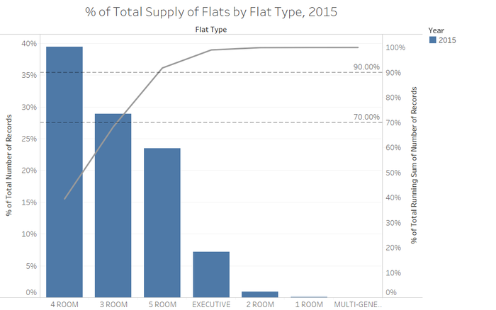
Generally, from this graph, we can see that most of the supply of resale flats consist of 4-room, 3-room and 5-room flats. Upon further observation, we can see that that about 70% of the resale applications are made up of 3-room and 4-room resale public houses. Also, about 90% of the resale applications are made up of 3 to 5 room flats.
Distribution of Resale PH Prices
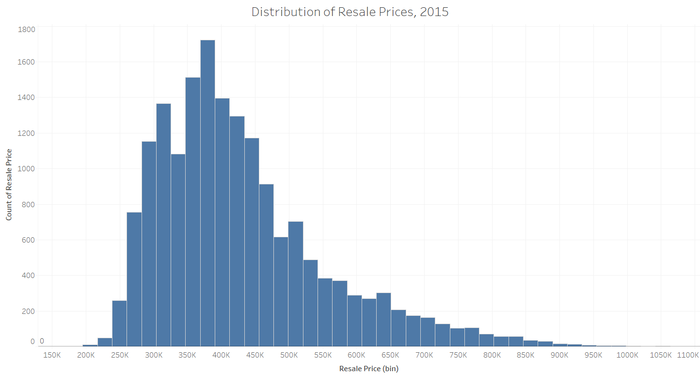
A general distribution of the resale prices was first plotted. It can be seen in the figure below.
From this histogram, we can see that the distribution of the resale price is right-skewed. This means that the median price of the resale prices is less than the average of the resale prices.
To understand the variables that may impact the resale prices, we will zoom in to the following variables: the flat type, town/ region, storey range, and number of years of lease left.
Flat Type
The distribution of the resale prices per flat is right-skewed, as median value is less than the average value of each flat type. As the 1-room and multi-generation flat types.
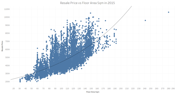
Similar to resale price per sqm, the distribution for resale price is right-skewed, as the median value is less than the average value of each flat type. Interestingly, the resale price per sqm for 1-room and 2-room flats are higher than the other flats. This can be explained in the following graph:
The resale price was plotted against the floor area, and it was fit an exponential trend line. R2 Value: 0.50655 P- Value: <0.0001 This is because, each time the floor area increases by 1, the resale price increases by approximately a factor of 2. As such, the transaction prices of 1-room and 2-room resale houses tend to be higher than the other types of resale houses.
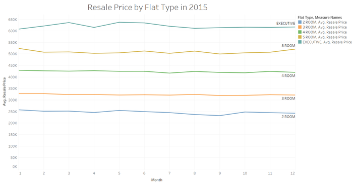
It can be seen that the prices remained quite stable over the time frame of 2015 by just looking at resale price by flat type.
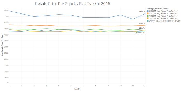
Looking at the time frame throughout 2015, we can see that the prices per sqm were less stable.
Town/ Region
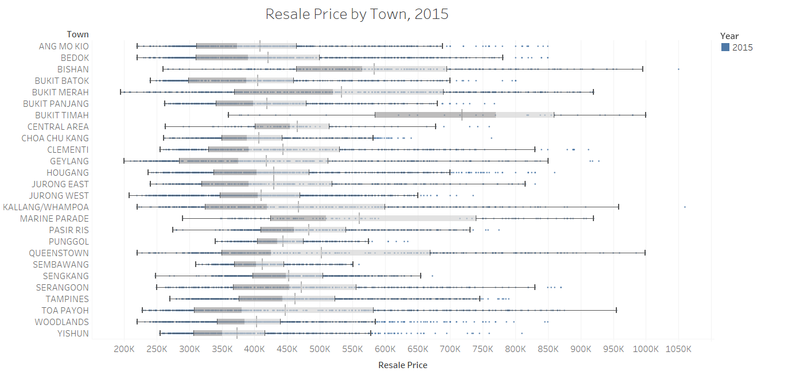
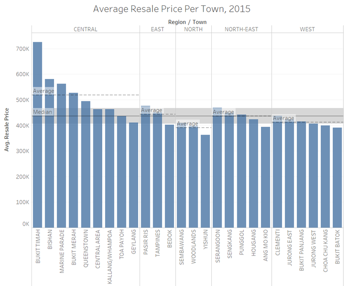
As the resale prices may vary based on which town the houses were from, I created bar charts of the average resale price per town. From here, it can be seen that resale hdb flats that were in bukit timah and the central area made up most of the distribution.
Hence, a separate boxplot was created to understand the resale prices by region. This is done by categorising each town into groups, mainly, “Central”, “East”, “North”, “North-East” and “West”. In general, we can see that all the distributions are right-skewed. From this boxplot, we can see that the variation within the central region is the widest as compared to the other regions. Also, the median and the average price of resale public housing in the central region is the highest as compared to the other regions.
From the separate visualisation, through bar charts, one can see that most of the transactions of resale HDBs in the central region make up the bulk of the upper limit. As such, it is important to categorise the transactions by towns, as it has a large contribution to the transaction prices.
Storey Range
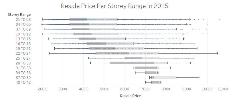
Looking at the price per storey range as well, we can see that the prices paid for resale flats of higher storeys are generally higher.
However, when the box plots were further categorised into the regions where the towns were in, we can see that the houses that were situated in the central region make up most of the data of storeys above 30 storeys. Hence, we cannot immediately conclude that the storey range has an impact on the resale prices. Upon further investigation of the other regions, we can see that in general the prices tend to increase when the number of storeys increase. As such, it is possible that the storey that the resale flat is has an impact on the prices.
No. of Years of Lease Left
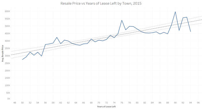
Last but not least, the resale price was plotted against years of lease left. From the results above, we can see that there is a positive linear relationship between the price and the number of years of lease left. The higher the number of years of lease, the higher the resale price.
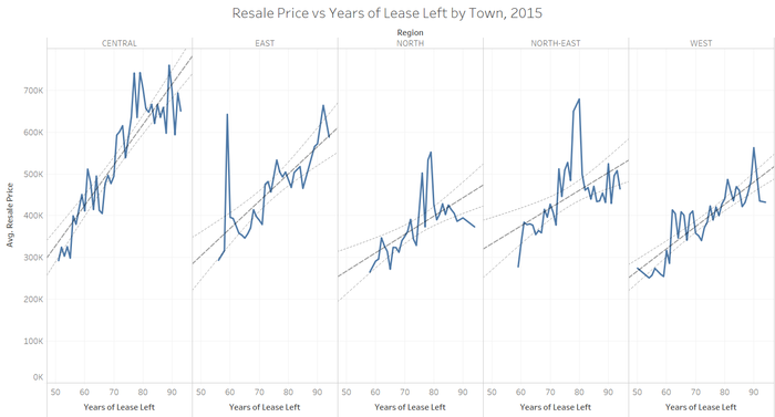
Interestingly, when the average resale price was plotted against the years of lease left by Regions, it can be seen that the patterns start to vary. The linear relationship in the central region is the strongest. (R value: 0.807) However, by looking at the line graphs of the other regions, we can see that the linear relationship is weaker. This is an interesting phenomenon, as transaction price is expected to increase with a longer lease period, but it was seen to not be the case in regions apart from the Central Region.
Comparison between 2015 and 2016
To compare the supply, as well as the prices of resale public housing in 2015 and 2016, I have decided to limit the data to the first half of 2015, and compare it with the first half of 2016. Also, I decided to use orange colour for the data of 2016, as a contrasting blue colour for the data for 2015. This is because blue and orange are complementary colours on the colour wheel, and it is easy to tell them apart.
Supply
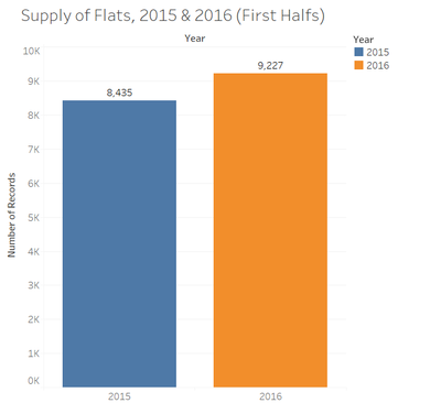
Firstly, I compared the supply of flats to get a general idea of the trend. From the chart below, we can see that there has been an increase in the supply of flats. I used bar charts for the following charts, as I wanted to gain a general insight into the patterns between 2015 and 2016.
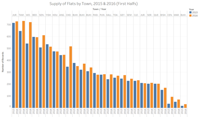
After which, I decided to look at the differences in the supply of flats by Towns. From the chart below, we can see that the supply of flats for most of the towns have increased in 2016.
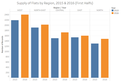
However, because there are too many towns, I decided to narrow down the towns, into regions, in order to see the pattern in the regions itself. From the chart below, we can see that there has been a greater increase in the supply of flats in the Western Region and the Central Region.
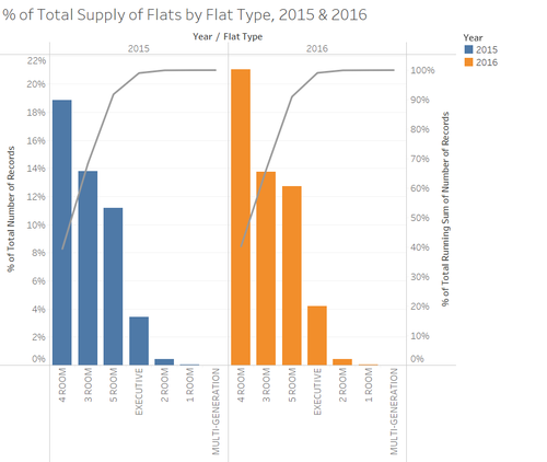
Also, pareto charts were introduced, to look at the cumulative frequency. From the chart below, we can see that the supply of for the types of flats have generally remained the same.
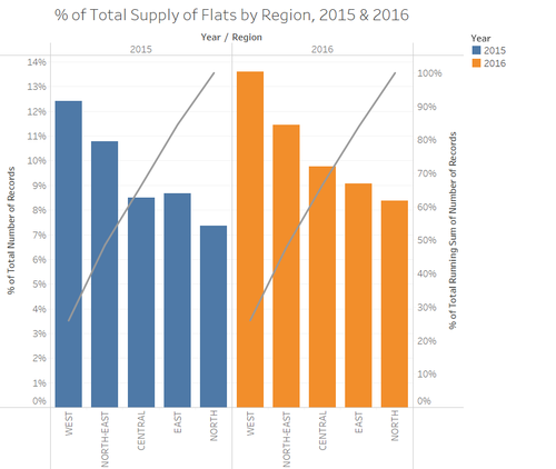
Also, from the pareto chart below, we can see that the supply of flats by region has also generally remained the same.
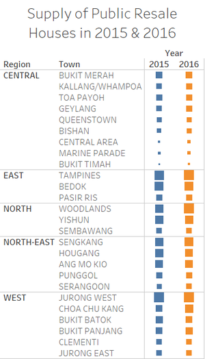
I also created a heat map, to create a simple visualisation to understand the supply of flats by region. From the size of the boxes of 2016, we can see that there has been an increase in the first 6 months of 2016, as compared to the first 6 months of 2015.
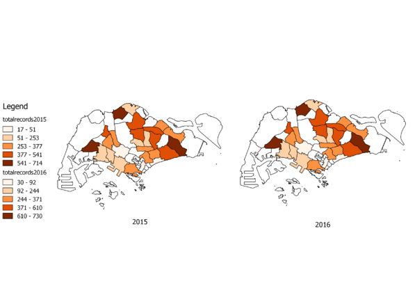
Last but not least, I mapped out the supply of resale public housing on a choropleth map below. The darker the shade of orange, the greater the supply of houses in that region. From these two charts and the legend provided, we can see that there has been no change, except that the supply in 2016 has increased (as seen from the legend).
Prices
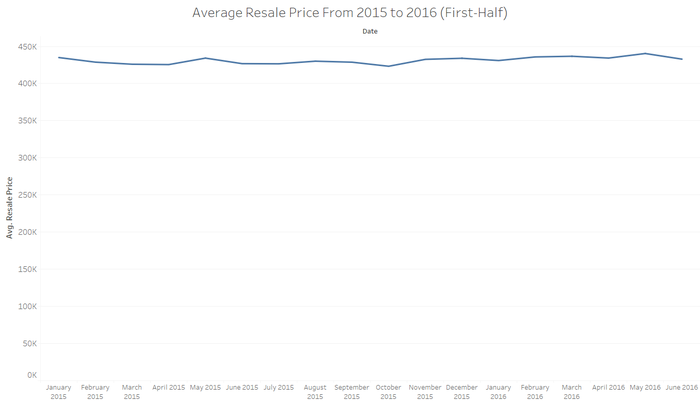
To analyse the prices between 2015 and 2016, a time series line graph was used. We can see that the average resale price has remained almost flat through the one and a half years.
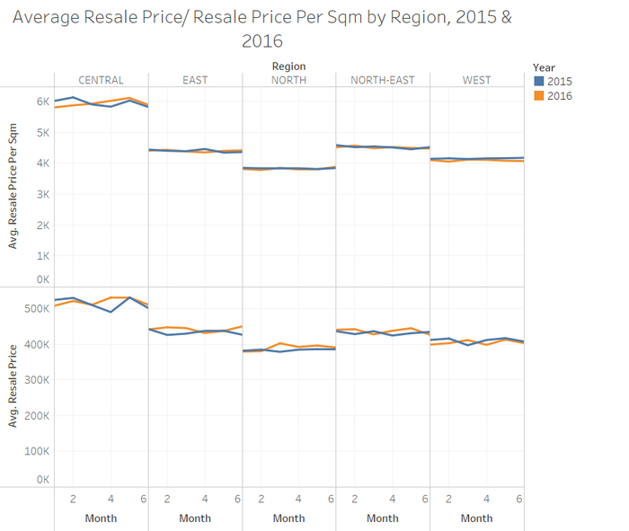
From the chart below, we can see that there has not been much of a difference between the average transaction price per sqm along the first 6 months of both 2015 and 2016. Although we can observe some fluctuations between the average transaction prices between 2015 and 2016, the fluctuations are still generally minimal.
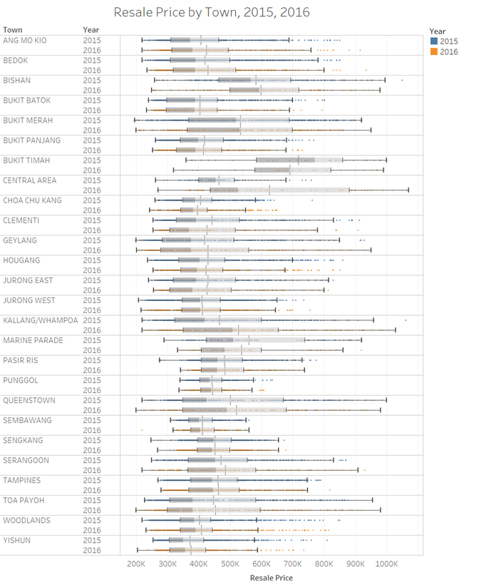
I also created box plots, in order to analyse the quantiles and the median values of the resale prices by towns. From the box plot below, we can see that the prices have remained similar. The only major difference is that the variation, and the median price of the town, "Central Area", has increased significantly.
Looking at the box plots by region below, we can also see that the general resale prices are fairly similar.
Also, by looking at the box plots of the resale price by flat type, we can see that there aren't many fluctuations between 1-room to 5-room, and executive resale houses. The biggest difference would be within the multi-generation flat. However, because there has been limited data, it is prone to greater variation, and hence, is not of a concern.
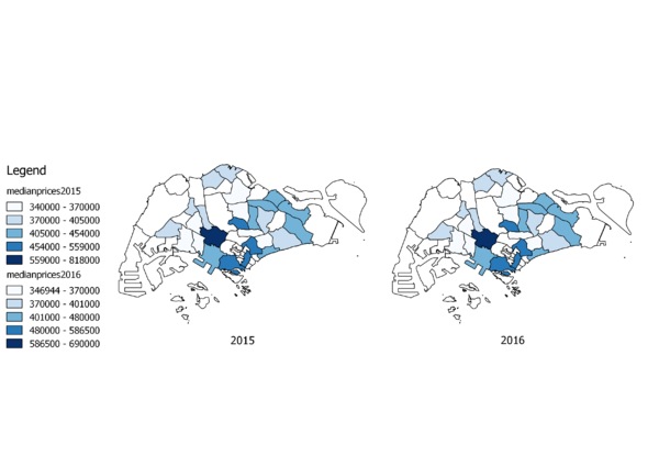
Last but not least, I also mapped out the median prices of the resale public houses onto a choropleth map. The darker the shade of blue, the higher the price of houses in that region. From these two charts, we can see that the distribution of the prices of transactions relative to other regions has not changed.
Results
Main Findings
From the analysis above, here are the main findings that I've observed:
Supply
- From 2015 to 2016, there has been a slight increase in the supply of resale public housing.
- About 50% of the supply of resale public housing come from the West and the North-East Region.
- About 90% resale flats that are supplied are 3 room to 5 room flats. This also means that it is highly possible that it is the most commonly purchase flat in Singapore.
Prices
- The prices of resale public housing have remained generally flat.
- Executive room flats have the highest average transaction price, followed by 5 room flats, 4 room flats, 3 room flats, and then 2 room flats.
- Based on regions, the resale public housings in the central region have the largest variation. Also, the average and median transaction prices are higher than that of houses in other regions. This is largely because of the houses that have been sold in Bukit Timah, Bishan and Marine Parade.
- Based on the resale price per storey range, it is likely that the higher the storey of the house, the higher the transaction prices. However, we can only conclude this for houses up to level 30 of Singapore. This is because most of the houses that make up the >30 storey range are based in the central region, where prices of houses tend to be higher.
- The higher the number of years of lease left, the higher the transaction price. This is especially true for houses in the central region.
- The greatest price fluctuation occurred in the town "Central Area", where the median price has increased significantly, and the variation widened.
Conclusion
Based on my analysis earlier, we can see that there has been a slight increase in the supply of public housing, and the prices of resale public housing have remained generally flat from 2015 to 2016. Even while looking at the other variables of price, we can see that there hasn't been much of a variation within the prices of each variable (between 2015 and 2016). Hence, returning back to the question that I was seeking to answer, of whether the cooling measures have been working effectively. I would conclude by saying that by looking at internal factors alone, these cooling measures that were put in place, to reduce housing prices, have not been working effectively for the past one and a half years.
This is because the transaction prices, which were expected to dip, have not been dipping as significantly as it has increased before the cooling measures have taken place. Also, although cooling measures were targeted towards buyers who were speculators who would often purchase houses in the Central Region, it can be seen that there has been no significant dip in the transaction prices of houses in the Central Region.
As such, the current cooling measures that are set in stone may not be as effective as they are supposed to be, and the government should look into other measures in order to bring down the prices of the resale public housing market.
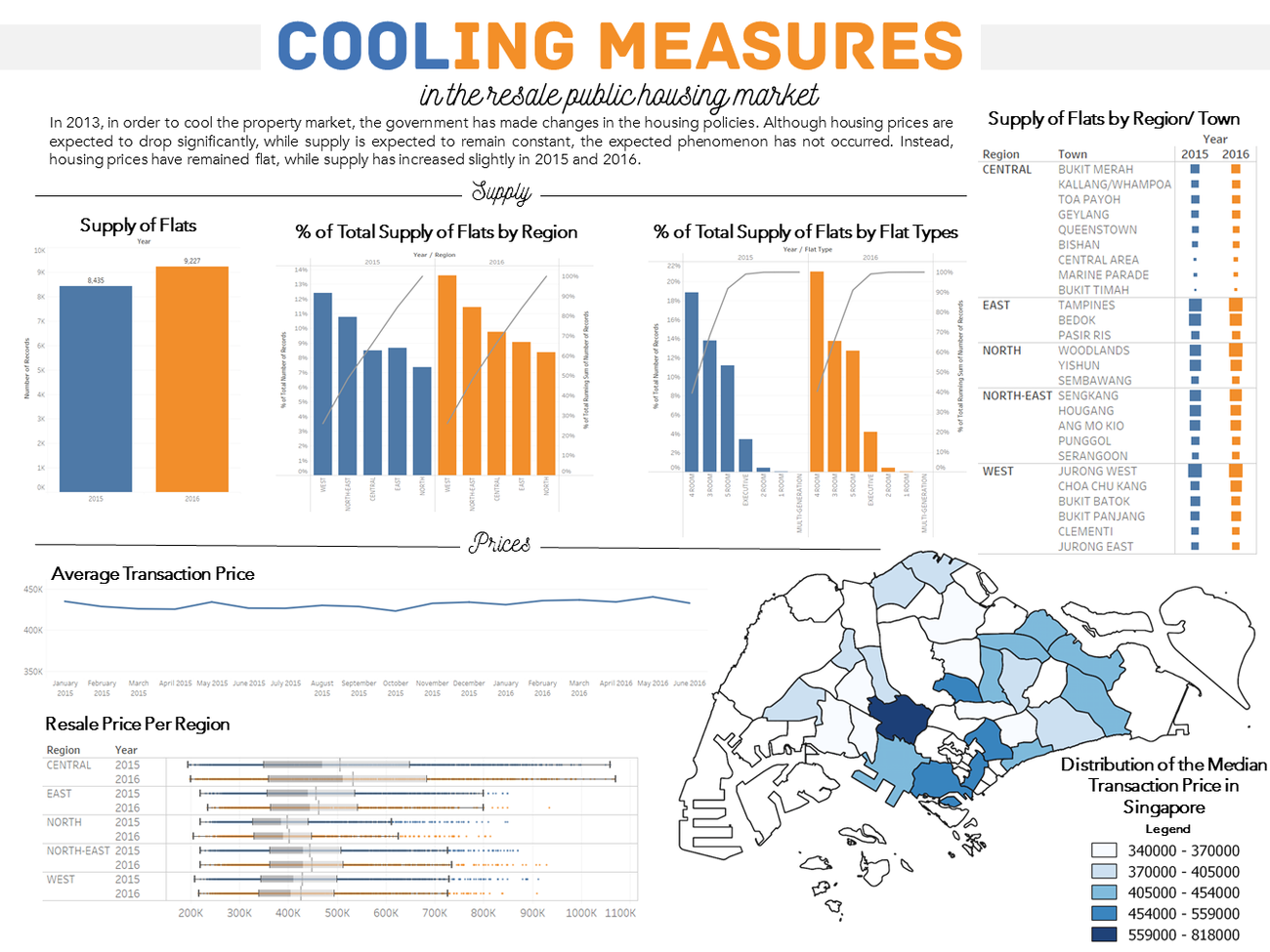
Infographic
PDF Version: Download Here

