IS428 AY2019-20T2 Assign David Chow Jing Shan
Contents
- 1 Background
- 2 Objectives
- 3 Information Gathering
- 3.1 Employee List & Fixed/Mobile Proximity Data
- 3.2 Home Dashboard
- 3.3 Employee Activity
- 3.4 Q1)Typical Patterns In Proximity Card Data & Typical Day Of GAStech Employees
- 3.5 HVAC Control System Dashboard - Heating
- 3.6 HVAC Control System Dashboard - Ventilation
- 3.7 HVAC Control System Dashboard - Air Conditioning
- 3.8 Power Consumption Dashboard
- 3.9 Exhaust Fan Dashboard
- 3.10 Chemical Dashboard
- 3.11 Interesting patterns that appear in the building data and describe what is notable about the pattern
- 4 Reference
Background
Every two years, SUM libraries conduct a comprehensive survey to receive feedback from the faculty, students and staff with regards to the libraries' services. With the data collected, SMU libraries hope to gain some insights so that they can enhance their existing services and meet the emerging needs of SMU faculty, students and staff.
However, the past reports were not able to give a comprehensive and condensed summary for the SMU libraries as they are mainly made-up of pages of tables. With the information overload, it becomes difficult for the SMU libraries to get the essential overview of which area they should focus on improving.
Objectives
With such a massive amount of data being collected, it is important to summarize the key areas and provide proper visualizations for them. Hence, using all the visualization and analytical techniques that I have learned in class, I aim to create an interactive data visualization to help SMU libraries to better understand their service feedbacks so that they can make improvements on their services to better satisfy the needs of their respective users.
With this interactive visualization, SMU libraries would be able to easily find out the feedbacks for their services that are used by their respective users:
- undergraduate students
- postgraduate students
- faculty
- staff
Information Gathering
With the given data(2018 Survey dataset), like any visualization processes, it is vital to understand and look through the data before using any visualization software. I will be using Tableau as my visualization software and there are some work to be done on the given datasets before I plot my visualizations.
Employee List & Fixed/Mobile Proximity Data
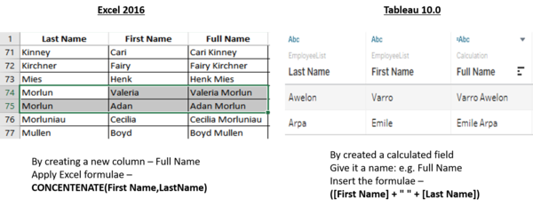
Data doesn’t always come ready for analysis. As many of you have experienced, some data needs a lot of work before it can be sensibly analyzed. To begin with, Employee List provided names in the format of Last Name and First Name. Therefore, the first thing I did to better identify these people, I used the Excel CONCATENATE () function to join all of them into a unique single column called Full Name (First Name – Last Name) format. This is because among the employees there are people with similar first or last names.
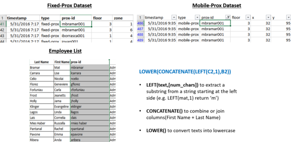
Moving forward, I went on to find out how does a typical day look like for a GAStech employees. With the above information provided by the Employee list, it is only possible for me to make assumption that all employees are staying in their respective office throughout the whole day which is highly unlikely the case. As such, I went ahead to investigate further on other available datasets hoping to spot any patterns or relationships. Given the information from the case, we know that all employees are required to wear a proximity card while they are in the building, and proximity detectors have been installed throughout the building to enhance the safety and security of its employees. There are two types of proximity sensors, fixed sensors that register when a proxy card crosses a boundary and a mobile sensor reader that moves throughout the building to detect and record any available proxy cards within its vicinity. Both proxOut-MC2.csv and proxMobileOut.csv contains a field name: prox-id that could possibly help us to identify the whereabouts of an individual employee together with their given timestamp. Hence, I have created a new column name: prox-id in the Employee list using Excel formula as shown below:
With that, we are able to map the prox-id in the Employee List with the proxOut and proxMobileOut lists. Although I have managed to create the prox-id column, I still need to manually locate and make changes to those inconsistent prox-ids that are either wrong in spelling or contains extra characters (e.g.”- “, or <space>,”.”). This is to avoid inaccuracy of information being retrieved when analysing data.
After the first batch of data cleaning, I move on to investigate what are the typical patterns that I could find based on the given proximity card data. The proximity card data comprises of two separate .csv files – proxOut-MC2.csv (contains the Fixed-prox data) and proxMobileOut.csv (contains the Mobile prox data). Given the x, y coordinates in the mobile prox dataset, we can easily plot it onto tableau and add the different background images on to it for better visualization and clarity. Additionally, we also find out that the mobile robot, Rosie operates in two different shifts, hence the data collected by Rosie is from Morning: 0900H – 1000H and Afternoon: 1400H – 1500H respectively.
After that, I move on to plot the visualizations for the fixed-proximity dataset. However, we are not given the x, y coordinates this time, so I spent quite a long time trying to figure out how to create those coordinates. Eventually, I would like to give credit to one of my fellow classmate, Gwendoline Tan, as I’ve gotten valuable insights on how to create them. Refer to the steps on her page.
|
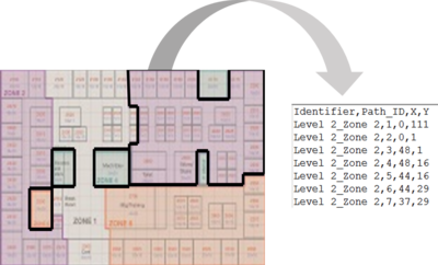
First of all, the (x,y) coordinates are based per floor with the lower left of the provided map being (0,0) and the upper right being (189,111). Thus, I have cropped the pictures of ProxZones F1, F2, F3 and resized them into (189,111) use Paint Tool. I then proceed to use the tool provided from this Website:https://tableauandbehold.com/2015/04/13/creating-custom-polygons-on-a-background-image/ so as to create custom polygons based on the background image and retrieve the vertices of each polygon that I’ve drawn. The data is shown in figure 3 – with field names (Identifier, Path_ID, X, Y). In my case, I am drawing the outlines for the various zones of each floor. | |
|
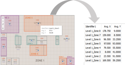
After which, I imported the data into tableau to retrieve the center point of the x, y coordinates by floors and zones respectively.However, there are some datapoints that are out of the zones, so to resolve this error, I had to perform a manual task. As such, I make use of Tableau function - "Annotate" which allows me to select a specific mark and retrieve the x,y coordinates. This process is repeated until all the centre point has been fixed. Finally, I have successfully created the x,y coordinates for the fixed-prox dataset. | |
|
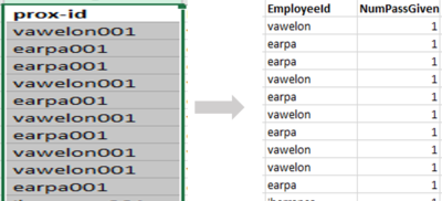
For both the fixed-prox and mobile-prox datasets, I split up the prox-id column and created 2 new columns: EmployeeId and NumPassGiven by using Excel Formula.
Extract all characters starting on the left side until it reaches the character “0” and -1 to remove the “0”.
|
The interactive visualization can be accessed here:https://public.tableau.com/profile/lim.kim.yong#!/vizhome/VA_Assignment3_Final6/Home_Page
The resolution of the visualization is custom set at the size of 1280 x 700 for a better user experience.Throughout all the different dashboards, useful tips/sharings will be provided to assists users in navigating through the different filters and actions so that their analysis can be performed smoothly.
Home Dashboard
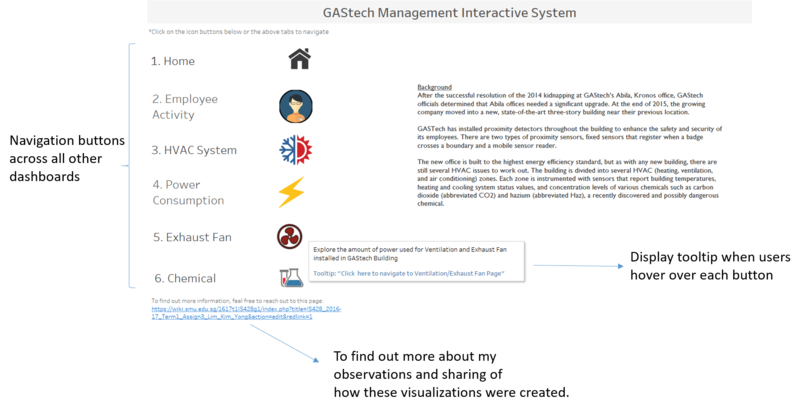
A homepage is created with 6 different data categories in mind - Home, Employee Activity, HVAC System, Power Consumption, Exhaust Fan and Chemical. Each of these categories are further broken down into its respective sub-categories for the ease of users to perform their analysis. As such, users can select any categories that they are interested in to conduct their investigations.
The following shows the home dashboard:
Employee Activity
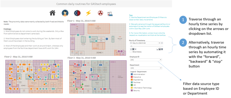
The following shows the employee movement dashboard:
Based on the given dataset, GAStech has 7 departments: Administration, Engineering, Executive, Facilities, HR, Information Technology, and lastly Security. I have decided to use tableau to visualize how does a typical day look like for GAStech employees by the various departments.
To assist with my exploration, I decided to use “Sort”, “Filter” and “Pages” to show the movements of employees from all the different departments throughout a typical day. Below are some of the screenshots that I got after using “Filter”, “Sort” and “Pages” functions.
The “Pages” shelf creates a set of pages, with a different view on each page. For e.g. the view below shows the movements of all employees from various departments and floor for each hour throughout the entire 2 weeks (31st of May to 13th of June).
Q1)Typical Patterns In Proximity Card Data & Typical Day Of GAStech Employees
The following shows the typical routine for GAStech employees in a specific department in general:
| Department | Activities |
|---|---|
| |
| |
| |
| |
| |
| |
|
Based on the information gathered above, the typical day for GAStech employees, in all departments:
- Employees start entering into the building at 7am. By 9am, majority of the employees would have already reached their compartment/office.
- Lunch break is usually in between 12pm to 2pm.
- By 2pm, most of the employees will be back as observed by the large amount of movements/activities occurring during that period in all level of floors.
- Employees typically ends work at around 5-6pm.
- After 6pm, most of the departments would have left except employees from the Facilities,Engineering and IT department.
- After 7pm, employees working in level 3, mainly executives, would have left the office.
- At 12am, most of the employees would have left the building except for Facilities department who are on 24-hour rotational shift.
- It is always the same people in facilities department that perform the night shift(Employee Stenig and Varja are found in Floor 1 as their offices are located in that floor).
- Most GAStech employees do not work during the weekends. However, a few of the employees from the administration department came back during the weekends and work from 8am onwards till latest 3pm.
- Some Employees from the Engineering & IT departments often stay till 11pm-12am.
HVAC Control System Dashboard - Heating
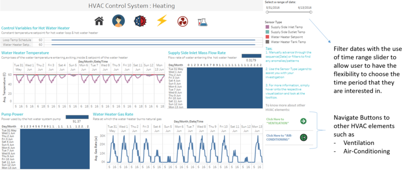
When creating the dashboard, Heating, Ventilation and Air-Conditioning comes to my mind to segregate them into three different dashboards rather than putting everything onto one dashboard. The following shows the HVAC(Heating) dashboard:
The visualizations created are based on these attributes and their units:
- Water Heater Tank Temperature (C): Temperate of the water inside the hot water heater(Tank)
- Water Heater Setpoint: Temperature you have set to maintain.
- Supply Side Inlet Temperature (C): Temperature of water entering the hot water heater.
- Supply Side Outlet Temperature (C): Temperature of the water exiting the hot water heater
- Pump Power (W): Power used by the hot water system pump.
- Water Heater Gas Rate (W): Rate at which the water heater burns natural gas
- Supply Side Inlet Mass Flow Rate (kg/s): Flow rate of water entering the hot water heater.
- Loop Temp Schedule: Temperature set point of the hot water loop. This is the temperature at which hot water is delivered to hot water appliances and fixtures
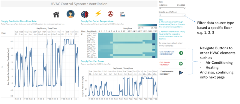
HVAC Control System Dashboard - Ventilation
The following shows the HVAC(Ventilation) dashboard:
The visualizations created are based on these attributes and their units:
- Supply Fan: Fan power (W) - Power used by the HVAC System Fan
- Supply Fan Outlet Temperature (C) - Temperature of the air exiting the HVAC System fan
- Supply Fan Outlet Mass Flow Rate (kg/s) - Total flow rate of air delivered by the HVAC system fan to the zones it serves
- Air Loop Inlet Temperature(C) - Mixed Temperature of air returning to the HVAC system from all zones it serves
- Air Loop Inlet Temperature(C) - Mixed Temperature of air returning to the HVAC system from all zones it serves
- Air Loop Inlet MFR (kg/s) - Total flow of air returning to the HVAC system from all zones it serves
- Drybulb temperature (C) - Drybulb temperature of the outside air
- Outdoor Air Mass Flow Rate (kg/s) - Flow rate of outside air entering the HVAC System
- Outdoor Air Flow Fraction - % of total air delivered by the HVAC system that is from the outside
- Cooling Coil Power(W) - Power used by the HVAC System cooling coil
- Heating Coil Power(W) - Power used by the HVAC System heating coil
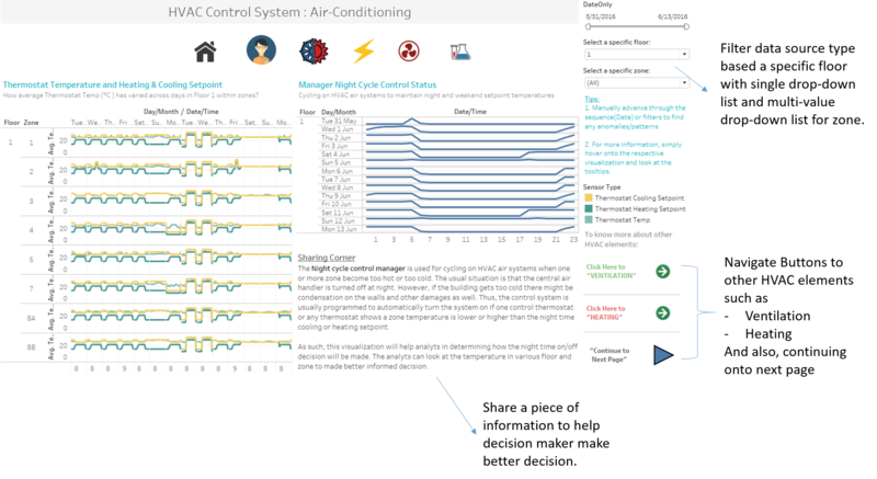
HVAC Control System Dashboard - Air Conditioning
The following shows the HVAC(Air Conditioning) dashboard:
The visualizations created are based on these attributes and their units:
- Night Cycle Control Status: ON/OFF status of the HVAC system during periods when system is normally scheduled off.
- Thermostat Cooling Setpoint (C): Cooling set point schedule for the zone
- Thermonstat Heating Setpoint(C): Heating set point schedule for the zone
- Thermostat Temp (C): Temperature of the air inside the zone
- Supply Inlet Temp(C): Temperature of the air entering the zone from its air supply box
- Supply Inlet Mass Flow Rate(kg/s): Flow rate of the air entering the zone from its air supply box.
- Reheat Damper Position: Position of the zone's air supply box damper. 1 corresponds to fully open, 0 corresponds to fully closed.
- Reheat Coil Power (W): Power used by the Zone air supply box reheat coil.
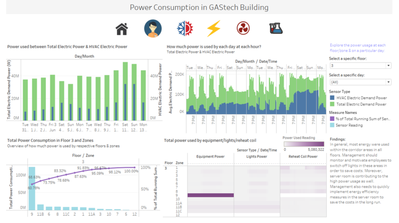
Power Consumption Dashboard
The following shows the Power Consumption dashboard:
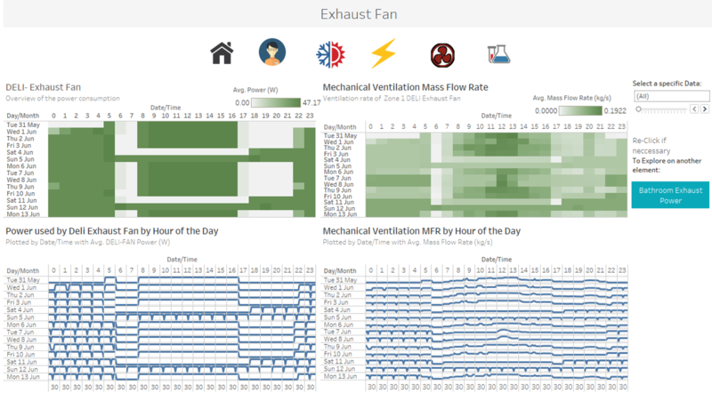
Exhaust Fan Dashboard
The following shows the Exhaust Fan dashboard:
Chemical Dashboard
The following shows the Exhaust Fan dashboard:
Now that we have created all the necessary dashboard, we are ready to use it as a platform to conduct our exploration and analysis.
Interesting patterns that appear in the building data and describe what is notable about the pattern
| S/N | Interesting Pattern | Significance |
|---|---|---|
| On floor 1 and 2, the bathroom exhaust fan is turn on continuously throughout the whole day. However, on floor 3, the bathroom exhaust fan power is only consuming power between 7am to 10pm. | Through this pattern, we can see that floor 1 & floor 2 does not comply with the energy efficiency standards. Knowing that energy are non-renewable resources and will eventually run out. Adopting best practices to conserve energy not only helps to conserve resources but also translates into cost savings. | |
| In general, most energy usages were consumed within the corridor areas throughout all floors. | This is exceptionally bad for the company as the corridor spaces do not contribute greatly to employee's productive or efficiency. Furthermore, not only does it contributes to energy wastages, it causes the company to incur unnecessary costs. Therefore, management should come out with policies to curb such issue. | |
| The server room at Floor 3, Zone 9 has been constantly using a huge amount of energy. | It is not surprising that server room usually consumed the largest amount of equipment power.Management should know such situation and make necessary energy efficiency measures so that resources would be deployed properly. |
Reference
Below are some works I personally admire and learning from it.
