IS428 2016-17 Term1 Assign3 Dina Heng Li Gwek
Contents
- 1 Overview
- 2 The Task
- 3 Background
- 4 The Data
- 5 Data Cleaning
- 6 Data Import/Configuration
- 7 Observations and Answer to Questions
- 7.1 What are the typical patterns in the prox card data? What does a typical day look like for GAStech employees?
- 7.2 2. Describe up to ten of the most interesting patterns that appear in the building data.
- 7.3 3. Describe up to ten notable anomalies or unusual events you see in the data.
- 7.4 4. Describe up to five observed relationships between the proximity card data and building data elements.
- 7.5 Data Visualisation
- 7.6 Tools Used
- 7.7 Reference
Overview
After the successful resolution of the 2014 kidnapping at GAStech’s Abila, Kronos office, GAStech officials determined that Abila offices needed a significant upgrade. At the end of 2015, the growing company moved into a new, state-of-the-art three-story building near their previous location. Even though the employee morale rose somewhat with the excitement of the new building, there are still a few disgruntled employees in the company.
The new office is built to the highest energy efficiency standard, but as with any new building, there are still several HVAC issues to work out. The building is divided into several HVAC (heating, ventilation, and air conditioning) zones. Each zone is instrumented with sensors that report building temperatures, heating and cooling system status values, and concentration levels of various chemicals such as carbon dioxide (abbreviated CO2) and hazium (abbreviated Haz), a recently discovered and possibly dangerous chemical. CEO Sten Sanjorge Jr. has read about hazium and requested that these sensors be included. However, they are very new and very expensive, so GAStech can afford only a small number of sensors.
With their move into the new building, GAStech also introduced new security procedures, which staff members are not necessarily adopting consistently. Staff members are now required to wear proximity (prox) cards while in the building. The building is instrumented with passive prox card readers that cover individual building zones. The prox card zones do not generally correspond with the HVAC zones. When a prox card passes into a new zone, it is detected and recorded. Most, but not all, areas are still open to staff members even if they forget their prox cards. People are somewhat careless with their prox cards, but some diligent staff members will go to the security desk and pick up a new prox card if their old one is mislaid. As part of the deal to entice GAStech to move into this new building, the builders included a free robotic mail delivery system. This robot, nicknamed Rosie, travels the halls periodically, moving between floors in a specially designed chute. Rosie is equipped with a mobile prox sensor, which identifies the prox cards in the areas she travels through.
The Task
As an expert in visual analytics, you have been hired to help GAStech understand its operations data. In this assignment, you are given two weeks of building and prox sensor data. Can you use visual analytics to identify typical patterns of and issues of concern?
You will be asked to answer the following types of questions:
- What are the typical patterns in the prox card data? What does a typical day look like for GAStech employees?
- Describe up to ten of the most interesting patterns that appear in the building data. Describe what is notable about the pattern and explain its possible significance.
- Describe up to ten notable anomalies or unusual events you see in the data. Prioritize those issues that are most likely to represent a danger or a serious issue for building operations.
- Describe up to five observed relationships between the proximity card data and building data elements. If you find a causal relationship (for example, a building event or condition leading to personnel behavior changes or personnel activity leading to building operations changes), describe your discovered cause and effect, the evidence you found to support it, and your level of confidence in your assessment of the relationship.
Background
The Data
You will have the following data and supporting information at your disposal:
- A building layout for the GAStech offices, including the maps of the prox zones and the HVAC zones
- A current list of employees, roles, and office assignments
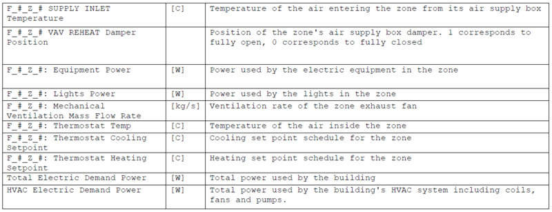
- A description of the data formats and fields provided
- Proximity sensor data for each of the prox zone regions
- Proximity sensor data from Rosie the mobile robot
- HVAC sensor readings and status information from each of the building’s HVAC zones
- Hazium readings from four sensors.
The datasets above can be generally grouped into 2 different category
- Employee Proximity Card Data
- Building Data
The data will then be visualized using Tableau. However, data cleaning is required to ensure all is working properly.
Data Cleaning
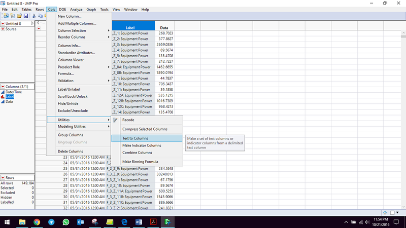
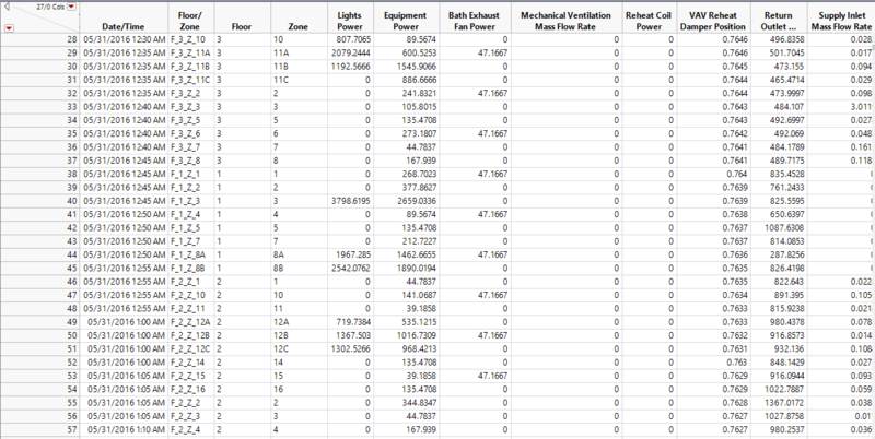
I managed to clean the data and sort according to equipment power (all levels) in one excel document.
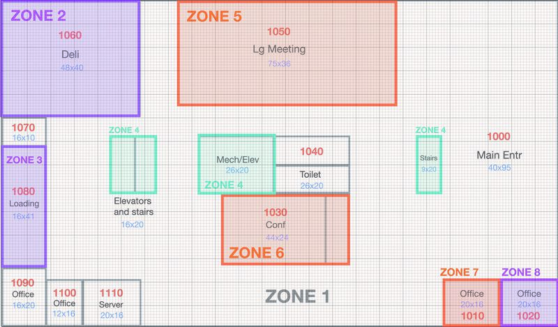
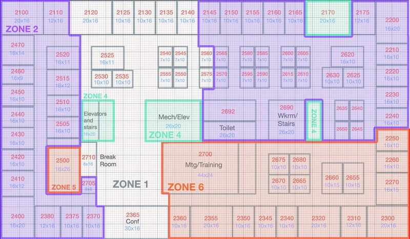
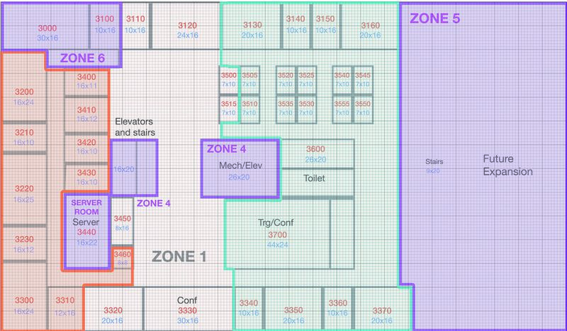
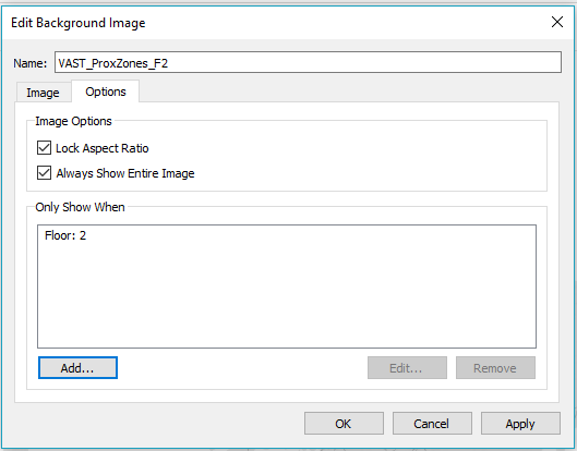
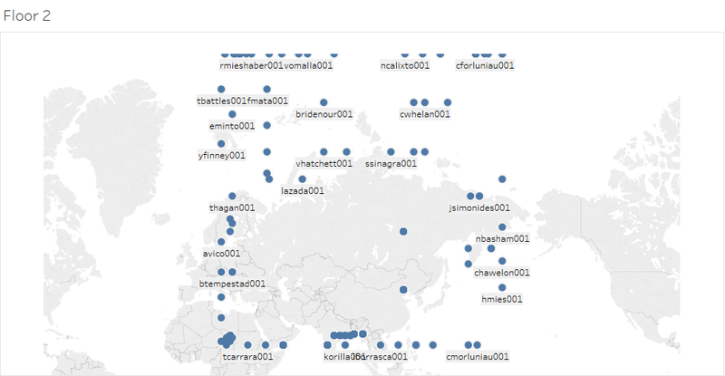
The floor plan is being imported into tableau with reference to the steps highlighted by Heng Yi Teng Mabel. However, instead of toggling between the 3 floor plans using a filter, i have created 3 sheets for each floor plan in order to better visualise the movement of the employees.
Sensor data
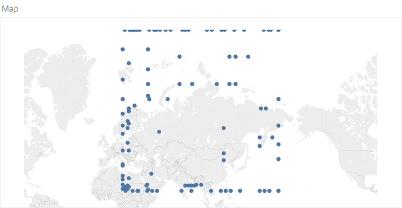
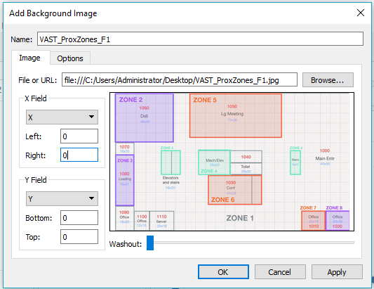
Creating a map for sensor data
I don’t know why I can’t map the image.
Data Import/Configuration
Observations and Answer to Questions
What are the typical patterns in the prox card data? What does a typical day look like for GAStech employees?
- In general, all GasTech employees report to work at approximately 7 AM, and next at around 12 PM they will go for an hour lunch,
- 11am-1pm is their lunch time. How I inferred was that there is a high level of activity going on in the elevators, stairs and corridors.
- They knock off at approximately 5 PM.
- On weekends, there is minimal employee activity.
- Most of the employees from the Executive department are situated on the 3rd floor.
- The Engineers are the ones who work the latest, as they have been detected by the sensors at 11 PM.
2. Describe up to ten of the most interesting patterns that appear in the building data.
- There is a constant usage of light power on some floors. This just means its a common area for all whereby lights won't be switched off.
- There is a spike in hazium concentration --> this could pose risk to employees!
- The HVAC electric demand power is higher during the weekend than during the weekdays.
- The lights and equipment power usually increase sharply at 6 AM then it drops to zero at 5 PM. This just means the usage of utilities when employees are arriving for work and knocking off.
3. Describe up to ten notable anomalies or unusual events you see in the data.
- The electrical demand is weird because it will be logical when there are not many employees in the weekend,the energy consumption will be low. However on June 11 and 12, I saw that the electrical consumption is high. Maybe because they forgot to switch off the lights.
- On June 11 and 12, the reheat coil power was usually high. This suggests that the HVAC systems were left on over the weekend. The power consumption was also much higher than normal office consumption.
- Ventilation going lower usually during the weekend but particularly high on the Sunday 12th June.
- Co2 concentration in the building on 7 and 8 was also observed to be higher on both days.
4. Describe up to five observed relationships between the proximity card data and building data elements.
- When there are more people in the building, the total electricity consumption goes up too. The same goes for water heater and gas. This makes sense because as more people enter the building, more activities are being conducted which leads to a rise in electricity demand.
Data Visualisation
Uploaded on eLearn
Tools Used
- Tableau 10
- JMP Pro
- Microsoft Excel
