IS428 2016-17 Term1 Assign3 Heng Yi Teng Mabel
Contents
- 1 Visualization
- 2 Question 1
- 3 Question 2: Interesting Patterns in the Building Data & Their Significance
- 4 Question 3: Anomalies in the Data
- 5 Question 4: Observed Relationships Between Proximity Card Data & Building Data Elements
- 6 Data Cleaning
- 7 Tableau Visualization Process
- 8 Your Comments, Please!
Visualization
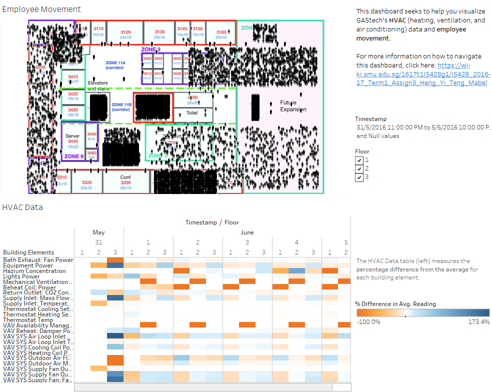
Click on the image below to explore the interactive dashboard or click here to view the entire Tableau workbook.
Question 1
Q: What are the typical patterns in the prox card data? What does a typical day look like for GAStech employees?
- In general, the 1st floor has the most activity in the corridors, lifts and staircases. This makes sense as employees likely enter the building from the 1st floor.
- The 2nd floor has the most office activity.
- The 3rd floor has much less employee movement than the 2nd floor, possibly since it consists mostly of Executive and Administrative office. Executives might not go to the office often, leaving only the administrative staff on the 3rd floor.
Weekdays:
- 7-8am: There is high human activity in zones of elevators, staircases and corridors across all 3 floors. This is probably when most employees arrive at work. There is not much activity in the 1st floor Deli, which indicates most employees either do not buy their breakfast from the Deli or the Deli is not open in the morning.
- 8-11am: There is much less activity on the 1st floor, which is likely because these are the morning working hours. In contrast, there is plenty of employee movement on the 2nd floor which is because there are many offices there. As mentioned previously, there is less office activity on the 3rd floor.
- 11am-1pm: These are probably the usual lunch hours since there is very high activity in the elevators, staircases and corridors. This is supported by the fact that there is significantly higher activity in the 1st floor Deli, which also implies that it is lunchtime.
- 1-2pm: There is still high activity in the elevators, staircases and corridors. However, there is little to no activity in the Deli which means lunchtime is probably over.
- 2-4pm: Similar to the morning work hours, the afternoon work hours see much less activity on the 1st floor. There is plenty of employee movement on the 2nd floor and again, less office activity on the 3rd floor
- 4-6pm: High human activity observed in the elevators, staircases and lifts. This is probably due to employees going home at the end of the work day.
- 6-8pm: We also see moderate activity in the 1st floor Deli, likely due to some employees grabbing their dinner there.
- 8-10pm: Employee movement is minimal but we still see some activity in the 2nd floor offices, specifically in Zone 10 and 11. These are the I.T. and Engineering offices and some employees seem to overtime there frequently on weekday nights.
- 10pm till next day: There is usually no employee activity.
Weekends
- Generally, there is minimal employee activity. However, the 3rd floor office shows consistent activity on weekends in a few office zones. These are the Executive and Administrative office.
- Room 3000, belonging to Executive Mr. Sten Sanjorge Jr., shows activity between 8am-1pm. Similarly, so does a couple of the Administrative office zones. It is likely this Executive comes into work on weekend mornings with 1-2 of the Administrative staff. They tend to leave around lunchtime.
Question 2: Interesting Patterns in the Building Data & Their Significance

In general, we see that Light Power seems to be exceed Equipment Power slightly. On weekends and everyday between the hours of 12am-6am, both Equipment and Light power levels are low. This makes sense since there is likely to be less employee activity. We notice that the 2nd floor appears to receive higher power levels than the 1st floor, which would make sense as the 2nd floor consists of many offices.
The 3rd floor receives exceptionally high Equipment power. When we drilldown we notice that it is Zone 9 on the 3rd floor which receives particularly high Equipment power. This is likely because it is the Server Room. It is highly powered throughout all hours, everyday.

Overall Consistent Thermostat Settings

The thermostat heating setpoint is kept low from around 12am-4am while the thermostat cooling point is kept high. Once the morning working hours start to roll around, the difference between both setpoints will start to decrease. This is probably to regulate the temperature for employees and they go about their day. In general, the temperature appears to be consistent at around 24-25 degrees. At around 9pm, the band between the heating and cooling setpoint increase again, allowing for greater temperature fluctuations as most employee activity has ceased. On the weekend of 12-13 June, we can observe all temperature measures being regulated to approximately 24 degrees as employee activity is expected to be lessened. Perhaps the temperatures could be regulated even lower, since few employees would be around. This could generate some energy savings.
Question 3: Anomalies in the Data
Hazium Spikes on 3 June, 7 June, 9 June, 11-13 June

Although some of the spikes happen on weekends or during hours where employee activity is low, it is definitely worrying that Hazium levels appear to be erractic. More needs to be done to ensure Hazium concentration is kept under control. Also, the current Hazium detectors are located in populous areas such as offices and corridors. High Hazium levels in such areas are likely to affect a significant number of employees. This further strengthens the importance of keeping careful observation of Hazium levels.

Supply Inlet Temperature Spike on 7 June & 8 June

Zooming in on 7 June and 8 June, we see that temperatures first spike at around 7am, going from around 12.8 degrees to over 35 degrees. The temperature drops back to lower levels subsequently and spikes again from around 8-9pm on both evenings.

Thermostat Temperature Errors on 7 June & 8 June
Ths issue could be linked to the Supply Inlet Temperature spike above.

In the early mornings (12am-6am) and nights (10pm-12am) of these 2 days, the thermostat temperature exceeds the cooling setpoint which should not be the case. Upon further investigation, we find that it is because the Cooling Coil power seems to have malfunctioned.

Although low employee activity is expected in these hours, more care should be taken to ensure the thermostat settings are precise as this could lead to unnecessary energy expenditure.
Supply Inlet Temperature Fluctuations on Floor 3, Zone 1

From 3 June to 13 June, we see that temperatures are high (about 36.8 degrees) from 12am to approximately 5am. They then drop to a low (around 12.8 degrees) from 5am-12pm before increasing to high levels which are sustained through to the next day. Although this strange pattern only affects Office 3000, it reflects an intensive use of energy in heating up the room for majority of the day. It is something which should be examined.
Question 4: Observed Relationships Between Proximity Card Data & Building Data Elements
Data Cleaning
Building (HVAC) Data
I wanted to create a variable Floor/Zone so I used the Stack function in JMP.

Result:

Next, I used the Text to Columns function to create 3 new variables: Floor/Zone, Floor and Zone.

I did this transformation on all the building data, including the Hazium sensor data, and got the combined data file below.

Finally, I used Stack to combine all the Building Elements into one variable. A sample from the final data file is as shown below.

Sensor Data
I needed (x,y) coordinates for mapping on Tableau. The fixed sensor data, proxOut-MC2.csv, did not have coordinates. To assign them with coordinates, I uploaded the ProxZones floor plans onto Tableau (see section on Creating a Map for Sensor Data for more detail) and used the Annotate Point function to retrieve approximate coordinates for each zone.


For each zone I took 2 (x,y) coordinates. Next, I matched the coordinates to the fixed sensor data based on the variables Floor and Zone.
_coordinates.PNG)

I then randomly assigned each record to a coordinate within the respective zones.


Next I used JMP to Join the fixed sensor and mobile sensor datasets based on timestamp, proxid and floor. I did this because I wanted to check if there were instances in which both the fixed and mobile sensors recorded the same activity.


In these cases, I chose to keep the mobile sensor data as it already comes with (x,y) coordinates. I then deleted the repeat fixed sensor data. Lastly, I combined all the sensor data into 1 dataset.

Tableau Visualization Process
Building (HVAC) Data Visualization
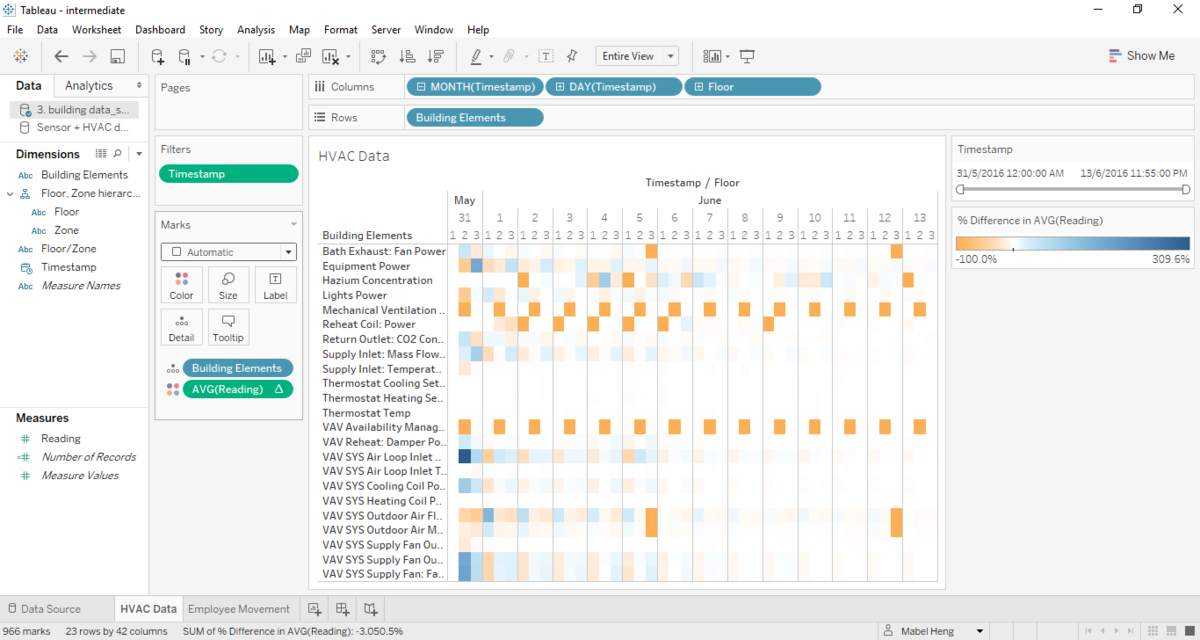
I wanted to highlight readings that were above average. Hence I used a Quick Calculation to calculate percentage differences from the mean:

I also created a Floor/Zone hierarchy to allow for easy drill-downs. This is done by dragging the Zone measure onto Floor.

Below are the settings for the final version of my Building (HVAC) visualization:
Sensor Data Visualization
Creating a Map for Sensor Data
I first loaded the mobile sensor data, proxMobileOut-MC2.csv, into Tableau. On the Data Source tab, I changed the Geographic Roles for X and Y to Longitude and Latitude respectively.

Next, in a new worksheet, I dragged X to Columns and Y to Rows. However, we can see below that the data points are superimposed onto a default world map.

Instead, we want to upload a map of the floor plans for the building. First, I manually cropped the VAST_ProxZones_Fx.jpg files and removed the white spaces, leaving only the floor plan. The result is something like this:

Next on Tableau, I uploaded the images under Map. As there are 3 floors, I had to upload 3 different floor plan images and set different conditions for them.


Lastly, I used the variable Floor as a filter to toggle between views of the map. This yielded the following:

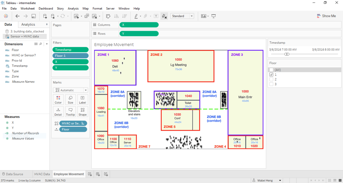
Sensor Data Visualization Settings
Below are the settings for the final version of my sensor data visualization: