IS428 2016-17 Term1 Assign2 Thomas Joseph Thio Kit Sun
Contents
Link to Visualization:
- Version 1: https://bl.ocks.org/ThomThio/raw/28f8043c3d91bb33408a6f1e256dfaa6/
- Version 2: https://public.tableau.com/views/VAIA2V2/Dashboard1?:embed=y&:display_count=yes
Please refer to Version 2's writeup here: https://wiki.smu.edu.sg/1617t1IS428g1/IS428_2016-17_Term1_Assign2V2_Thomas_Joseph_Thio_Kit_Sun
Theme of Interest
I selected the Work Injury data set as I wished to know more about the industries that were deemed dangerous, and what were some interesting insights to learn by occupation, time and causes of those injuries. With a suitable visualization, one could uncover interesting patterns that would otherwise be hidden in the data set.
I was particularly keen on building something applicable for use in a business setting, conducting preliminary analysis and identifying what are the precise questions to ask just before making a decision. I read a few articles on business dashboards and “self-service” analytics, but this may actually be detrimental to the organization due to the possible lack of understanding of the meaning or use of the dashboards/charts. As such, the process that begins the decision-making is important – i.e. “What are the right questions we should be asking?” and “Which aspects need our immediate attention?” This would be a useful tool in decision support analysis.
One could argue that slicing and dicing categorical data may just lead to high level views – but that is the point. Continuous data constituting different ranges of value, or time series will require a different type of analysis, of which they are already formed from the initial questions sparked off by the higher level view! If one were to automatically dive into looking at the micro level, there would be no need for Tableau to introduce their Story feature would it? My understanding is that Stories are meant to gently introduce users to insights uncovered, and this usually begins with a high level view for understanding the context – and that is what my work here aims to achieve.
However, having used Tableau to produce interactive visualizations in prior projects, I wanted to experiment with new tools that can achieve a different type of interactivity and engagement for users. d3.js came to mind, as in-class examples showed wonderful visualizations that I wished to build. In future assignments and work, I hope to be able to link these charts and processes together to form a seamless link from the high-level to low-level views, and d3.js seemed the most flexible to do just that.
Pre-processing of Data & Comments
The data set was relatively clean. There were some columns I felt were redundant, or did not give much meaning even if presented to users. They were:
Accident agency levels, Company postal code:
The agency levels were just numbers with not much meaning. One could plot the injury data by geography, but that would be misleading to say that injuries tended to happen more in certain areas due to having a large number of factors leading up to an incident.
Accident level 1 descriptions:
The level 2 descriptions were much more detailed.
Accident Type Level 2, Accident level 2 category:
This was just a number. I thought it might make more sense for users to see categories instead. The level 2 category was a close duplicate of the description.
Major Industry (SSIC 2010):
These were grouped into 3 large categories. I decided to use subindustries for more granularity.
Report Month (mmm):
I used the actual date representation instead.
Accident Month, Year:
Month as a string category makes more sense, and it would be easier for users to see.
Victim's Employment Start Mth, Victim Employment Start (MMM):
Left these out as we could use the mont's employee has worked in the company to make meaning, such as their experience in the company.
Accident Weekday No:
Not necessary, used weekday category instead.
Overview first, zoom and filter, then details-on-demand
I noticed that the data set were largely categorical. I narrowed down possible visualizations which could capture such relationships better – it was between parallel coordinates, Sankey diagram or a treemap. I reasoned that parallel coordinates were better fit for data with a range of continuous values for each dimension, rather than string-based categories.
Sankey works great to show the relationships between a network, but there was no network in the data, and creating one would amend the representation of the data – something would potentially mislead the user. I went with a treemap instead, as I thought showing proportions were more applicable based on the theme I chose. This required me to add an additional column called “Count”, where every row had the value “1”. This would enable d3.js to roll-up and drill-down the categories later on. In Javascript, each level was aggregated by an Aggregate function from the d3.js assets.
Questions For Investigation & Data Attributes Required
With the remaining variables, these were the questions I had at that time when pondering over the data set’s columns. Some of the columns did not make much sense at first, and I had to look closer at the values to understand that some of the columns represented something else. For example, Accident Level 2 Description tells more about the equipment/objects involved rather than an actual description of what happened. For interpretation purposes in this wiki, I renamed them to make more sense and listed what could be compared in order to visualize them:
1. Which industries did accidents happen the most? Which jobs? Were their work mostly manual labour? What was the cause?
- Industry (Specific)
- Occupation
- Proportion of Manual Work
- Cause of Accident
2. Which injuries happened the most at which times? In which industry?
- Nature of Injury
- Time of Accident
- Cause of Accident
- Industry (Specific)
3. What type of accident happened, and what objects where involved?
- Cause of Accident
- Accident Description
4. For those who were injured, how long have they been working in the company?
- Nature of Injury
- Employee’s Months with Company
5. For each type of accident, which day of the week did they frequently occur on? Which times of the day did accidents occur the most?
- Accident Description
- Weekday of Accident
- Time of Accident
6. How bad were the injuries?
- Was Injury Major?
- Nature of Injury
- Accident Description
- No. of MC Days
- Hospitalized for at least 24 hours?
Building The Visualization
With so many columns/dimensions, I felt it was important to provide a user-friendly environment for interactive data analysis. I wanted to give the user the ability to see aggregated data by reducing or increasing the number of dimensions, or climb up or down the concept hierarchy, and being able to retrieve as many abstraction levels which makes sense to the user from the given data. I decided create a way to build a visual hierarchy, a concept borrowed from Tableau’s View Hierarchy feature.
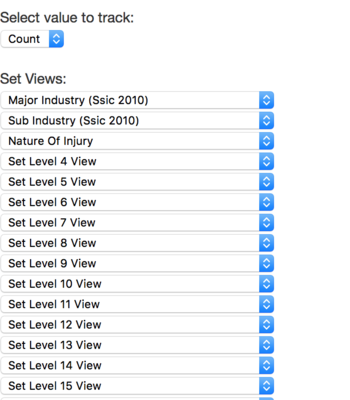
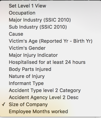
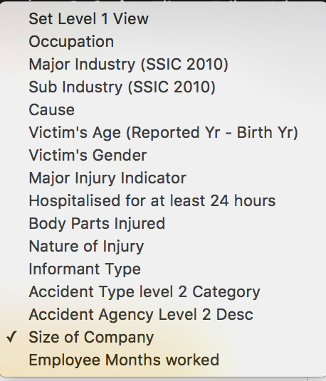
I like the fact that treemaps could serve as a business decision support tool, and users could uncover what they wanted to find fairly quickly. I would think that having a way to access insights on demand was more important than the first, initial questions, as it would ultimately mean giving non-technical users the ability to explore the data and their ideas on their own. Thus, I built a drop down list for each level, where the user could also select the category appropriate to their own questions:
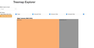
My first draft was as follows:
15+ levels of a hierarchy would seem really intimidating when a user sees it for the first time though. Playing around with these options, I found that some variables had more 'importance' than others in terms of the visual hierarchy. As such, I filtered out the columns I deemed unimportant/redundant (mentioned in the pre-processing segment). This reduced the hierarchy levels and options to choose from.
But there were still too many levels. Based on my questions, a maximum of 5 would be enough. It would also not be possible to drill down through all categories, as that would be too granular and doing so would dilute the answers we are supposed to get.
So instead of generating hierarchy selections to N (number of features), I decided to limit it to 5, as that was the depth I thought human perspective could take when interpreting the levels of meaning. For example, to answer the question "Which industries did accidents happen the most? Which jobs? What was the cause? What types of injuries" is already 4 levels. Adding one more seemed to max out the level of detail that should be extracted from a glance. I generated the first working model of the treemap thanks to open source d3.js projects. Some plumbing in Javascript was necessary to link up with the options and buttons though. The “Count” column was used to help d3.js flatten/expand the data based on proportion of each category at each level of the hierarchy. Placeholder/foreign objects are used to hide the parent/child objects behind the current view. These are hidden by default, until a layer is clicked.
For example, you can see smaller rectangles within the main rectangle. What d3.js does is to ‘expand’ these nodes on top of the lower levels, giving the illusion that they appeared out of the parent rectangles.
Transformation of the flat csv file was done with javascript closures, applied on the parent/child nodes. The first node is considered the “root”, and this would be the first level the user starts with. It can also be interpreted as the first filter. How the d3.js filter works is akin to a funnel – as the user clicks, an additional filter is applied, the funnel gets slimmer, and only a few data points are left when ‘pouring’ it through.
The treemap’s rectangles are generated based on the proportion of the counts in relation to every other data point available after the filters are applied. To “zoom” out of the hierarchy, Mike Bostock’s treemap implementation came in-built with this navigational header, where the user could click on the header to go out of a level. As the user goes up and down the hierarchy, the ‘grandparent’ takes this into account and forms a kind of ‘breadcrumb’ (similar to that of a website showing where the user is in the entire website). This allows the user to navigate backwards. It also uses a javascript closure, but in the reverse direction of the ‘funnel’ analogy.
Having settled how the treemap is generated, I played around with the options, and found that the labels did not make much sense – they came directly from the data set. I made placeholders for them based on the categories I established for each of my questions. This was the before and after result:
Much better. Instead of cryptic labels such as “Sub Industry (SSIC 2010)”, I renamed it to “Industry (Specific)” to make slightly more sense. Additionally, variables with Boolean values were re-labeled with question marks to denote their nature.
I still thought that the user would find it troubling to select one variable out of so many. I implemented a capability to search within the dropdown list, to help users select variables and analyze quickly, just to make the user's life a little bit easier. This reduces the need to scroll through the entire list of variables (which I did), and enable exploratory analysis to be done easily. I also made it such that only 5 variables are shown in the list at a time, of what I thought could ease the user into the usage without overwhelming them. I did leave out having the user select the mode of calculation, as I was concerned it would have misleading results – for example the total count of MC days. I reasoned that an aggregation over any of the categories would not lead to meaningful insights – rather, No of MC days should be cross-tabulated on an individual level rather than overarching categories.
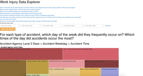
The visualization still seemed too flexible. The visualization and interactivity was open-ended, even though I had specific question I wanted to ask. I thought of helping users by pre-setting the visualizations in accordance to the questions - therafter, they can play around with the visualization for themselves, so this would be a mini 'tutorial' to get them introduced to its usage.
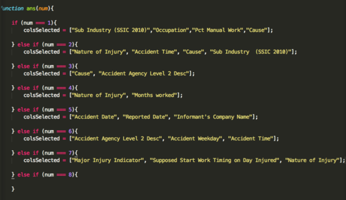
I mapped the questions and the required levels of categories, and this was the result:
If users did not want to select their own indicators, they could just click on the questions and interact with the treemap to get the answers, by rolling up or drilling down accordingly. In addition, users could click on the breadcrumbs, which also serves as a way to let them know how deep they are in the hierarchy, lest they lose their perspective.
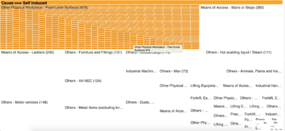
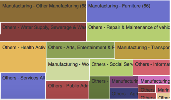
Some data values were very long, and appeared squished in their squares:
As such, I made them appear as ellipsis, to be more presentable. For extremely small squares, the text would be hidden entirely, showing just a colored rectangle.
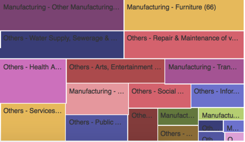
Users could still see that other rectangles represented a value, rather than seeing the values squeezed or become hidden under other rectangles. The rectangles are made clearer with white lines separating them, making the change slightly more intuitive due to the number of darker colors generated by the color function. To make the distinction of change clear, I changed the color palette to be of lighter colors.
Next, I explored two new questions which came to mind:
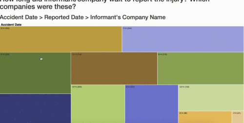
How long did informant/company wait to report the injury? Which companies were these?
Finding that there were time elements involved, I thought it would be interesting to see the companies that took their time to report the accident! Why would they wait a day later to report it, or even more? How long was the delay? A possible way to represent this in a treemap is if the dates tally – if they do not, there was a delay! The company names are just ID’s though – but to organizations with their mapping tables, they can easily find out which companies they are and take action if required.
 (If this file does not animate, please click on the image to view the animation.)
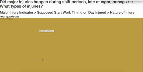
Did major injuries happen during shift periods, late at night, during OT? What types of injuries?
 (If this file does not animate, please click on the image to view the animation.)
A surprising find that it wasn't OT, and major injuries actually occurred in the mornings! This was an interesting finding to me, and I decided to add it to the pre-set list of questions. Therafter, I added the captions and descriptions for each of the question as users click on them. I felt that it makes more sense to have a brief guide on how each visualization would try to help the user understand the patterns.
One important element was still left out – color. From the previous iterations, I did get the randomized color working, but some words in dark colored rectangles were difficult to view. What helps is that I used the solid colors to ensure readability if through any color. For the font itself, a function handles whether to render it in black or white, namely getContrast50(color(parseFloat(d.rate))). It changes the contrast balance between the background color of the rectangle slightly, which makes it all the more pleasant to view. However, I did some testing between Chrome, Safari and Firefox. It seems that this neat trick does not seem to work on Chrome – it could be the way the browser renders these contrasts or interprets the color codes – Safari and Firefox seem to work fine.
The transitions were also colored, following the rectangle the user has clicked on. Once the animation is complete, the rest of the drawn rectangles appear in their own color, indicating a change in perspective of the data to the user. The final result can be seen below. To view the actual visualization, please visit this link: https://bl.ocks.org/ThomThio/raw/28f8043c3d91bb33408a6f1e256dfaa6/
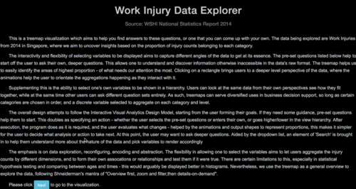 (If this file does not animate, please click on the image to view the animation.)
Limitations:
1. The treemap does take awhile to render especially when switching between questions - something I have not been able to optimize just yet. Reason being is that the new “root” takes time to sort and render on-the-fly – thus making it seem that some of the categories are missing when it is actually loading.
2. First-time rendering faster in Safari however, and has smoother rendering of the transitions.
3. I was also unable to prevent the treemap from going into the last level, where it shows “undefined”. As it is my first time exploring d3.js, I believe further self-exploration would solve this issue, by for example, using crossfilter to aggregate or slice for me rather than building and customizing my own functions.
4. Unlike available tools like Tableau or Microsoft BI, I have to acknowledge my handcrafted visualization has design and interactivity elements lacking as compared to them - however, I took this exercise as a good opportunity to learn d3.js for future uses.
