IS428 2016-17 Term1 Assign2V2 Thomas Joseph Thio Kit Sun
Contents
Link to Visualization
Version 2: https://public.tableau.com/views/VAIA2V2/Dashboard1?:embed=y&:display_count=yes
Note: Best viewed at 75% zoom due to width constraints.
Version 1: https://bl.ocks.org/ThomThio/raw/28f8043c3d91bb33408a6f1e256dfaa6/
Please refer to Version 1's writeup for my attempt to cover the limitations of Tableau: https://wiki.smu.edu.sg/1617t1IS428g1/IS428_2016-17_Term1_Assign2_Thomas_Joseph_Thio_Kit_Sun
Theme of Interest
I took the second attempt at this project to do a comparison of Tableau and d3.js. My motivation for selecting the data set was the same, wanting to know more about the industries that were deemed dangerous, and what were some interesting insights to learn by occupation, time and causes of those injuries. With a suitable visualization, one could uncover interesting patterns that would otherwise be hidden in the data set. The thing was, which aspects would be the most important? Off-the-shelf data exploration, or custom-made interactivity?
Thus, this second attempt is a revised version to use the capabilities of Tableau and see what it can add value to us from an off-the-shelf standpoint. Again, I really wanted to building something applicable in a business setting where interactivity was key. There were some interesting things you could do with Tableau, such as highlighting and actions, but anything else required more customized Table Calculations, or playing around with Parameters. Even adding a custom sort or button to go up and down a hierarchy, which I thought was essential, should come out of the box.
Nevertheless, Tableau does cover the areas that is most important, such as displaying the proportions accurately and neatly (unlike custom css styling with the HTML/CSS/JS stack). Additionally, the highlight and filter features came embedded with Tableau, which was nice. As such, these were useful for users to quickly filter by a dimension and see the results that remained.
Pre-processing of Data & Comments
As mentioned in version 1, redundant variables were removed/ignored. I only took what made sense to be displayed in Tableau.
Sankey and Parallel Coordinates could represent the categories as well, but they would not represent continuous variables and integers together very well.
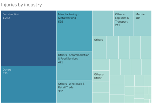
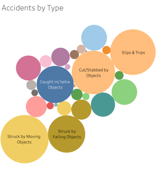
Although Tableau has an in-built treemap and bubble charts, once again I felt it was lacking in interactivity, so as to make more sense of the data given. Nevertheless, these were used to better represent the overarching categories of Accidents by Industry and Types.
Questions For Investigation & Data Attributes Required
My questions did not change from my first attempt. They were:
1. Which industries did accidents happen the most? Which jobs? Were their work mostly manual labour? What was the cause?
2. Which injuries happened the most at which times? In which industry?
3. What type of accident happened, and what objects where involved?
4. How bad were the injuries?
Now that I was using Tableau, there were actually ways to make use of one overview dashboard to answer these questions.
Building The Visualization
The first was to rebuild what I did in version 1. Looking back, this took a significantly shorter time than coding it from scratch - showing the power of Tableau for quick data exploration!
I felt that these were useful as both visualization and filter tools. Users could see large rectangles and circles respectively, and click to interact on any of them to see what remained in those categories. This was something that d3.js could not do out of the box.
Users could wonder if perhaps heavy industries tend to have the highest injury count. Perhaps certain occupations with manual labor tend to have more injuries, and of a certain type. Thereafter, users can know if the work involved consists of manual labour, and the cause of the accident by seeing if the color size and remaining data has changed.
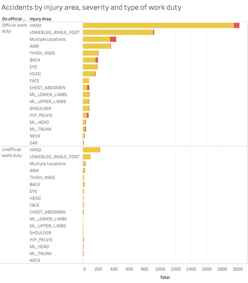
At a glance we can see a large proportion of injuries came from the Construction, Metalworking, Wholesale Retail & F&B industries. However, perhaps the types of injuries differ between them. One could reason that F&B or Retail could have less severe injuries as compared to the heavy industries. To see the difference, I added an additional chart:
Red represented Major Injuries, and Yellow for Minor Injuries. They were represented as stacked bar charts to resemble the proportion of the severity according to injury to the body. Additionally, having a breakdown whether they were from official work duties, we can gauge the severity even if there are counter-claims to what is considered 'severe' or not. For example, there are people who abuse general insurance and make claims for any tiny accident - this view would be useful to know compare and contrast the types of injuries received and if it is significant enough to defend against claimants.
Combining this with the view on industry and accident types, users can reason and remove assumptions that perhaps heavy industries tend to have the highest injury count. Perhaps certain occupations with manual labor tend to have more injuries, and of a certain type. Users can see the proportion of injuries by industry and see the occupations with the highest injury count in that industry, and the nature of the industry.
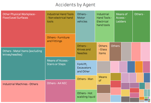
Filtering by F&B and Retail, we can see that there are actually many instances of minor injuries to the hands and lower legs. 113 were from being cut (due to the nature of handling food and packaging) or slips and falls. There were severe injuries to do with exposure to extreme temperatures, in which the proportion of red to yellow was the largest amongst all other selections made. For retail trade however, there were much more incidents involving being struck by moving objects. This could be due to nature of moving goods with forklifts. However at this point we do not know what is might have caused it. Thus there is a need to represent the data by proportion of accident agents (i.e. what might have caused it). This would give us a clearer picture:
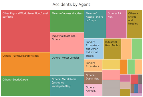
And we can see that in general, most accidents were from floor/physical surfaces, and metal items (excluding knives and needles). Filtering once again by Wholesale trade and retail, this changes to:
It turns out that floors were the culprit! Furnitures and fittings, cargo and ladders were other reasons. It turns out our assumption of moving goods with forklifts were wrong! Thus the user can find value by comparing the results and filtering them down to test their assumptions and make an accurate conclusion. In addition, one can question: "What were the common accidents, and what equipment, tools or objects were involved?" In doing so, we can uncover a pattern between these two variables - if the count is higher for a certain object, further investigation can be done on the operational processes or its individual handling. Perhaps the object is faulty, or the nature of its handling make it accident-prone. Users can see the types of accidents, and for each, the objects involved. Click on one to drill-down and make comparisons to other types of accidents.
Next, we factor in time to the accidents that happened so far:
We can assume that odd or late hours tend to be when we are at our lowest levels of concentration, possibly leading to accidents. After-lunch sleepiness could also affect our focus. Could there be a correlation between these timings and the injuries, perhaps of a certain type?
The chart above shows the times of the day, and the redder and larger the squares, the more accidents were logged in that time. In interpreting the chart from an overview level, most accidents happened between 10-11am, and 3-4pm. It would be an interesting study to do if after-lunch sleepiness could have caused the afternoon accidents to be a larger proportion, as the other reason I could think of may not be as applicable anymore. The results are the same when filtering by the labour types - in fact more accidents happen in a larger time span, from 2pm-4pm!
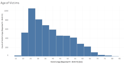
Users could compare with the rest of the charts to see for example, the age and gender of victims. Users can click to filter in both directions, allowing some interactivity to explore the data.
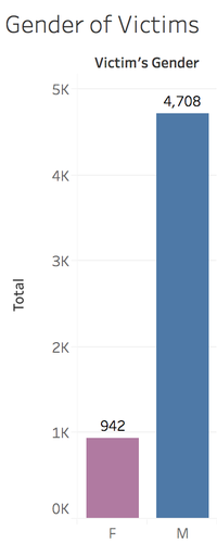
We can see that a large proportion of victims were Males. If we click on Males, we can see that the remaining industries, occupations and labour types were the same as before - but when we click on Females, the results were different. Labour types when accidents occurred of almost equal proportion, and most injuries were actually Slips & Trips! The "Others" & "Accomodation & Food Services" made up a bulk of them, where their work was as Cleaners, Waitresses, Kitchen Assistants, Cooks & Factory Workers. We can also tell that a number of victims were aged 23-27 and 52-56 years of age. In this way, we can find out much about the demographics by continuously stacking the filters and exploring the data. This was as close to a drill-down exploration interaction compared to Version 1's Treemap approach.
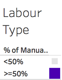
Manual work was to represent the nature of the job involved. The squares would be bigger if a large number of accidents occurred in jobs involving more (>=50%) or less (<50%) manual work respectively. This gives a good gauge where users could glance at it to know the type of occupations involved, and filter from the other charts thereafter.
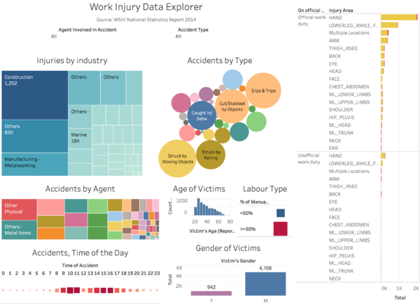
Finally, putting it all together in one piece:
Tableau also has the ability to filter, thus I added the filters of "Agent involved in accident" and "Accident Type", as users may want to select these criteria and see what remained when they explore the data.
Limitations:
- Tableau does not have interactive Treemaps, and that is why Version 1 of this project aimed to tackle that. It was more of exploration, but there are obvious areas which it does not cover as well as Tableau.
- Space constraints require the user to zoom out, or have a larger resolution screen.
- Unable to provide buttons for custom sorting and drill-down view hierarchies, or placement of such buttons. Users are restricted to finding the sort buttons within each table, and sometimes it may be detrimental when they misclick.
- Hovering and filtering requires time to load, instead of being near-instant such as d3.js. However, it does get the job done to help users interact with the data. I do think Tableau does very well in data exploration, but may not be as applicable in production usage using large data sets.
