G7 Dashboard
With our Confirmatory Analysis, we can be certain that the operational performance is different across different BUs and across different Flight Types. But this analysis was done for the entire data set on a broad level. We can possibly get more insights if we can go in further depth and analyze for specific lanes during specific time periods. To achieve this, the team came up with a Dashboard consisting of a combination of conventional visualizations like stacked bar graphs and non-conventional visualizations like Mosaic plot and Box plots to visualize the operational performance across different BUs and for different Flight types. The flexibility of this dashboard will give GAMs a more comprehensive and easy to understand view of the operational performance.
Business Unit Analysis
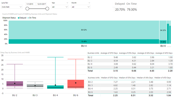
The following is a breakdown of the different parts of this dashboard:
1. Firstly, the layer of filters on top allows the Sponsor to filter data used to generate the graphs according to:
- Lane Pair
- Date Range across the three years of provided data
- Years
- Months
2. A summary table on the top right to show overall performance (Delayed vs On-Time percentage) of a specific lane.
3. A mosaic plot measuring the percent of ‘Delayed’ vs ‘On Time’ shipments across different BUs. In this, the light blue layer represents ‘On Time’ shipments, while the dark blue layer represents ‘Delayed’ shipments. The width of each box in the Mosaic rectangle shows how big each BU is in terms of total number of shipments for that lane. This visualization will help understand the true performance of a lane as GAMs can focus only on the performance of BUs with large widths since they account for the bulk of shipments.
4. Since we cannot use mean as a point estimator for delay days, we use a box plot visualization on the bottom left which displays the entire distribution of delay days across different BUs. The black line represents the median and the dot represents the mean.
5. Tables on the bottom right displaying the average number of days and the median number of days taken for each journey leg of a shipment, broken down by BUs.
Example of insight drawn: In the screenshot above, it can be derived that for the last three years, for the lane from Cincinnati (CVG) to Paris (PAR), BU 4 accounted for the most number of shipments, with 80.52% of them on time, with an average of 3.08 days for the entire DTD journey. The most number of days were taken in ATA. The box plot shows that the median number of days by which the shipment was delayed is 1 day.
Flight Type Analysis
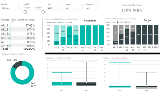
The second dashboard was created to analyze the operational performance for different flight types across different airlines. Using this, GAMs can compare the performance of different airline carriers and assign more jobs to the carriers performing better. The following is a breakdown of this dashboard: 1. Firstly, the layer of filters on top allows the manages to filter data used to generate the graphs according to:
- Lane Pair
- Date Range across the three years of provided data
- Years
- Months
2. A summary table on the top right to show overall performance (Delayed vs On-Time percentage) of a specific lane.
3. The table on the left shows all the Airline Carriers currently being used for the specific chosen lane and their corresponding percentage of shipments.
4. The stacked bar charts show the performance for different airlines. They are split into two charts - Passenger and Cargo so that performance of different flight types can be compared.
5. A pie chart on the bottom left, breaking down the total number of shipments by flight types.
6. Since we cannot use mean as a point estimator for delay days, we use a box plot visualization on the which displays the entire distribution of delay days across the 2 flight types. The second box plot displays the distribution of ATA days.
Example of insight drawn: In the screenshot above, it can be derived that for the last three years, for the lane from Cincinnati (CVG) to Paris (PAR), Airline 9 was used the most, with 98.94% shipments going through Airline 9. Out of these, 85.02% of shipments were sent across on Passenger flights, and 14.98% were sent across on Cargo flights. On diving further, it can be seen that on all the Passenger flights being used, 20.55% times the shipments were ‘Delayed’, as compared to 14.9% of all the Cargo flights.
Dashboard Evaluation
Reviewing the dashboard overall, the Mosaic plot used to visualize the business unit performance enables the users to effectively interpret the operational performance of shipments easily and in greater detail. It combines the benefits of a pie chart and a stacked bar chart into a single visualization to get comprehensive insights. With these easy to understand visualizations, Company X can develop an understanding of the overall picture and insights into key variables. The dashboard is organized to ease the analysis process and ad in decision making from a managerial perspective.


