AY1516 T2 Team SkyTrek Methodology
| Project Description | Data | Methodology |
|---|
Contents
Overview
The following table demonstrates the analytical methods proposed for use, in order to achieve our objectives for this practicum.
| Objective | Analytical Method(s) |
|---|---|
|
To validate and possibly identify new CT |
Content Theme Performance Analysis Via Clustering |
|
To increase organic growth by identifying key article attributes that draw high levels of traffic and interest |
Understanding performance of news article attributes based on organic viewership via Logistic Regression |
Facilitate the content planning process by way of an interactive dashboard
|
Data Visualization |
Multiple Linear Regression on Article Characteristics
Based on the merged dataset comprising of attributes from Google Analytics and article attributes scraped directly from the new articles, we will be performing multiple linear regression (MLR) to determine key attributes affecting the number of unique page views.
We will be exploring the following dependent variables in predicting the number of unique page views:
| Independent Variable | Intuition for Selection |
|---|---|
|
No. of words (stopwords removed) |
This measure serves as an indicator of the length of the article. Recognising that readers have a limited attention span, it would be interesting to explore the effect of a lengthy article on its popularity. |
|
No. of outbound links references |
Outbound links typically direct readers to more in-depth content. An article with more links might be indicative of more meaningful content, which might translate to greater popularity and better reception amongst its readers. |
|
No. of images |
Images and videos make for a more interactive experience with the reader. It might be an important determinant in an article’s receptivity. |
|
No. of article shares |
The intuition is that people share articles that are useful and impactful. Number of article shares is expected to have a positive correlation with the number of unique page views. It would be of interest to assess its importance, hence making an assessment of the importance of social media as a platform of publicity in comparison to other platforms. |
|
Bounce rate |
Readers arriving at Skyscanner’s news pages are expected to be browsing for information related to a particular destination or related travel content. Since Skyscanner articles are light (bit-sized) reads, we would expect readers to continue browsing other relevant articles via the recommendation engine or the outbound links within the articles themselves.Nevertheless, there will bound to be a point where readers finally exit the site. Hence, we are expecting to see an average bounce rate and exit% rating across the articles. Articles with particularly high ratings would serve as good negative-subjects of study for future reference.
|
|
Average time on page |
Time spent on a page is expected to be indicative of interest levels in an article and possibly the number of unique page views. It would be interesting to validate if time spent is a predictor of unique page views. If so, we could also consider study articles with long average times to identify good articles. |
Understanding key dependent variables which influence the value of the unique page views will help in the creation of content which have greater tendency of receiving higher page views.
Google Trends Analysis
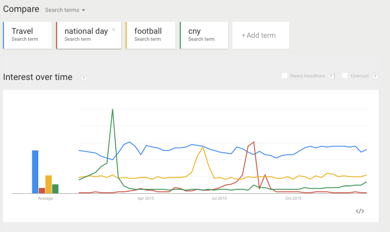
In planning the content for the upcoming quarter, the content management team typically uses Google Trends to understand consumer trends in both past similar quarters as well as the present. They would also consider the present context of festivities and events. A word cloud of Google trends relevant to each quarter will help incorporate these trends into the content planning process.
This will tie up with our exploration of seasonality and the effect of external events on the content readership. While Google Trends does not have an API, the data can be scraped through manipulation of the URL. This trend data will be aggregated and put into word cloud and put side by side with the quarterly patterns of the different Google Analytics metrics in order to gain a better understanding of seasonality.
Content Themes Analysis
Skyscanner has classified its collection of 399 news articles into 7 CT. They are Skyscanner Product, Practical/Tips, Deals - Prices, Trending, Domestic/Local, City Guides and Inspirational. It would be useful to know which CT is most well received with readers, hence facilitating a more targeted allocation of article-writing resources. The converse also hold true. This analysis predicates on the validity of the CT provided. Hence, it would be prudent to first validate the truth of these pre-identified CT. In order to address this, we employed the use of clustering analysis.
In the clustering of articles, one would intuitively base the classification on the content covered in the article. However, given that our primary objective was to evaluate the performance of the CT discovered from this clustering, we found it more useful to perform clustering on the article titles. After all, given the swarm of information on the internet and social media, the decision to view the article or not is very much contingent on the appeal of the article title.
This then begs the question: Shouldn’t the clusters generated on the article body be similar to those on the article title? While the CT identified were similar, the examples constituting the clusters were found to be different, leading to different conclusions on the CT performance analysis. There are a few reasons explaining this. The clustering algorithm does not directly emplace the articles into the CT. Therein lies the inherent evil of subjectivity in the profiling and assignment of clusters to new/existing CT. Last but not least, Skyscanner is known to use highly-searched keywords in the naming of their article titles in a bid to drive article performance. This might lead to the forced use of keywords which could differ from the article content. Our analysis will demonstrate the existence of this disparity between CT performance between article title and body. After considering the order of activity flow in a typical decision of whether to read an article or not, we find the the article title to take precedence. Hence, we shall base our recommendations on the article title analysis.
Data Visualization
Source/Medium Dashboard
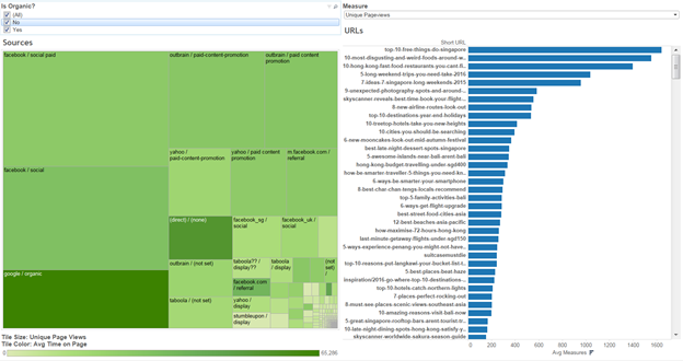
From the discussions with our sponsor, Skyscanner Content Team would like to perform exploratory analysis on the effectiveness of paid and unpaid articles, across multiple platforms that Skyscanner promotes the content. Thus we have created an interactive dashboard using Tableau software to facilitate this exploration process, based on the data that we have assimilated.
Since the attributes of interest for Skyscanner are unique page views (UPV) and average time on page (ATOP), and since Skyscanner also wants to understand which platforms or mediums bring the most satisfactory result, we decided to represent the information using a treemap. Each tile within the map is assigned a platform/medium. The tile’s size shows the relative UPV, with bigger tile meaning that particular source has higher UPV. Similarly, the tile color shows us the relative ATOP, with darker tile having higher ATOP, and vice versa.
Skyscanner also wants to find out more about the organic growth of their articles (non-paid), and in term of paid content, possibly which platforms yield better UPV or ATOP, in order to focus their resources. Thus we also created a filter to separate data between organic and paid articles.
In order to provide a better drill down view on performance of each article within a particular platform, the right-hand side of the dashboard can show the readings of the articles, based on which platform is selected from the treemap. The result can be sorted to view, for example, top 10 articles with highest UPV that were searched on Google, or top 10 articles that has the most engagement from Facebook. User can also switch between different measures (UPV, ATOP, bounce rate, exit rate, etc.) to evaluate the performance or explore various perspectives.
Content Theme Visualization
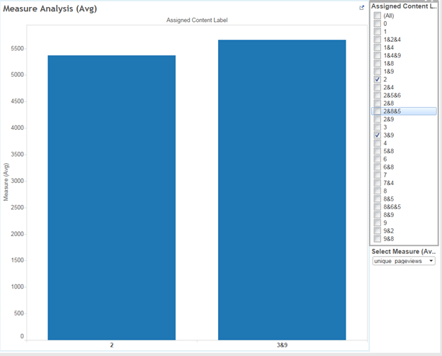
In conjunction with discovering which cluster an article belongs, it is interesting to investigate how each cluster perform against each other across multiple measures, so that Skyscanner can improve their planning process and allocate sufficient resources to the most appropriate content themes.
As mentioned above, we have identified 9 distinguish content themes, and one unclassifiable theme. However, there are some articles which could not be classified under a specific theme, and thus were assigned two, or even three themes. Through the filter on the right hand side, Skyscanner team can easily select and compare a certain measure between chosen CT classifications, which may be hard to realize when selecting all classifications.
Our group also include the capability to switch between different measures, such as UPV, ATOP, bounce rate, and exit rate, so that Skyscanner team can dive deeper into the characteristics of each cluster. Certain clusters may drive high UPV, but low ATOP, and vice versa.


