AY1516 T2 Sport Betting at Singapore Pools Project Overview Final
| Proposal | Midterm | Final |
Contents
Abstract
In today’s interconnected world, the gambling environment has transformed into a multifaceted playing field without boundaries, exposing more people and younger people to the games, and too creates loop holes for illegal gambling operators to enter the market. The result is greater public worry about the social ills of irresponsible gambling.
Our sponsor, the Singapore Pools, takes a strong stand in responsible gaming, wanting to offer a safer outlet for the public to play. This paper will explore gambling transaction data (n=930,000) to identify and better understand betting patterns that would eventually allow us to flag out players who engage in or is susceptible to irresponsible gambling in turn suggest ways to promote responsible gambling. This paper would also consult with past literature to guide our methodological approach and cross compare hypotheses and findings.
The methodological flow of this project begins with exploratory data analysis where the dataset would cleaned and transformed for further analysis. The large set of transaction will be aggregated into a list of user data. We then proceeded to relationship analysis of the parameters and bet preferences of players of different demographics. Using a clustering analysis, we will then profiled players into four main segments: (1) Masses (2) High-rollers (3) Players-at-risk (4) Habituals.
This unique segmentation would allow our sponsor to identify players would are at risk of irresponsible gambling, and suggest strategies to reach out to these segments and alert them of their betting behaviour and educate them about responsible betting. To ensure project continuity and future analyses, our team has created a dynamic dashboard to visualise monthly transaction trends, highlight popular events, players who are at risk, and allow exploration of each individual player’s profile and betting patterns (i.e. their betting intensity, transaction history).
Introduction
Gambling is often seen as a problem in society, no doubt gambling addiction poses a grave societal problem, however banning gambling is not a viable solution, for it would simply drive these activities underground. Our sponsor, Singapore Pools was set up by the Singapore government in 1968 to place gambling on legal grounds and to deal with the social ills tied to gambling. Ever since, Singapore Pools (SG Pools) has been the sole legalized operator to run lotteries and sports betting in Singapore.
Unlike in most countries where gambling houses are privately owned organizations, Singapore Pools is a stated-owned organization, registered under Singapore’s Ministry of Finance. Singapore Pools offers four main products to the public (TOTO, Singapore Sweep, 4D, Sports Betting) all of which –operations and product configurations – are regulated by Singapore’s Ministry of Home Affairs, Ministry of Finance, Ministry of Social & Family Development.
Our sponsor takes a strong stand in responsible gaming, wanting to offer a safer outlet, where players can bet responsibly within their financial means. Attrition rates have be raising over the years, and this could meant that Singapore Pools’ customers are seeking other avenues to participate in gambling activities such as illegal online-gambling sites, which may lead to irresponsible betting. Therefore, within the next few years, our sponsor seeks to undertake a data-driven approach to promote responsible gambling by monitoring the player's’ betting behaviour and performance, in hopes of highlighting alarming patterns that could indicate signs of irresponsible gambling, and too use this data to help usher in their online betting platform that is scheduled to launch in the upcoming year.
Thankfully our sponsor has been collecting user and transaction data for the past several years, but has yet put it to good use. Singapore Pools had set up a customer insights division about a year ago to better understand their customers through the analysis of these user data. This is their first step towards a data-driven approach to promote responsible gambling and to understand the gambling behavioural patterns of their customers; and thus this is where our team comes in.
Project Objectives
The aim of this project is to provide Singapore Pools with a better understanding of the gambling behaviours of their customers through the identification of betting preferences and patterns. Clusters of players may be identified base on their betting behaviour – ways of splitting their bets, preference for a league, different decision making process, and ways of selecting their bet selections. Such behavioural patterns could possibly be linked back to certain demographics pertaining to the cluster, allowing us to further infer reasons behind their gambling habits, and hopefully could help us identify those irresponsible gamblers too.
The scope of our project is limited to the Sports Betting segment of customers who have opened betting accounts with Singapore Pools. The data provide are confined to line betting transactions made by their ‘Gold’ and ‘Platinum’ members.
The overall objectives of our project are as stated:
(1) Provide insights with regards to gambling behavioural patterns
(2) Profile their existing pool of customers into meaningful segments
(3) Build a dashboard to visualize betting patterns and trends on a macro and individual level
And based on the characteristics of each cluster, the sponsor’s end objective is to (1) flag out players who display alarming patterns that could lead to irresponsible betting, and (2) tailored business actions that targets the derived clusters of players to enhance their gambling experience while ensuring that they make bets in a responsible fashion.
Literature Review
Gambling is one topic that is widely researched across the world, from survey polls of gambling participation and perception, gambling risk and pathology, to thorough statistical analysis on gambling behaviours.
According to a survey done by Singapore’s Ministry of Community Development, Youth and Sports (MCYS), within a year’s period, 58% of Singaporeans over 18 years of age have participated in at least one gambling activity. Further study on pathological gamblers by the MCYS found that players at risk to developing a gambling addiction would gamble at least once a week, and this pool of susceptible players made up 70% of the sample population involved in the study (2005).
Behavioural or betting patterns is another popular area studied across most papers – for they provide cues to possible pathological gambling behaviours; difference between betting behaviour of regular players and players at risk (problem gamblers) is evident, a common finding in most studies. One study revealed that gamblers at risk are more likely to bet more frequently coupled with increasing bet amounts, regardless of their bet outcome (Mizerski, 2011). And that less frequent players are more likely to put more effort into decision-making when making bets to allow for future betting possibilities, as compared to regular or frequent players. Evidently they also found that certain betting games and game arrangements may actually prompt reckless betting that could like to irresponsible gambling.
Several other papers provided insights to a more analytical approach to segment gamblers and identify those at risk. A study by Faregh and Leth-Steensen (2011) discovered clusters of players with variations in terms of their bet activity level (frequency), bet variability (spread of stakes and odds), time spent on making the bets, and the games played. Relationship and predictive analysis between selected parameters may reveal variables that best predicted returns, and reflect bet strategies that are less sophisticated (Gainsbury & Russell, 2013). Suggestions on data collection procedures, selection of metrics and parameters for clustering players in these papers are just some of the secondary insights that have aided our choice of methodology and analysis – determining ways of profiling our result clusters – that will be elaborated on later in this report.
Besides researching the field of gambling and the analytical methodologies, we took examined past data visualization papers to learn about the pit falls and best practices of data visualization. “Different types of graphs are designed to communicate different types of messages” quote data visualization expert, Stephen Few, as he demonstrated in his papers regarding the effective use of points and lines to shape data trends, to the principles of colour selection for data visualization – use of contrasting or analogous colours for varying purposes (Few, 2004; 2006; 2007). Meanwhile some graphs are best to avoid, such as alluring 3-D graphs or pie-charts which can be rendered better in a two-dimensional plane, for the added depth and angle makes interpretation more difficult (Few, 2005). Returning to the dashboard, two guiding principle in designing the dashboard layout that we took from Few’s recommendations was to (1) find balance between being information rich and not oversimplifying and (2) to remove clutter or any distractions that do not add value (Few, 2005).
Leveraging on these prior knowledge, our team hopes to deliver actionable insights with regards to the betting behaviour of our sponsor’s pool of customers, and present the findings on a dashboard that is all visually appealing, intuitive, practical, and accurately data driven.
Data Cleaning & Transformation
The original sample data set that was given to us was a comma separated values (CSV) file containing over 930,000 unique observations (transactions). The time period spans from January to March 2015, which coincides with the peak period of the different international soccer leagues, so as to ensure the highest volume of betting activity for analysis.
The first phase of our data cleaning process would be to remove the noise, irrelevant fills and outliers in our data set – identified from our early data exploration.
There were two types of noise in our data set: (1) irrelevant fills – some of which are variables or observations that do not pertain to the soccer betting products, rejected bets which have no odds indicated, and ‘Championship Winner’ bet types for which is considered atypical to regular bet patterns; (2) outliers – these observations lie beyond the 99th percentile of selected parameters, the thresholds were identify based on scatterplots of the data distribution on Tableau.
The dilemma we faced then was that if we removed the outlier transactions, we would be artificially changing the users’ bet behavior and preference when we aggregate these transaction data into one user’s overall bet pattern. The other option was to aggregate all transactions (including extreme observations) into a user’s overall bets, and then to filter the users from the population. Given that the outlier transactions would impede of analysis of transaction data, we had no choice but to remove these outliers. And in effect, we had to remove the affected users (users who made those extreme transactions) to maintain the integrity of the user data. Therefore, after data cleaning, we are left with 529,678 unique observations (transactions).
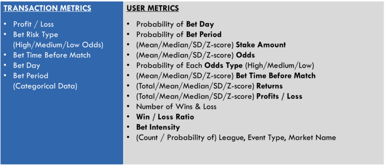
To gather deeper insights in later data exploration analyses, our team created new metrics that reflect certain attributes of bet behaviours. This then allowed us to test some of the hypotheses about betting patterns that our sponsor highlighted to us. The new metrics would be used to test difference in betting preference between gender, age, account types, players of different risk profiles. If the metrics do not differ between the segments of players, or does not significantly affect one’s bet placement – as we were to discover during the data exploration phase – they would then be removed; retaining only the useful newly created parameters.
After the data cleaning and data transformation procedures, we moved on to consolidate all the transactions in the “TransactionList” to form list of unique users in another worksheet also known as “UserList”. Observations in the transaction data were aggregated into meaningful players’ parameters such as profit/loss, returns, transaction count, and number of bets of each league or market type just to name a few. We also calculated the players’ individual mean, median and standard deviation for variables such as odds, stake amounts and returns – such statistics allows us to make further inference on the bet patterns, for example the standard deviation or spread of stake amounts offers insights to whether the player is a stable bettor who places consistent amounts for each bets or is an erratic strategist who alters his or her stake based on the games. The final data consolidation resulted in a total of 5,562 unique players (user accounts) for further analysis.
[Note: greater details of the fields of the created parameters can be found in the analytical data cube]
Exploratory Data Analysis
Methodology for Clustering
Results & Findings
Recommendations
Project Dashboard
Client's Requirements for Dashboard:
• Ability to view latest performance updates
• Ability to identify top performing products
• Ability to highlight new overall monthly transaction trends
• Ability to flag out players who are at risk of irresponsible gambling
• Ability to explore betting patterns and preference of specific players
• Enables easy switching or input of new datasets
Objectives of our Project Dashboard
Automated Data Cleaning
Our dashboard is designed to provide continued monitoring capabilities by accommodating future data inputs. To facilitate that feature and for the convenience of our sponsor, we had to automate the data cleaning process such that the format can be read and displayed by the dashboard. Given the large dataset Singapore Pools has each year, using Microsoft excel formula and VBA scripts to clean and transform the data would be inefficient.
There are many languages for the job (such as Python or MATLAB) but we decided to use R due to its open-source nature, having strong community support with an enormous number of different libraries/packages. The steps implemented in our R codes are similar to that described in our manual data cleaning and transformation procedures, with the final parameters as listed in our analytical data cubes, but in a JSON format – to reduce load times.
To “integrate” R into the workflow of a web application, “Full stack” solutions such as Shiny framework – for both frontend and backend – would not be feasible due to performance speed given the large dataset.
To resolve that issue we decided to keep our frontend purely HTML/CSS/Javascript and build only our backend side by R by using rApache. Our backend side will generate APIs (in which parameters are basically user inputs) which will be consumed by our frontend side. We will cater the format of the response of our APIs to be “friendly” to D3.js so that it can directly visualize the response without doing much data transformation.
With rApache, it is also possible to host our web application on a standard Ubuntu server or cloud instance so it also offer flexibility on deployment which will be helpful in case if our sponsor needs more processing power to process bigger datasets in future.
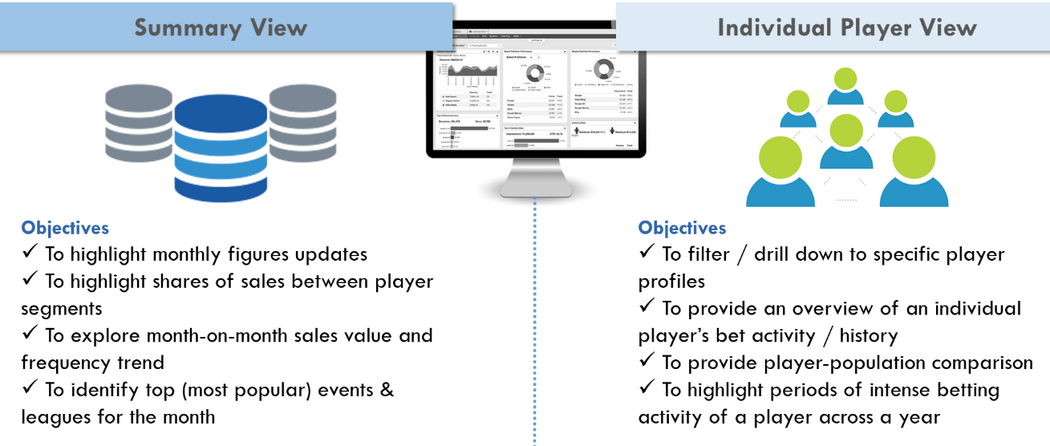
Summary View
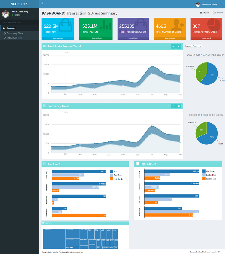
A quick snapshot of the summary view.
The main view of our dashboard would be the “Summary View” page whereby users can evaluate sales trends and have a glance of their latest overall monthly performance. The first feature that the user will notice is the colourful statistics boxes above all the other charts; these boxes display the latest monthly performance figures – which were derived from discussions with our sponsor – that includes the following: (1) Total profits made by Singapore Pools (2) Total payouts (3) Total transaction count (4) Total number of active users for the month (5) Number of new users.
Right underneath the boxes are 2 trend line charts and pie charts. The first trend line chart displays the total stake amount (in dollars) on a month-on-month horizontal axis, while the chart below represents the frequency or count of the transaction across the time range. The pie charts on the right sides of the charts shows the share of value stake amount and count of transaction amongst the different segment categories: (1) Share of gender (2) Share of account type (3) Share of bet odds type (4) Share of bet time (5) Share of bet day. Clicking on the drop down list button above the pie charts allows the user to switch between the segments, and it too transforms the trend line by splitting the trend lines into the segments of the pie (e.g. by selecting the gender share option in the drop down list, the trend lines will split into the stake amount of all male and all female, and the same happens for the frequency trend line chart).
Users can use the two trend line charts as shown above to make comparisons and perhaps highlight abnormalities or unique events in certain months. For example, the usual trend or correlation is that one would see synchronize fall or rise in both stake amount value and frequency lines, however when the reverse is seen such as in the case when stake amount value rises while the count of transactions stagnant or falls, it could mean that for the particular period people have been making ridiculously high bets.
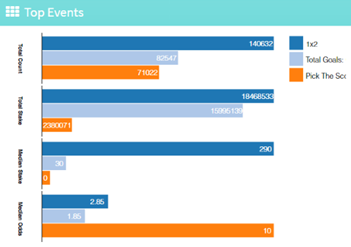
The next data visualization chart would be the bar charts underneath the trend line charts as per the charts above. These bar charts feature the top 3 event types (bet game options such as 1x2, or pick the score) and the top 3 leagues for the selected time period. The parameters that are displayed includes the (1) Total frequency (2) Total stake amount (3) Median stake amount (4) Median odds of the particular top event or league. The same parameters of each event or league is grouped together (placed side by side) for easy comparison to understand how these top events or leagues differ on those parameters.
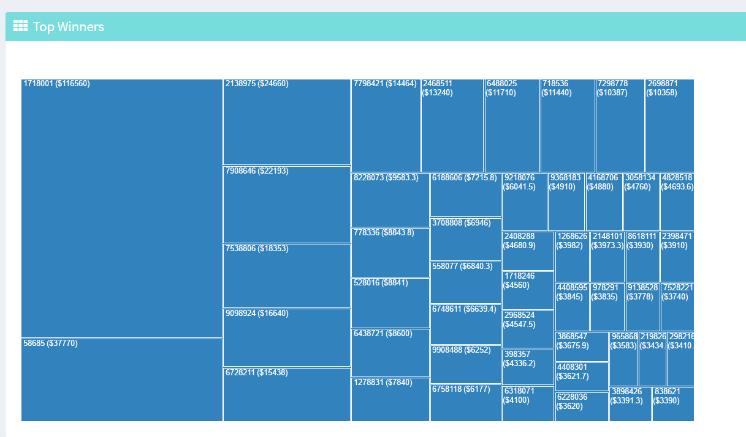
Lastly, the visualization tool at the bottom of the “Summary View” page is the tree-map chart as shown above. Tree maps are great for showing the big picture (high level view of the data) by allowing comparison of the different units within a small space, and allows us to add additional labels to the boxes for a more detailed comparison. One downside of tree maps is that it cannot size negative values, which is a huge concern in our case for we are using profits or losses are of main quantity measure, as such we had to split the losses first and later transform the data for sizing.
As of currently our tree map only ranks players based on the size of their profits for that is our client’s main interest. Clicking on the box (individual player ID) will redirect user to that player’s profile view should would provide more in-depth data about his or her bet patterns and transaction history. However, we will offer further customizations to the tree map (i.e. adding colour formatting and secondary dimensions) if our sponsors want more information to be displayed.
With the use of Tableau, our team will create different sample variations of tree maps for our sponsor to pick from. For example, using colour as an identifier for gender or account type, or additional labels such as median odds. Likewise, this approach of “pre-visualizing” the charts can be applied for the other charts in our dashboards in coming user testing meetings with our sponsor.
Individual Player View
A quick snapshot of the individual player view.
Users can enter the “Individual Player View” via two ways, either by clicking on the player cube in the tree-map on the “Summary View” page which redirects users to that individual player’s profile view, or by clicking on the “Individual Info” tab on the left navigation bar. If the user performs the latter, he or she will land on an empty player view page, and in order to select a player to view, the user can use the dropdown list to filter the players to view. The users may filter users based on their “player group” and/or their “gender”; selecting the options in those filters will narrow down the selections in the third dropdown list “Player to view” making it easier for the user to locate a particular user.
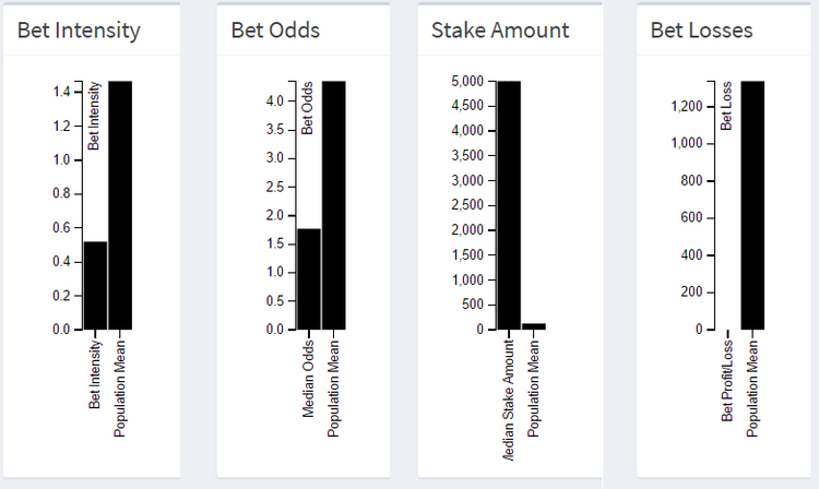
Upon selecting a particular player, the user will first get an overview of the player’s profile and betting behaviour, as displayed in three info summary boxes: (1) Demographics Data; (2) Betting Summary Statistics; (3) Income Statement / Performance. The selected parameters of the players were derived from our discussions with our sponsors, and aims to deliver immediate insights that would allow the users to quickly infer bet patterns to hypothesize if the player is at risk of irresponsible gambling. Still, it is recommended that the user explores the other data charts before making the claim, for these other charts will allow population comparison.
Bar charts as shown above are used as it gives us an easy comparison of the player’s statistics against the population’s mean at a single glance. The length of the player’s bar as compared to the population’s bar would let us know whether the player is under or above the mean. Other charts such as the line graphs and pie chart are inappropriate and would not allow us to interpret the comparison as easily as the bar charts.
Our team has decided to use a calendar view chart as shown above to visualize the bet intensity of a particular player over the year. The calendar view that allows to view a player’s daily number of betting transactions over a year, which is quantized into a diverging colour scale. The values are visualized as coloured cells each day with red being highest quantile of transaction count and green being the lowest quantile of transaction count. The days are arranged into columns by weeks, and then grouped by month and years if the transaction spread over a year. This allows the sponsor to easily identify any possible patterns in the transaction count of the players in this summarized view, instead of viewing these transactions from a list.
The last section of the player view is the behavioral pattern breakdown. Initially, we chose to use pie charts to compare different parts of the player’s transaction count in terms of betting day, betting time period, bet leagues and bet events. However to reduce wastage of space and to allow easier segment comparison (given the many breakdowns for the events and leagues, the relatively equal slices of the pie makes comparison difficult), we have decided to use horizontal bar charts as shown above to display the breakdown. Bar charts would to provide sufficient depth of data for theses parameters for we are not interested in showing these changes over time but only interested if any of the segments stands out in terms of high frequency.
However do note that are the graphs are still subjected to changes depending upon further feedback and request from our sponsor.
Limitations & Challenges
1) Large Dataset
Load times was one of the key considerations we accommodated when creating the dashboard. Given the large dataset, our team had to veer away from using loops and iterations of arrays to reduce load time. Utilizing most JavaScript’s native functions and libraries such as Underscore.js were some ways to optimize performance.
2) Rigid Data Format
As the result of the automated data cleaning process, the final data format to be bootstrapped into the dashboard would in a JSON format. This dataset is thus read as an object, and not as an array which is the commonly accepted input for most of the D3.js charts that are used for the dashboard. As such we had to iterate through the index array [0,...,length-1].
3) Limiting Sample Date Range
The sample data that was given to us had a historical 3 month date range. Initially our implementation was coded in a way to complement the sample data range. But to accommodate future datasets of varying date range, our team had to fine tune our codes to support dynamic start and end dates.
4) Visualization of Clusters
Given that k-means clustering analysis is an unsupervised learning method, we are unable to automate the analysis and visualize the clustering results on our dashboard. Interpretation of the cluster profiles would too require some degree of statistics knowledge. In light of this, our team will present the clustering analysis result as a separate deliverable.
Further Developments
Moving forward to gather deeper consumer understanding, our team proposes a more extensive data collection procedure. Singapore Pools have collected basic demographical data on their Platinum users, however this was not extended to the Gold users. With greater demographic data – such as customer’s salary and occupation, customer’s address, customer’s family background – we may discover new betting patterns, and new relationship between existing (betting behaviour) parameters and player demographic data; and so offering a better understanding of what responsible gambling should be at an individual level rather than a general take across the entire population.
Besides collecting demographic data, there are other transaction data such as account top-ups which could too provide greater insight on one’s betting behaviour. Historical trends of one’s frequency and amount of top-ups, coupled with his or her past winnings records, could reveal patterns of irresponsible gambling.
There are many papers and research carried out regarding the use rule-based classifiers and pre-learning data clustering such as association rule clustering and automated genetic clustering, but still this process is yet to be viable in the near future. Such machine learning approaches are still unperfected given the vast number of rules that needs be considered, and the incapability of the machine to learn beyond the training data. Coupled with another obvious limitation regarding the interpretation of clusters’ profiles that will be left to the dashboard user, and as subjective as it is, the user would require some degree of statistics knowledge to make meaningful inferences.
Our team would therefore suggest that having a workable methodology or guide on how to perform the clustering analysis would be more feasible. The results from the current clustering analysis only provides a one-time-off understanding of the current market context, the insights cannot be replicated for future references. There is a need to revise the clustering analysis from time to time, updated with new datasets representative of the latest trends and context. A more sustainable solution would be to have a trained analyst to conduct the clustering analysis each round.
Lastly as mentioned above, the dataset that our team have been working on is merely a three month long dataset, as such we will continue to work with our sponsor to carry out load testing with a larger set of data. Client user testing of the dashboard is also currently on going, and we too will continue to provide support to update the dashboard charts and interactive tools upon further feedback.

