ANLY482 AY1516 G1 Team Skulptors - Inbound EDA
| Data Cleaning new! | Inbound EDA new! | Outbound EDA new! |
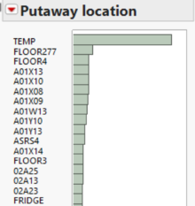
Most of the inbounds putaway location are placed at TEMP or FLOORS locations. This indicates a detrimental issue of overflowing as the warehouse is often running out of space to store the goods. Nonetheless, there can also be a possibly that this could be simply just due to the fact that there is no proper warehouse utilization. Hence, the TEMP and FLOORS areas are used predominantly.
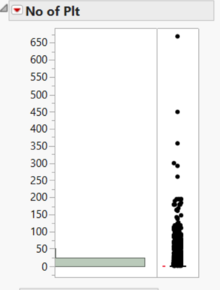
As a warehouse, quantity of products might not be as prevalent a contributing factor as compared to the number of pallets. The warehouse itself contains shelving location for such pallets to be stored in. Each shelf is able to store 1-3 pallets. However, as seen from the distribution analysis, the number of pallets vary from 1 to a whopping 669 pallets (Overloads the whole warehouse). Although these scenarios are not common, it only takes one inbound of 669 pallets to cause a problem of overloading. This is similar to a dog-food distribution, with a heavy positive skew. Based on the right skew, the mean value will be greater than the median value. Hence, the median would be a better choice for estimation in this scenario.
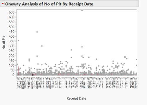
This graph shows the number of pallets received by date. From this graph, the team had come to a common consensus that in general, there is a consistent inflow of the medical products regardless of dates. Nonetheless, there is still the presence of a few outliers as shown by the representation of 669 pallets. This might be due to an error in scanning or the company’s practice to have a huge inbound in the middle of each year.
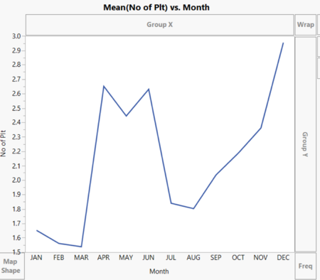
The line graph above depicts the average number of pallets coming into the warehouse by month. As shown, there is generally two peak periods of inbounds in Quarter 2 – April to June, and Quarter 4, the end year period. This information will be useful for warehouse managers to have a brief insight of the storage preparation and thus, ensure less TEMP and FLOORS location usages.
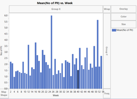
This bar chart further slices the time dimension to a weekly level analysis. In this graph, we can see generally in each week, there is at least 1 pallet coming in on average. Week 25 and week 51 are the outliers, with both of these weeks reaching an average of 5 to 6 pallets inbound. The rest of the weeks generally fall between 1 to 4 pallets inbound a week on average. In this graph, we decided to use the bar chart because our group feels the bar graph has a better visibility for 52 weeks compared to the line graph. As such, for months we will display using the line graph while for weeks, bar graphs will be used.
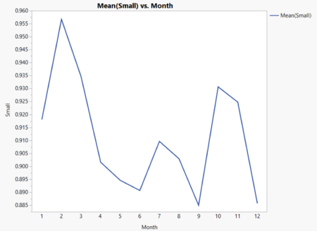
In this graph, we continue from the other diagram where we compare the relationship between number of pallets to the time dimension, month. In the previous graph, we look at all pallets, however, each inbound may be a small or large inbound, with regards to the number of pallets per transaction. Thus, our group decided to group all inbound transactions that involve one or less pallets to be a small inbound. Anything more than 1 pallet per inbound is considered a large inbound. The graph shows the average of small inbounds. From the graph, we can see the lowest is an average of 0.30 pallets on month 5. Over the year 2015, it can be seen that there is decreasing trend of small pallets inbound, with the value dropping from 0.515 to 0.36in a span of one year. This can potentially be a problem because the warehouse space remains the same, but the inbound rate has decreased. The warehouse might not be fully utilized. This will be further examined later for the large inbounds, to see whether the inbound pallet rate has dropped over the year.
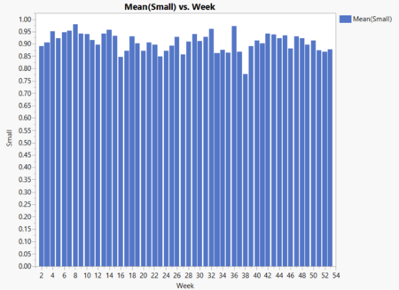
A more in-depth analyzation was conducted where we further slice the time dimension into weeks. This is done to observe whether the number of small inbounds has an increasing trend that is similar to the one versus month. There is much more variations in the weekly analysis as compared to the monthly one, with an outlier at week 8, which nearly triples an average weekly pallet inbound rate for small transactions. Generally, there is a minimum of 0.2 inbound pallet per week for small inbounds. The trend is less obvious on a weekly basis, but for small inbounds, the average number of pallets per week never exceeds one pallet despite its high volume. This shows that each week, the warehouse space taken up by small inbounds are relatively low, which may portray a problem of under-utilization of the warehouse.
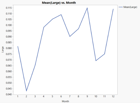
Moving on to the large inbounds, we notice the vice-versa of trends as compared to the small inbounds. While the small inbounds shows a general decreasing trend, the large inbounds is shown to increase over the year 2015. Large inbounds refer to inbounds with pallet size greater than 1 pallet. From the start of 2015 to the end, the average monthly inbound rate has nearly doubled from 14.25 to 26.3 in December 2015. Although the small inbound rates have decreased, this is insufficient to counteract the substantial increase for large inbound rates. These could result in the problem of overloading, which most warehousing companies face due to lack of inbound control.
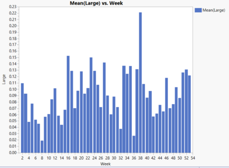
Similar to before, we slice the time dimension to weeks, to see whether the same consistency is valid for the weekly basis. As compared to the small inbounds, there is much less consistency when it comes to large inbounds. Although the graph looks similar, the range of pallets varies differently. In the small pallets, it ranges from 0.3 to 0.5 roughly. However, the variations here are definitely more than 1 pallet size. Variations range from 8 to whopping 53 pallets average for a given week. This makes it harder for the warehouses to prepare for large inbounds. In week 25, the percentage of large inbounds went to an all-time high of 53 pallets, an outlier compared to the other weeks. The usual range of inbounds varies from 15 to 30 pallets. From this graph, it is safe to say at least 8 pallets will be contributed from large inbounds.
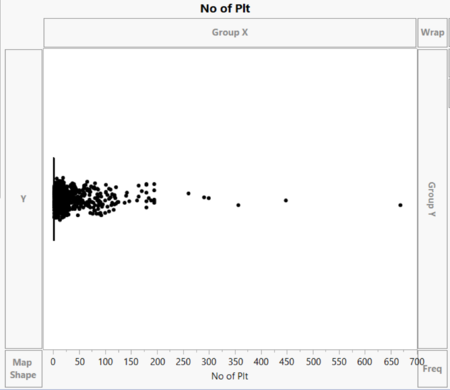
The box plot of the number of pallets for inbound is shown above. As show, the deviation analysis shows that much of the pallets lie close to zero. This is because most of the inbounds come in as one pallet or a half filled pallet. This can be seen from the diagram, where the interquartile range lies entirely near to zero (The inter-quartile range is so small it is closely ranged to zero).
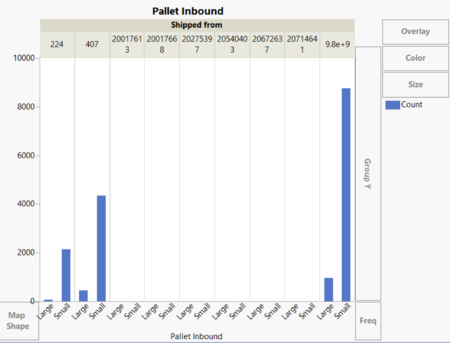
There are 3 main locations, 224, 407, and 9800000074. For the x-axis, if the number of pallets incoming is less than or equals to 1, the pallet inbound would be “Small”, if not “Large”. From all 3 locations, the number of pallets that inbounds with 1 or less pallets takes majority of the inbounds. Particularly, shipped from location 9800000074 is the most popular. This will be further inspected in the next graph.
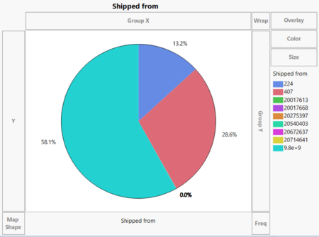
More than half of the inbound is shipped from location 9800000074. Based on this information, the company can evaluate better allocation of resources to better prepare for inbound shipped from this location.
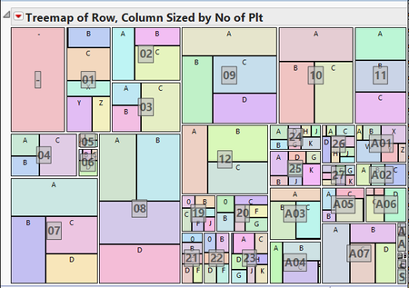
The above shows the tree map analysis of the putaway location of the inbounds. The sizes are allocated based on the number of pallets that is placed in the specific location. The name that is displayed in the grey boxes are the rows in the warehouse, and the sub-boxes are named after the column in the row. If the row and column values are “-“, they are either TEMP or FLOOR locations. As shown, majority of the putaway location is represented by “-“, which shows that most of our inbounds are stored at these locations. This is shown above as well. However, we noticed that the size of the square is not very big, which tells us that many of this inbounds might be small inbounds, even though the TEMP and FLOOR location is actively used for majority of the inbounds. Overall, most of the warehouse uses the rows 01 to 12 more commonly than the other rows. We assume this is because these rows have a larger size as compared to the others, and thus they are able to accommodate more number of pallets.
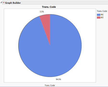
Based on Prof Kam’s recommendation, we included back all the previously removed transaction codes of IRT. A transaction is labelled IRT if the inbound transaction fails, as mentioned earlier in the revised analytics segment of the report. The rationale for including back IRT transactions was because Prof Kam foresees that the company would also wish to gain insights from IRT transactions in the future and thus, the data will still be relevant and useful for the team’s EDA. As shown in the pie chart above, there is a total of 5.5% of the inbounds with an IRT transaction code. This could be due to failed inbound supplies which were supposed to be send out by the suppliers to the company. This can be attributed to a lack of supply on the supplier’s side and thus, unable to send to the company its usual supplies. This chart will serve to allow the client’s company to clearly monitor and investigate the causes of these IRTs, and make business decisions accordingly.
