ANLY482 AY1516 G1 Team Skulptors - Methodology
![]()
| Summary | Description | Warehouse Tour new! | Methodology new! | Technology new! | Limitations & ROI |
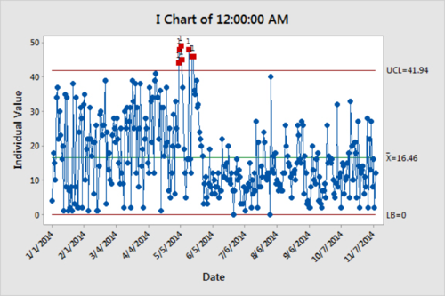
Before – Control Chart of Warehouse on Landing Page
The landing page of the dashboard was initially designed with a control chart instead of a tree map as sponsors were unfamiliar with tree maps and its usage. The control chart in a warehouse context is a graph used to study both warehouse inbound and outbound of SKUs over time. Data are plotted in a time order with a central line for the average, an upper line for the control limit (80% percentile), and a lower line for the lower control limit (20% percentile). These lines are determined by the data obtained from the sponsors.
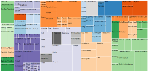
After – Tree Maps of Warehouse on Landing Page
Upon advice from Prof, the team managed to convince the sponsors on the adoption of a tree map on the application’s landing page. A tree map is a method for displaying hierarchical data by using nested rectangles illustrated by different sizes and colors of squares. The control chart on the other hand, will be incorporated as a subset of the treemap. This meant that each click on a specific square on the treemap will brings the sponsor to a page depicting the outbound control chart for that specific put location.
The rationales of placing the tree map at the landing page is as follows:
- Realistic and practical
- Putting a tree map at the landing page would be appropriate for a warehouse context as it can be used and designed in the form of the warehouse’s floorplan.
- High level view of warehouse utilization
- The different squares of a tree map can be used to depict the put away locations in the warehouse whereas the size of each squares can be used to show the total quantity of SKUs held within it. In addition, the colors of each square can also be used to signify over utilized or underutilization of a warehouse put away location. The control chart on the other hand, only shows micro view of the total outbound from the warehouse.
- Ease of problem identification
- With different color and size dimension correlated in some way with the tree structure, it allows users to spot patterns that would otherwise be difficult. For instance, numerous red squares can easily signify that there the warehouse is not optimally utilized.
- Efficient use of space
- In a warehouse context where there are hundreds of SKUs and put away locations, tree map suits the criteria of legibly displaying hundreds of items on the screen simultaneously compared to other charts (Pie, bar charts).
- In a warehouse context where there are hundreds of SKUs and put away locations, tree map suits the criteria of legibly displaying hundreds of items on the screen simultaneously compared to other charts (Pie, bar charts).
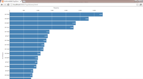
Before – Usage of Pie Charts for Data Visualization
Pie chart was initially opted as one of the visualization graph to be used on the dashboard. However, due to nature of it, the team decided to not use pie chart in the dashboard. This is due to the following reasons.
- Space consuming
- The space consumed by each slice to form a pie is much more compared to a bar graph. As there is space constraint in the dashboard, Prof did not recommend the usage of it.
- Rigidity in color
- Unlike in a bar chart where all individual bars can show the same color, in a pie chart, each slice of the pie has to be represented in a unique color or it would not be easy to see. Hence, in this scenario where the team wanted to use a pie chart to show 20 top moving SKUs, it can be really and this can be very distracting (as shown below).
- Misleading and not explicit
- The data visualization of data is based on a pie hence, it is easily misinterpreted wrongly as it seems less accountant compared to bar graphs. They are thus, often a wrong way to represent subtle but important differences. It is hard to point out which segment is the biggest or smallest, just by looking at the pie chart itself.
- The initial pie chart was coded in a way to be sort the largest slice to the smallest slice in a clockwise direction. This however, was explicit enough to be picked out by the sponsors.

After – Usage of Bar Charts for Data Visualization
Hence, based on the context of this project, the team switched from pie charts to bar charts as it will provide a better summary of a large data set in visual form.
With the usage of the bar chart now, this will better allow sponsors to do the following:
- Clarification of trends
- Compared to a pie chart, the bar chart provides a quick visualization and impression of the trend of data. By incorporating a sort feature, this will also allow users to not misinterpret data easily.
- Timeline visualization
- In a warehouse data analyzation, it is important for sponsors to track the changes of inbound and outbound frequency of SKUs over time. Hence, the usage of bar charts instead of pie charts is preferred in this scenario, as pie charts are unable to track changes over time.
- In a warehouse data analyzation, it is important for sponsors to track the changes of inbound and outbound frequency of SKUs over time. Hence, the usage of bar charts instead of pie charts is preferred in this scenario, as pie charts are unable to track changes over time.
Before – Inadequate Information on Inbound Control Chart

The initial inbound control chart only showed the quantity of incoming SKU by month, throughout the year of 2015. The purpose of this graph was to allow sponsors to have a visual sense of how the warehouse inbound pattern was like throughout ach quarter of the year.

After discussion with the sponsors, the group understood that in the logistic industry, the company follows an 80/20 rule in the control chart. Hence, the 80% upper quartile, 20% lower quartile and the mean of the inbound quantity were added into the control chart to suit the sponsor’s needs. This will allow sponsors to be able to easily identify the time periods where inbound warehouse were beyond or beneath the upper and lower quartile, and adjust their inbound rate accordingly.
For the list of methodology & technology proposed during the proposal stage, please refer to: Team Skulptors - Methodology & Technology