AY1516 T2 Team WalkThere Project Interim Progress
Data Cleaning
Extraction of Data
In collaboration with the Living Analytics Research Centre (LARC), a week’s (9-15 January 2012) of Ez-link data was provided for this study. To deal with the large data size of over 40million records, extraction of data was carried out in sets:
- Extract by the category of demographic groups - student, adult, elderly;
- By individual days;
- Bus as the only transit mode
Given that the data provided are in the raw format, joining of tables is required to gather a more complete view of the data. The following diagram shows how joining of tables is carried out.

Cleaning of Data
Removing of Duplicates
There are duplicates of “location_id” in the “Location id coordinates” data due to the updates in the coordinates of the bus stops as reflected with the updated “entry_date” recorded in the data. The “remove duplicates” tool in excel is used to remove the repeated “location_id”. With that, there are 4903 updated records.
Removing Undefined Records
There are instances where commuters do not tap out when alighting at their destination. These were recorded as “-99” and “?” in various fields where data on destinations are recorded. These records were removed as limited analysis and findings would be gathered out.
Bus stops in Tampines planning area
As the focus of this study involves analysing commuters’ behaviour only in Tampines planning area where commuters’ activities begin from, the application of GIS tools to extract relevant bus stops is required. Taking into consideration of commuters travelling to either Bedok, Pasir Ris or Changi, which are located just beside Tampines planning area, bus stops in these areas were extracted for the analysis. Bus stops in the Tampines planning area are where commuters begin their travelling activity while bus stops in the east region reflects on the commuters’ destinations.
These were the steps taken to extract relevant bus stops:
- Join “Location id coordinates” data with “Location mapping11” data with “location_id” as the common field.
- Using QGIS, upload the bus stop data and clip it with URA’s subzone shapefile. Two separate layers are created - bus stops in Tampines planning area and bus stops in the east region.
- The bus stops layers are then saved with the coordinate reference system set to SVY21
Cleaned Data
Standardised Format
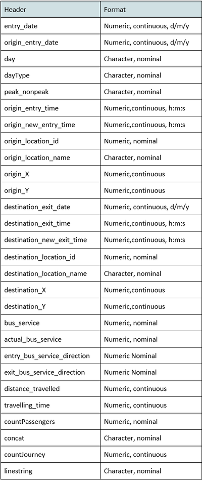
As JMP is one of the analytics tools used for this project, to ensure the data type and format for each column is correct, the following is done:
Grouping Records

Keeping Relevant Data
Given the aim of this project is to assess the walkability in Tampines planning area, having long travelling routes included in the analysis will not be helpful as it is understandable that commuters will choose to commute by bus than walk for long distances. As such, a threshold of travelling distance is set at 1 km. Routes that are more than 1 km are removed.
Besides setting a threshold to the travelling distance, to determine what are the commonly travelled routes, the top 97.5% distribution of the data (99.5% for adults’ ez-link data due to the large data size).
Findings
Overall
Students
Number of Commuters Per Day
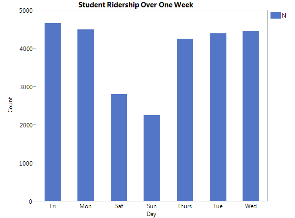
Bar chart showing the number of commuters per day
From the graph, higher student ridership is observed on weekdays as compared to weekends. Student ridership on weekdays is also relatively constant.
Peak Hours
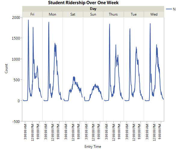
Line chart showing the number of commuters in 15-minute intervals per day
From the graph, two peaks are observed on weekdays whereas an inverted U-shaped graph is observed on weekends. This indicates the presence of peak hours on weekdays whereas there tend to be more students in the afternoon on weekends. For Monday - Thursday, the peak is roughly at 6.45pm, 2.45pm-3pm. For Friday, the peak is at 6.45am and 12.45pm.
As seen from the 2 graphs above, student commuting pattern exhibits different characteristics on weekdays and weekends. Thus, we would split the student dataset into weekdays and weekends, and weekdays dataset is further split into peak hour and non-peak hour for a more holistic analysis.
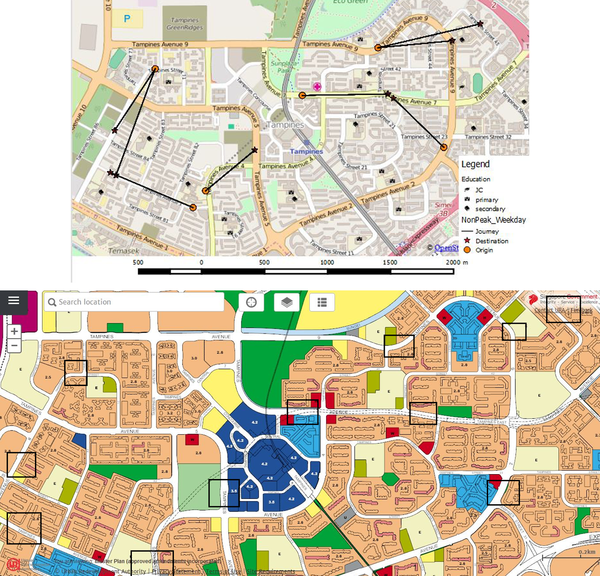
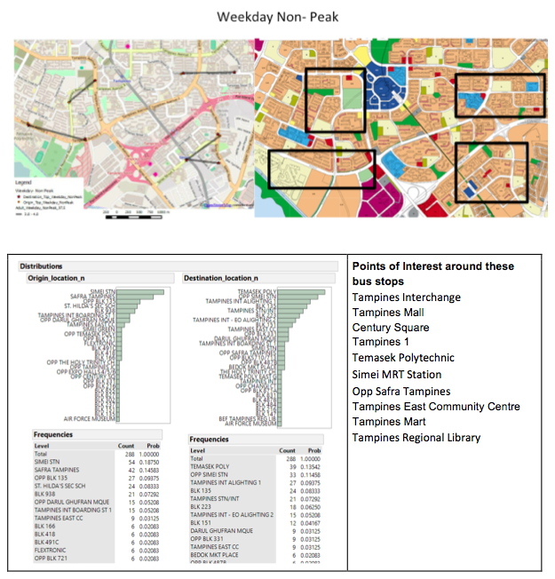
Common Points of Interests
Weekday Peak Hours

Weekday Non-Peak Hours
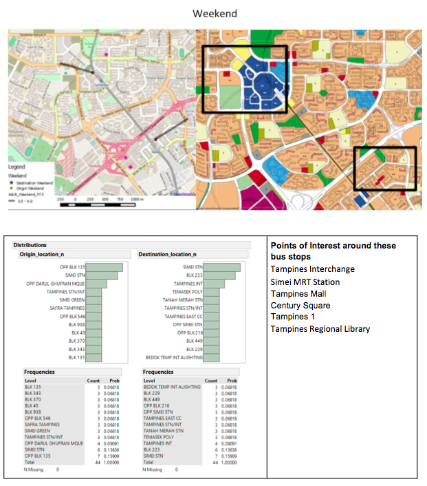
Weekend

Adults
Peak Hours
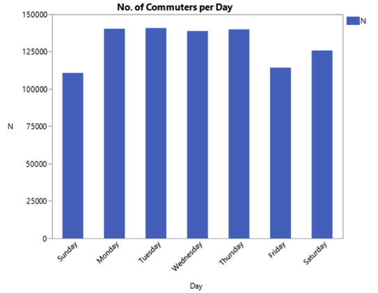
Bar chart showing the number of commuters per day
From the graph, we can see that there has been generally a higher ridership on weekdays, except for Friday. In general, there are more than 100,000 commuters each day.

Line chart showing the number of commuters in 15-minute intervals per day
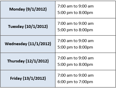
From the graph, we can see a similar trend of peak periods for monday to friday. These peak periods occur around at around 7am to 9am, and, 6pm to 8pm. An explanation for this would be that the majority of the working force go to, and back from work at these timings. As for the weekends, there are no peak periods.
Peak periods of each day:
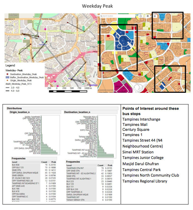
Common Points of Interests
Weekday Peak Hours
Weekday Non-Peak Hours
Weekend
