ANLY482 AY2017-18T2 Group13 Analysis & Findings Final
| Interim | Final |
|---|
Contents
Abstract
Effective monitoring of employee retention, training cost and predicting future training demands are some of the main challenges the Human Resource Departments face. This is especially evident in a labour-intensive environment present in logistics and manufacturing industries. A solution that this paper offers is to build a strategic dashboard to aid the management in overcoming such challenges. As such the final paper aims to build a user friendly dashboard that meets the needs of a human resource department.
In-depth research on the selection process of visuals for the dashboard to best deliver the most salient information is covered in this paper. In addition, the use of interactive dashboard features such as bullet graphs, mosaic plot, slicers and drilldown filters are explored and reviewed. Justifications for the use of Power BI are elaborated upon before proceeding into the development of a case specific dashboard for a logistics firm in Singapore, covering 3 main areas - Employees, Training and Performance. One limitation encountered is the lack of staff level performance tracking, hence the study seeks to recommend performance tracking at an individual staff level to establish meaningful data collection for a more accurate assessment of training effectiveness.
Section I
As the use of business intelligence expands across businesses, business intelligence (BI) systems such as visual dashboards have become a critical component for companies in optimizing business operations[1]. Visual dashboards offer a concise visual representation of key indicators of the business with up-to-date performance measures. They serve as a powerful tool for employees to have a quick overview of valuable information critical in making key management decisions.
Our research stems from the need of research material in building interactive dashboards compatible for companies unfamiliar with business intelligence systems and seeking to implement visualization dashboards at a management level.
i. User-friendly Design:
The first objective of the dashboard is functionality. A good dashboard design provides a good user experience by maximising usability and ease of navigation. An uncomplicated design should capture the necessary top-level information while equipping the user with friendly navigation tools to drill down further to access more details[2].
ii. Close monitoring:
The second objective is to develop a dashboard that aids close monitoring. With the use of interactive visualization dashboards companies can now progressively monitor these key indicators monthly or quarterly as new data is being collected. This would enhance firm’s responsiveness to changing business needs and conditions. With a shorter response time, the management can stay ahead and anticipate business problems pre-emptively before they aggravate and translate into problematic complications or major losses to the company[3].
iii. Future Planning:
Thirdly, the objective of the dashboard is to explore the functionality of predicting business needs. Forward planning based on current circumstances and field-specific knowledge can help the firm strategize and set aside resources to meet future demand.
iv. Cross Department Analysis and Investigation:
Lastly, this paper aims to explore dashboard designs that enables the observation of relationships of inter-department data. For example, human resource training data may be combined with performance reports from the operations department to identify useful relationships that would otherwise remain isolated with the respective departments. Abnormalies in data may also prompt the management to perform further investigations.
In a data-driven business landscape, there is a need to go beyond statistical data and into effective communication of data for greater analytical results[4]. Visualization dashboards have become key tools used in modern enterprises as they provide analysts with critical business metrics that reflect the performance of the business[5]. By centralizing different data, dashboards make data easily accessible to the management where it can be drilled down to make cross department analysis and target comparisons. Users can thus monitor key risk and performance in a single screen to make decisions and actions that mitigate risk and improve performance[6].
The phenomenon of a surge in year-end spending is commonly observed and such a malpractice results in a lower quality of resource utilization compared to spending during other times of the year[7]. Visualization techniques can help management have tight supervision over budget expenditure and make periodic adjustments regularly to alleviate such problems. For example, remedial actions can be undertaken should the dashboard signal warnings when the realized expenditure exceeds or fall below the ideal amount.
The utilization of such business intelligence extends to individual departments such as human resources. Some of the key areas of human resource departments that should be measured include recruitment, retention, capabilities and training expenditure planning[8]. In a case study , CAPPE08, the team also proposed to organize visualization by levels for managers to view main indicators first before drilling down into having quantitative or qualitative focus. For example, rate of employee turnover can be a main indicator while turnover by department would be part of the quantitative drill-down. Qualitative drill-down, on the other hand, provides managers with more information of a particular first level indicator[9].
Graphical representation is key to visualization dashboard designs. Common dashboard visualizations include gauge charts, pie charts and histograms, They aid in visualizing target performance, part to whole relationships and distribution respectively[10]. However, such graphical representations have their drawbacks. Graphs in a circular shape, such as pie and gauge charts, do not fully utilize the dashboard space resulting large. Furthermore, interpreting the angles of such graphs require higher cognitive effort than interpreting lengths or visualizations with parallel positions relative to a common baseline[11].
a. Removing Information Clutter
Beyond mere aesthetics, an intuitive dashboard is key in avoiding misinterpretation of data. Cognitive barriers that may hinder understandability should be eliminated. One example are 3D charts that may potentially distort the perspective of the chart and lead to a wrong emphasis of values. Briggs suggests that 2 to 3 charts should be created from the same set of data to display different comparisons[12]. This decomposes the information into digestible bite-size.
b. Choice of Colour, Size and Shape
Distracting colour schemes may confuse the user hence colour choice is important. Additionally, the interpretation of colours varies across cultures[13]. For example, red generally indicates stop, bad or attention is required in the Western culture. Sizes should be used with caution as the size of a circle may suggest the relative volume. Moreover, the gradient shading of a shape may suggest the use of a different measure. Colours also serve as state indicators which provide visual cues to users representing a categorical data (For example – Poor, Satisfactory, Good).
Section II
1. Bullet Graphs
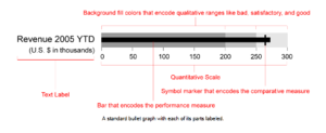
As compared to the gauge which can only hold 1 measure, bullet graph is able to feature 3 variables within a constrained linear space, thus providing a richer display of data in a smaller space[15]. The bullet graph displays a single quantitative value in the form of a bar chart. Different background fill regions allow users to evaluate the indicative range (poor, satisfactory, good) that the current measure falls in. Furthermore, a symbol marker can be included on the bar graph to include a comparative measure. Additionally, users can compare across measurements quickly as bullet graph are in a parallel position.
2. Sparklines and Line Graph
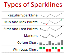
With reference to Edward Tufte, the display format of sparklines is useful for displaying trends over time[17]. Such data-rich, word-size graphic enables the user to grasp the historical context of the information. Maximum and minimum values can also be highlighted at a glance while hiding the complexity of the details from the user unless requested in the form of a drill down. For more details, full line graphs would be more suitable for comparisons and can be offered in a drill down function.
3. Mosaic Plot
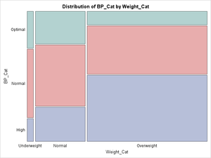
The mosaic plot features a part-to-whole relationship, representing the proportions of a dataset in accordance to 2 variables. As compared to bar graphs which is restricted by a univariate plot, a mosaic plot can display multivariate categorical data[19]. The object which depicts the whole contains smaller parts to provide a high dimension visualization within a constrained space. Furthermore, with a regular shape, the mosaic plot is more space efficient compared to other part-to-whole graphs like pie charts. However, when featuring many categories within each variable in a mosaic plot, smaller parts to be less visible[20].
The datasets used to demonstrate the use of the dashboard covers three areas – training, employees and performance. The master staff list records that employees’ information including the employee identification number, designation, join date and leave date. The training records keep track of the training details of the trainee, trainer, and the training courses. Performance is measured by the key performance indicators of the firm (TnD) that are focused in productivity, quality and safety.
Employee data provided were tracked on a year to year basis in separate documents. In preparation of the dashboard, employees that have been present from 2013 to 2017 in the raw staff list provided were compiled to form a master staff list. An additional column to record the date left was included. This suggested format would help to make the computation of employee statuses easier.
The training records used were extracted from the raw data of the 2016 and 2017 training records. As yearly budget was not available, a sample budget was used instead to visualize expenditure monitoring.
Due to the limited access to monthly performance data, performance data was extrapolated from the 2014 monthly TnD raw data and relabelled as 2018. A sample 2017 TnD data was randomly generated with reference to 2014’s actual data. Additionally, to keep performance tracking consistent, the original cumulative Safety and Quality targets and actual values have been converted to monthly averages and monthly absolutes respectively.
Power BI is a visualization tool developed by Microsoft. Power BI is equipped with basic graphic templates such bar charts, combo charts, scatter plots. Extending its functions from excel sheets, Power BI allows users to connect different datasets in terms of relation tables and utilizes both excel functions and DAX language. Being part of the Microsoft ecosystem has encouraged the adoption of this tool thus enabling a diverse community surrounding customized graph templates to thrive online. Power BI software is chosen as the development tool for the dashboard due to the the following reasons.
1. Compatibility with Existing Tools
Excel Microsoft has developed this agile analytical tool closely connected to other Microsoft related products. The prevalence of Microsoft excel, especially in the logistics industry makes adopting Power BI ideal because it can be easily adapted to the existing raw data from Excel that the company keeps.
2. Affordability
The basic version is freely available for download online. Where cost is a concern, Power BI is a top choice with a low acquisition barrier in terms of price-performance trade-off. An upgraded power user version is also affordably priced at $99.99 per user, per month[22].
Existing build-in charts were used with the addition of Bullet Chart custom visualization by OkViz which offers comparisons of actual and target values in qualitative performance ranges that can be further colour coded for the ease of readability. Qualitative performance ranges may also be flexibility adjusted manually.
A sparkline custom template add-on by OkViz is also used in the performance section in the visual dashboard, displaying minimum and maximum of performance indicators over time.
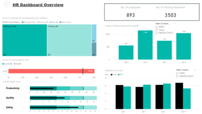
A visualization dashboard should closely relate to the taxonomy of data as suggested by Shneiderman, B[25]. This allows users to have an overview of the data and filter accordingly to get details on demand. At the topmost level, the dashboard gives users a macro view of company performance over the past year using simple and clear visualization of key figures in 3 summary tabs - Employee, Training and Performance. Subsequent tabs then provide graphical representations of data zoomed at a micro-level for users to conduct focused analysis on various business functions such as employee training and target performance indicators. By arranging dashboard pages from the company overview to individual business areas, the dashboard emulates a presentation style to facilitate user interaction with the dashboard.
The dashboard also includes drill down features in certain graphs to add depth in the information provided by the same graph. With this, users can drill into a certain time period or category in hierarchy data types. By having a user interface design catered to the needs of the users, the dashboard facilitates the logical thought processing essential in conducting cross department analysis and investigative work when a pattern of trend is observed.
Section III
Strategic and analytical dashboards are critical in helping logistics companies make key decisions at a management level. Companies on a medium to multinational scale often face challenges in scaling the business while monitoring various business function such as human resources. Furthermore, logistics companies are exposed to varying quality standards and targets that may be specific to individual customers.
Visualization dashboards should not be underestimated in this field. Data examined in this case study is from a local branch of a international logistic processing company that has 2 business units. Hence, the following case study aims to present the application of the proposed dashboard in a real life scenario and the effectiveness of it in conducting close monitoring of the performance of its business units, examining employee retentions and evaluating effectiveness of training.
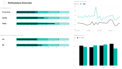
The visual dashboard constructed in this case study consists of an overview page, followed by Employee Status, Training and Performance pages. Training is further broken down into training placements and hours and training expenditure; and the performance indicators in each section (Safety, Quality, Productivity) are displayed in separate pages.
Employee Dashboard Implementation
Employee Status Breakdown
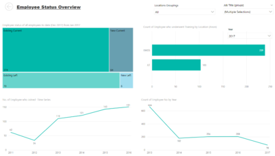
Given the join and leave date of employees, we are able to segment the employees according to 2 variables - Existing or New employees and Stay or Left.
Mosaic Plot
We use a mosaic plot to compare the proportion of employees in these 4 different components. While there is evidently a small percentage of new hires, we can observe that the company has an employee turnover rate close to 50% for both existing and new employees.
Yearly count of employees who left and joined
The graph depicting those who left from 2011 to 2016 shows a declining trend in the number of employees leaving from 2012 to 2013. Dropdown lines also serve as visual cues to guide users in making accurate interpretations. Drilldown features is included for users to zoom into the months and days of the week in which employees left within each to examine seasonality patterns at a micro-level.
Employee Training Dashboard Implementation
1. Training Placement
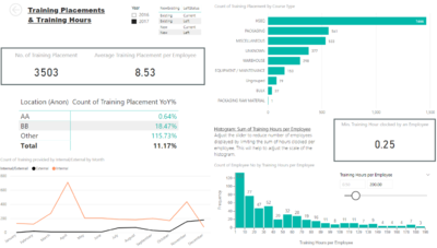
As the sponsor company records each attendance of an employee to a training session as training placement, identical training course names can be provided in multiple sessions, especially regular orientations conducted for new employees. Thus, a new unique identifier column Training Placement was created in a format of “Course Name__StartDate__EndDate”.
2. Training Course Grouping
The training courses are categorized into different groups according to their purpose. For example, the courses designed to educate employees with safety standards and environmental compliances are grouped into Course Type HSEQ (Health, Safety, Environment & Quality), and those to provide operational guidance are under specific operation group such as Packaging and Warehouse. HSEQ course type showed the highest number of training placement since it consists of basic and essential courses usually undergone by new employees.
3. Distribution of Training Hours by Employee
A histogram was used to provide with an overview of training distribution, which shows the number of hours that the employees spent for their training. Total training hours in the current year (Sum of Hours per employee) was calculated for each employee. Using bins of 20 hours, the height of each bar represented the frequency of employees falling into each bin of training hours. As such, given the maximum total hours per employee is 600, we can observe that a majority of employees undergo a total of 1 to 30 hours of training.
Given the limitations of Power BI, a histogram was utilized instead of a density plot to describe this distribution of training hours.
4. Training Expenditure and Budget
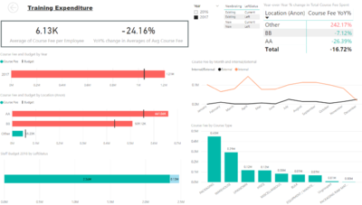
Each training placement incurs certain amount of course fee depending on whether it was provided internally or externally.
Total course fee for the current and previous year was plotted as a simplified bullet chart, based on the current system date. Using a marker, total course expenditure to date can be compared to planned budget.
Target Performance Dashboard Implementation
1. Direction of KPI
Analytical efforts were focused on 3 main components - safety, quality, and performance of a single year’s data. Different key performance indicators (KPIs) have different assessment criteria. In some cases, the lower the achievement, the more the target was being met. A value (-1 or +1) was used to represent the direction of each KPI. For example, when the absolute value of 100% of the target was higher than the absolute value of meeting 75% of the same target, the value corresponded to a positive 1 direction.
2. Achievement Tier
Each KPI had 3 achievement tiers (>50%, >75% and 100%). For KPIs in the positive direction, performances are classified into a Tier when realised values are equal and above that Tier Value but less than the next higher Tier. However, KPIs with the negative direction is placed in a Tier when the realised values are less or equal to the that Tier value but greater than the next lower Tier.
Achievement tiers were represented using state indicators. This resulted in clearly visual cues for KPIs that were in a negative direction.
3. Weighted Score
According to the Achievement Tiers attained for each component, the team assign values 0, 0.5, 0.75 and 1 respectively. A weighted score is then calculated by multiplying the values assigned to the Achievement Tier and the weightage that was pre-assigned by the sponsor.
Bullet graph
As compared to bar graphs, the use of bullet graphs provide clear indications of whether 100% targets are met and if not, the distance between actual performance and targets. Assuming the correctness to the data provided, it is clear from the graphs that overall XX business unit performed better than YY business units. However, YY business unit has more component targets to meet which also suggest more stringent requirements.
Bar Graph
Safety components is highly valued in the company and are common performance indicators in both business units, hence a drill down comparing to the actualized values of the individual components between the 2 business units would provide additional insights.
Section IV
Upon reviewing the dashboard, we are able to see the importance of high dimensional graphs such as bullet graphs which can effectively condense the data and provide efficient comparison of actual and expected target performance. Users can easily process information at a greater level of detail such as employee who left, department training and effect on performance by different time periods, hence encouraging interactivity between the 3 differing data sets in the company.
There are some limitations for the dashboards. For the employee section, there may seem to be an exceptionally high attribution rate in the month of December. However, this is due to the limitation of the raw data that was given when the compile staff list was created.
Ideally, weighted scores in Tnd performance measurements should be able to account for the difference between common and unique components. However, due to changing component weightage and inconsistencies in most recent years, weightage scores do not add up to a 100% for both business units. With a complete set of data, the visualizations would be accurate reflection of the current performance.
Additionally, there are other factors that may limit the meaningfulness of the comparisons between the two business units. One of which is the fact that the nature of their work is different. XX is a single custom unit handling larger volumes of orders while YY is serves multiple customers with smaller but more diverse order specifications. Hence, performance comparisons maybe biased towards the smaller business unit YY.
1. Master Staff List
One of the main recommendation to the sponsor is to have a master staff list. While annual December staff lists were shared with the team, the firm has a practise of keeping monthly staff lists. Since the evaluation of training wastage is based on the resources spent on the new hires who left within a year, employee records of this group of workers can be easily retrieved with a master staff list. The “new” status can be obtained from the “date joined” and the “left” status can be obtained from the “date left”. Using a master staff list also provides convenient maintenance of the staff records in the same format.
2. Consistent TnD Performance Tracking
Another recommendation is to track Safety and Quality performance measures consistent with Productivity measures which uses monthly average as targets. This would make comparisons of performance over the months easier and more intuitive. Specific top-performing or under-performing months can be quickly identified at a glance if performance were tracked in monthly absolutes, instead of interpreting the gradient of cumulative actualised values.
3. Staff Level Performance Tracking
The team would like to propose the sponsor to adopt staff level performance tracking instead of the current TnD performance which is tracked on a broad company level. While the top-level management may be unconcerned about the staff level contributions to the performance, this approach would be useful in evaluating the training effectiveness more accurately. Individual staff performances before and after training can be analysed to objectively measure the training effectiveness.
The team also believes that more insights can thus be obtained with a staff level performance tracking to further investigate areas for improvement. This approach can be implemented with the aid of technology to reduce the manual monitoring cost. Huge investments have already been made to equip employee with smart devices such as proximity sensors to enhance safety, tablets to scan QR to track location of goods. Hence, this recommendation is aligned with the company’s strategy to integrate technology in their operations to promote efficiency and accountability.
This research offers an application-based approach to combine dashboard design suited for close monitoring, investigation and predicting future demand. However, employees will always find challenges in adopting of new technology due to unfamiliarity. Hence, following this research, it will be helpful for the team to conduct a usability study to track user experience, ease of adoption and study reasons for resistance, if any. Subsequently, more modifications to the dashboard can be made to better suit the needs of the user.
With the current sample data, the investigative feature unable to objectively measure the training effectiveness at a granular level hence making this analysis less actionable. Future research can be done with to incorporate staff level performance tracking to enhance the effectiveness of the investigative feature.
The authors wish to thank Professor Kam Tin Seong for his careful guidance and advice to the team throughout this project. The authors would also like to thank our sponsor for the provision of data as a case study in this research.
References
- ↑ White, C. (2005). The Next Generation of Business Intelligence: Operational BI. DM Review, 15(5), 34.
- ↑ Shacklett, M. (2017, April 7). Why dashboard design is critical to analytics success. Retrieved March 31, 2018, from https://www.techrepublic.com/article/why-dashboard-design-is-critical-to-analytics-success/
- ↑ White, C. (2005). The Next Generation of Business Intelligence: Operational BI. DM Review, 15(5), 34.
- ↑ Welbourne, T. (2015). Data-Driven Storytelling: The Missing Link in HR Data Analytics. Employment Relations Today, 41(4), 27-33.
- ↑ Chowdhary, Palpanas, Pinel, Shyh-Kwei Chen, & Wu. (2006). Model-Driven Dashboards for Business Performance Reporting. Enterprise Distributed Object Computing Conference, 2006. EDOC '06. 10th IEEE International, 374-386.
- ↑ Ioana, B., Claudia, S. P. D., & Ioan, B. M. (2014). Using dashboards in business analysis. THE ANNALS OF THE UNIVERSITY OF ORADEA, 849.
- ↑ Liebman, J. B., & Mahoney, N. (2017). Do expiring budgets lead to wasteful year-end spending? Evidence from federal procurement. American Economic Review, 107(11), 3510-49.
- ↑ Campos, A., Vale, F., & Alturas, B. (2008, September). Human resources metrics dashboard. In Proceedings of the 26th annual ACM international conference on Design of communication (pp. 257-262). ACM.
- ↑ Campos, A., Vale, F., & Alturas, B. (2008, September). Human resources metrics dashboard. In Proceedings of the 26th annual ACM international conference on Design of communication (pp. 257-262). ACM.
- ↑ Pérez Acosta, A., Moreno Espino, M., & Bandón Casamayor, R. (2016). Goal-oriented dashboard's requirements with i: A case study. Ingeniare. Revista Chilena De Ingeniería, 24(4), 680-689.
- ↑ Campos, A., Vale, F., & Alturas, B. (2008, September). Human resources metrics dashboard. In Proceedings of the 26th annual ACM international conference on Design of communication (pp. 257-262). ACM.
- ↑ Briggs, J. (2012, September 19). How to Build a KPI Dashboard in 4 Steps. Retrieved March 31, 2018, from https://www.targetdashboard.com/blog/125/5-Steps-to-Better-KPI-Graphs.aspx
- ↑ Hazell, J. (2013, November 28). The Darlings of Dashboards. Retrieved March 31, 2018, from https://www.dundas.com/Support/blog/the-darlings-of-dashboards
- ↑ Few, S (2013 , Oct 13). Bullet Graph Design SpecificatioN. PerceptualEdge. Retrieved April 01, 2018, from https://www.perceptualedge.com/articles/misc/Bullet_Graph_Design_Spec.pdf
- ↑ Few, S (2013 , Oct 13). Bullet Graph Design SpecificatioN. PerceptualEdge. Retrieved April 01, 2018, from https://www.perceptualedge.com/articles/misc/Bullet_Graph_Design_Spec.pdf
- ↑ Picture of sparklines (2010, May 18). What are Excel Sparklines & How to use them? [Excel 2010]. Retrieved April 01, 2018, from https://chandoo.org/wp/2010/05/18/excel-sparklines-tutorial/
- ↑ Tufte, E. R. (2006). Beautiful evidence (Vol. 1). Cheshire, CT: Graphics Press.
- ↑ Picture of Mosaic plot. Retrieved April 01, 2018, from https://blogs.sas.com/content/iml/2013/11/04/create-mosaic-plots-in-sas-by-using-proc-freq.html
- ↑ Martin (2011, Sept 18). Understanding Area Based Plots: Mosaic Plots. Fundamentals of Graphical Data Analysis, General, Stat. Graphics 101. Retrieved March 30, 2018, from http://www.theusrus.de/blog/understanding-mosaic-plots/
- ↑ Few, S (2014). Are Mosaic Plots Worthwhile?. PerceptualEdge. Retrieved April 01, 2018, from https://www.perceptualedge.com/articles/visual_business_intelligence/are_mosaic_plots_worthwhile.pdf
- ↑ Power-BI.jpg. Retrieved from http://office365online.pl/produkt/power-bi-pro/
- ↑ Straight Talk Review: Strengths and Weaknesses of Microsoft Power BI. (2016, January 23). Retrieved March 31, 2018, from https://www.yurbi.com/blog/straight-talk-review-strengths-and-weaknesses-of-microsoft-power-bi/
- ↑ OkViz(Mar 26, 2018). Bullet Chart(v2.1.6) [Power BI custom template]. Retrieved from https://okviz.com/bullet-chart/
- ↑ OKViz(Dec 9, 2017). Sparkline, v1.1.2. Retrieved from https://okviz.com/bullet-chart/
- ↑ Shneiderman, B. (2005) “The eyes have it: A task by data type taxonomy for information visualization” IEEE Conference on Visual Languages (VL96), pp. 336-343.
