ANLY482 AY2017-18T2 Group26 Findings & Insights
Revision as of 05:49, 15 April 2018 by Soundvani.2014 (talk | contribs)


| Home | Project Overview | Findings & Insights | Project Management | Link to Other Projects |
Due to the confidentiality of our data we can't disclose our Findings and Insights publicly.
|


| Please refer to our dropbox on eLearn or email us to know more! |
Exploratory Data Analysis
|
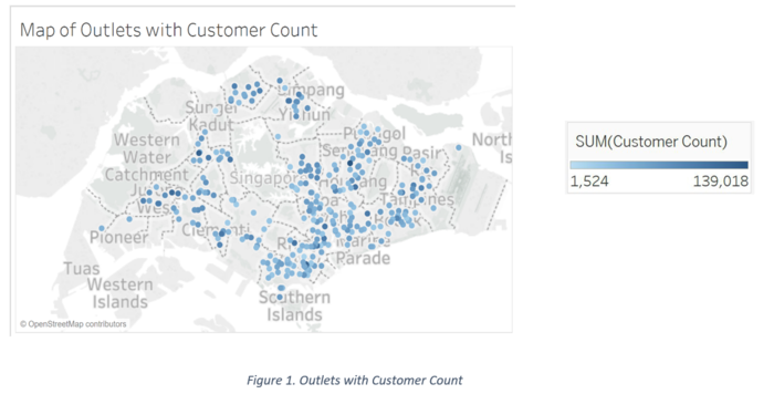
Below is a map of all the outlets of Company PQR. We can see that the most outlets are in the North East of Singapore. The colour of the dots indicates the number of customers that have visited the outlet in the last quarter (October to December 2017). Looking at the colour intensity, we can see that most regions have at least one outlet with a high customer count.

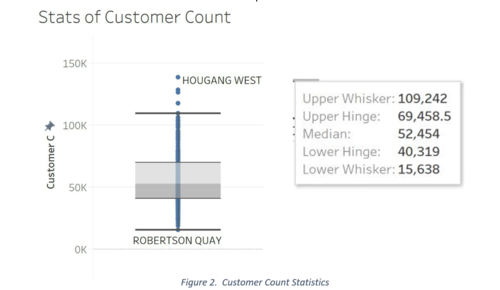
The box plot below, shows us Customer Count by outlet, same as the intensity of the blue colours above. The labels indicate Subzones that the outlets fall into. Subzones with the highest customer count are Hougang Wast with 139,018, Choa Chu Kang with 128,242, Pearls Hill (Chinatown) with 126,477, Jurong West with 117,507, & Lorong Ah Soo with 109,242 customers who visited in the last quarter of 2017. These locations are in varying regions unlike the locations with the lowest customer count concentrated at Kranji with 1,524, Chinatown with 4,635 & Serangoon Central at 7915 customers. This is interesting as Pearls Hill attracted one of the highest customers in comparison to Chinatown. Further, the average customer count is 52,454 and we can see from the box plot that there is no regional focus of number of customers and subzones.

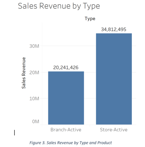
A comparison of type of outlet (Company PQR branch or store). Again, it is clear that Stores that have a higher aggregated sales revenue in comparison to branches.

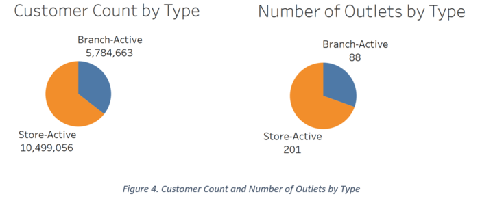
The pie charts below show the customer count by outlet type and number of outlets that are Branches and Stores. The Stores reflect a higher customer count and number of outlets.

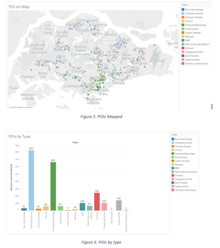
Below is the spread of the POIs within Singapore, colour coded by type. Bus Interchange, Food and Beverage and Childcare Centre appear to be the most popular. Childcare, Food and Beverage and School appear the most frequently. Sikh Temple, Tertiary Institutions and Indian Temples are the lowest.

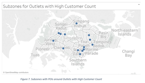
In order to filter out the important POIs, which are those within 500m of the existing outlets, we mapped the POIs and the outlets in QGIS. We saw the distribution of the Customer Count values and decided to take the highest values (over 100,000 customers). Analysing the outlets with the highest customer counts, we generated another map (as shown below) to see their distribution across subzones. There is exactly one outlet with high customer count in each of the below subzones.

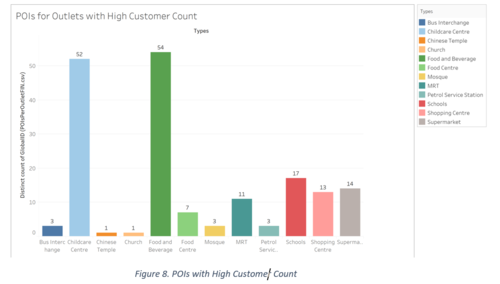
Next, we analysed the POIs within 500m of the outlets within the subzones using a Distance Matrix in QGIS and then found the distribution of these POIs by Type. This helps us analyse which POIs might have a higher influence in drawing customers to the outlets with high customer count. The highest appearing POIs here are Food and Beverage, Childcare Centre and Supermarket as well.

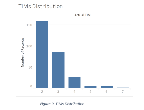
The chart below represents the number of outlets that have the specific number of TIMs (number of counters) in them, from 1 to 7. The data revealed about 5 outlets with a ‘NULL’ value, we treated as missing values and excluded them from this chart. From the bar graph below, it is apparent that most outlets have 2 or 3 TIMs. In order to understand this further, it would be useful to investigate where the outlets with low and high TIMs are and if there exists any correlation to customer count.

The map below is designed with the coordinate size representing the customer count of the branches, and the shade of the coordinate representing the number of TIMs at that outlet (darker the green, more the TIMs). If we filter the map to just display outlets with high TIMs, we can see outlets in Choa Chu Kang, Clementi, Ang Mo Kio, Kallang, Outram, Bedok and Hougang. Only the branches in Bedok and Hougang have a low customer count, whereas the rest are higher.
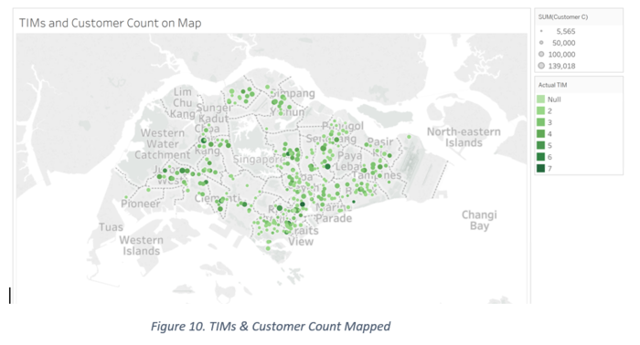

If the map is filtered by branches with high customer count, we can see branches mostly in central and North West of Singapore, with at least 4 or more TIMs. This verifies our hypothesis that branches with high customer count will need a high Actual TIMs count.
We used graphs to visualize different combinations of variables (as shown above). Aggregations and statistical analysis were done along the way, like when using subzones instead of individual outlets and showing a bigger picture (sales revenue, distribution by type of product, and by producing a box plot for customer count by subzone). Furthermore, we used a Geospatial Distance Matrix to limit the POIs we looked at for each branch. We used a distance of 500m which covers the flower hexagons. QGIS allowed us to filter this way and we could derive the outlets with a high number of POIs and look at them more closely. Additionally, QGIS also allowed us to link the hexagons to outlet points via a Polygon to Coordinate Analysis. This way we could analyse more accurately while aggregating outlet points in a polygon.
Based on our findings, we decided to use Multiple Linear Regressions to find the relations between our variables and the financial outputs of Company PQR.
Model Data Preparation
|
After exploring the variables that describe the outlets, POIs around them and our financial estimates, we discovered interesting patterns and began to see dependencies and possible correlations. Before performing multiple linear regressions, we included an additional data preparation step to quantify these.
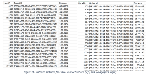
Revised Distance Matrices: In our exploratory analysis, we calculated the number of POIs by type within 500m of every outlet. In order to get a clearer picture of the proximity of these POIs and its impact on the success of the outlet, we calculated the distance between each outlet and it’s nearest POI by type. This was done using the Distance Matrix feature of QGIS. We had to split the Point of Interest vector layer into many layers, i.e. one for each type of POI. We also used this to get the distance between each outlet and its nearest neighbouring outlet.
Below are some of the distance matrices, where ‘InputID’ is the ‘Retailer Id’, ‘TargetID’ is the identifier of the Point of Interest and distance is the distance between them in metres.

Transformation: Furthermore, our variables needed to be logged as we used the ‘Number of counters in each outlet’, which we used as one of the dependent variables in our model, as it has a very different scale compared to that of the distance values between POIs and Outlets, and the population data. The number of counters value ranges from 0 to 7, whereas the other values could go up to 6 digit numbers. Due to this, we had to scale down the distance and crowd variables by transforming them to their log values. Additionally, we transformed our independent variables, customer count and sales revenue, for the same reason.
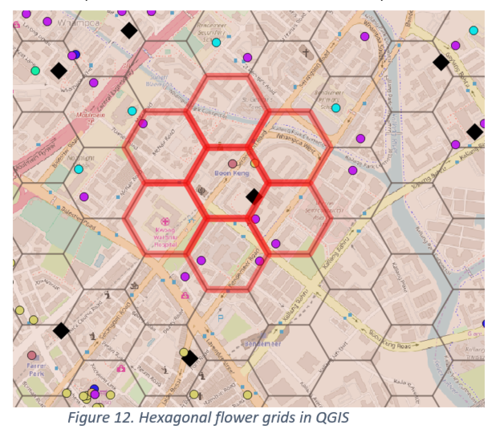

Aggregation: Our data at present reflects the resident, transient and worker population values for the grid in which outlet belongs to. To make our model account for the population in the surrounding grids, we performed an aggregation of the population data for the flower (adjacent grids) for every outlet. To do this, we derived the centroids of the grids and used a Distance Matrix to get the nearest neighbouring grids that makes up the flower of each grid. We then proceeded to sum the population data by resident, transient and worker, and included this aggregated value in our model’s independent variables list.
Our Model
|
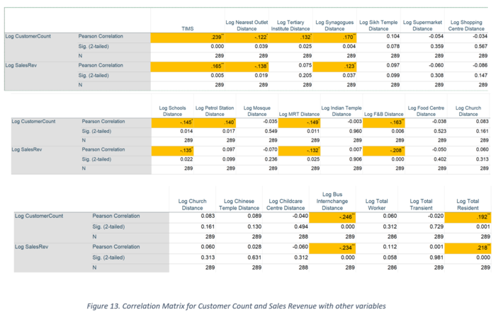
With all the variables defined, the first step in running the regression is to explore the correlations between variables to determine which might be the most influential in determining customer count and sales revenue.
We used the logarithmic value of both Customer Count and Sales Revenue in order to standardize the scale of the large values variables and small valued ones like number of TIMs. Assessing the variables with a p-value of less than 0.05, we identified significant correlations between Customer Count and TIMS, distance to nearest outlet, distance to nearest Tertiary Institute, distance to nearest Synagogues, distance to nearest School, distance to nearest Petrol Station, distance to nearest MRT, distance to nearest F&B, distance to nearest Bus Interchange and total Resident. Similarly, sales revenue is influenced by TIMS, distance to nearest outlet, distance to nearest Synagogues, distance to nearest School, distance to nearest MRT, distance to nearest F&B, distance to nearest Bus Interchange and total Resident. With these correlations in mind, we run multiple linear regressions to measure the influence of these values on the dependent variables.
In order to find the best explanation for our financial measures, we performed 2 explanatory regressions against Sales Revenue and Customer Count each, one accounting for the Outlet Type and one otherwise. In each of these, we have noted down the R square value, Variance and Significant Variables and have documented our findings below. Since we have explored the correlations between variables first and manually added in and removed variables into our regression models, the regression overall is manually adjusted.

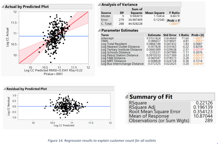
To explore the variable dependencies on customer count, we attempted to fit the model with the variables that displayed significant correlations in the correlation matrix. Only some of these variables turned out to be significant, as the p-value of their parameter estimates are < 0.05 as show. Customer count is mostly influenced by number of TIMs, distances from petrol stations, food and beverage outlets and bus interchanges. They are negatively related (except for petrol station) which indicates that for a 1% increase in the distance from the outlet to the nearest POI, there is a decrease in the customer count. This implies that these POIs are significant in attracting customers to the outlets. The R-square value suggests that about 22% of the variance in customer count is explained by the explanatory variables. The distribution of the points in the residual error scatter plot shows that the errors are normally distributed, and the linearity assumptions are not violated.

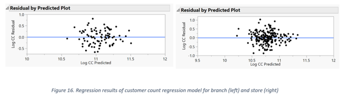
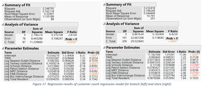
We then performed a regression accounting for the two types of outlets, Branch and Store. Our R Square is shown above, for both outlet types. The values are 0.25 and 0.22 respectively which indicates the percentage of variance is explained by the independent variables. The distribution of the points in the residual error scatter plot shows that the errors are normally distributed, and the linearity assumptions are not violated.
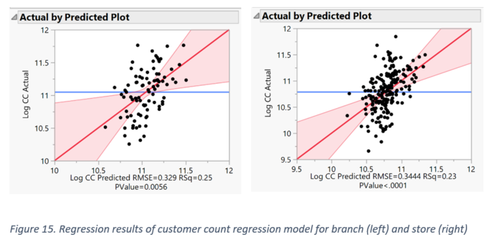


When the outlets are split by branch and store, we can see slight differences in the influencing factors. For branches, the distances from tertiary institute, distances from petrol station, distances from food and beverage affect the customer count. With every 1% increase in the distance from the nearest tertiary institute and petrol station, the customer count increases, whereas it decreases for food and beverage distance. The interpretation for store is similar, except it is also negatively related to distances from bus interchange and school.

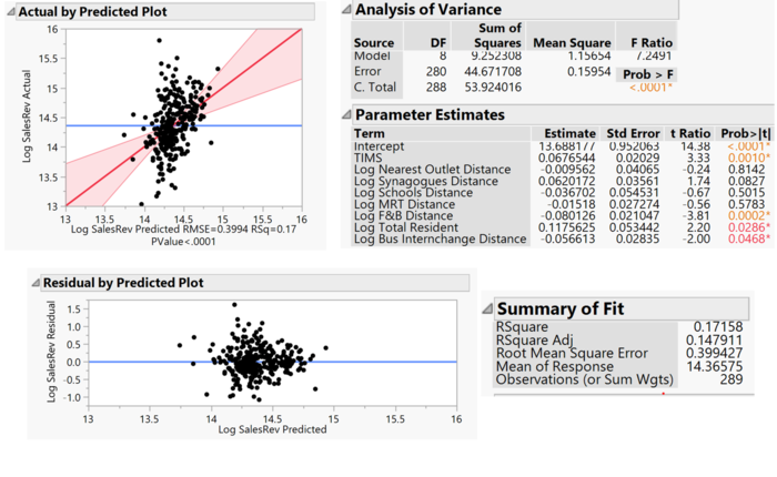
To explore the variable dependencies on total sales revenue, we attempted to fit the model with the variables that displayed significant correlation in the correlation matrix. Only some of these variables turned out to be significant, as the p-value of their parameter estimates are < 0.05 as show. Sales revenue is mostly influenced by number of TIMs, distances from food and beverage outlets and bus interchanges, as well as the total resident population. The distances are negatively related which indicates that for a 1% increase in the distance from the outlet to the nearest POI, there is a decrease in the sales revenue. This implies that these POIs are responsible for attracting customers to the outlets. The R-square value suggests that about 17% of the variance in customer count is explained by the explanatory variables. The distribution of the points in the residual error scatter plot shows that the errors are normally distributed, and the linearity assumptions are not violated.

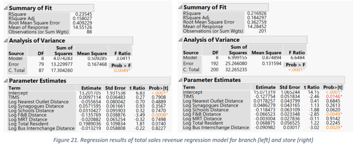
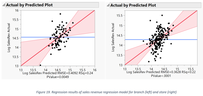
We then performed a regression accounting for the two types of outlets, Branch and Store. Our R Square is shown above, for both branch and store. The values are 0.24 and 0.22 respectively which indicates the percentage of variance is explained by the independent variables.

The distribution of the points in the residual error scatter plot shows that the errors are normally distributed, and the linearity assumptions are not violated.
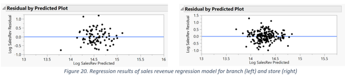

When the outlets are split by branch and store, we can see slight differences in the influencing factors. For branches, only the distances from the nearest food and beverage outlet is significant; with every 1% increase in the distance from an outlet to its nearest food and beverage point of interest, the total sales revenue reduced by about 0.14%. The interpretation for store is similar, except it is also negatively related to bus interchange distance and is inversely related to the number of TIMs.