AY1718 T2 Group21 Midterm Findings
Problem Summary:
Brainsmith, an e-commerce company that sells children educational products has been operating for over two years but their website conversion rates have been lower than industry average. Using customer behaviour patterns and purchase data - we hope to help identify website traffic patterns in order to identify possible methods to help the company increase their conversion rates
Definitions:
- User: Every person who has every accessed the site
- Customer: A website user that has made at least 1 purchases
- User: A website user that has not yet made any purchases
Conversion Rates:
We segmented conversion into two approaches:
1. Customer Retention
With customer behaviour data and information such as website pages clicked before purchasing and number of user sessions before purchase- we hope to identify factors that correlate with
2. Customer Acquisition
With information on both Customers and Users, we hope to find correlations between the two sets of data.
Data Cleaning:
The data cleaning process was two fold:
1. Rechecking for human error: Matching of all corresponding web behaviour with the customers - pages visited and actions taken on the website, since the variables and data set were defined through human web-crawling and manual entry
2. Adapting and creating some sub-data files: This was done for ease of access to load onto R and briefly for Tableau and to de-aggregate our data, keep it succinct, useful and effective
We recoded columns in our data, using R, as per our statistics analysis required.
Data Exploration Methodology:
Most of our exploratory research and insight derivation has been through a trial basis by loading our relevant data onto Tableau.
We looked at scatter plots, box plots, histograms and bar charts with varying degrees of complexity depending on the number of variables involved and made sense from a business perspective.
Keeping in mind our business objectives, and the emphasis laid on different factors by our client, we focused our attention on certain key variable that we are going to be discussing.
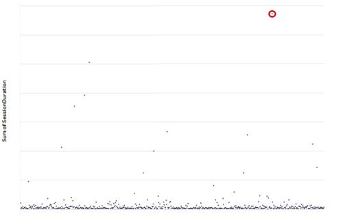
Initially, when analysing basic level data variables, for example the Average Session Duration on users on the website, as well as the Total No. of Page Views per customer, we found anomalies in terms of outliers, like these ones. These could be the founders and managers of the company in-charge of the website themselves, or teams like us, working in tandem projects with them.
The first part of our analysis will deal with mostly factors that will be useful to design policy to retain our existing cutomers.
Product Sales Quantity and Revenue:
The company has a total of 112 products. In order to obtain Product-related data. We had to zoom in on the Customer data set to obtain numbers such as Total Quantity of Each Product Sold, the Average Price of each product (Since the product cost differed at different times).
Knowing information on products was key to helping us with the other data categories as it allowed us to understand the available products better.
a.Top Products:
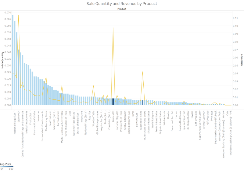
One of the first exploratory steps for products were to observe the performance of products by looking at their Revenue and Sales Quantity figures, as shown in Figure 3. In Figure 3, the size of the boxes represents the quantity of each product sold, whereas the colour represents the sum of the revenue- the darkest colour being the highest-revenue product. After combining the two figures to one graph- we made two observations. Firstly that the distribution of quantity of products sold was very wide- the average quantity sold per product was 12.34 with standard deviation of 17.31. Another observation was that the two highest total revenue products were very much higher than the rest of the product’s revenue. The average product revenue was 16, 226 with a standard deviation of 29, 115.
b. Categorising the products into bins:
With the knowledge that there was a large number of products available and there was a large variation in both revenue and quantity sold per product. We decided to bin the products and explored the process with several methods.
Bin by product category
There were three main categories for all the products, namely:
* Combo Packs: Products that consisted of bundles of the other products
* Quantum Cards: Educational card sets
* Wooden Toys: Toys and objects such as play tables and sorting blocks that were made of wood
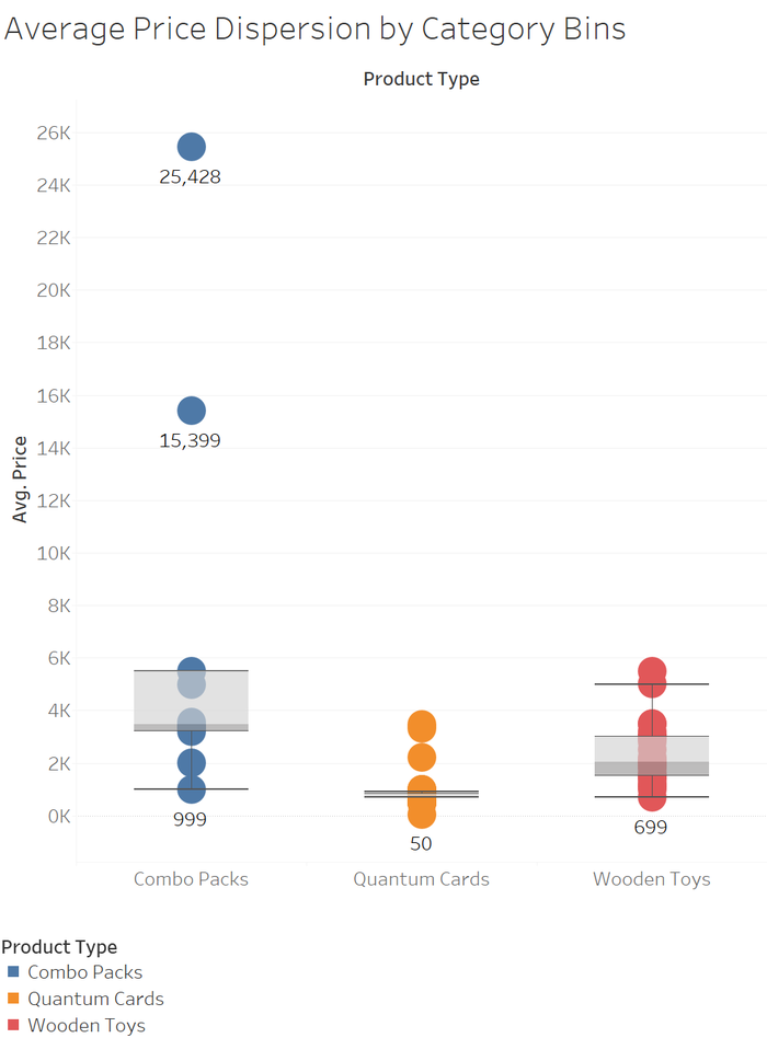
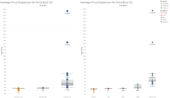
From Figure 4, we observed the distribution of average prices for each bin and noted that for “Combo Packs” there were two price outliers that belonged to two particularly pricier products. The range of prices per product category also showed large variation. Despite the large variation in average prices within each category- we felt that categorising the products into product type was still a necessary method for future analysis since product categorisation identifies the product by function.
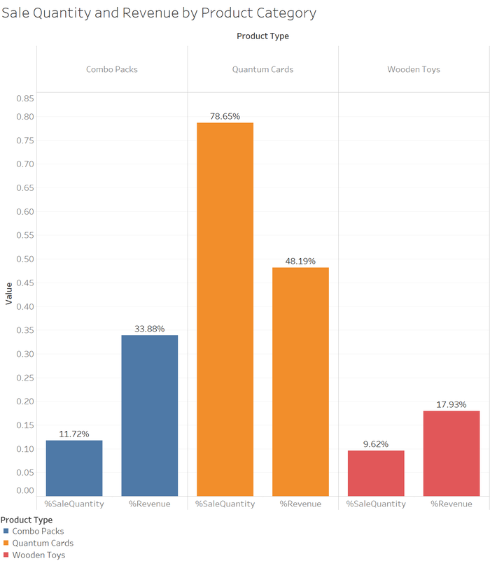
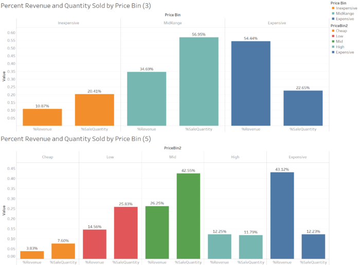
From Figure 5, we observed that Quantum cards provided the total largest sale quantity and revenue. However for the same amount of revenue, quantum cards need about 6 times more sale quantity than Combo Packs
Bin by average prices
We attempted to have two sets of bins with different number of categories to access which could better represent the subsequent data better:
| 5 Category Bins | Upper Bound Price Percentile |
|---|---|
| Cheap | 20.00% |
| Low | 40.00% |
| Mid | 60.00% |
| High | 80.00% |
| Expensive | 100.00% |
| 3 Category Bins | Upper Bound Price Percentile |
|---|---|
| Inexpensive | 33.33% |
| MidRange | 66.66% |
| Expensive | 100.00% |
By using finding the respective prices at each percentile- we categorised all the products into their respective bins.
Session Medium
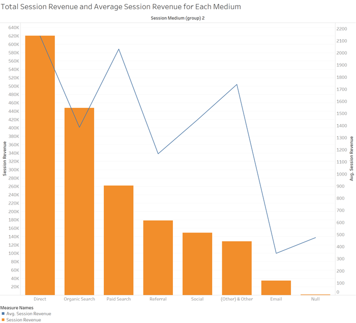
First, we decided to investigate the average price per session medium as seen in Figure 8.
By looking at the average session revenue per medium, we may be able to access how much (monetarily) that people are willing to spend online. For instance- customers that had Email as a session medium, despite having officially subscribed to the emailers, have the lowest average revenue. Contrastingly- people who have accessed Brainsmith via their paid advertisements has the highest average session revenue.
With this information, Brainsmith can attempt to explore possibilities to improve their email marketing efforts to convert their customers that have signed up for emailers as there is room for improvement, but of course this being said- there may also be a lack of people on the emailing list, and this inevitably will lead to lower revenues. In this situation, Brainsmith can explore methods to expand their email list to try growing their profits and customer acquisitions.
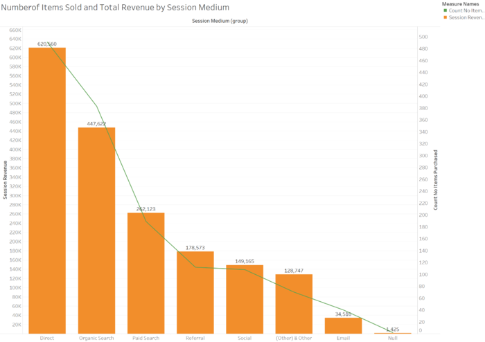
From Figure 9 it seems that the number of items sold for each medium is directly proportional to the total revenue for the medium. This is an interesting matter to note as when seen from the previous section- items have large variation in their prices. Usually, we would expect that certain few products that are higher priced will have lesser quantity sold but higher revenue generated. The equitable distribution shows that each medium is similar in terms of product types and just varies in terms absolute quantities that is corroborated by the analysis of Figure 10.
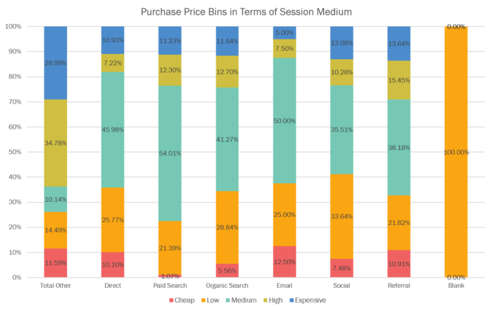
Finally, using our Product Price bins we wanted to know which Product price bin contributed greater revenue to each Session Medium
From Figure 10 above, we can observe that in terms of quantity of items sold, Mid-priced items contributed to the greatest number of items sold across all mediums. We can also observe that Expensive items perform better in Organic Searches. Finally another interesting finding is that cheap items do not perform well in Paid Searches.
There are a few key take-aways we can have from this visualisation: Firstly, we are able to observe- in absolute numbers the type of products that tend to sell better in respective mediums. With the knowledge that products that fall under the “Cheap” category have few sales on Paid Search, we would recommend Brainsmith to showcasing these “Cheap” items as the first items for the landing page on paid searches. We would also recommend featuring Low and mid-priced items on the main landing pages for organic searches due to the higher sales numbers.
Seasonalitiess during holidays and festivals
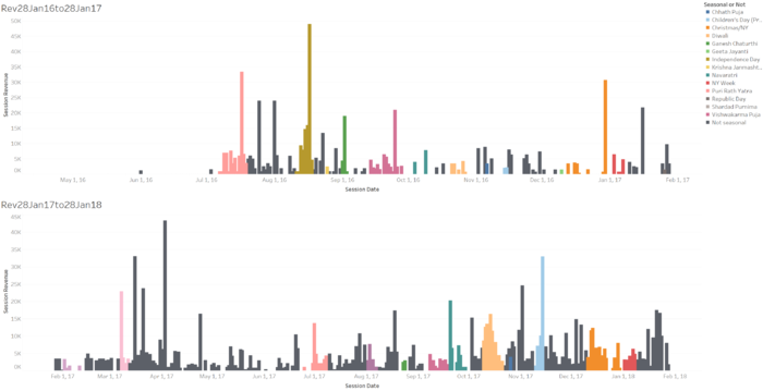
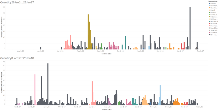
As a part of our exploratory data, we also explored the purchases made by date. These dates were matched with festivals in India (since majority of sales are from India) as well as international holidays. We wanted to see whether there were signs of seasonality in purchase patterns. By observing the data alone- it appears that during many peaks of revenue- the peaks occur during festive occasions. However, a considerable number of peaks also occur during non-festive occasions. As such - we do not see an obvious seasonal.
Moving forward it would be good for Brainsmith to take note of the festive occasions and holiday seasons to drive more sales by providing promotions during those periods. Although there is no clear seasonality- we do observe that peaks do occur during some of the festive occasions. By taking note of those occasions with more obvious peaks, Brainsmith can better plan their marketing campaigns. With more data in the future- a clearer trend may be momre obvious.
Acquisition of visitors as customers
This next part of our analysis will deal with factors that could potentially help us gear
towards acquisition of visitors as customers.
We explored data from all users on the site in order to compare the differences between
customers and visitors. Due to the limitations of the data extracted from Google Analytics,
where individual users’ data points are collated instead of split into individual sessions on the
site, we could only compare two relevant variables - geography and average session time per
user.
As each user only has a specific geography, we are able to track the visiting behaviour of
users. Users are split into countries from USA, India and Others. Users from India account
for 91.88% of visits, 3.85% are from USA, while the remaining 4.27% are collated into
Others due to the small number of visits from individual countries.
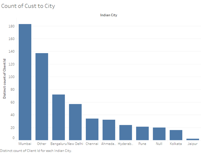
Within India itself, we further split them into major cities Ahmedabad, Bengaluru, Chennai,
Hyderabad, Jaipur, Kolkata, Mumbai, New Delhi, Pune and Others. Cities with null values
mean that they are not from India, either USA or Other countries.
Exploring customers and visitors data separately, these are the things that we have observed.
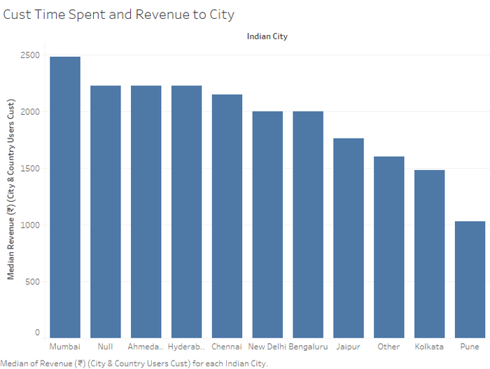
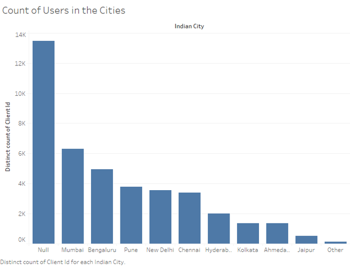
From Figure 13, we can see that most visits are from Mumbai, with majority of the revenue generated from that city. However, when taking the median of the customers from each city, we see that the revenue generated from each customer from various cities are relatively equal. We took the median value as we wanted to reduce the skewness of purchase tendencies in each city.
We see that other than the cities of Jaipur, Kolkata and Pune, all other cities including those outside of India have a median spending of 2000. Given that these three cities also have the lowest count of customers, Brainsmith can have more geographically targeted advertisements to increase conversion rates.
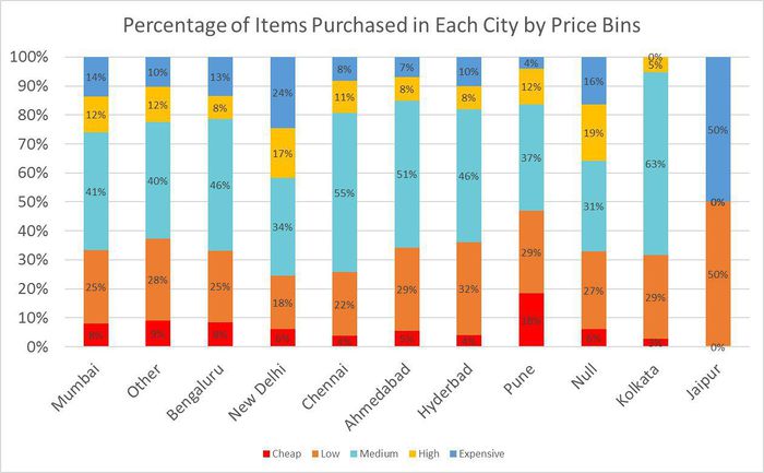
Next we binned the products by price: Cheap, low, medium, high and expensive - we explored the types of products purchased by customers from each city.
The majority of products bought in each city are medium priced. However, this visualisation
allows us to identify what kind of products, in terms of price bins, perform better in each
country. For example, New Delhi has the highest proportion of expensive products and Pune
has the highest proportion of cheap products bought. This helps us to propose a better
targeting advertisement campaign within each city so as to maximise revenues.
We explored visitors to the site and found out that majority of them do not come from India,
despite majority of the users coming from India. This means that the advertising campaigns
are not targeted well and since Brainsmith invests heavily into Paid Search, this may be an
inefficient use of their budget
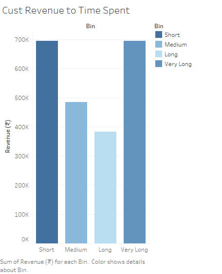
We explored the relationship between customer revenue and average session duration. We binned average session duration into the four quartiles - short, medium, long and very long.
The pattern above shows that most revenue is generated when they spend a short or very long time on the site. This may be useful to provide a recommendation to increase conversion rates in future. For example, they can either close the deal quickly, or provide engaging information to keep users on the site for longer in order to convert them into customers.
Data Quality Issues
The data is a little stale in terms of the fact that our client has not been actively using and updating their event trackers on the website. We also believe that Google Analytics itself has a lot of measuring error involved that cannot be overlooked:
i. Lack of machine and medium integration means that we have to be aware that various ClientIDs could be part of the same actual client, since every user has several devices several times unconnected.
ii. Google Analytics often couldn’t track discount period properly, and there were data disparities when it came to recording a total bill – for eg. if there were two products bought for INR999.00 and INR999.00, GA would record it as INR840.00 because there was an expected discount on one of the products. We were mindful of these and took steps to correct it at the data input stage itself.
There is a lot of human effort and toil, that has gone into crawling every customer profile on Google Analytics to achieve this datasets, and hence we recognise that there are possible lapses in data quality via simply human error.
To mitigate this, we each took turn to run randomised but in-depth tests on each others’ input, inclusive of random row checks, excel compilation standardisation and so on.
Statistical Anomalies
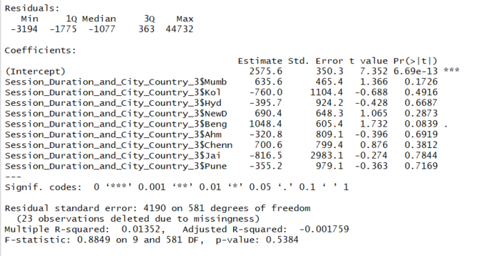
The regression run shows that there is no systematic difference in the session revenue based on the City. None of the city variables have a significant explaining power for the changes in revenue. This tells our client that there is no reason to focus on city-wide differentiation in their marketing or sales procedures as those differences are not a factor of decision.
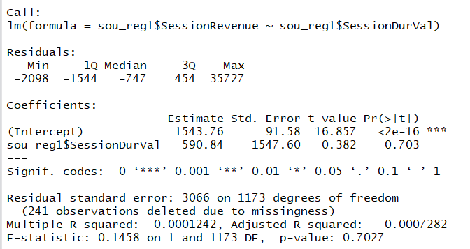
The Session Revenue is not directly dependant on Session Duration, and the values are significance. I.e., this model does not explain the variance or change in our dependant variable.
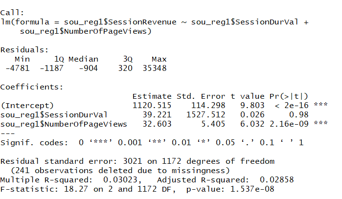
The data here implies that there is no significance of the Session Duration on our Session Revenue, but there is a high significance for the total number of page views: This shows that with an increase in 1 page view by the customer, it is very likely that the Revenue will show an increase of 32.603 rupees.
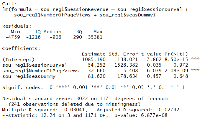
When a Seasonality Dummy is introduced into the model alongside the given independent variables, we see no change and no increased explanatory power - in fact the adj. R-squared value decreases slightly. Hence we can conclude that the fact that there is a season or festival during the time period, does not necessarily mean that there will be an observable change in the revenue due to it.
For various different data sets, and with solely the season dummy as well, we observe that this is not the case.
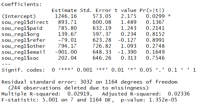
Again, once again we can observe that in the data observed, the Medium from which the user arrives into a particular session has no bearing and significant effect on the revenue in that session, i.e. indirectly, to the items bought.
Steps moving forward:
We are considering two possibilities:
1. There is a lot of uncertainty and no one factor seems to be key to explaining the
variables of interest (which are increased site visits and amassed revenue through conversion
of visitors). Henceforth, we hope to concentrate on the purchased products, and work on
creating the best bundles to instigate the bet possible value for our client and the customer –
to ensure greater concentration on the products that are more profitable and demanded.
The best way we consider this will be possible is to have a detailed Market Basket Analysis
on the basis of already purchased combination of products – as well as attempting to
reconcile this with the exploratory trends pertaining to city, session medium, revenue,
average time spent as well as revenue fluctuations depending on these variables, to come up
with the best recommendations.
We will bolster this with an automated tracking dashboard, which takes in periodical input of
data to observe the operational trackers that we have analysed in our exploration above,
including the suggested bins and adapted column headings.
2. Secondarily, we also have now received their marketing data as well, which we hope to further analyse on the basis of the most effective landing page link to link with – and the allocation of the budget on the correct mediums of advertising based on observed user behaviour. We are hoping to conduct a detailed campaign analysis since Facebook is their primary agent for marketing, and a significant budget is allocated to this. The end objective of this analysis would be to observe the factors affecting the end-goal of click-through rate. We are also looking at creating an automated dashboard, which would then generate a result for our client to have the best marketing strategy to increase clicks into their website, and which campaigns have been more successful and which factors affect this CTR.

