ANLY482 AY2017-18 Group9: Project Findings
Delivery Analysis
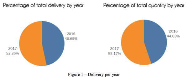
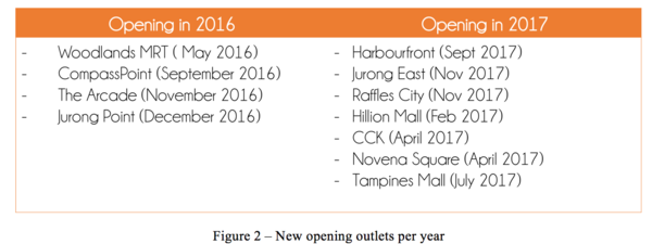
As shown in Figure 1, we can identify that the percentage of total delivery in 2016 stood at 46.65% and 53.35% in 2017. In comparison to the percentage of total quantity ordered, 2016 stood at 44.83% and 2017 stood at 55.17% increment. Upon further investigation in our EDA, we realized that it is mainly due to the new outlets open in 2016 and 2017 (Figure 2), which made 2016 data collectively lesser than 2017 dataset.
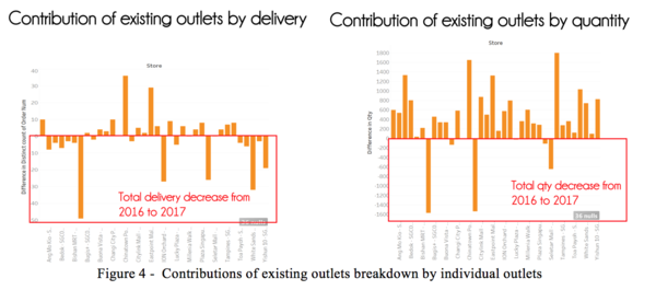
As shown in Figure 3, new outlets contributed to 551 (7.84%) increment of delivery counts and 18,439 (7.47%) of quantity counts. While the remaining contribution can be broken down into contributions by various existing outlets as shown in Figure 4 below.
As shown in Figure 4, we can identify that there are several outlets that had shown total delivery decrement from 2016 to 2017 (i.e. 2017 do less deliveries than 2016). Examples of outlets decrease from 2017 as compared to 2016 are Ang Mo Kio, Bishan and ION Orchard. However, in comparison to the chart on the right regarding contribution of new outlets by quantity, it displayed otherwise. Henceforth we can conclude that although the number of delivery decrease from 2017 as compared to 2016, it does not justify that the order decrease. With that we have decided to focus on the chart on the right which shows contribution of new outlets by quantity.
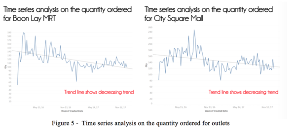
Figure 5 below illustrate the trend analysis on the quantity ordered for Boon Lay MRT outlet and City Square Mall outlet. From the chart, we could identify that the time series trend for the two outlets which shown significant quantity decrement. Henceforth, we have noted and will highlight to our sponsors regarding the outlets business performance for their consideration.
Outlets Analysis
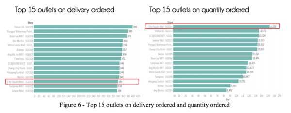
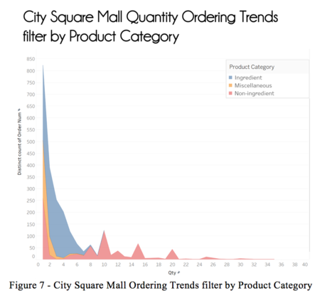
Figure 6 highlight the top 15 outlets on delivery ordered and quantity ordered. From the chart, we have identified “City Square Mall” as the abnormally with low number of deliveries recorded (rank 13) but high quantity ordered (rank 1). We have drilled down to understand the underlying reason behind it (figure 7)
From Figure 7, we can see that “Non-Ingredients” (red area) makes up the bulk of high quantity order, whereas Miscellaneous and Ingredients trends relatively normal. We want to understand the underlying reason behind it, henceforth drilled down to make comparison against the average percentage across all outlets as shown in Figure 8 below:
From Figure 8, we can see that on average (chart on the right), Ingredients makes up to be about 80.47% of the quantity ordered, Non-Ingredient makes up about 10.59% and Miscellaneous makes up about 8.93% across all outlets. Whereas in comparison in City Square Mall, Ingredients makes up to be about 50.95% and Non-Ingredients makes up to be about 43.70% of the quantity ordered. There is a big contrast between City Square Mall and the average amount ordered, thus a point to note and highlight to our sponsor.
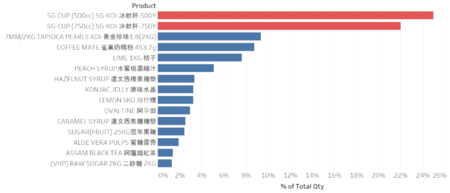
After which, we further break down into the specific products that contribute to this abnormally, and the chart below highlight the critical composition which is “SG-CUP” for both 500Y and 750Y.
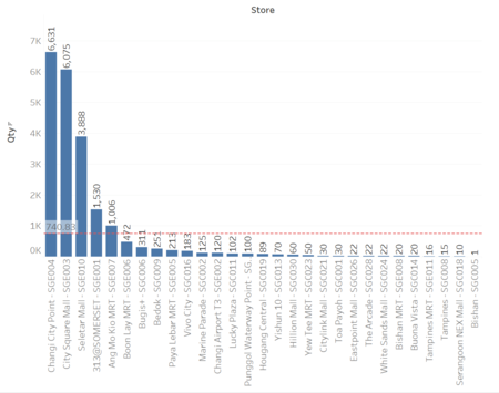
Next, we wanted to identify outlets with similar abnormally, henceforth we have decided to plot the chart as shown in the left. From the chart, we can identify that outlet Changi City Point and Seletar Mall both have similar abnormally, thus we have noted and will subsequently update our sponsor.
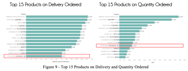
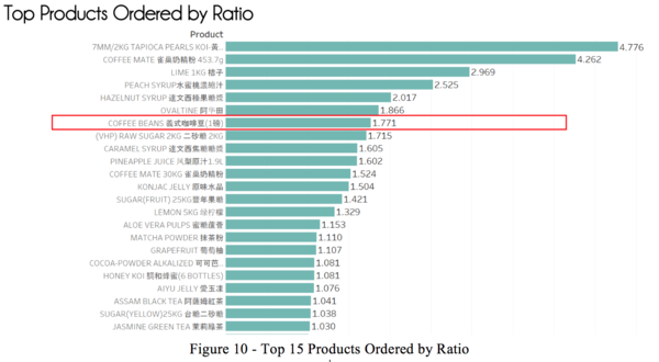
From Figure 9, we can identify the top 15 products on delivery and quantity ordered. For instance, Coffee Beans had 7077 delivery orders across all outlets and 12,531 quantity ordered counts. We want to identify what are the ratio between the delivery and quantity (i.e. how many quantity ordered per delivery). Henceforth we have created Figure 10 below to illustrate the ratios:
From Figure 10, we can see that coffee beans stood at 1.771 per delivery. Whereas the top spot remains for Tapioca Pearls at 4.776. This means that for every delivery order, there is an average of 1.771 coffee beans and 4.776 of Tapioca Pearls ordered. From this ratio, it’ll allow us to gauge what are the average amount per delivery that we can propose in our prediction in the later part of this project.
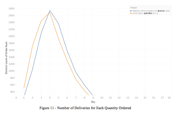
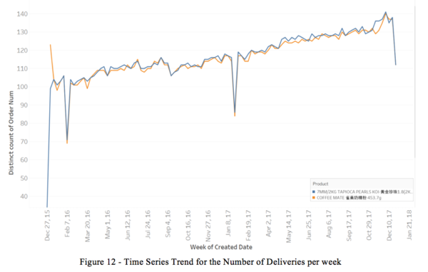
From Figure 10 above, we identify that the top 2 products look similar in terms of deliveries, quantity ordered as well as ratio at 4.776 for Tapioca Pearls and 4.262 for Coffee Mate. Henceforth, we have drilled down to look in-depth into their order patterns. As shown in Figure 11 and discover that they have similar order patterns. Following which, we have drilldown into Figure 12 below on a weekly basis.
From Figure 12, we can see that both Tapioca Pearls and Coffee Mate follow a very close pattern on a weekly basis. Henceforth this is a point to note for our future model development as well as business recommendations for our sponsor on the market basket analysis products for future reorder purpose.
Reordering Frequency Analysis
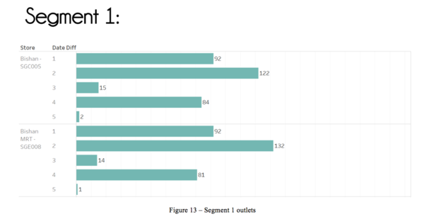
We have implemented a new column called “Segment” to compare the reordering frequency patterns between outlets and make comparison between various outlets in the same segment. Outlets with the similar reordering frequency will be grouped into the same segement. As such, this enable us to make further evaluation and business recommendations to our sponsor about delivery. Example of the following 3 segment are as shown below.
With references to figure 15, we realized that outlets in Segement 3 consists of outliers in term of reordering frequency and henceforth there is a need for us to drilldown to understand the underlying reasons behind these outliers.
From Figure 16, we have identified the products that causes the outliers. Jasmine Green Tea and Cold Glass Bottle are the two products that contributed to the outliers with Jasmine Green Tea of a higher concern since it occurs in 7 outlets across all outlets.
From Figure 17, it shows that in months of Feb, there are some abnormally as indicated in the red box. We have further drilled down into the month of Feb, and it is as shown in Figure 18 below.
Upon drilled-down to understand the underlying reason behind outlier of order frequency over 6 days, we realized that there is a similar trend across all the branches including 313 Somerset, Ang Mo Kio, Ang Mo Kio MRT, Bedok, Changi City Point, ION Orchard, Paya Lebar MRT and Plaza Singapura. We concluded that the long order frequency of 6 days between 5th Feb 2016 to 11th Feb 2016 was due to the Chinese New Year long holiday.

