ANLY482 AY2017-18T2 Group06 Analysis Findings
|
|
|
|
|
|
|
|
DATA CLEANING AND PREPARATION
For our data cleaning and preparation, we used the following software to both visualize and ETL the data into other forms: 1. JNP Pro 2. Tableau 3. SQL Server Data Tools 2015 (MSSQL) 4. Microsoft Excel
Through the visualization seen earlier in the report, we realized that there is a need to perform data transformation to visualize all the data. Therefore, the data was prepared with MSSQL instead to produce a ‘day aggregated’ data-set for analysis on the day-time period basis.
Our initial methodology was to use the clustering method to identify clusters which could be treated as baskets for investment. As the currency values of USDJPY and the rest are vastly different, there was a need to transform into percentage change and standard deviation for clustering.
However, our client does not have 15-20 or more currency pairs in their database. Hence, we would be focusing on forecasting with these 5 currency pairs. Our team used the ARIMA forecasting method and thus the data transformation method would not be required as the ARIMA model uses its own unique method to transform data.
The image below shows the result of our first data transformation.
We performed data transformation to allows us to visualize the data differently and derive new insights on the data:
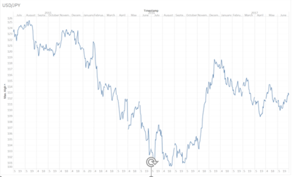
As seen in the visualization of the data of the same currency pair and time period, we can see the trends and price movements for the entire time period of 2 years for USDJPY data.
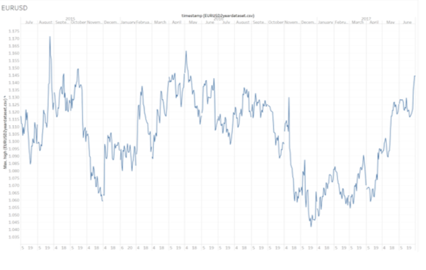
This provided additional data discoveries which we observe significant shifts in the price movements and their variations throughout the time period. This allows us to visually compare across multiple currency pairs to spot any prominent similarities and trends between them. Although nothing of significance was identified through the visualization charts as shown below, we could identify periods of time which could increase the granularity of the data points to allow deeper analysis for our forecasting.
DATA VISUALISATION
Below would be initial visualizations 2 sets of the data by Tableau, using the original data without any transformation:
Initial observations of the data revealed incomplete dataset, which was revealed to be time periods of the weekends when the market is closed. Future analysis of the data will take this information into consideration.
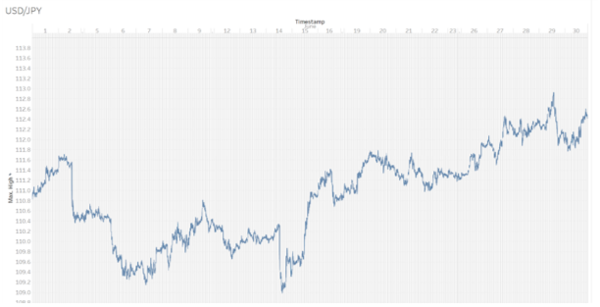
Attempting to visualize minute tick data is restricted to a maximum of 1-month time periods due to the volume of data. The result of this visualization is as shown below:
EXPLORATORY DATA ANALYSIS
Fundamentals
The Japanese yen is one of the “safe haven” currency, together with the swiss franc, it is a go to for investors whenever there is major uncertainty in the market. The Japanese yen has a 13.6% weight of the US Dollar index, 2nd behind the EUR (ICE Futures U.S., N.D.). It is also the world’s 3rd biggest economy behind the united states and china, with 5.9% of the world’s GDP.


