ANLY482 AY2016-17 T2 Group19 Documentation
Contents
Key Deliverables
Reports and Minutes will not be available due to client confidentiality
Interactive Visual Analytical Dashboard
1. User Interface Design
Figure 1
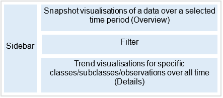
The Interactive Visual Analytical Dashboard (IVAD) presents transactional data in 3 main perspectives to provide a holistic view of the data: Geospatial, Product, Customer Type. This approach was based off the 5 Ws of information gathering, with geospatial relating to Where, product relating to What, Customer Type, relating to Who. Alongside with these 3 perspectives, a consistent underlying philosophy was taken to the UI design, following the Schneiderman’s Mantra: overview, zoom and filter, details on demand. This was implemented by creating 3 distinct portions in every perspective view: Snapshot, Filter, Trend. The Snapshot portion acts as an overview/navigation panel that takes the form of either a web-map or a tree-map, alongside with a simple bar chart/heatmap. The Snapshot portion utilises data from a selected time frame with two levels of data visualisations: a snapshot level relating to a certain time frame that is selected in the sidebar (overview) and displayed alongside trend information (detail) in the form as shown in Figure 1. This would be further elaborated below with regards to the various perspectives.
Geospatial Perspective
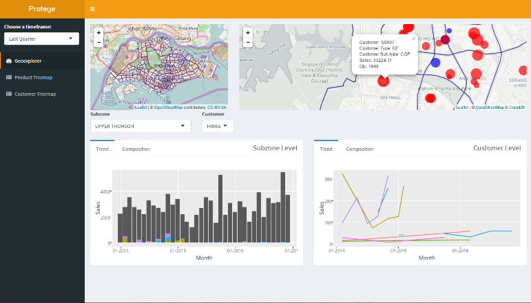
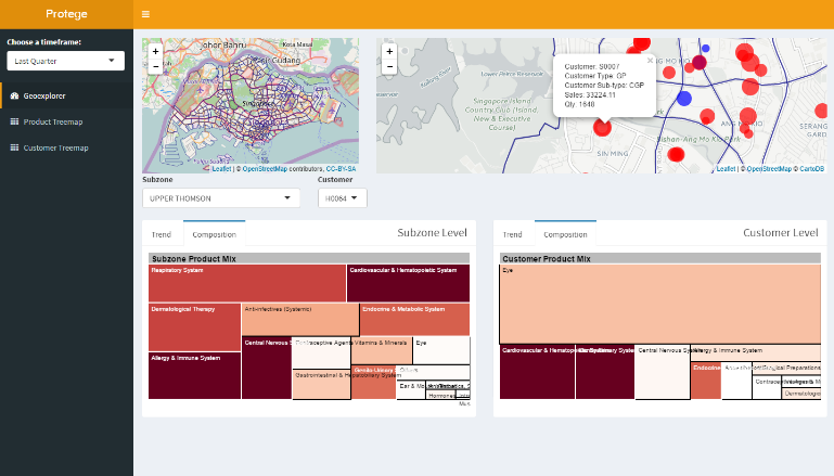
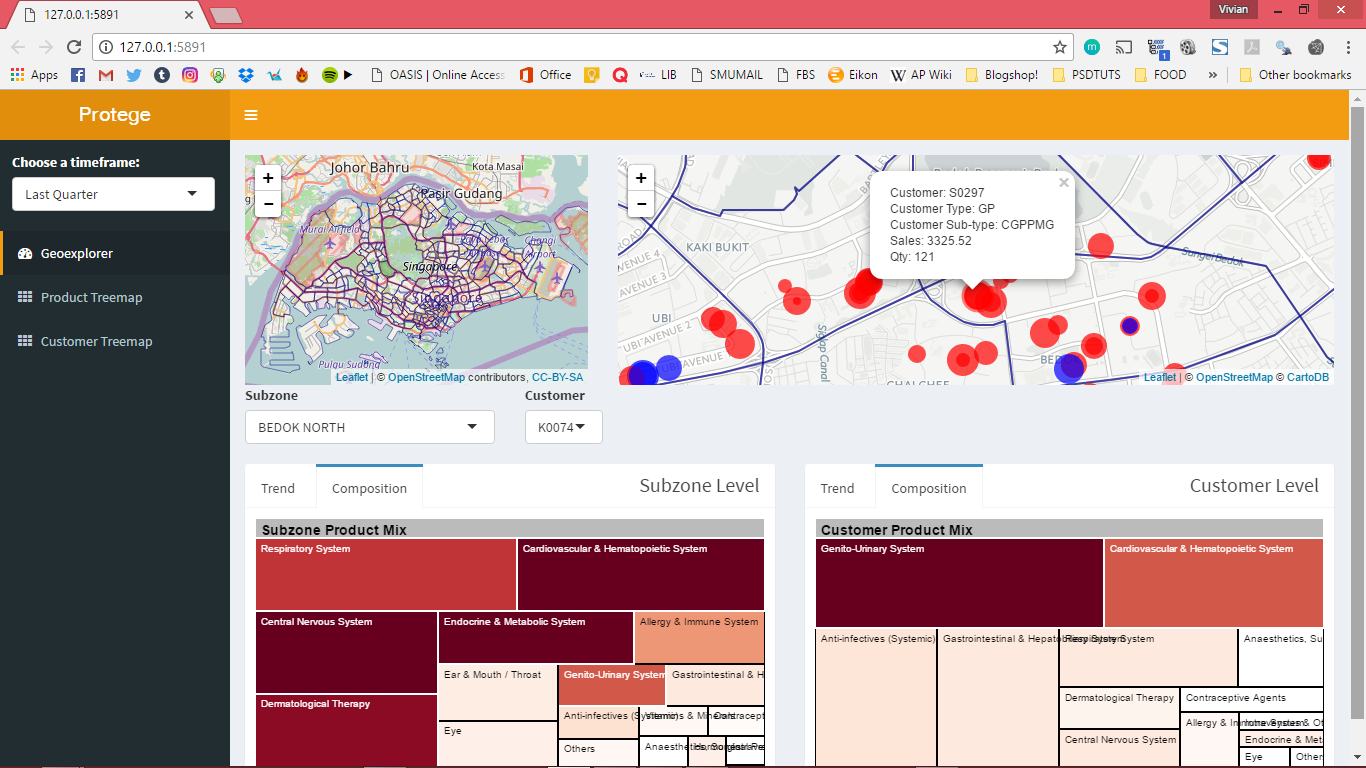
A geospatial overview is provided at the initialisation of data with a snapshot of the past quarter’s customers displayed as a proportional symbol map next to a synced control map that is zoomed out to give an overview of the entire map. This acts an overview of the data with the proportional symbol also acting as a navigation panel with clicks leading to a reactive filtering of data and the generation of trend charts on subzone performance alongside specific individual customer performance over time as seen in Figure 2. In addition, users can probe into the composition of the performance of each subzone or individual customers with a tree-map and this provides a more effective visualisation of multivariate information on both sales and quantity information with respect to different categories or specific products. This also allows for a comparison of a specific customer against its peers within the same subzone. (Figure 3)
Figure 2
Figure 3
Product Perspective
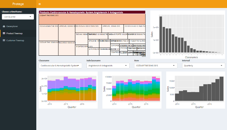
In the product perspective, an interactive treemap based on data from the selected timeframe is used instead of a webmap.
Figure 4
The tree-map serves as a navigation as well as an overview as it would allow the user to drill down from a broad product category into a single product and subsequently view the sales trends of each broad product category to item with the choice of different intervals. In addition, a simple bar chart is also available next to the tree-map for a simple overview of sales of different categories over a specified timeframe.
Customer Perspective
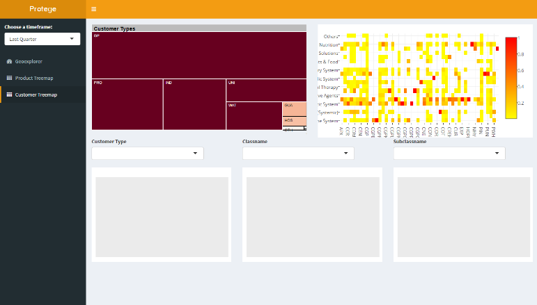
In this perspective, a tree-map of the customer type is used with the levels being 1. Broadest customer grouping 2. Customer grouping 3. Category of products 4. Subcategories of product
Figure 5
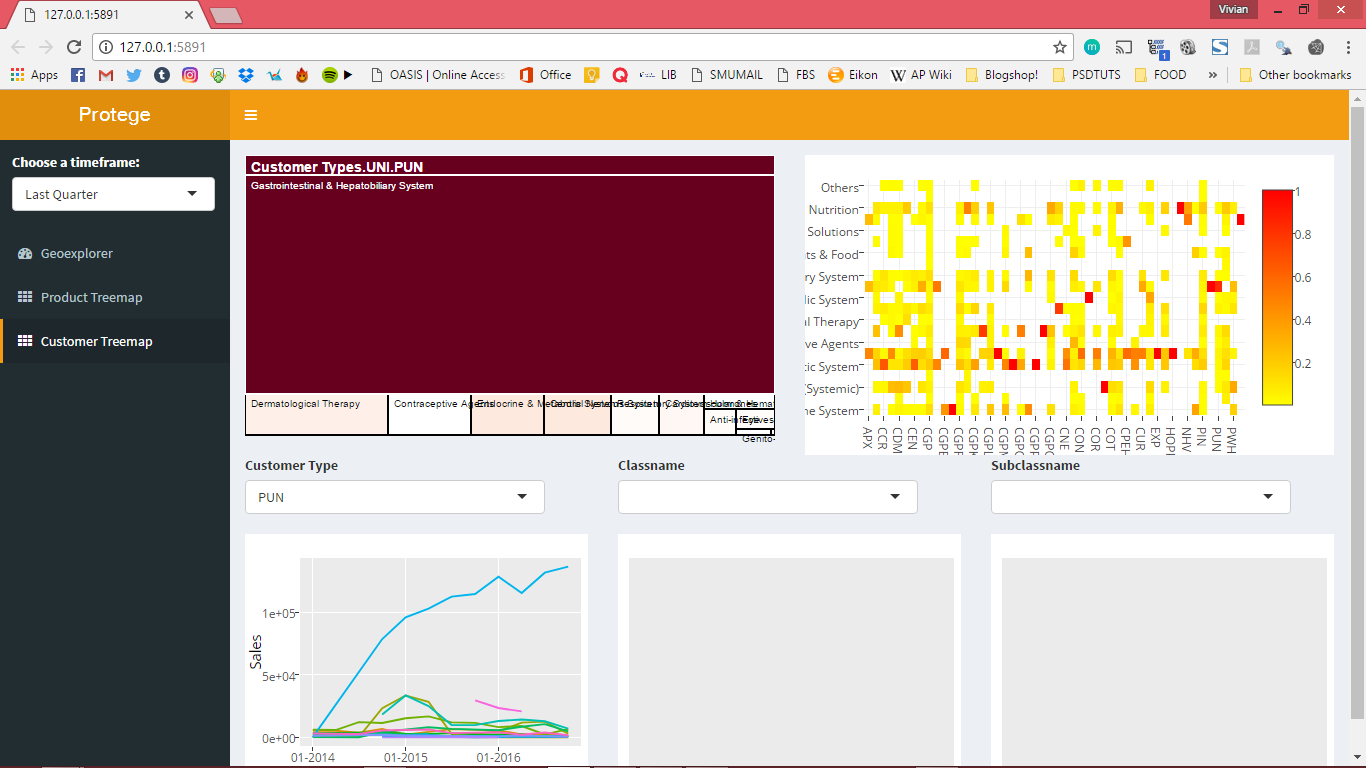
Using a tree-map as a navigation tool again allows the user to track the changes in the composition of buying patterns (in the form of reactive trend charts) for different customer types over time while at the same time providing a quick overview of buying patterns of a certain customer group over a time frame. (Fig 5). A heatmap also visualises the purchasing patterns of various customer segments and allows for quick identification of strong product categories across all customer segments.
Figure 6
Data Visualisation Processes
The shiny app runs on a single file format and carries out the bulk of data visualisation processes, namely web-mapping, interactive treemapping, and reactive charting.
I. Generation of webmap
Using the leaflet R plugin, the web-map generated consisted of 2 main sections, a control map and a zoom in map, as shown in Fig. 7. The two maps are synced through proxies with clicks on the control map leading to a zoom onto the corresponding area on the right map. This allows for convenient navigation of the map. On the right map, proportionate symbols relating to sales within a specified timeframe are generated with colours of the symbols corresponding to different customer types. Upon clicking the selected symbol with then be highlighted in red and key details would appear in a popup (redacted for confidentiality)
Figure 7
Alternatively, navigation could be done using dropdown menus that are populated with items from the corresponding time frame. This navigation is done through a series of observer events where the click input first updates the dropdown input which then navigates to a specific view and zoom on the right map. This reduces the probability of a trigger cascade.
II. Interactive treemapping
Modifications were made to the d3treeR package, an extension of the tree-map package. The tree-maps used in this app were preloaded along with the environment image due to the complexity. The d3treeR allows for interactive hover-over-to-reveal visualisations and for tracking of clicks and thus enabling use of the tree-map for reactive charting.
III. Reactive charting
By using the click inputs to both the leaflet webmap and d3treeR, dropdown inputs were populated and used as reactive inputs to filter datasets in addition to other input parameters prepared in the global script and charted using plotly in addition to ggplot. The key benefit in using plotly is that is allows for easy export of its charts as images as well as the ease of brush-zooming and provision of hover-info. These functions allow for ease in access and useability as users can brush-zoom into areas of interest and hover over interesting trends to gain greater insight.
Case Examples
A. GEOSPATIAL PERSPECTIVE
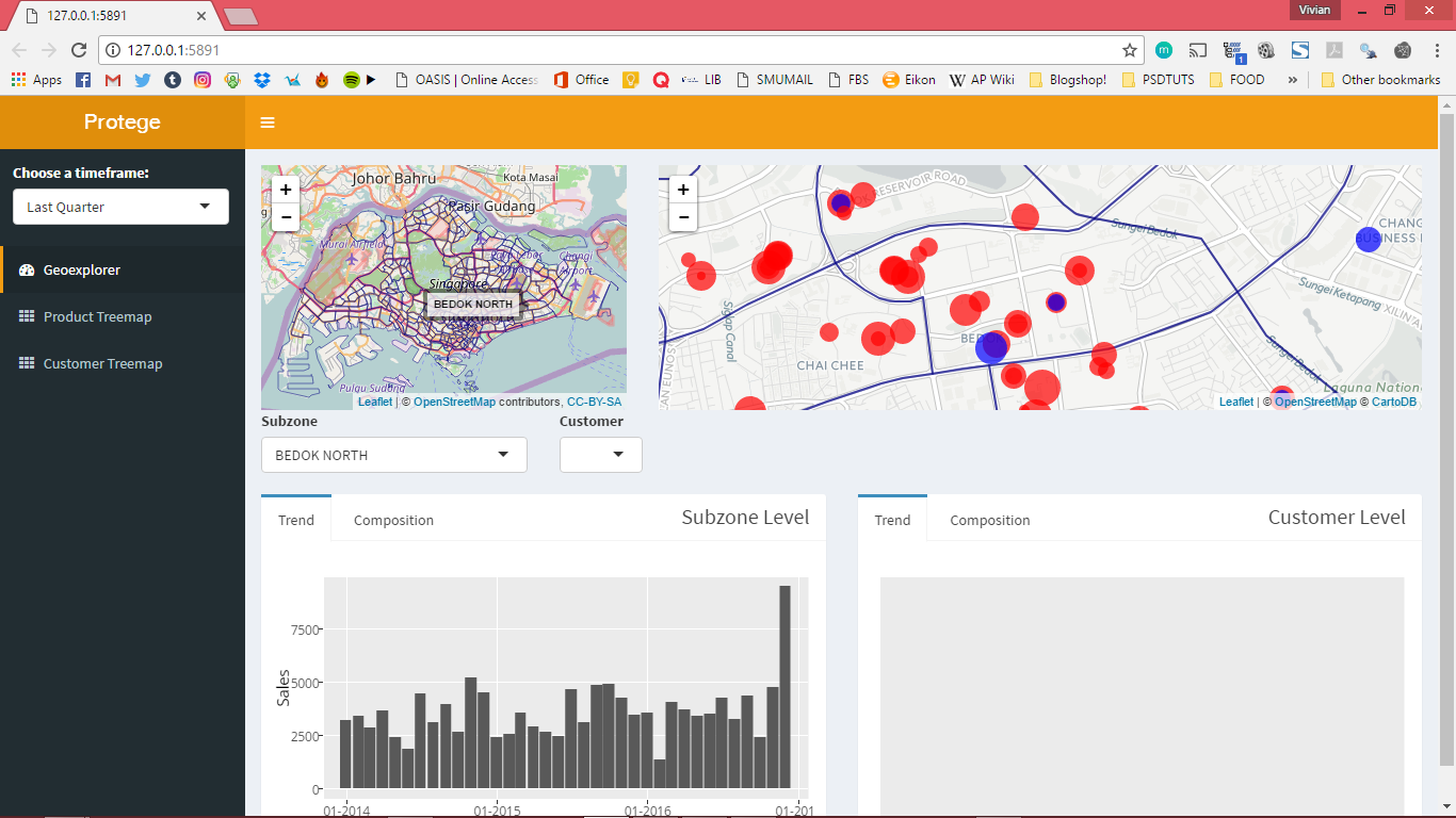
Suppose that a user wishes to run a query on the subzone of ‘Bedok North’, this can be done by either navigating through the smaller map navigator on the left which would have hover over labels or through the drop-down menu in the filter area. This zooms into the subzone on the display map on the right where points of interest are presented in a proportionate symbol map as seen in Fig. 8.
Figure 8
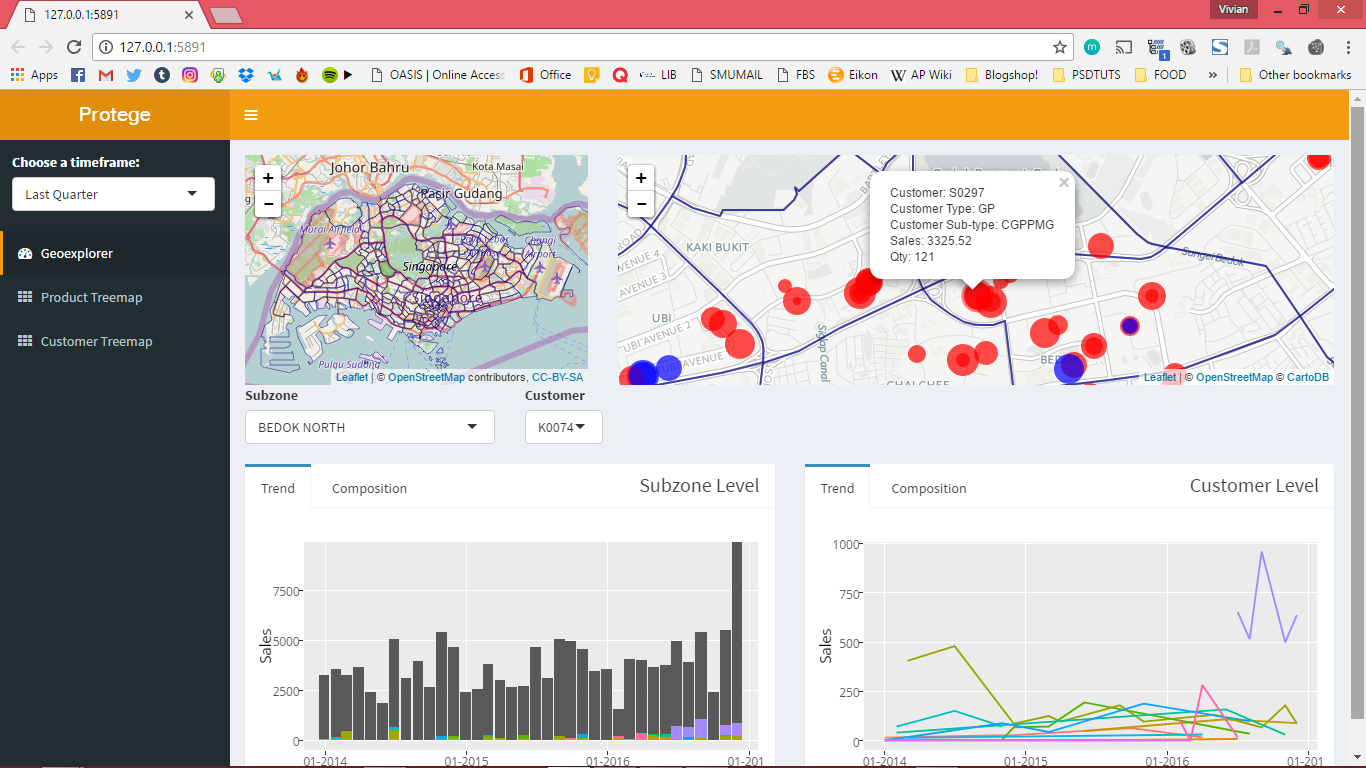
After which, by clicking on a particular point within the subzone, for example, S0297, or by selecting this customer through the dropdown, both subzone and individual data would be displayed in the form of a bar chart and line chart correspondingly, the bar chart would also display contribution of the individual within the subzone. This allows for a quick view of the relative importance of this customer to a specific subzone as well as assessing what product classes this customer has been purchasing as seen in Fig. 9.
Figure 9
Other than the trend tab, a product mix comparison is also available using treemaps which are 2 levels deep and allow for the user to compare the individual’s purchasing patterns against the subzone’s total market basket.
Figure 10
B. PRODUCT PERSPECTIVE
Moving to a product perspective, a user could analyse the sales performance of a specific product class, e.g. Respiratory System by selecting the item on the treemap.
Figure 11
This, in turn, populates the filter section which also plots a stacked bar chart of the trend over a specified time frame, which by default is set to ‘Quarterly’ due to contextual requirements.
Figure 12
The user would also be able to further drill down into the subclass group as well as the specific item through the treemap and this would allow for a clearer understanding of specific products as comparisons would be easily made across the product, subclass, and product class.
Figure 13
C. CUSTOMER TYPE PERSPECTIVE
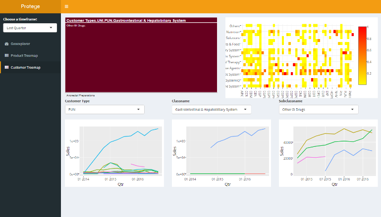
The Customer perspective is very similar as compared to the product case, however, in the customer perspective, a heat map is also supplemented to show the percentage of sales of various product classes against the various customer groups. Navigation is done in a similar way to the product perspective with the treemap being 5 levels deep (Customer grouping level 1, customer grouping level 2, product class, product subclass, item). This complexity of treemap allows for the user to understand exactly which products the customer group or customer subgroup is purchasing as well as allow for a quick view of how the market basket is through the treemap. In this case, through navigating through UNI>PUN, we see that Gastrointestinal & Hepatobiliary System products are driving growth.
Figure 14
Deeper drilling through the relevant subclass (Other GI Drugs) would then allow for the narrowing down of growth drivers.
Figure 15
In addition, the interactivity of the treemap further enables the comparison of market baskets across customer segments and the identification of potential opportunities of upselling or cross-selling.
Conclusion
A. LIMITATIONS
This project is set to be limited in span of roughly 6 months, from the sourcing of a data sponsor to the EDA then finally to the dashboard construction. With severe time constraints, the full capabilities of R and Shiny platforms could not be represented fully and accurately. Furthermore, insights generated from the sales data in this project is not exhaustive as not all relevant techniques and tools are used.
B. RECOMMENDATIONS / IMPLICATIONS
We recommend that future research or work be done in this field to consider exploring the use of clustering on top of geospatial analysis to provide a deeper understanding of the business. Furthermore, should the data set be operational in nature, it is critical to analyse stock movements considering holding and transportation costs. Predictive analytics can be employed to forecast demand and as such better allocate time for restocking. In regards to transportation costs, delivery schedule or routes can be analysed to increase operational efficiency to lower cost for the business. This applied research into R and Shiny platform would have implications on how businesses apart from large corporations can employ big data analytics in a more affordable way. With more businesses making use of their untapped wealth of data, greater value can be generated to benefit the end-consumers and the country’s overall productivity.
C. ENDING REMARKS
IVAD’s initial development was done with the data sponsor’s interest in mind, however, applications for this dashboard has potential to benefit SMEs who have business models based on wholesaling. IVAD’s open-sourced nature and its intermediate IT requirements presents a viable alternative for SMEs to leverage on the benefits of data analytics. The geospatial aspect of IVAD provides users with a new avenue to analyse their sales transactions, thus allowing them to improve upon logistical processes and the precision of marketing efforts. The combination of the geospatial, product and customer aspects along with its reactive charts and interactivity can be used to improve decision making through data-driven insights. However, a significant barrier that remains is nonchalance of many SMEs towards using newer technologies in driving productivity. Common concerns behind this nonchalance are related to ease of usage, which should be alleviated with the user-friendly interface and operation of IVAD.
Acknowledgements
Additions to the data, namely the demographic data and the subzone data, were sourced from Data.gov.sg, a publicly accessible database run by the Singapore Government. We would like to extend our gratitude to our data sponsor for entrusting us with the sales data as well as the efficient assistance rendered. We appreciate the timely correspondence with regards to our enquiries and clarifications. We would also like to extend our gratitude to Professor Kam Tin Seong, our project supervisor, for his valuable insights regarding dashboard construction and for guiding us throughout the entirety of the practicum.

