ANLY482 AY2016-17 T2 Group16: PROJECT FINDINGS/Finals
Contents
Data Overview
We started with request log data (a.k.a. digital trace) and student data. Request log is a NCSA Common Log Format (CLF) dataset that contains billions of records captured by the library’s URL rewriting proxy server throughout the year of 2016. This dataset captures all user requests to external databases. The record attributes are user ID, request time, http request line (method, URL, and protocol), response time, and user agent. The student data, specifying faculty, admission year, graduation year, and degree program, is also provided in csv format for the team. At a later stage, two additional attributes - if the student is citizen of Singapore and if the student is Dean’s Lister in AY2015-16 - were also provided. There are users other than students (e.g. alumni, staff, visiting students and anonymous users), but the scope of this project is only limited to students because of the availability and insightfulness of student data.
Student dataset contains 22,427 records, not only limited to full-time but also postgraduates and exchange students. Number of students vary much across faculties but little across years of admission. This accords with the actual distribution of SMU students across faculties and admission years. Students with value “others” in faculty column come from various non-degree programs, with most of them from International Exchange Program . By comparing the number of student IDs with unique number of students, we confirmed there is not duplicate identifier. We also systematically check for missing values. and found out there is no missing values under faculty, degree name or admission year. During EDA, we confirmed the distribution of students across different admission years and graduation years is reasonable.
The request log records are filed by months. The monthly numbers of records in request log data vary from 3 million to 11 million and the file sizes range between 1GB to 3GB. Requests are produced more in March, September and October, and few in school holidays.
Analysis Workflow
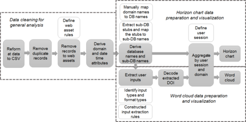
The workflow diagram below shows “data cleaning for general analysis process”, “horizon chart process” and “word cloud process”. A cleaned log dataset with additional attributes is produced after data preparation process. These attributes come from URL and additional data set collected.
Duplicate requests
Duplicate request is defined as a user makes multiple identical requests with the same URL within 30-second time span This is supposedly caused by auto page refresh.
The removal of duplicate records was done in two rounds for efficiency reason. The first round takes each record as a single string and look backs 20 lines in the rolling cache for exact match. The second round only looks for matches by hashed email and URL within 30-second range.
Requests to web resources
With removed duplicate records, the data would still be noisy due to many requests to web assets. Web assets are used for page rendering and display. The typical ones are JavaScript (.js), Cascading Style Sheets (.css) and images (.img, jpg). Such web assets do not help us understand user behaviour as the requests are not generated by user and are database dependent. The requests to web assets are identified by web assets file extensions.
The requests to web assets should be removed from analysis on two grounds:
- Inflation on intra-domain analysis, as the web assets indefinitely increase the number of requests within a domain
- Distortion on inter-domain analysis, as the number of web assets used to render pages vary from site to site.
We iteratively built up a list of web assets extension stubs as exhaustive as possible. Subsequent pattern extraction also uncovered more types of web assets to be added to the list. We then search in each request line for the extension stubs from the list. Sites render pages differently, thus the pattern of requests to web assets vary.
Derive domain and date time
The domain names in URLs indicate the resource provider. A simple URL utility toolset can extract the domains from request URLs. However, since April 2016, when the library website redirects users to external e-resource page, the
destination URL is encoded in the URL data as a value. For example, we need to extract the URL to Economist from the “qurl” section as that is the actual user intention. This requires recognising and extracting the actual URL from the libproxy redirect requests and decode them into plain text.
Date time section also requires transformation. The date time section (e.g. “[01/Oct/2016:00:00:01 +0800]”) in the records does not take a format acceptable to the analysis tool that we used, and it is rigid for time lapse analysis. Thus, we extended it into timestamp, date, day of week, week and hour.
Deriving database name from URL
To understand the features of databases, we need to group all query URLs by their databases. (i.e. which database is requests with each URL). This is not a straightforward task due to a many-to-many relationship between database name and domain name, and the scale of the manual resolution. In fact, from our preliminary analysis, each database is mapped to 7.38 domain names on average. An extreme case is Sage, which uses 495 different domain names in September data.
The major challenges
- 1. Manual resolution :
Domain names comes in various forms. Some are obviously identifiable, some aren’t. For example, it is not apparent that tandfonline.com is a domain name for the journal database Taylor and Francis. Therefore, there is no systematic way to map the mouthful domain names to the database names which are familiar to the project sponsor.
- 2. Variation in domain levels :
A database can use as much as 500 different domains which comes in various length. There is no single pattern to automatically translate the domain names back to the corresponding database. Most databases use the same top and second level domains. (For example, a common database Financial Times use as many as 39 different domain names, but they are all something like *.ft.com.) However, many databases use multiple top level domains, such as Wall Street Journal and Westlaw.
- 3. Encoded domain name :
Starting from April, the real domain name for some database are encoded into parameters for requests with domain name libproxy.smu.edu.sg. This is flagged out as the that the number of requests to libproxy.smu.edu.sg surged in April. In subsequent months, such domains amount to 21% of overall requests.
- 4. Domains may not contain database name :
For a couple of e-resources providers, the domain name is encoded in URL request data instead of explicitly shown in the domain section. These include Ebsco and ProQuest. For these sites, we will need to read the entire URL to find the DB stub and decipher it to real database name.
The first step we took is extracting top-two level domains (e.g. wsj.com) for all requests in domain statistic file, since intuitively the top-two level domain would suffice to identify most of the databases. The statistic files summarized the statistics below for each top-two level domain.
- number of requests,
- number [proportion] of post requests,
- number [proportion] of requests to web assets,
- number of unique users,
- and number of user sessions
With that, we manually looked up the database names (or “semantic” domain names) from library database catalogue (http://researchguides.smu.edu.sg/az.php) which lists out LKS Library’s 191 databases (till Feb 2017) and their descriptions. The statistics proved over 90% of overall traffic can be attributed to known databases.
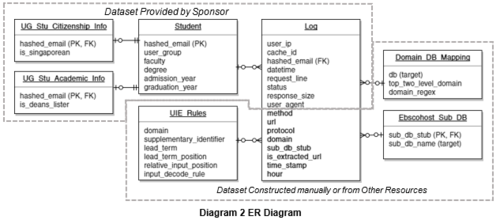
We then extracted all full domain names from request URLs, find the identifiable token (wsj in www.wsj.com or businesstimes in www.businesstimes.com.sg), automatically populate database names from the existing mappings, and manually add or modify the mismatched ones. This data is stored in Domain_DB_Mapping table in Diagram 2 ER Diagram. Depending if it is identifiable with top-two level domains, we categorise databases as:
- Domain matching database: databases that can be identified by top-two level domain (e.g. aisnet.org for AIS Electronic Library)
- Regex matching database: databases that cannot be identified by top-two level domain but have to be identified with regex. (e.g. www.businesstimes.com.sg for Business Times)
- Mixed database: databases that uses both type of domains (e.g. cambridge.org and “*.cam.ac.uk” for Cambridge University Press)
As regular expression (regex) is computational intensive and most databases can be identified by top-two level domain, we match database with top-two level domain first.
Diagram 5 illustrate the process to resolve “sub” database names under Ebscohost. Once sub DB stub is extracted from URL. It then looks up in Ebscohost_Sub_DB from Diagram 2
Extract and decipher user input data
Top requested contents partially define students’ usage patterns, with many other attributes. To find out the interested contents, identifying key user actions (KUA) is a necessary step. KUA is defined as:
- Search - identifiable search result page with search query as a URL parameter
- Landing Page - a request to the summary page of a resources, which typically shows title, author, abstract and other mega data of the resource
- View - web embedded reader for online viewing of content
- Download - direct request to content files to offline viewing or, less commonly, embedded PDF viewer
The format of date extracted for KUA actions can be one of:
- Text – instantly readable strings, from which we can directly obtain the information of user input. Decoding may be necessary to remove word connectors.
- IDs – Database specific identifier. We cannot perceive the meaning from the ID but it can be used to compare.
- DOI - Digital Object Identifier is a persistent identifier or handle used to uniquely identify objects. Public APIs can resolve it to a resource title. It looks like “10.1002/(ISSN)1932-443X”
As we cannot revisit the pages as we desire, not to mention the sheer magnitude of work, tagging each and every URL with its meaning is impossible. We used two approaches to extract URL pattern rules for each KUA. The URL pattern rules will then be used to tag KUA records and extract requested resource from URL.
- 1. Pattern Approach :
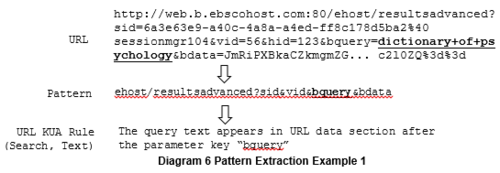
A pattern captures URL subdomains and request parameter names, and defines a group of URLs with the same subdomain structure and parameter names. A pattern disregards data value and reduce the amount of manual work in discovering URL KUA rules. Diagram 5 shows the general pattern extraction process.
Once the URLs have been reduced into patterns, we would manually identify patterns related to one of the three KUAs according to traces from the pattern literals. From the identified patterns, we can then build URL pattern rules based on the observed pattern.
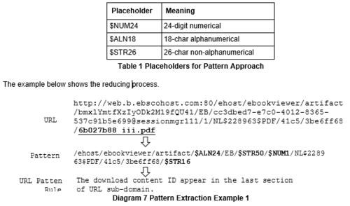
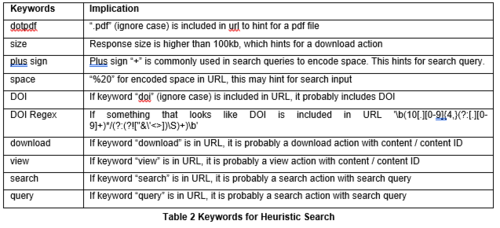
We further reduced the patterns by replacing fixed length subdomain strings to certain placeholders that capture the type of string and length. This is necessary because some databases (i.e. ebscohost) encode content ID or DOIs as a subdomain parameter (instead of a conventional data parameter). The table below illustrates the meaning of some placeholders used:
- 1. Heuristic Search Approach :
After expanding the work scope from eBook databases to all databases, despite a higher accuracy, the pattern approach is not efficient enough. We then used heuristic search approach to identify URLs for KUAs.
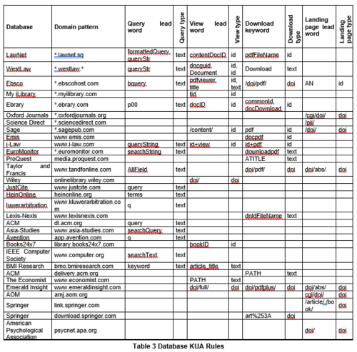
The output data indicates which keywords appear in each URL. Although false negative rate is higher than pattern approach, this makes it much easier to identify URL KUA rules. Combining two approaches, we built up the rules for the databases below.
This table only shows features of rules; the actual rules are coded in python as standalone modules. Code 1 is used to extract DOI “10.1002/smj.2268” from Wiley’s database URL. As this pattern means a landing page, the KUA type is also returned, along with format type (DOI) and the DOI data. The DOI extracted will be used in the next step.
Decode extracted DOIs
Upon extraction of each DOI, the program calls a public API “http://api.crossref.org/”. The API returns the title, author, license and other details of the publication, but only the title is recorded along with the log record. Caching is used to reduce the expensive API calls and improve efficiency.
Aggregate data by user sessions
User session is chosen as the measure for general analysis on database on the grounds that students tend to have a single objective within a user session. We chose it also due to these limitations:
- Even though we have cleared requests to web resources, we cannot identify all requests initiated by user (not the machine)
- Query rules are available for all databases in the dataset
Thus, aggregating request on user session is a comprised step with many virtues. We leveraged on cache ID for user session differentiation. Cache ID is generated by the proxy server for user identification purpose. More specifically, students are authenticated for the period of 30 minutes (a session window). Combined with database name [database category], cache ID is will identify user access to a database [database category]. Number of sessions aggregated by hour is used for domain trendline and horizon chart analysis below.
Visualization Designs
Horizon Chart
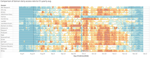
The rationale for us to utilise the horizon chart with 'Tableau' interactive visualisation tool is that horizon chart overpowers the usefulness of simple trend line in comparing data over time for many items within a category. The traditional line chart that squeeze all the curves on a single graph is not palatable when it comes two tens of databases . However, it is still necessary to put them on a same perspective to make logical comparisons. Eventually, horizon chart becomes the dominant alternative to this situation.
Converting from the trend lines to colour coded horizon chart not only helps segmenting messy trend lines into clear and straightforward heat map rows, but also insulate each element to include the trend lines with abnormal value such as the ‘Factiva’ case demonstrated in _ .outliers. The improved visualisation method can be seen in Figure 1 Horizon Chart below, where each row represents the popularity of individual domain been used across the time frame.
Word Cloud
Another approach to derive insights with the data in common log files is via text mining on the extracted user accessed contents. Two aspects been chosen for aggregation is by faculty and by batch. The rationale behind this course of action is to find out what each school and each batch is searching for the most. Word Cloud the choice of visualization as it best illustrates the most searched topics in an easily understandable way. This will help the librarians to understand what each school searches on and cater recommendations to them later on.
Two R libraries, 'tm' and 'word cloud', were used for word cloud pipelining. The former is used to remove pipeline characters and other non-alphanumerical characters, stem words (e.g. reduce “bigger” to “big” or “exercising” to “exercise”), remove stop words which provides no information, and convert all text to lower case.
The following steps will be taken for word cloud analysis:
- Load data, tm library and word cloud library
- Build a corpus, and specify the source to be character vectors
- Remove non-alphanumerical characters and extra whitespace
- Remove pre-defined and added stop words from corpus
- Keep a copy of corpus to use later as a dictionary for stem completion
- Document matrix as a table containing the frequency of the words
- Inspect every word and their association phrases
Horizon Chart Analysis
Findings
One of the possible ways to utilise this horizon diagram by itself is to generate the usage pattern based on a set of filtering criteria and by only changing one variable to observe the differences. For example, to discover the different usage patterns for ‘ebrary’ database for school of ‘Business’, ‘Law’ and ‘Social Science’. The results go as follow:
In the example given above, we can clearly observe some similarities lies within each trend lines. The usage rate of ebrary platform starts to surge from week 7 onwards across all three schools, and plunges during none school terms. This is in line with the school academic schedules, as well as the course schedules where most projects only kick starts in the second half of the semester.
However, exceptions are also very prominent in this case, as the students from SOB start to generate more accesses from week 5 onwards, which is much earlier than the other two schools. It may lead by a different course structure in school of business as they have an interim report due in the first half of the semester. Even though the usage rate by students from SOB and SOSS has three similar period of spikes in the second half of the semesters, SOSS students demonstrate a more consistent high demand than SOB students as the bar constantly filled with warm colours.
Furthermore, Law students work very intensely during the recess week. The figure above shows an intense red portion in comparison to all three rows of data. They also have an early start of their hardworking momentum approaching the end of week 7 as compare to the other two schools. They tend to enjoy their weekend after mid-term before heading back to school projects. Generally, they also tend to 'cool off' earlier than the other two schools may again suggest they have an 'early bird' and prompt working style. They prepare their work way before time as compared to other schools.
Word Cloud Analysis
Aggregate by Faculty
To first aggregate by faculty is to find out the most popular search queries for different faculties. Its purpose is a preparation for the librarians to do up a recommender system based on their search queries. This can also value add to the online library platform for the students by showing more relevant articles on top while they perform searching.
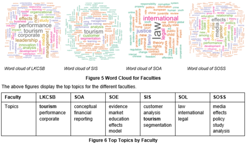
Examples on the word cloud generated by aggregating on faculty:
School of Accountancy, Economics, Law and Social Sciences tend to search for topics that are within their own scope of study.
One interesting finding is that Business and Information Systems students has the same hot topic "Tourism". It is most likely inferred that we could see that LKCSB undergraduates are interested in tourism because tourism brought about the most business revenue for Singapore in 2016 (Lim, 2017). As for Information Systems students, it appears that they are interested in finding out more about customers. Our logical deduction is that since all Information Systems students are required to do a Final Year Project which requires them to do competitor analysis, this is why they need to do a lot of research on customer analysis and segmentation.
Tourism was also found to be a hot topic in the aggregation by admission year. It may be due to the surge in tourism in 2016 where the tourism in Singapore hits record high (Lim, 2017). This may have caused professors to be focused on tourism as the research topic. Therefore, students are being assigned to this topic in class. Drawing reference to tourism being the hot topic for AY2016 students, we found out that tourism is the research topic for one of their university core modules called "Project Work & Research".
The above table shows the associated phrases that are frequently searched by the various faculties. One example that we could see is that LKCSB undergraduates are interested in entrepreneurship and leadership which is not surprising because SMU has always been promoting entrepreneurial spirit and leadership skills.
- Interesting findings from Faculty Word Cloud :
- Tourism is a hot topic.
- School of Business, Economics, Law and Social Sciences students search within their own major whereas School of Accountancy and Information Systems have the tendency to search outside their major e.g. Tourism – This is an interesting finding as School of Accountancy and Information Systems are more technical degrees
Aggregate by Admission Year
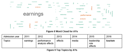
Aggregation by admission year is able to show what the different batches are searching for in 2016 and deduce why is it possibly so. This could help the librarians to find out the hot topics among the different batches in 2016 and whether their searches correlate to the world trends and current affairs. Here are the examples of word cloud created.
- Interesting findings from Admission Year Word Cloud :
1. Similarity – Students basically search for topics that is most relevant to them based on their current status
One interesting discovery is that the top most popular searched topics for the respective batches correlates to what is their main concern based on their current status. For example, students of AY2011 are the graduating batch in 2016. The most popular searched topic for them can be career prospects and their most popular searched topic is "earnings", which correlates to their major concern. What they will be most concerned about is job earnings.
For AY2015 batch, "Leadership & Teambuilding" module was made compulsory for all year one students to take in their first year. That explains why they searched for leadership related topics the most.
Media is a hot topic among year 2 and 3 students. Based on our research, "Media Psychology" is a new module launched in AY 2015-2016. It will be the seniors who can choose to take this module instead of year 1 students as their schedules are being filled by pre-assigned modules.
2. Tourism being the most popular search topic cross faculty and admission year.
Despite having “tourism” to be the most popular topics for the School of Information System and School of Accountancy in the former word cloud analysis, looking from this second perspective, it is interesting to find out that the tourism requests are mostly generated by Year 1 students. From our domain knowledge and experience, we infer a highly probable cause can be the module “Project Work & Research” (PWR) is a requirement for all year 1 students.
