Hiryuu Analysis
|
|
|
|
|
|
|
| Data Preparation | Analysis |
|---|
Contents
Exploratory
1. TAT across different countries
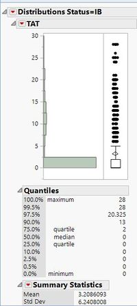
Although there are some datasets where the 90 percentile of the TAT is less than 3 days, there are some data sets where there were a huge proportion of failures.
One example is the dataset below which has a high value of 13 days for its TAT at the 90th percentile. This is an alarming number and should be flagged out for further in-depth analyis on the factors for failure.
2. Ending day of shipments
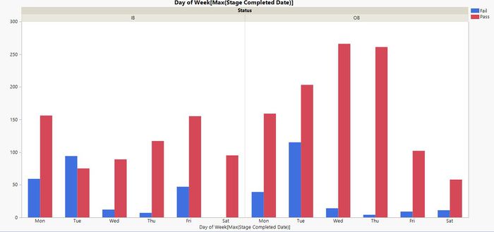
We have observed similar trends across various datasets in the failure rates for shipments ending on Monday and Tuesday.
An example of the distribution is shown below:

For OB data, the reason for the higher failure rate might be the inavailability of customers over the weekends.
However, for IB data, there is no conclusive reason as of now, and we will be clarifying with our sponsors.
Time-Series
Clustering
Geospatial
Simple Plot
Neighbouring Polygons Patterns
We observed that neighbouring cities around a city with a high number of inbounds tended to have higher inbounds than others as well. So hence we suspect that neigbouring inbound might be affected. Spatial randomness analysis will be relevant here, specifically Moran I and Geary’s C. We suspect that with time when we input failure points into this map and perform the same analysis, we might be able to find some pattern. Such that areas that tend to have high failures have neighbouring cities that also have failures. And possible explanations could be the transport mode, or transport companies that are assigned to handle these areas. These kind of information is rather useful to our sponsor.

