ANLY482 AY2016-17 T1 Group5 - Visualizations
| Overview | Description | Scope & Methodology | Visualizations | Technology | Limitations |
The following visualizations are taken into considerations for our project.
Contents
Calendar View
Credits for image: https://bl.ocks.org/mbostock/4063318
The calendar view chart allows user to easily know when there is a high profit and when the profit is average via the color attribute. User could also make comparison for sales across different weeks and months easily and more accurately by looking at weekend or weekday respectively instead of having to check what day it is. From this chart, we would be able to see make comparison and identify trend for sales across weekday/weekend, different week, month and year.
Bullet Graphs
Credits for image: https://bl.ocks.org/mbostock/4061961
This graph allow user to see mutiple thing on one chart. The user can see the value such as revenue of the current selected time period and compare it against a set of range to see which range category it currently fall user and the marker could show the target achieve for the previous time period and allow user to see how much different is the value.
Horizon Chart
Credits for image: https://square.github.io/cubism/
This graph allows user to compare the number of orders taken at different times of the day.
Parallel Sets
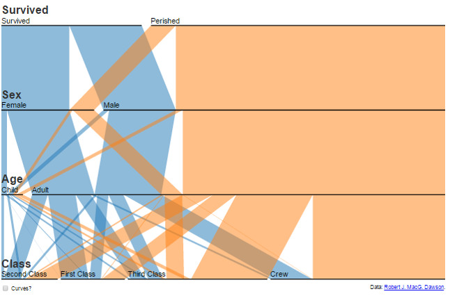
Credits for image: https://www.jasondavies.com/parallel-sets/
This graph allow the user to see the multiple dimension. It allow the user to see the dimension and its subcategories.
Sankey Diagram
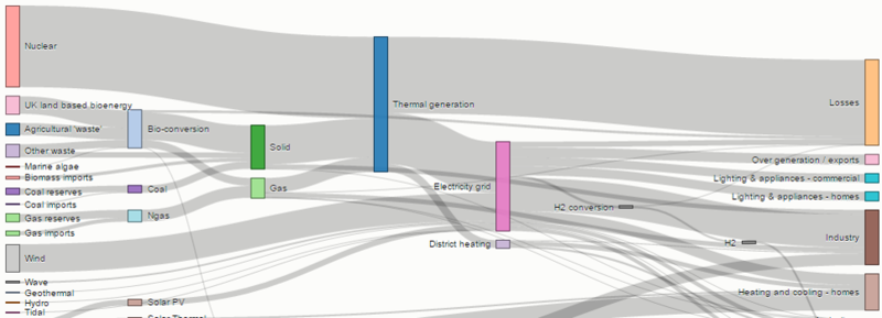
Credits for image: https://bost.ocks.org/mike/sankey/
This graph allow the user to see the flow and the thickness of the line could represent the popularity.
Sequence Sunburst Diagram
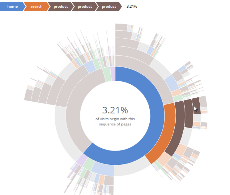
Credits for image: http://bl.ocks.org/kerryrodden/7090426
The diagram can show the data in sequence so it will be useful for identify the most popular item and the modifiers.


