Griffins Proposal
| Home | Project Proposal | Project Management | Deliverables |
|---|
The Health Promotion Board (HPB) was established as a statutory board under the Ministry of Health in 2001 with a vision to build a nation of healthy people. HPB organises many Health Promotion programmes and requires many tools to assist them in planning to ensure efficient outreach and maximize public resources. HPB is also tasked under the Healthy Living Master Plan, to enable Singaporeans to have access to healthy living at the “doorstep” of every home, workplace and school, by 2020.
Currently, the process to calculate the accessibility of healthy living amenities at HPB is highly manual. The HPB staff are required to do perform analysis within selected areas for their outreach programmes, and this is largely done on excel spreadsheets. In addition, new colleagues typically have difficulties picking up technical skills related to GIS (such as using QGIS), and hence, are very reliant on a small group of staff that with the technical skills, to perform geospatial queries.
Our project aims to provide a custom GIS platform, named Healthy360, that will reduce manual data entry, is easy to use, and will enable the staff to gain greater insights into the data they currently possess.
Healthy360 will be in the form of an interactive and visual web application that utilises GIS functions for geospatial planning and analysis and will allow the user to do the following:
- Check HPB’s KPI, i.e. obtain the percentage of dwelling units that has access to x number of amenities at x buffer distance
- Obtain the number of amenities surrounding each HDB block at a set buffer distance or at varying distance for each amenity
- Identify HDB blocks that are classified under high, medium and low risk
These functions aim to allow HPB staff to identify blocks with limited accessibility and plan for more healthy living amenities in the vicinity.
Our scope of work includes building a web application that would run on a SVY21 projection.
Visualisation
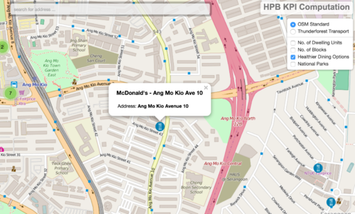
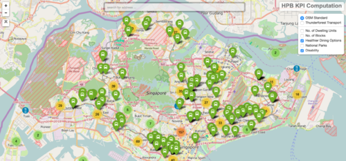
One of the key visualisation feature is allowing users to toggle, view and overlay map layers, on top of base layers from OpenStreetMap (OSM). Attributes of each location can be displayed on mouseover and users may customise the colours used to represent pointers on different map layers according to their own preferences.
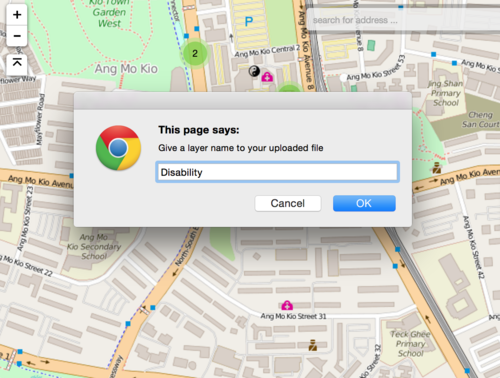
The function to upload a GEOJson or KML would be included, to allow users to plot their own map layers, and introduce new amenities into the analysis.
KPI Calculations
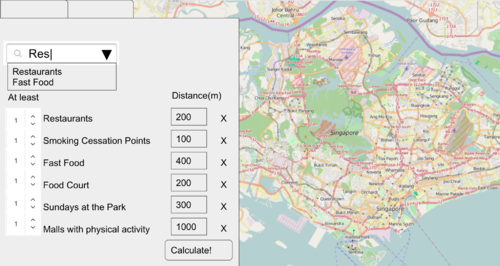
To allow users to calculate the KPI, a form would be required to allow users to input the buffer radius and type of amenities to search for within the radius. Based on the number of amenities that falls within the user-defined buffer area, the HDB blocks will be classified into high risk, medium risk, and low risk blocks.
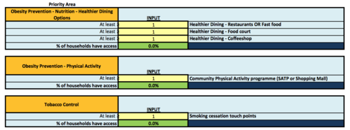
HPB currently have 3 priority areas and HDB block’s risk level is determined by the number of priority areas, whose criteria were met.
High risk – HDB blocks that do not meet any of the criteria
Moderate risk – HDB blocks that meet 1 of the criteria (any 1 of the 3)
Low risk – HDB blocks that meet 2 of the criteria (any 2 of the 3)
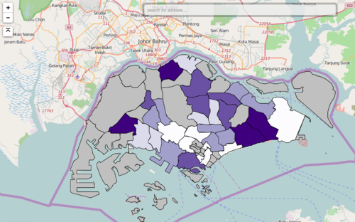
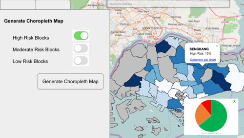
The different risk levels will be visualised in the form of a choropleth map, grouped by planning area as well. This can allow the staff to identify planning areas with greater density of high blocks, or planning areas with higher concentration of low risk blocks. For the staff to further gain insights, tables and charts can generated to reveal the number of amenities within the planning area, highlighting amenities that is severely lacking, or over supplied.
The following datasets would be required for this project
- Living dwellings (List of HDB Blocks and number of dwelling units per block)
- Healthier dining options(Restaurants, Fast Food Food Court, Coffeeshop)
- Sundays at the Park
- Physical Activity Malls
- Smoking Cessation Touchpoints
- GRC zones
The above datasets would all be represented in point form, with the exception of the GRC zones.
Datasets would have to be converted to .shp or geoJSON and JSON formats. Shapefiles would allow us to explore the data on QGIS while geoJSON and JSON formats allow integration with javascript libraries like leaflet.js and d3.js.
Examples of Data
Healthier Dining.json
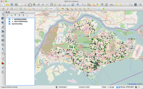
The original dataset for healthier dining was in csv format. It was geocoded and uploaded on QGIS, before being converted to geoJSON format using the QGIS2Leaflet plugin, to allow leaflet.js to display the map on the front end.
Before building the web application, we have to first process the data obtained. Datasets are in the form of .csv, and most of the datasets only have postal codes for locational details. These datasets will be geocoded using the OneMap API.
The geocoded data will be plotted on QGIS. Within QGIS, a plugin, QGIS2Leaflet, would then be used to generate a basic javascript web application, and the layers are saved in json format.
With the basic application in place, Bootstrap will be used to construct input fields for the user to select the relevant layers and the buffer distance for each of the layers. The user will also be able to key in the criteria that has to be met by each block, I.e. How many points from each layer should a buffer around each block contain.
The web application would then buffer around each individual HDB block and calculate the number of points, of each amenity, that falls within the buffer. This data would be store in geoJSON format for now.
The KPI currently used by HPB looks at the percentage of dwelling units that meets the criteria set by the user. We would then need to compare the number of each amenity found in the buffer, to the criteria keyed in by the user. On backend, this process, will be iterated through each HDB block. The amenities that meets or fails the criteria will be record as TRUE/FALSE on backend.
After iterating through all the HDB blocks, the HDB blocks that meet the criteria set will be retrieved and dwelling of these HDB blocks, will be summed up and divided against the total number of dwelling units in Singapore to obtain the percentage.
The process to classify the HDB blocks under high, medium or low risk follows a similar process. But instead of only considering the amenities selected by the user, all amenities under the three priority area will be used. Each HDB block will be checked by priority area and likewise, boolean will be used to record whether criteria(s) in each priority area is met. The number of priority areas with criteria(s) met, will be summed and classified into the different risk levels accordingly.
Users can then select the risk level and generate the choropleth map. Grouped bar charts can also be used to display the number of amenities in each planning area, or the number of HDB blocks, of the 3 categories, in each planning area, to provide a macro view for the user.
New layers can be added on the fly to display on the map for users to add to their analysis computation. This is done using leaflet’s fileLayerLoad plugin. Users can upload their file and sidebar to toggle layers, as well as the the list of layers available for the user to calculate the KPI, will be updated accordingly.
The data in the json files for the default layers can also be updated as needed.
To further aid visualization of the data, d3.js will be used to generate and display data in the form of charts and graphs.
| Technology | Description |
|---|---|
| Bootstrap | An open-source framework for front-end development to add aesthetics to our web application. |
| D3.js | Manipulate data using HTML, SVG, and CSS to allow interaction and animation for our map. |
| GeoJSON | An open standard format designed for construction of simple geographical features with their non-spatial attributes based on JSON. |
| Leaflet.js | An open-source JavaScript library for interactive maps to help us add in the needed interactions. |
| OpenStreetMap.org | A free to use map of the world under an open licence which will be used for our mapping in our web application. |
| QGIS | A free and open sourced geographic information system to create, edit, visualise, analyse and edit geospatial information. |
A lightweight, portable web application that can be easily brought over to different machines without installation. The interactive web application should show the Singapore map with many attributes for filtering to assist in HPB’s daily planning needs. The user would be able to use the web application for presentations and also export the generated results into various file formats.
We have to make the application portable and usable without any installation of programs due to the policy restrictions of our clients. In addition, the database cannot be hosted online due to the confidentiality of data which eliminates the use of Structured Query Language (SQL). The dataset will be kept in local drives and the queries must be done on the fly without the usage of database and SQL queries.
This leads to further difficulties in computing the KPI without a space to store, query and retrieve the data necessary to compute the KPI. This problem is also further complicated by the option to allow user to upload new layers and set different criterion.
In working around this limitation, we have explored the option of a portable database, Spatialite, and am currently trying out javascript libraries like, turf.js.
